Alejandra - alecrea studio
Graphic designer, brand creative director, content creator🪡
New to Contra
Alejandra - is building their profile!

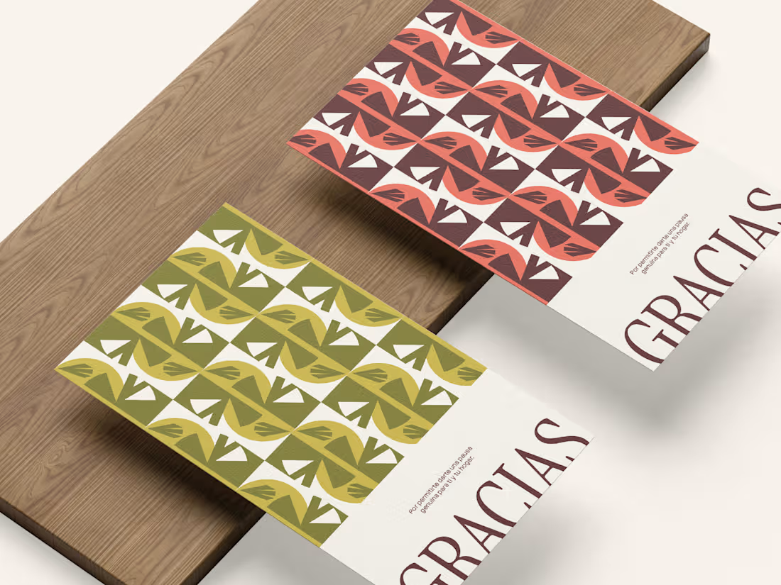
Brand Reveal — MOARA 🪔
When I received the initial briefing for this project, I fell in love with it at first sight. 🤍
The entire branding is built around a simple yet powerful idea: “bringing to light what needs time and space to emerge.”
MOARA Studio is an aromatic products brand offering wax melts, candles, room fresheners, and sprays, all handcrafted as a more natural and aesthetic alternative for decorating and scenting our homes. But there’s something that makes it especially interesting to me: when I first received MOARA, I loved the idea that it doesn’t understand “natural” as a synonym for neutral.
In a handmade and aromatic products market where whites, beiges, and “organic” tones tend to dominate, the brand seeks to show that simplicity doesn’t have to mean the absence of color, texture, or personality. Because all it takes is looking at nature to understand that it was never empty, it’s full of shapes, contrasts, textures, and diversity.
The identity takes its starting point from the meaning behind the word MOARA, which comes from a Tupi-Guarani word associated with the idea of “helping something be born” or “bringing it to light.” That idea eventually became the heart of the brand: giving time to what needs to emerge. The light in that moment when something is born, or when it slowly disappears at sunset, for example. From there, the visual system explores color, textures, and the imperfect reality of nature to build an identity that feels organic, but also expressive and alive. 🌿
In the end, I think that’s exactly what makes this brand so special to me: finding beauty not in emptiness, but in everything nature teaches us to look at more closely. ✨
I loved bringing this concept to life and building an identity that could make everything MOARA stands for visible. 🥰
2
1
72
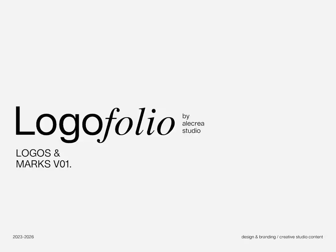
Logofolio — Logos & Marks Collection Vol. 01
A selection of visual identities developed between 2023–2026, built from the belief that branding should not exist only to follow trends, but to express something honest, recognizable, and emotionally distinctive.
At Alecrea Studio, every project begins by understanding the core of the brand, exploring its essence through purpose, personality, audience, and archetype before translating it into a visual identity.
Rather than forcing brands into the same minimalist aesthetic simply because it is visually trending or commercially “safe,” my approach focuses on discovering the unique language each brand naturally carries. Some identities require strength, others softness, structure, elegance, playfulness, or tension, and the role of design is to shape that individuality in a way that feels intentional and memorable.
This collection explores different visual voices through typography, symbols, composition, and graphic systems that go beyond aesthetics alone.
1
234
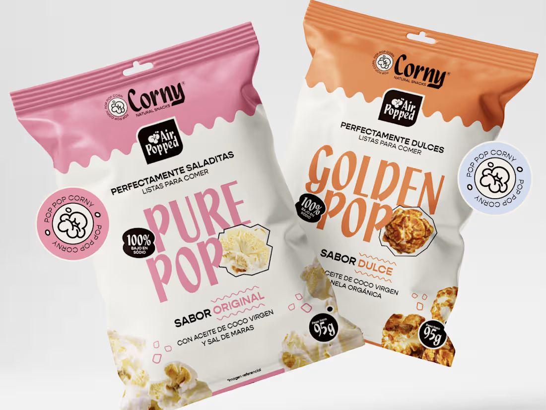
Corny —
A branding project inspired by the idea that natural can also be bold, playful, and full of personality. Built around the essence of popcorn as something light, fun, and easy to share, the identity explores expressive typography, soft organic forms, and a color system that feels both nostalgic and contemporary.
The visual language was designed to make “healthy” feel less rigid and more emotionally connected — turning an everyday snack into something vibrant, spontaneous, and full of character. Through contrast, oversized compositions, and fluid graphic elements, the project balances sweetness with attitude, simplicity with energy.
One of the things I enjoyed the most was translating the texture and movement of popcorn into graphic forms that could live beyond the packaging itself, creating an identity that feels flexible, memorable, and naturally expressive.
2
3
278
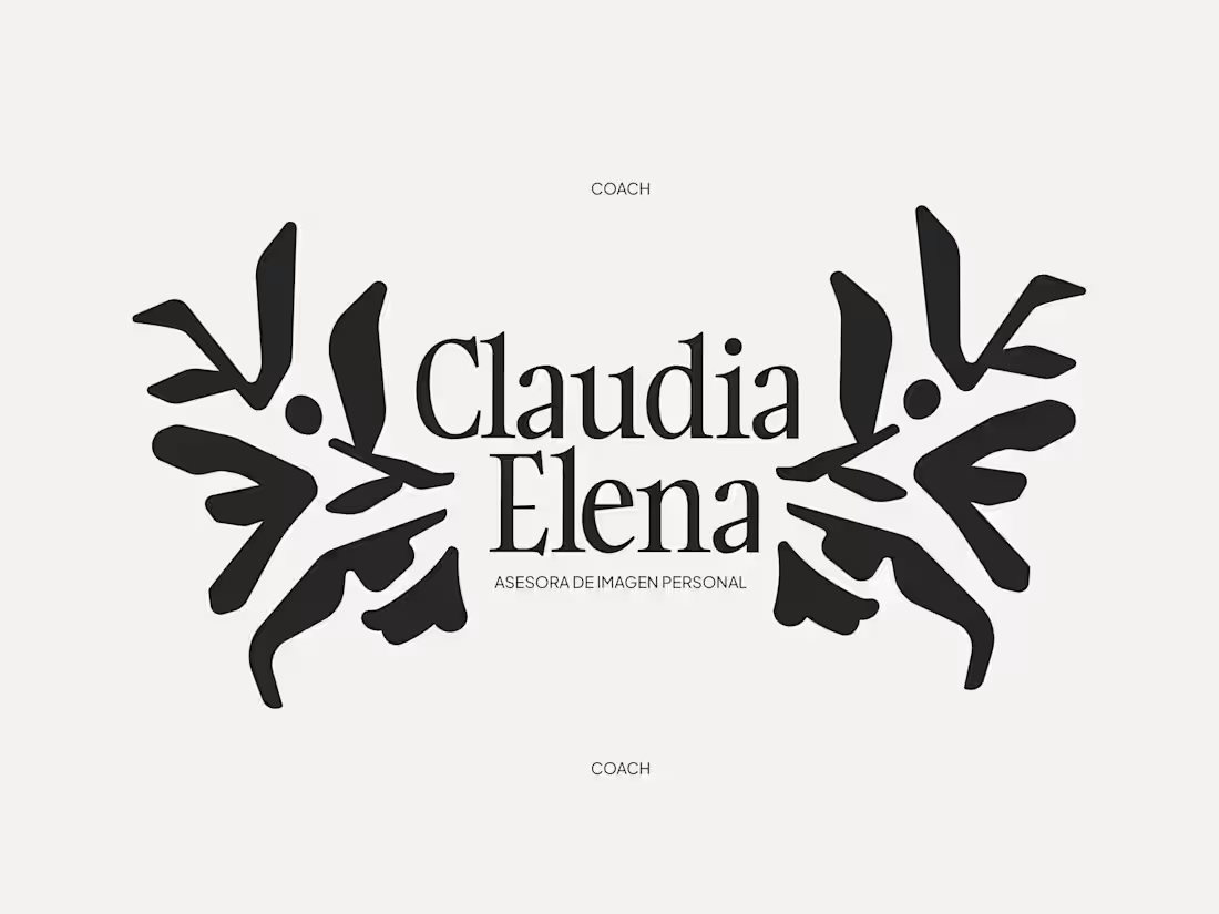
Claudia Elena — Personal Branding
A visual identity developed for Claudia Elena, a personal image consultant whose approach is rooted in authenticity, confidence, and self-discovery.
The concept behind “Structure” emerges from the idea that personal style is not about following rules, but about building a visual language that reflects who we are. Through organic yet intentional forms, the symbol represents balance between freedom and direction — a constant dialogue between expression and structure.
The visual system combines bold shapes with refined typography, creating a contemporary identity that feels both elegant and approachable. Neutral tones, minimal compositions, and tactile applications were carefully explored to reinforce a sense of sophistication, clarity, and confidence.
More than a visual identity, this project sought to translate personal transformation into a graphic experience — one that encourages people to reconnect with their essence and project it with authenticity.
0
273