
Alejandra Chávarri Romero
Graphic designer, brand creative director, content creator.
New to Contra
Alejandra is building their profile!

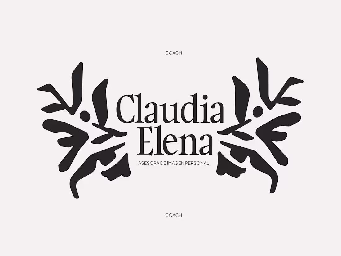
Claudia Elena — Personal Branding
A visual identity developed for Claudia Elena, a personal image consultant whose approach is rooted in authenticity, confidence, and self-discovery.
The concept behind “Structure” emerges from the idea that personal style is not about following rules, but about building a visual language that reflects who we are. Through organic yet intentional forms, the symbol represents balance between freedom and direction — a constant dialogue between expression and structure.
The visual system combines bold shapes with refined typography, creating a contemporary identity that feels both elegant and approachable. Neutral tones, minimal compositions, and tactile applications were carefully explored to reinforce a sense of sophistication, clarity, and confidence.
More than a visual identity, this project sought to translate personal transformation into a graphic experience — one that encourages people to reconnect with their essence and project it with authenticity.
0
17
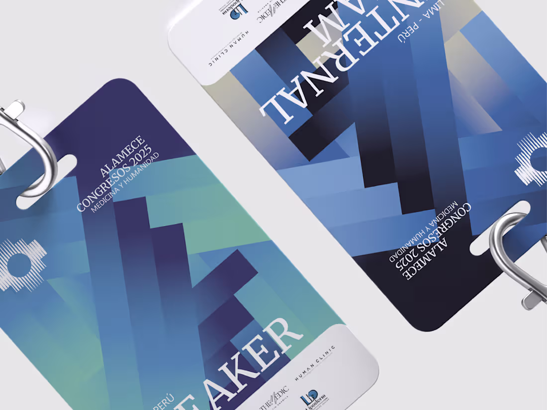
First Concepts — ALAMECE CONGRESOS 2025
Sharing the first exploration phase behind the credential design for the 1st ALAMECE Medical Congress, an event conceived to reflect the professional and human transformation of each participant.
The concept was built around flowing lines representing different paths and directions, symbolizing the opportunities, connections, and growth that emerge within an experience capable of marking a before and after in medical practice.
The gradient embodies this transition of mindset: a shift toward a more open, international, and limitless perspective. In this first stage, I explored initial proposals created specifically for speakers and the internal team.
Although the final composition evolved throughout the process, I wanted to document how the foundation of this concept was born, including the integration of sponsors and promoters within the lower section of the design.
A whole conceptual background for a simple credential? Of course. The details are what shape the experience.
1
24
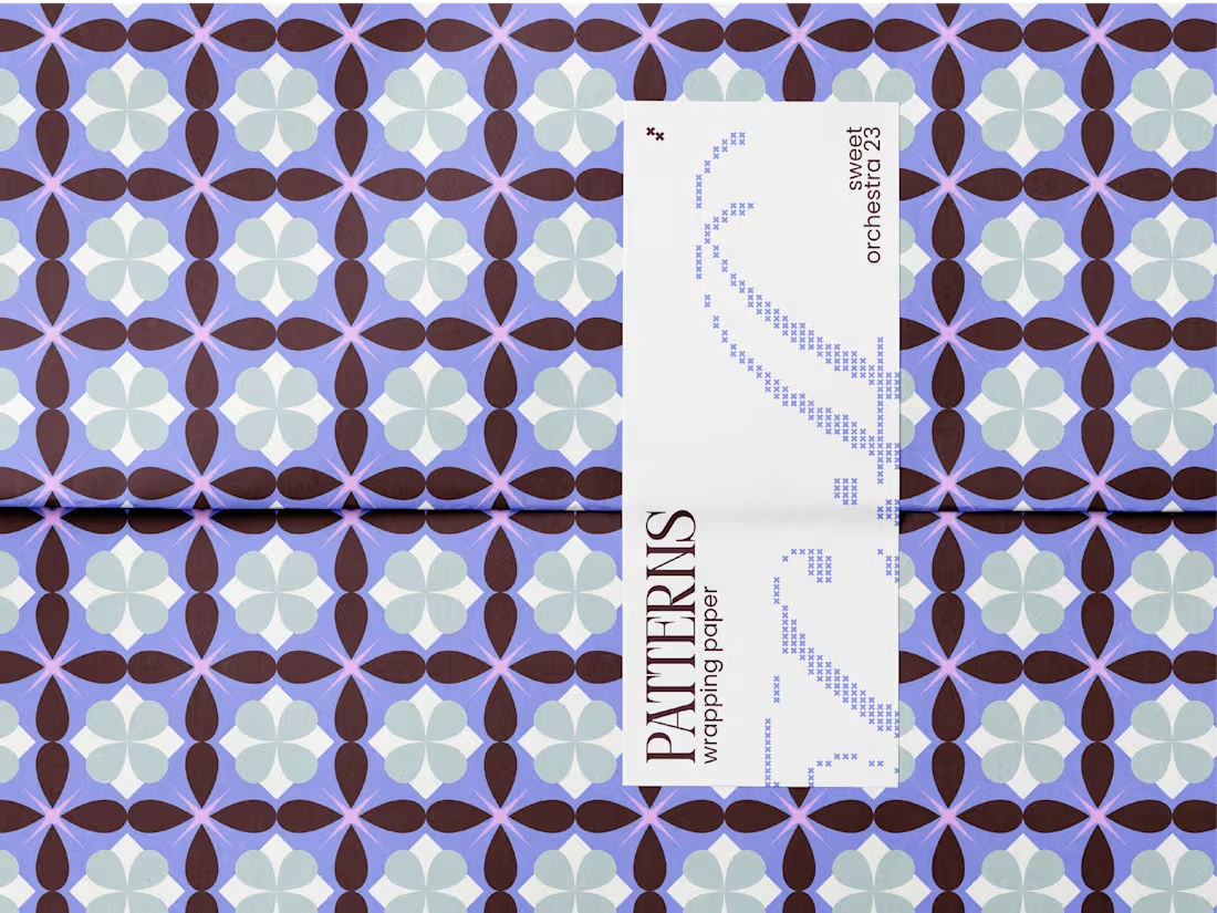
“Sweet Orchestra 23”
This project was born from a personal exploration of color, form, and the experience of gifting. Faced with the difficulty of finding wrapping papers that resonated with my visual language — characterized by vibrant colors, dynamic compositions, and expressive patterns — the need to create my own alternative naturally emerged.
The proposal takes shape through a series of graphic patterns designed to transform the act of wrapping into an aesthetic experience in itself. Each design aims to convey joy, warmth, and freshness, evoking a summery and spring-like atmosphere where color and form interact freely and harmoniously.
Beyond their practical function, these wrapping papers seek to redefine packaging as an extension of both the object and the intention behind the gift, turning it into a piece that communicates identity, emotion, and attention to detail.
2
7
77
BRAND REVEAL —
Welcome to Loobalab — beauty studio.
A space where every detail is designed to highlight your essence. Like a prism that reflects and expands light, Loobalab is a community that goes beyond self-care, transforming it into a true expression of self-love. Every experience is created to celebrate individuality within an atmosphere of elegance and grace.
Romantic, detail-oriented, and bold, Loobalab inspires a community that appreciates the beauty found in life’s smallest details, crafting experiences that allow every person to shine at their fullest potential.
I truly loved working on this project. Amazing clients, meaningful concepts, and a process I’m deeply grateful for.
1
48
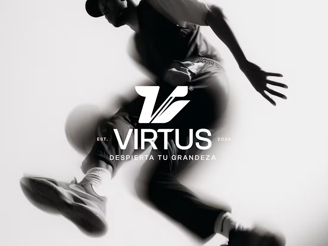
A glimpse into Virtus —
A project that sought balance between simplicity and detail. Inspired by the ancient Greek idea of virtue, or what is considered virtuous, from which its name is born, where value was rooted in excellence and the purpose of doing things well
I designed a proposal that merges the everyday and the formal with functionality into one experience, going beyond the idea of just a “training ground.”
A project that embraces the essential, while exploring how delicacy can also be supported by strength.
Honestly, it was a process I deeply enjoyed, especially exploring the forms of such an intangible concept. Maybe I’ll share more about Virtus soon.
2
1
60