
Akshika Singh
Making wellness brands impossible to ignore.


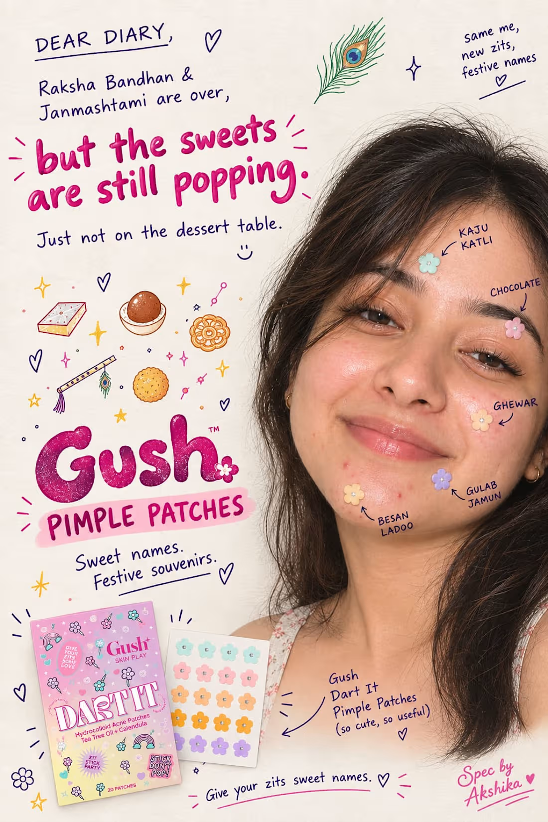
I use to name my zits as sweet names ..
Raksha Bandhan and Janmashtami just wrapped , and while the sweets are gone, the breakouts they left behind are just getting started.
My latest one is Kalakand 😙
Concept: what if pimple patches had the same sweet names as the mithai that caused the breakout in the first place?
This is a spec campaign I created for Gush Skin Play — reimagining how a playful, Gen-Z skincare brand could own a post-festival cultural moment through naming, tone, and visual storytelling.
Spec ad · Concept piece, not an official Gush campaign.
#SpecAd (https://www.linkedin.com/search/results/all/?keywords=%23specad&origin=HASH_TAG_FROM_FEED) #Copywriting (https://www.linkedin.com/search/results/all/?keywords=%23copywriting&origin=HASH_TAG_FROM_FEED) #BrandStrategy (https://www.linkedin.com/search/results/all/?keywords=%23brandstrategy&origin=HASH_TAG_FROM_FEED)
1
53
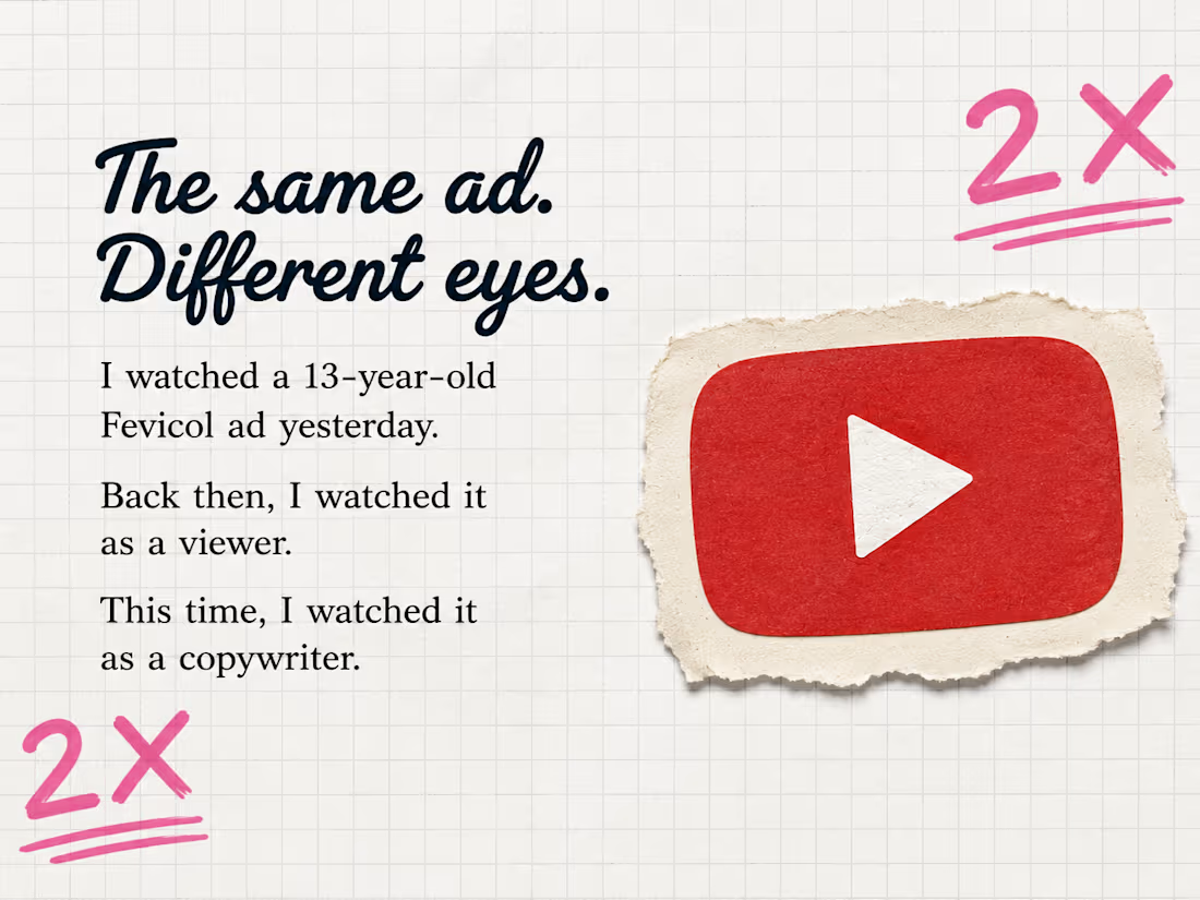
Fevicol Ad Observation #01
I watched this Fevicol ad twice.
The first time, I watched it as a viewer.
The second time, I watched it like a copywriter.
And the second watch changed everything.
I started noticing things that had nothing to do with a headline.
The Bengali folk music.
The river.
The boat.
The people.
The pace.
And most importantly — how little the ad tries to explain.
There isn't a voice screaming the product benefit at me.
There isn't a clever line fighting for my attention.
The story just keeps moving.
And Fevicol sits inside it.
That got me thinking:
What if good copy isn't always about finding the cleverest thing to say?
Sometimes it's about knowing what doesn't need to be said.
That's what I wanted to understand here.
So I took the ad apart frame by frame, not to tell you whether it's a “good ad”, but to figure out why it stayed in my head.
This is my first Ad Observation.
Not a campaign.
Not a client project.
Just me getting curious about an advertisement — and following that curiosity until I found something worth writing about.
1
120
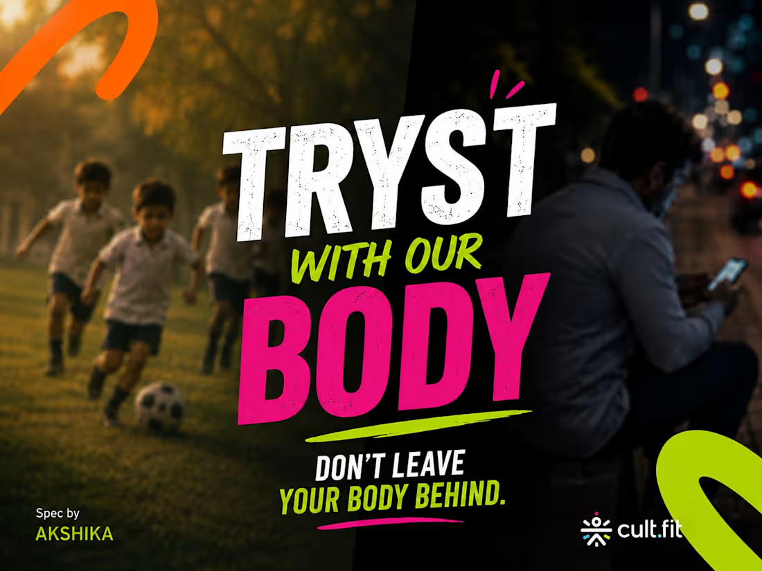
Project title:
A Tryst With Our Body
Independence Day Spec Campaign for Cult.fit (http://Cult.fit)
The challenge🚀
Independence Day advertising often celebrates the freedom we've gained.
I wanted to explore the freedom we quietly lose when our bodies become an afterthought.
The idea🙌
As children, we learned discipline through movement — Attention. Stand at Ease. March.
As adults, those same words take on a different meaning.
We sit longer. Move less. Eat between deadlines. And get used to discomfort.
So the campaign contrasts THEN vs NOW through familiar school-parade commands.
The campaign
ATTENTION
We learned to stand tall.
Then life taught us to sit.
STAND AT EASE
The body that once stood strong now carries the weight of desk life.
MARCH
We marched with energy.
Now we just move through the day.
Final thought
TRYST WITH OUR BODY
Don't leave your body behind.
My role🧠
Concept development
Campaign strategy
Copywriting
Art direction
Visual execution
1
120
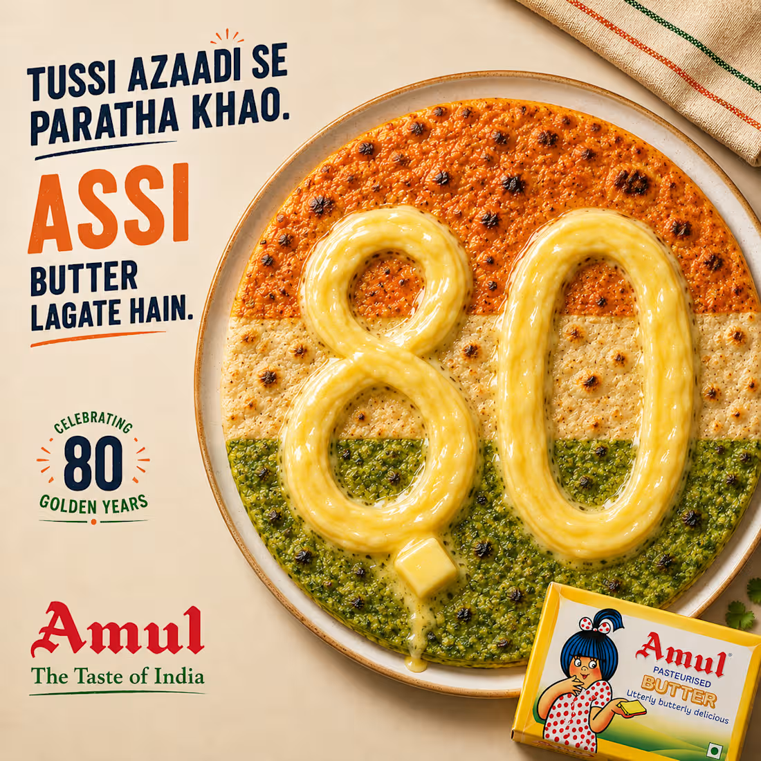
Spec Concept: Amul — 80th Independence Day
The Brief (self-initiated): Most Independence Day ads default to flags and patriotism clichés. I wanted something that felt native to how Indians actually celebrate — through food, at home, without needing to say the word "freedom" out loud.
The Insight: Amul has quietly been part of nearly every Indian household's daily ritual for decades — the kind of trust brands spend fortunes trying to manufacture. This year's 80th Independence Day gave that trust a number to celebrate.
The Wordplay: "Tussi azaadi se paratha khao, assi butter lagate hain." A bilingual pun — "assi" reads as both "we" (Punjabi) and phonetically as "80" — landing exactly on the milestone year.
The Visual: Three parathas — carrot, plain, and spinach — arranged as the tricolor, with "80" written across all three in butter, tying the number, the flag, and the product into a single image.
The Line: "80 years of independence. One butter, holding it all together."
Spec concept — not affiliated with Amul. Built to demonstrate cultural insight, bilingual wordplay, and full campaign execution from concept to visual.
2
152