ajao jelil
UI/UX Designer for Startups | Clean, usable products
Ready for work
ajao is ready for their next project!
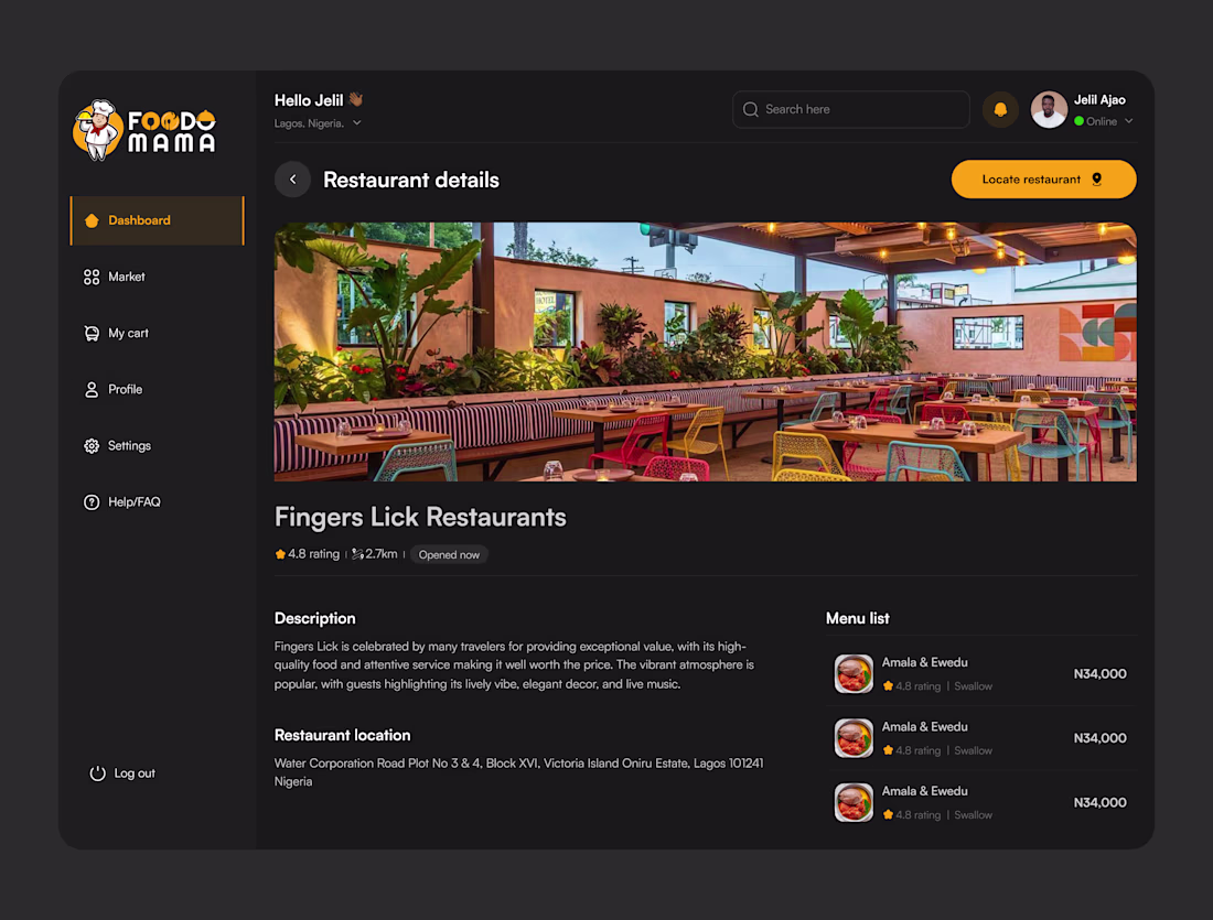
Project: FoodoMama — Restaurant Details Screen
A dark-themed dashboard screen designed for a food delivery platform, focused on helping users explore restaurant details before ordering.
Key deliverables:
• Full restaurant profile layout (hero image, rating, distance, status)
•...
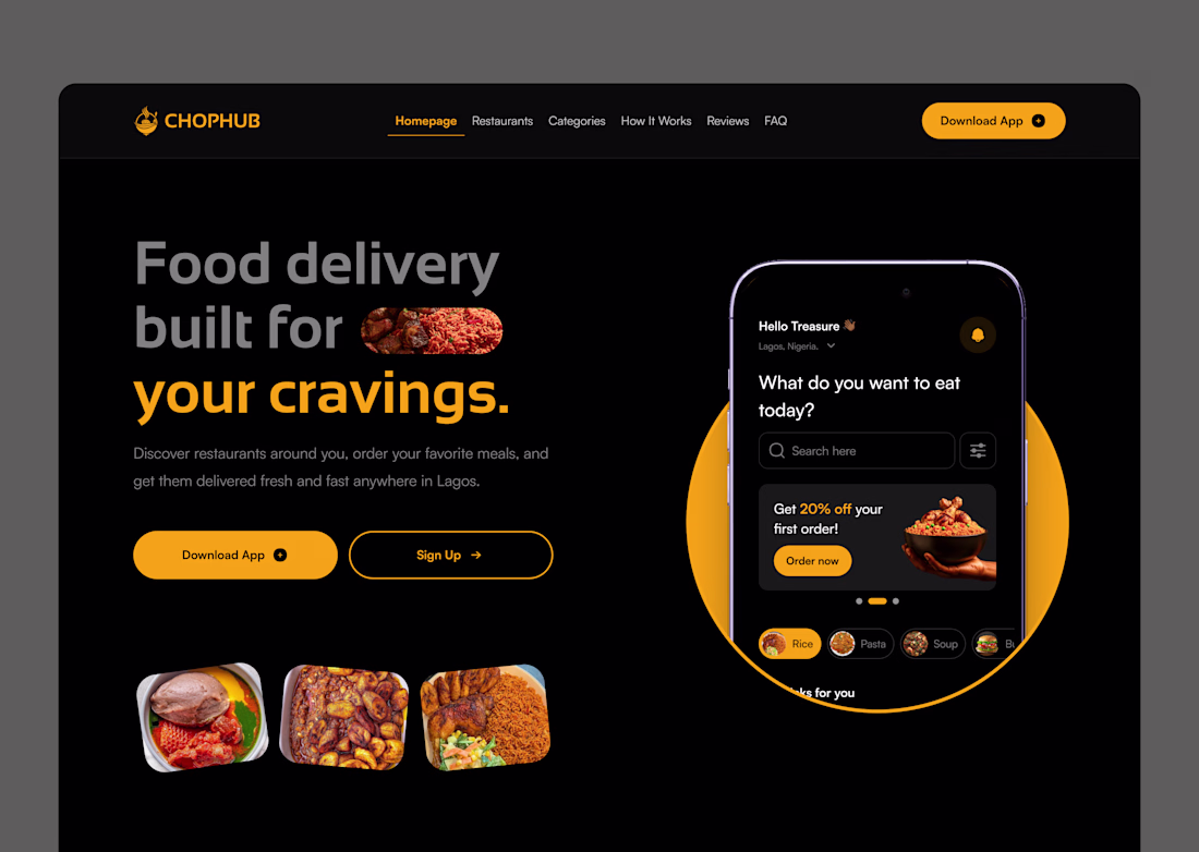
One color. That's all it took. 🟡
I designed this food delivery landing page for ChopHub and the entire visual language runs on a single primary color: amber.
No complex gradients. No trendy glassmorphism. Just disciplined use of one warm, high-energy hue against a deep black...
New week. New work to share.
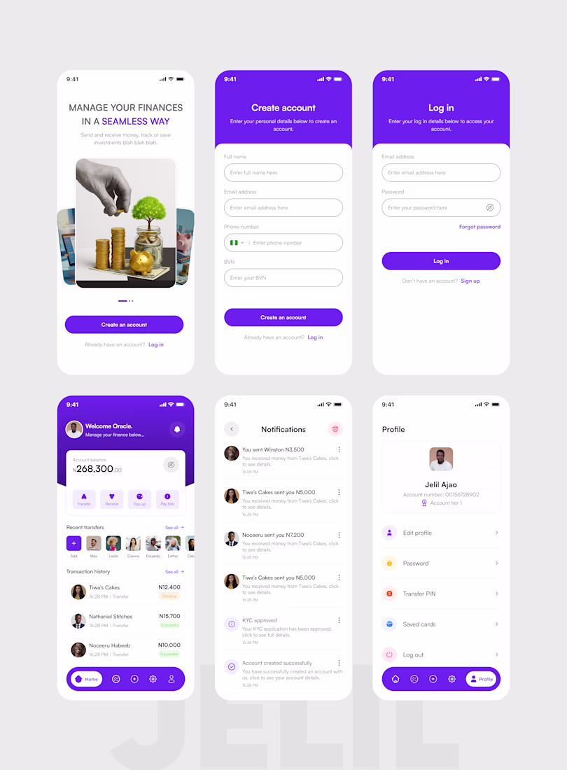
Fintech Mobile App - Full UI/UX Design
A complete mobile banking product designed to make everyday financial management feel simple, secure, and empowering for Nigerian users.
Screens delivered:
— Splash & onboarding screen - trust-first visual design
—...
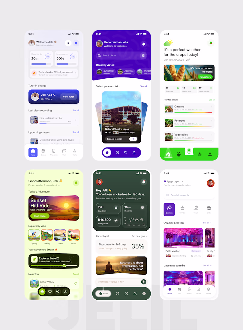
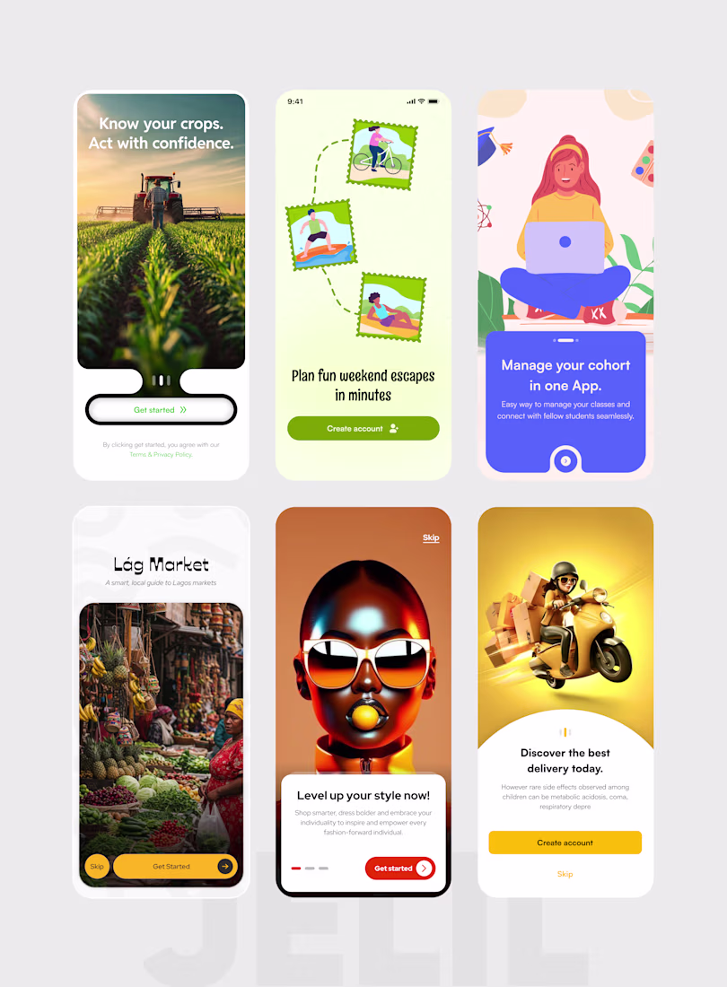
Onboarding UI Design - 6 Products, One Philosophy: Details Drive Conversion.
Your first screen is your first handshake with a user. If it's weak, they leave. If it's sharp, they stay.
These are splash and onboarding screens I designed across six different products, each built...
I'm Jelil. I design interfaces that feel effortless to use and are built to scale - across Mobile Apps, Web Apps, Landing Pages, and Web3 platforms.
Here's a snapshot of six recent projects:
— Cohort-based learning platform: dashboards, progress tracking, and class management...