
ajao jelil
UI/UX Designer for Startups | Clean, usable products
Ready for work
ajao is ready for their next project!
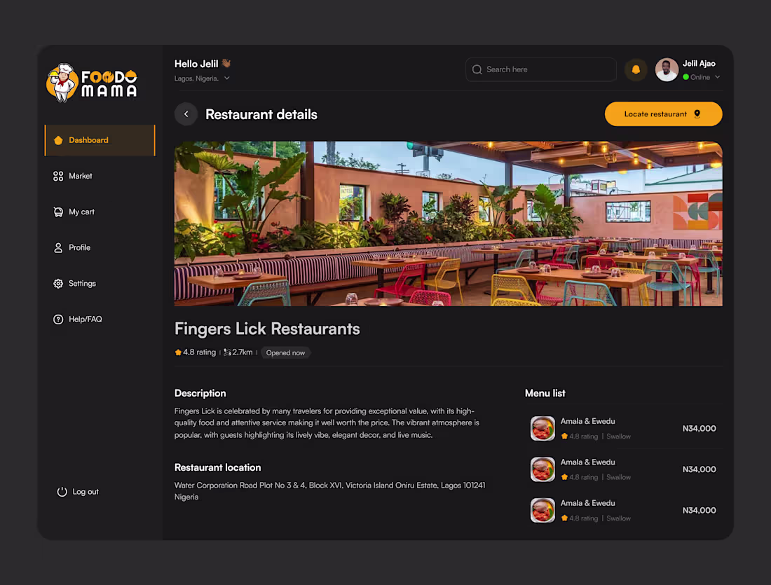
Project: FoodoMama — Restaurant Details Screen
A dark-themed dashboard screen designed for a food delivery platform, focused on helping users explore restaurant details before ordering.
Key deliverables:
• Full restaurant profile layout (hero image, rating, distance, status)
• Menu list module with pricing and item ratings
• Location and description sections for trust-building
• Consistent sidebar navigation across the dashboard
Design approach: dark UI to highlight food photography, clear visual hierarchy, and quick-scan information blocks for fast decision-making.
Tools used: Figma
Available for similar dashboard, mobile app, or food-tech design projects.
1
1
22
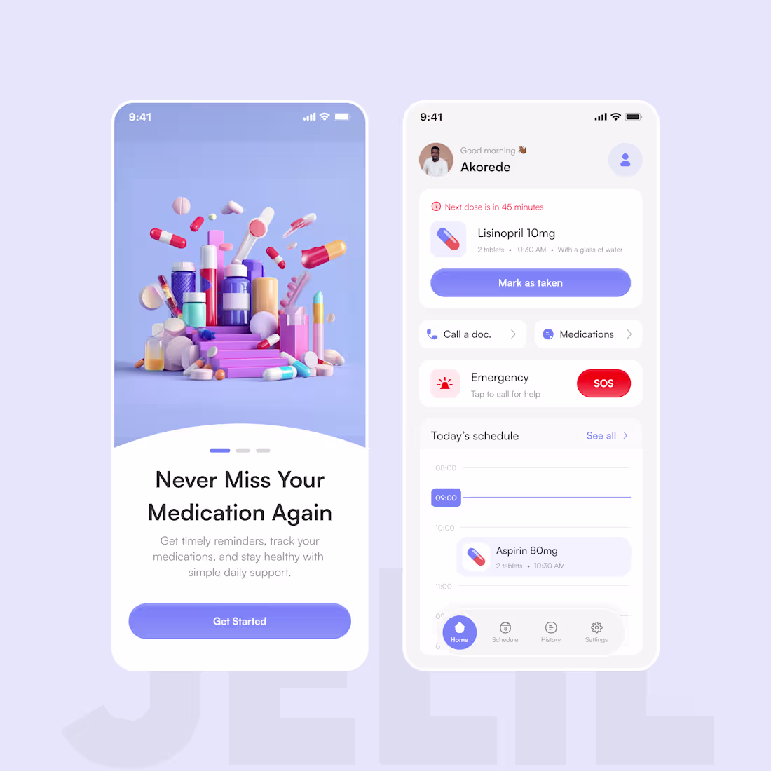
Medication Reminder App Concept 💊
Designed a clean and accessible healthcare mobile experience focused on helping users manage medications, track schedules, and access emergency support with ease.
The design prioritizes:
• Simplicity
• Accessibility
• Calm visual hierarchy
• Elder-friendly usability
Features:
Medication reminders
Schedule tracking
SOS emergency access
Doctor contact support
Medication history
Tools: Figma
Role: Product Designer
Available for healthcare, SaaS, fintech, and mobile product design projects.
0
13
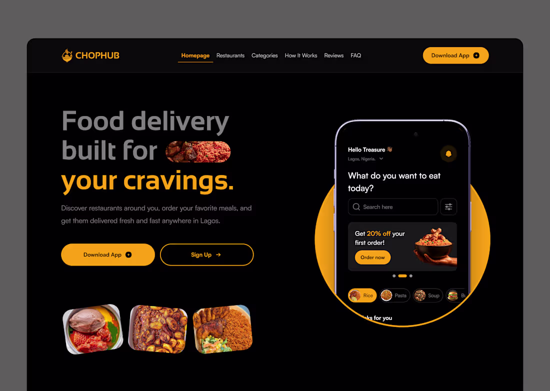
One color. That's all it took. 🟡
I designed this food delivery landing page for ChopHub and the entire visual language runs on a single primary color: amber.
No complex gradients. No trendy glassmorphism. Just disciplined use of one warm, high-energy hue against a deep black surface.
Here's the color strategy behind it:
✦ Amber = action. Every interactive element, buttons, active states, highlights, promo tags, lives in amber. Your eye always knows where to go next.
✦ Black = amplifier. Dark backgrounds don't just look premium, they make warm colors louder. The amber hits different on black than it ever would on white.
✦ Gray = support. Supporting text, inactive nav links, subtle UI elements, all in muted tones. They carry information without competing for attention.
The result? A UI that feels energetic, focused, and on-brand without visual noise.
This is color hierarchy in action. Not color variety. Not color trends. Just knowing where your primary color should live and protecting that space.
If you're building a brand-forward product, try this: strip your design down to ONE primary color + neutrals. You'll be surprised how much cleaner and stronger it gets.
🛠 Tools: Figma
🎨 Palette: Amber #F5A623 + Near-black #0E0E0E
📱 Type: Food delivery app landing page
Open to new projects. Hit Hire Me if you want a UI that works as hard as it looks. 🚀
1
1
32
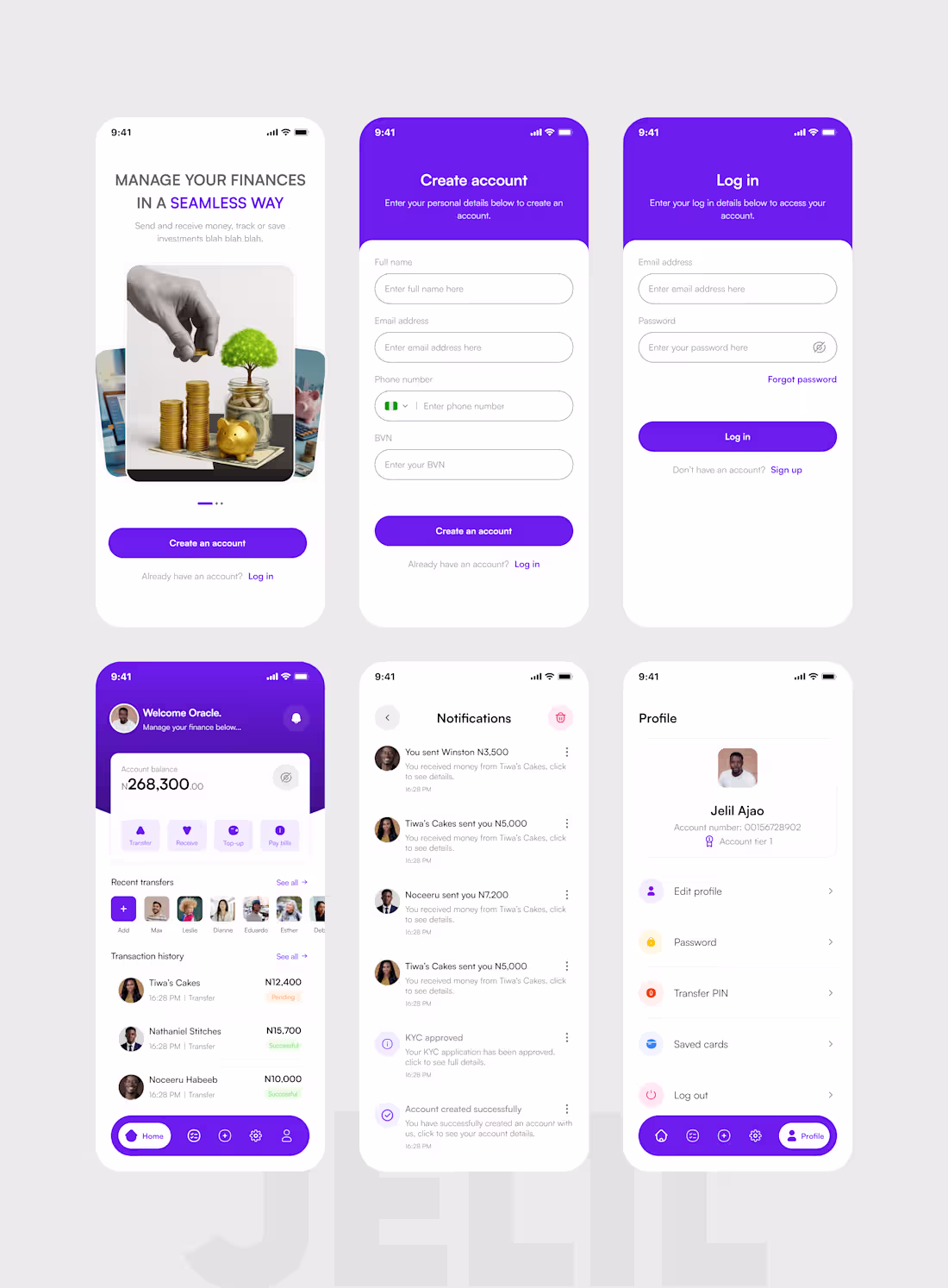
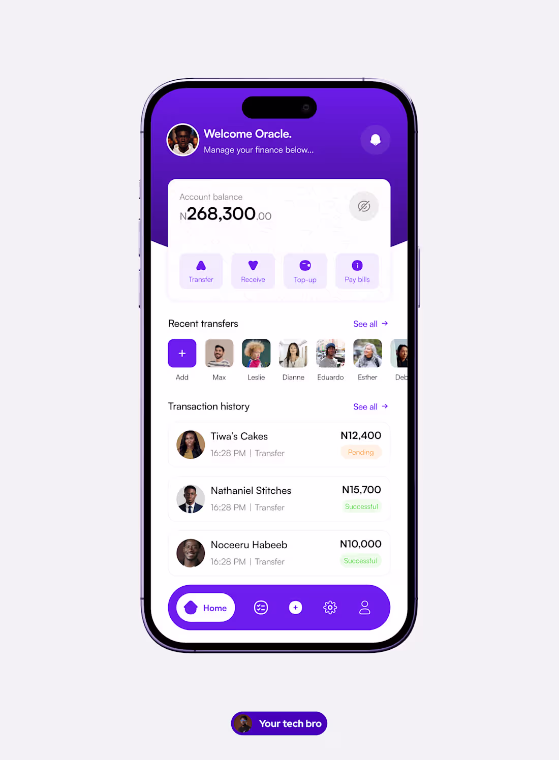
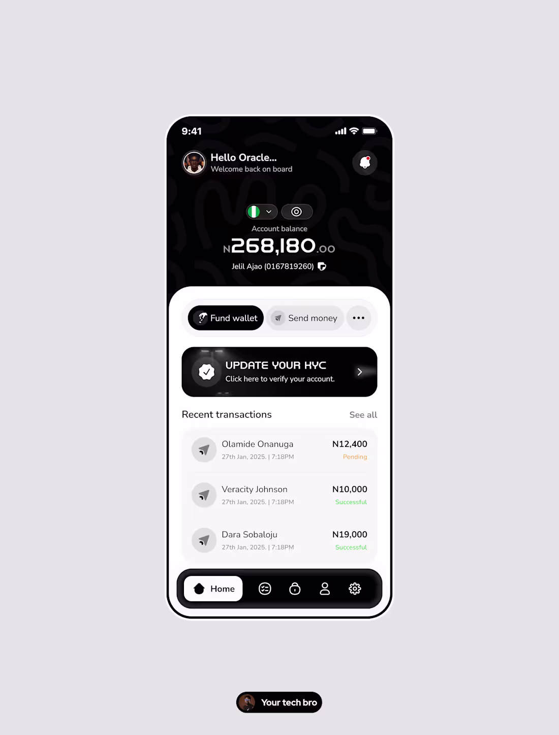
New week. New work to share.
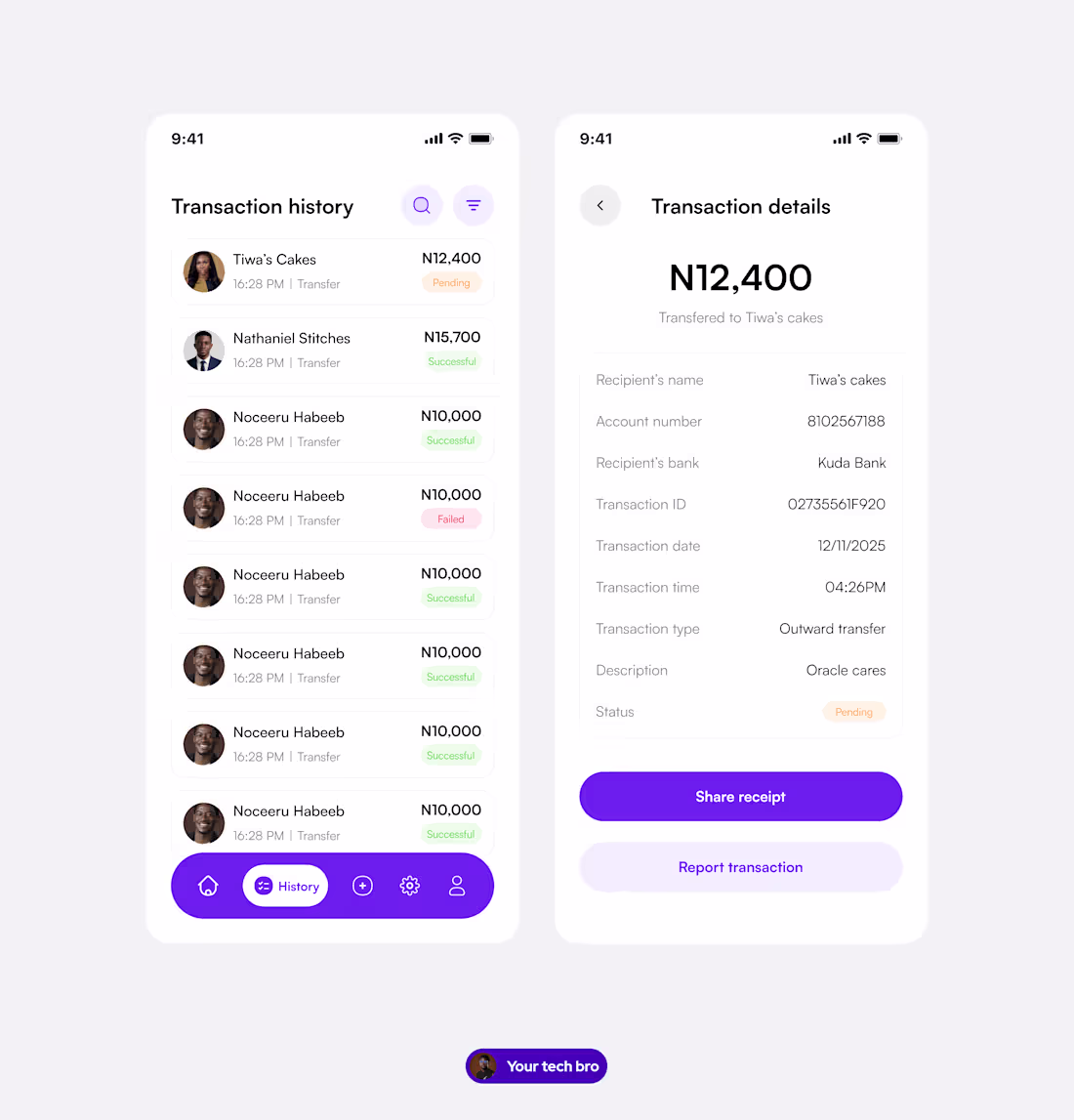
Fintech Mobile App - Full UI/UX Design
A complete mobile banking product designed to make everyday financial management feel simple, secure, and empowering for Nigerian users.
Screens delivered:
— Splash & onboarding screen - trust-first visual design
— Account creation flow - frictionless, BVN-inclusive signup
— Login screen - clean, secure, with clear recovery options
— Home dashboard - balance overview, quick actions, recent transfers & transaction history
— Notifications centre - real-time activity updates, clearly structured
— Profile & settings - full user control in a minimal layout
Design philosophy behind this product:
In fintech, clarity isn't just good UX, it's the foundation of user trust. Every spacing decision, colour choice, and copy line was made with one question in mind: does this make the user feel safe and in control?
What I bring to fintech products:
— End-to-end mobile UI/UX design
— User flow mapping & wireframing
— Design systems & reusable component libraries
— Developer-ready Figma files
— Onboarding, dashboard & transaction flow design
Available for new projects this week.
If you're building in fintech and need a designer who understands both aesthetics and conversion - let's talk.
1
1
16
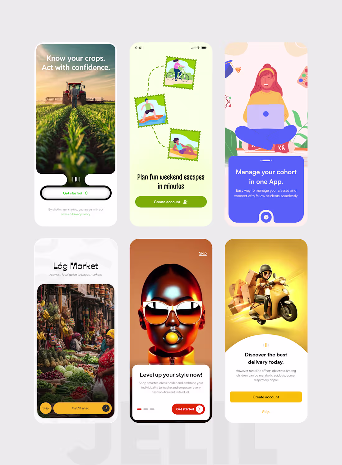
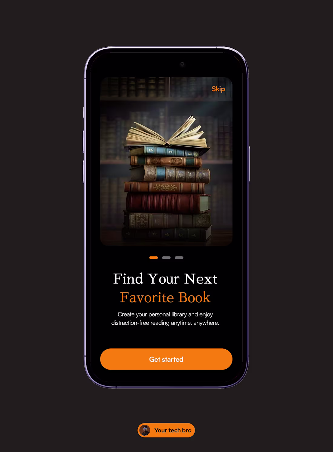
Onboarding UI Design - 6 Products, One Philosophy: Details Drive Conversion.
Your first screen is your first handshake with a user. If it's weak, they leave. If it's sharp, they stay.
These are splash and onboarding screens I designed across six different products, each built around a deliberate visual and UX strategy:
— Smart farming app: full-bleed hero image, bold headline, frictionless single CTA
— Travel & adventure app: stamp-style illustration system that sets a playful, exploratory tone
— Cohort learning platform: trust-first copy hierarchy with a clear value proposition above the fold
— Lág Market (Lagos market guide): culture-led visual identity that resonates before a word is read
— Fashion app: identity-driven imagery designed to make the user see themselves in the product
— Delivery app: high-energy 3D visual with warm, action-oriented copy built for fast decisions
The details I obsess over on every onboarding screen:
— CTA button contrast & placement
— Headline weight & emotional tone
— Micro-copy that reduces friction and builds trust
— Visual language that matches the product's core audience
— Colour and imagery that create the right first feeling
These aren't aesthetic choices. They're conversion decisions.
What I offer:
— Mobile app UI/UX design (iOS & Android)
— Splash screens, onboarding flows & empty states
— Design systems & component libraries
— Web apps, landing pages & Web3 interfaces
Currently available for new projects.
If your product's onboarding isn't converting — let's change that.
1
12
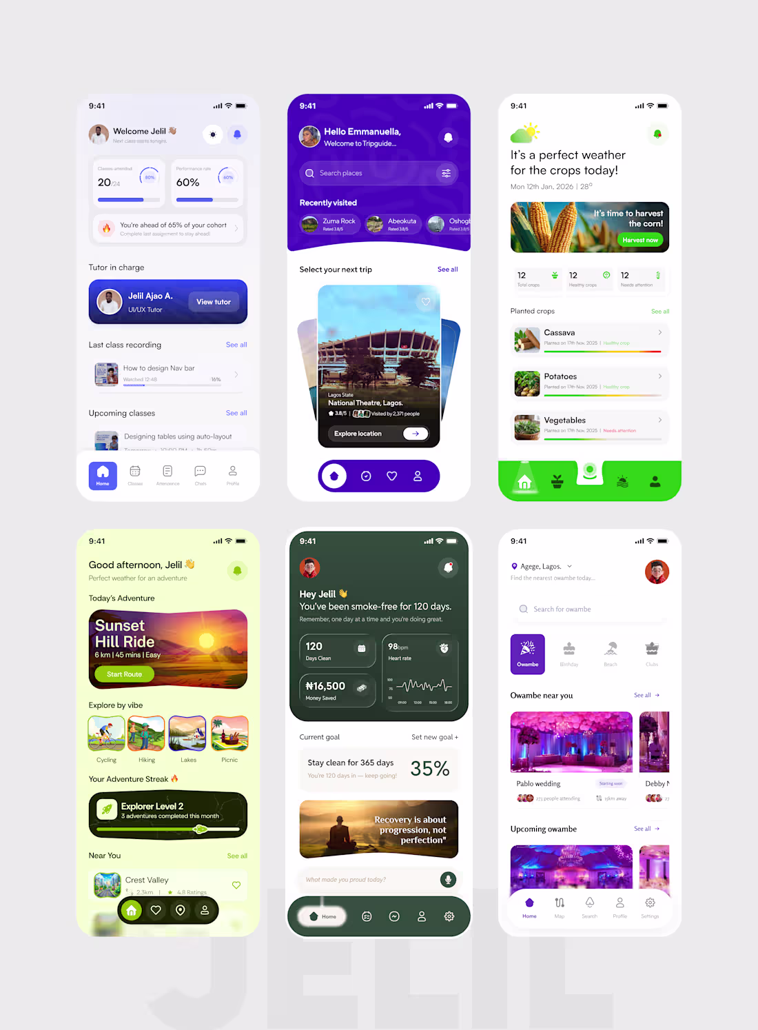
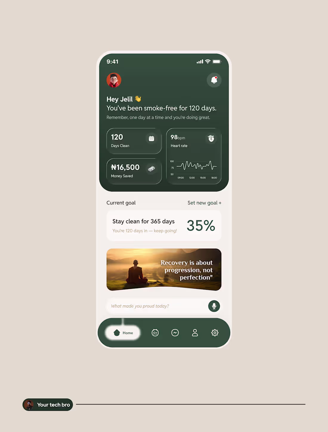
I'm Jelil. I design interfaces that feel effortless to use and are built to scale - across Mobile Apps, Web Apps, Landing Pages, and Web3 platforms.
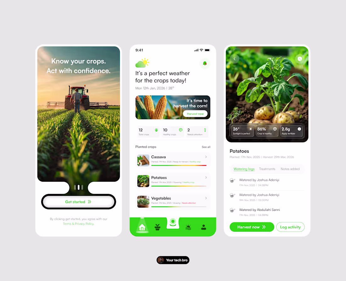
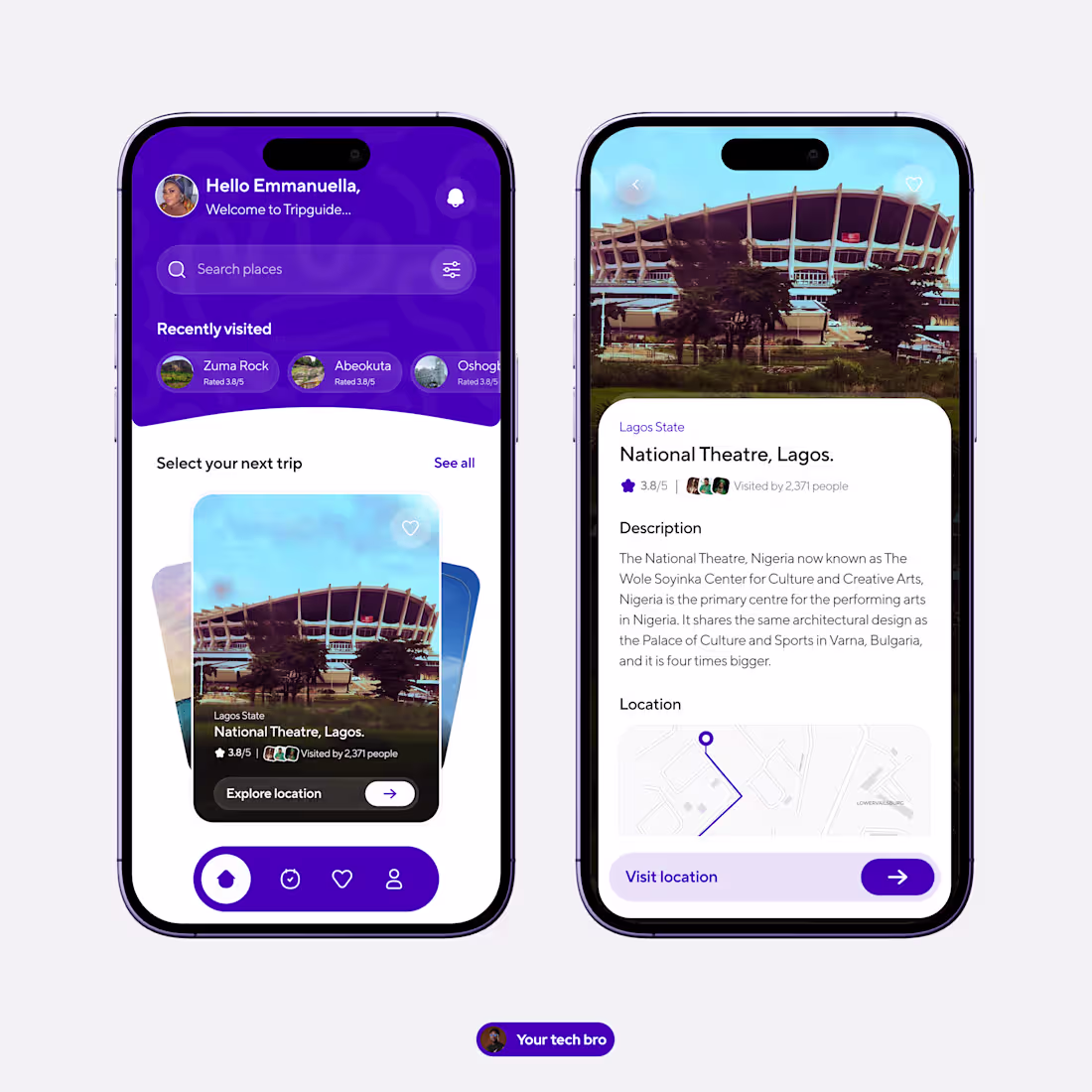
Here's a snapshot of six recent projects:
— Cohort-based learning platform: dashboards, progress tracking, and class management built for focus and retention
— Travel discovery app: immersive location exploration with a clean, card-driven UI
— Smart farming app: crop health monitoring and harvest alerts designed for clarity and speed
— Outdoor adventure app: gamified route discovery with vibrant, high-energy visuals
— Sobriety & wellness tracker: a sensitive, empathy-driven interface supporting daily recovery goals
— Owambe events app: a local event discovery experience built specifically for the Nigerian social scene
Every project starts with the same question: what does this user actually need to feel confident using this product?
What I bring to every engagement:
— End-to-end UI/UX design
— Design systems & component libraries
— Mobile-first, responsive design
— Web3 interface design
— Figma (prototyping, auto-layout, variables)
Currently available for new projects.
Let's build something that works beautifully.
1
18
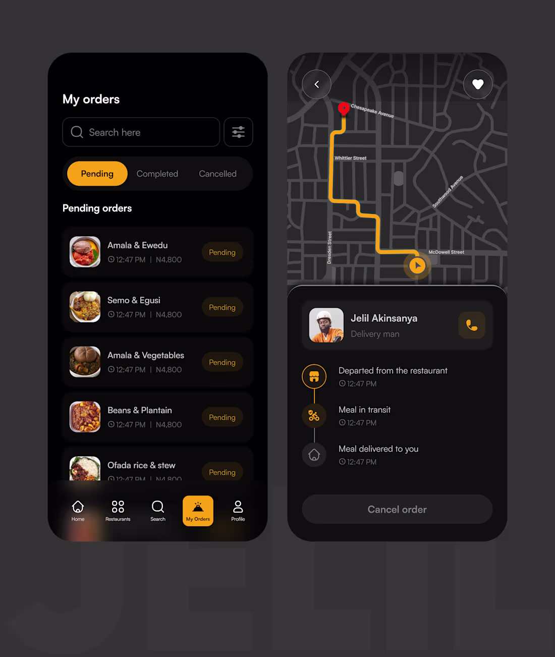
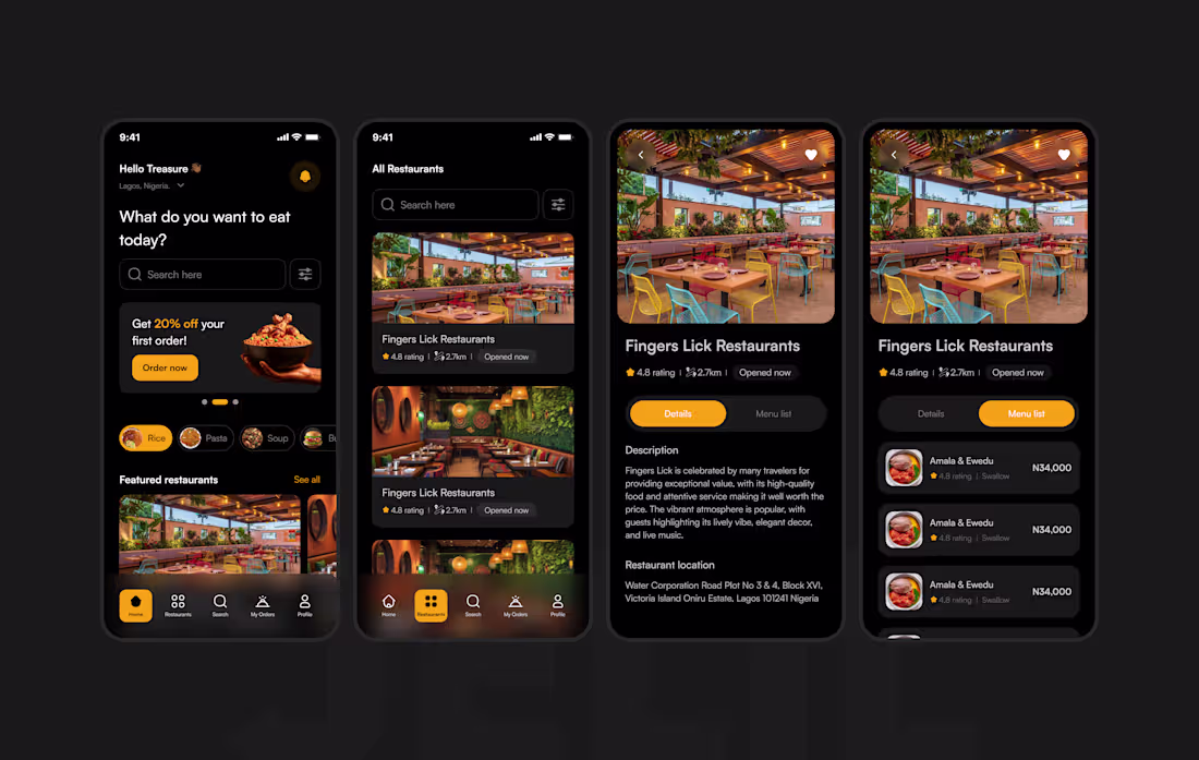
Food Delivery App — UI/UX Design
A mobile ordering and live tracking experience designed around one core need: keeping users informed without adding friction.
What I designed:
— My Orders screen with status-based filtering (Pending, Completed, Cancelled)
— Live delivery tracking with real-time route visualization
— Delivery timeline communicating progress at a glance
— Delivery agent profile for trust-building and direct contact
Design decisions I'm proud of:
The dark-first visual system, amber accent palette, and compact card layout were all chosen to support quick, low-effort interactions, the kind that happen on the go. The two screens needed to feel like one coherent flow, so hierarchy, spacing, and component patterns were kept consistent across both.
Tools: Figma
Type of work: Mobile UI, Interaction Design, Visual Design
Available for new projects, let's build something intentional together.
3
4
37
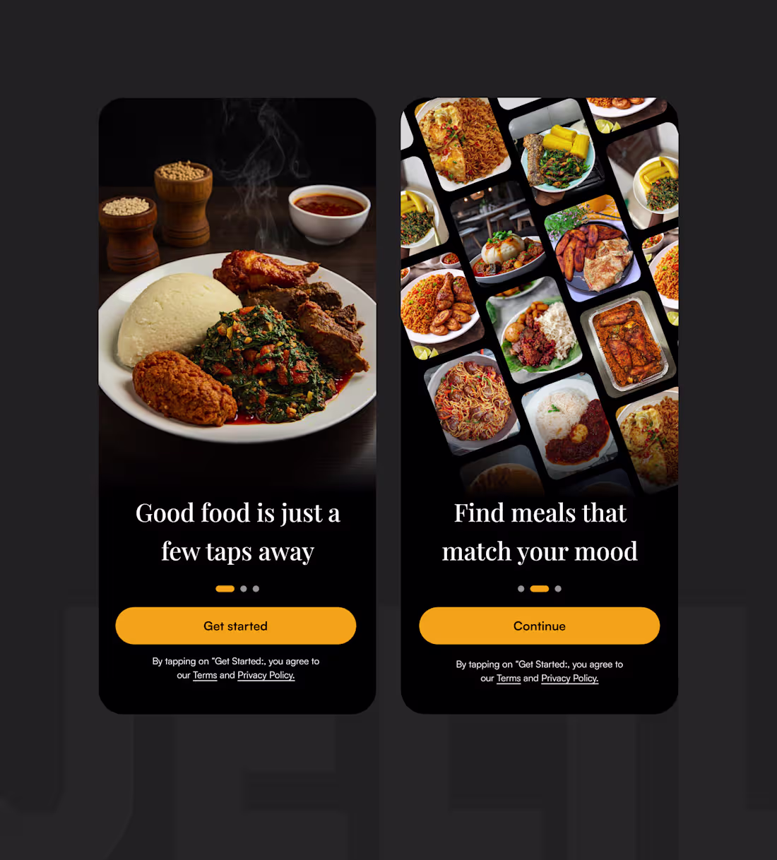
Aesthetics are not the opposite of UX.
They are UX.
I used to treat visuals as the last step.
Get the flow right first. Then make it look good.
Building this food delivery app changed that thinking.
The onboarding has no feature list.
No bullet points. No "here's how it works."
Just a full-bleed photo of a steaming plate of food.
And one line: "Good food is just a few taps away."
That's it. That IS the onboarding.
Because the real question a new user is asking isn't
"how does this app work?"
It's "is this app worth my time?"
A beautiful, honest image answers that faster than any copy.
Here's what I've learnt designing consumer apps:
→ Presentation sets expectations before the product delivers
→ Visual quality signals product quality in the user's mind
→ How something looks is how something feels
→ Ugly onboarding = low trust = high drop-off
You can have perfect flows and still lose users at first glance.
Aesthetics aren't a nice-to-have.
They're conversion design.
0
8
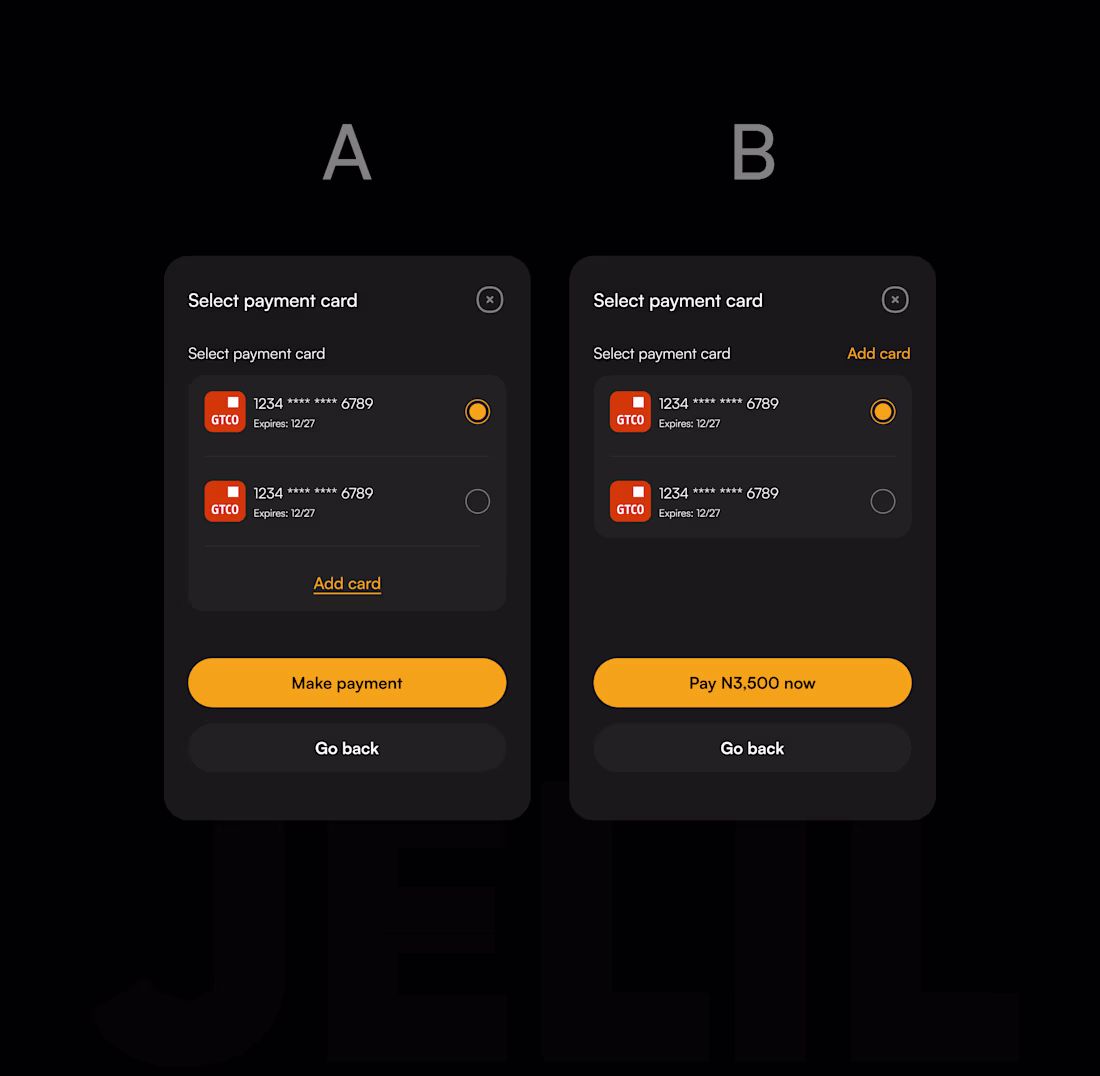
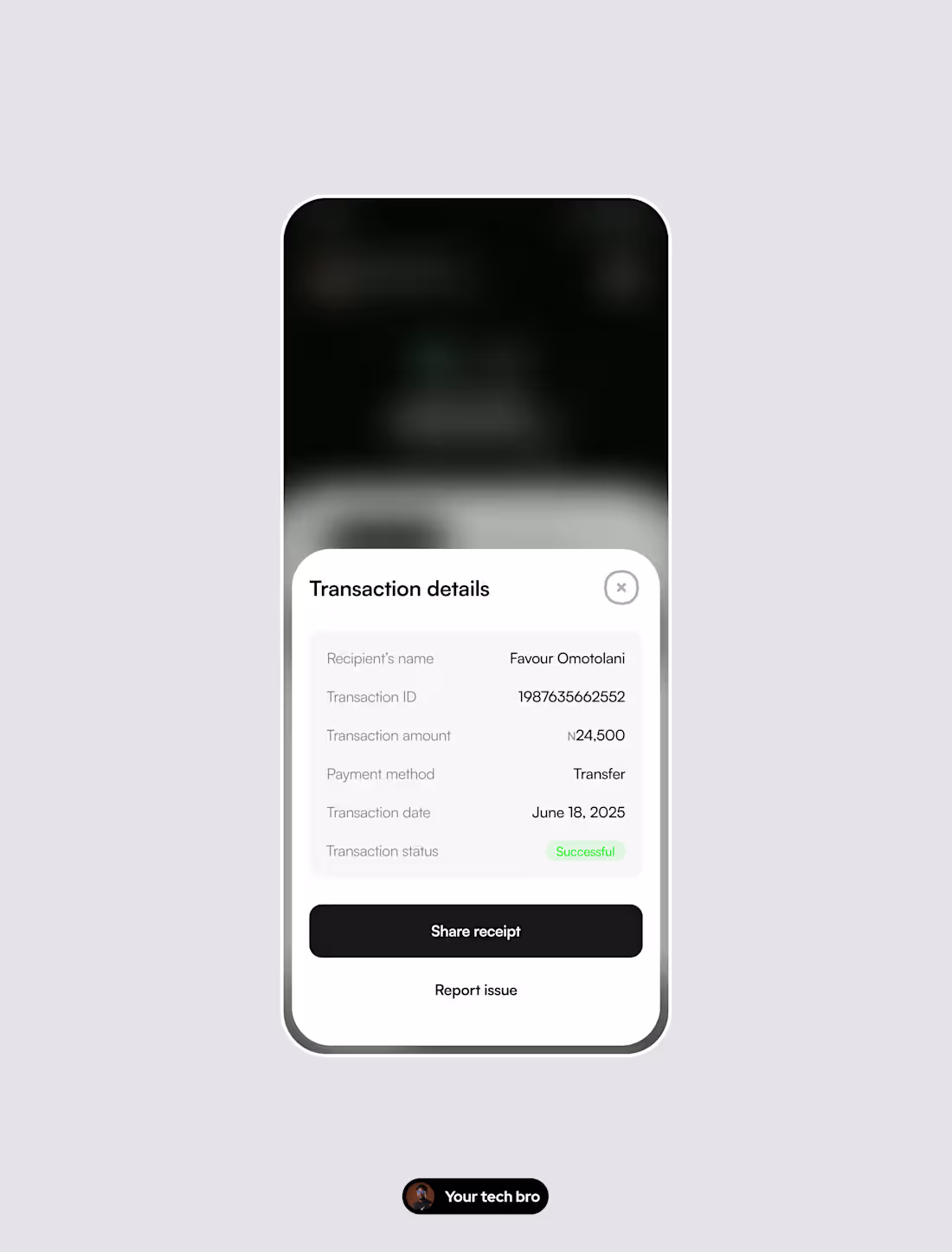
Payment screen micro-copy redesign — A vs B
The difference between A and B isn't visual. It's psychological.
Version A:
→ CTA: "Make payment" — tells the user what to do
→ "Add card" buried at the bottom, disconnected from context
Version B:
→ CTA: "Pay ₦3,500 now" — confirms the amount, creates confidence
→ "Add card" moved inline, next to where cards are listed
Why it matters:
At the payment confirmation step, users aren't unsure how to pay. They're unsure whether to pay. That's a trust problem, not a UI problem.
Showing the exact amount on the CTA removes the last moment of doubt. It answers the user's real question "is this right?" before they have to ask it.
This kind of micro-decision is what separates a screen that looks good from a flow that actually converts.
Available for fintech and SaaS projects. DM or book a call below.
1
20
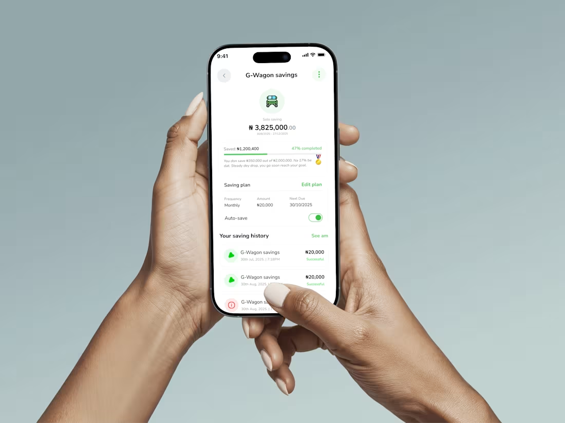
Food ordering mobile app
2
2
33
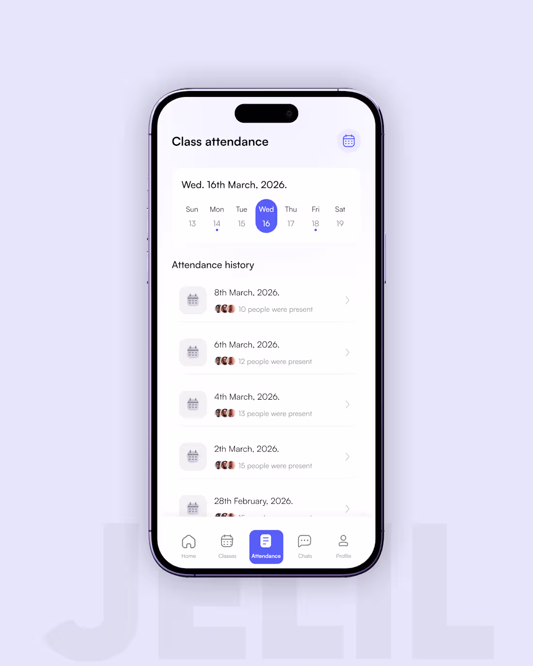
Attendance flow for learning mobile app project
2
2
52
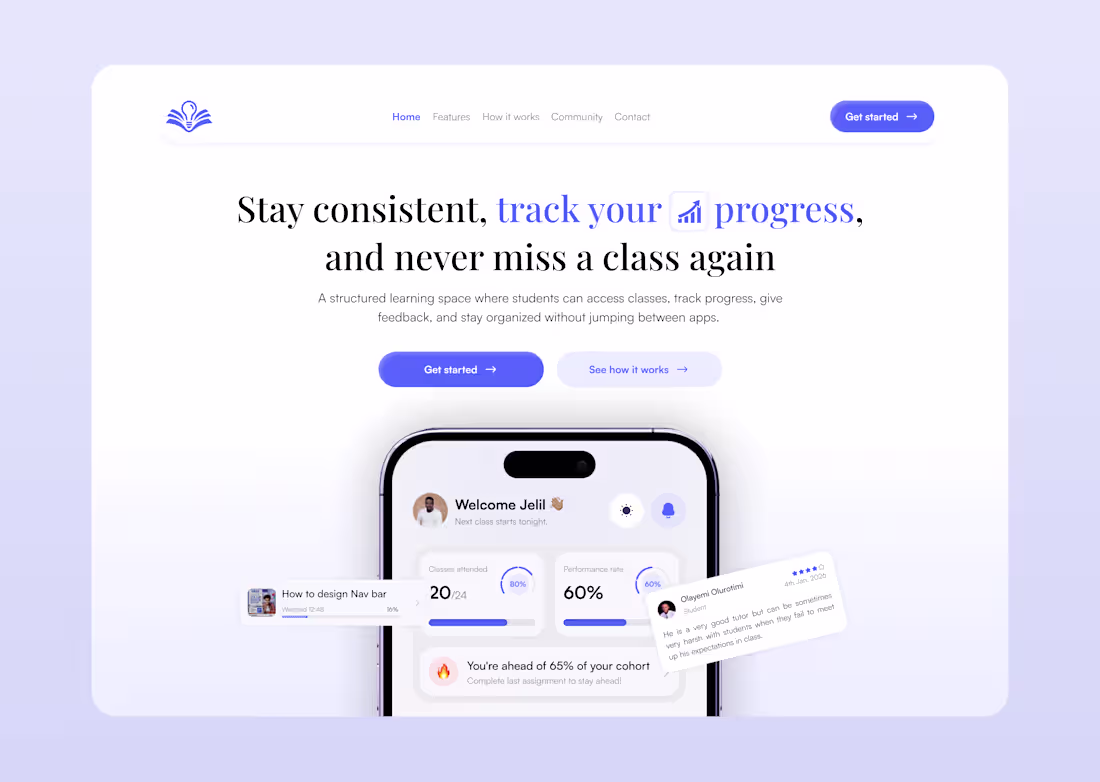
Learning app website landing page
5
5
60
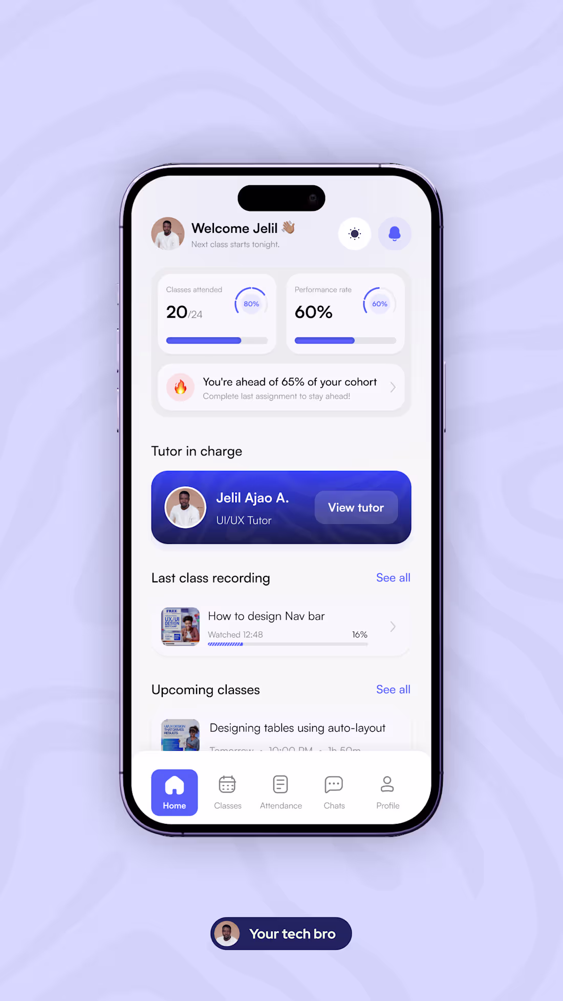
Designing for real usage means thinking beyond a single state.
For this learning app dashboard, I explored both light and dark modes with a focus on how students actually interact with products throughout the day.
The goal wasn’t just visual variation, it was consistency, clarity, and usability across contexts.
In this design:
• Key learning metrics (attendance, performance) remain easy to scan
• Important actions stay visible in both modes
• Visual hierarchy is preserved without relying on brightness
This is part of an ongoing learning platform I’m designing to improve how students track progress, stay accountable, and engage consistently.
Open to product design opportunities, especially in fintech, edtech, and data-heavy platforms.
1
2
28
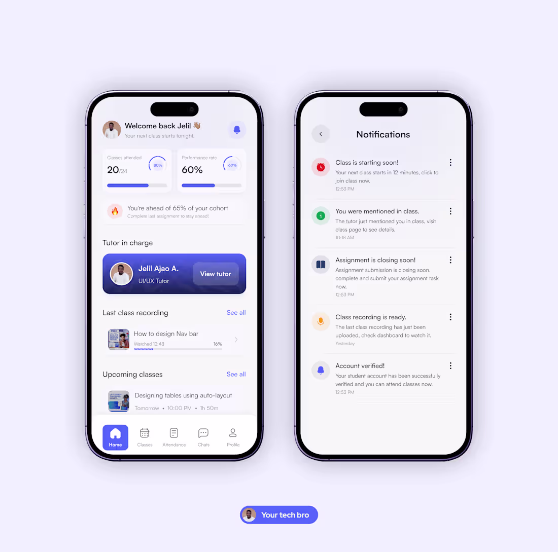
Notifications can easily become noise if they’re not designed carefully.
While working on the learning app we’re building, I designed the notification experience to focus only on moments that actually matter to students.
Instead of flooding users with alerts, the goal was simple: show the right information at the right time.
The notifications highlight things students need to act on:
• Class starting soon
• Mentions during class
• Assignment deadlines
• Class recordings
• Account updates
The challenge with notifications isn’t adding more messages.
It’s deciding which ones deserve the user’s attention.
Small design decisions like this often shape how useful a product feels in everyday use.
1
33
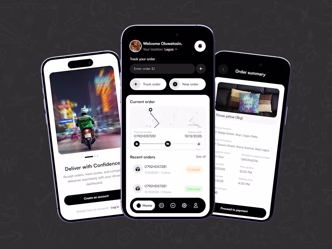
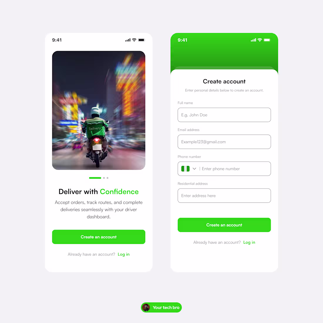
FastDrop Delivery Mobile App - Ajao Jelil
0
2
Doctor's appointment mobile app
0
14
Fintech app home screen animated in jitter...
2
2
27
Event finder mobile app design animated in jitter
1
1
50
Crop details page animated in Jitter
1
33
Food app animation made with jitter
0
23
Cart page animated in jitter... what do you think?
0
20
Delivery history animated page ui design
0
20
This design wasn’t made to impress designers.
It was made to:
– reduce user decisions
– guide attention naturally
– make the next step obvious
Every screen answers one question only.
Every interaction has a clear outcome.
That’s how you design for conversion, not applause.
1
36
Design isn’t just what users see... It’s how they move.
I design digital products that prioritize:
– clarity over cleverness
– flow over decoration
– outcomes over aesthetics
If your product feels confusing, design isn’t done yet.
Open to product teams and founders who care about usability that scales.
2
40
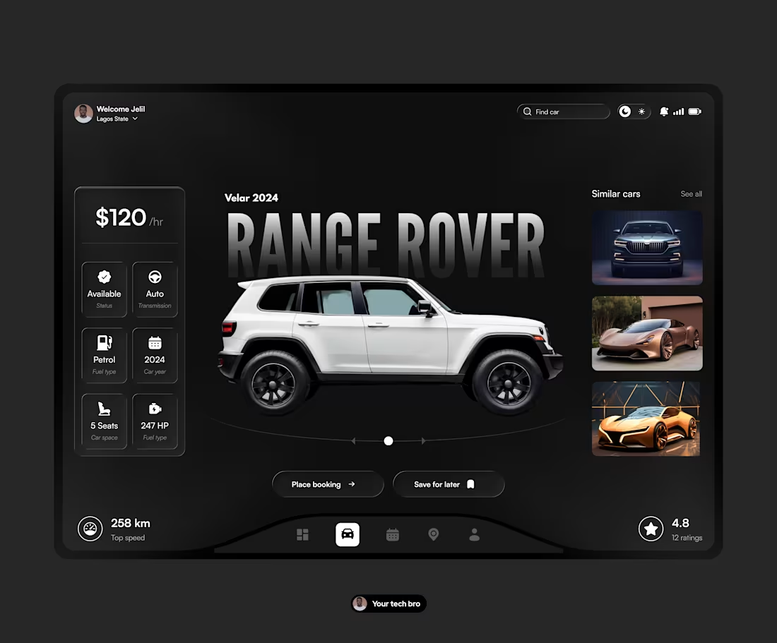
Car rental dashboard 🔥
0
29
Showing the process...
0
23
Keep showing up, so when you hit the spot they don't call it luck 🚀
2
3
30
𝗚𝗼𝗼𝗱 𝗱𝗲𝘀𝗶𝗴𝗻𝗲𝗿𝘀 𝗱𝗼𝗻’𝘁 𝗰𝗼𝗽𝘆 𝗽𝗶𝘅𝗲𝗹𝘀… 𝘁𝗵𝗲𝘆 𝗰𝗼𝗽𝘆 𝗶𝗱𝗲𝗮𝘀.
One thing I’ve learned in my design journey is the power of stealing like an artist, not cloning someone’s work, but understanding the thinking behind it.
When you learn to copy principles, not interfaces…
patterns, not screens…
reasoning, not colors…
you grow 10x faster.
Every great design you admire is a collection of borrowed ideas reinvented through someone else’s lens.
Your job? Study what works, remix it, and make it yours, ethically, intentionally, and creatively.
1
20
🔥 GOOD DESIGN ISN’T JUST AESTHETICS — IT’S LEADERSHIP.
It’s how a product communicates, guides, and earns trust without saying a word.
I’ve seen many founders focus on features, funding, and growth (all important), but overlook one thing that quietly drives all three: design that truly understands people.
When design is done well:
– Customers onboard faster
– Support tickets drop
– Conversion improves
– The brand feels more “premium” without extra marketing spend
– And teams make decisions with more clarity
Design is not decoration.
It’s strategy.
It’s product clarity.
It’s how users decide whether to stay… or leave.
For CEOs and founders building in 2025, investing in thoughtful design early is no longer optional, it’s a competitive advantage.
1
21
Last night in class, I walked my students through an entire onboarding flow — onboarding screens, sign up, login, and even password reset.
We sketched, planned, and designed everything in under an hour.
Watching them connect the dots, ask the right questions, and translate ideas into clean UI reminded me how much joy I get from teaching design. There’s something rewarding about helping people see design differently and gain the confidence to create on their own.
As someone who loves building digital experiences and simplifying complex flows, opportunities like this keep sharpening my process and pushing me to stay better for both my students and the products I design.
Sharing a few shots from last night’s session and the finished mockups — always proud of the work we create together.
2
2
18
𝗜𝗻 𝗱𝗲𝘀𝗶𝗴𝗻, 𝘁𝗵𝗲 𝗹𝗶𝘁𝘁𝗹𝗲 𝘁𝗵𝗶𝗻𝗴𝘀 𝗮𝗿𝗲 𝗻𝗲𝘃𝗲𝗿 𝗹𝗶𝘁𝘁𝗹𝗲.
One thing this journey has taught me is that small details speak louder than big features.
The spacing you adjust by 2px…
The colour contrast you refine…
The wording you rewrite to sound clearer…
Those tiny decisions are what shape the way users see a brand.
People may not always notice good design …but they always feel it.
That’s why I don’t rush screens.
I take my time to understand the users, the business, and the purpose behind every component.
Because in the long run, those “small details” are what separate a forgettable product from one people love coming back to.
If you’re a founder or CEO looking to build something clean, thoughtful, and user-centered, I’m open to gigs and collaborations.
2
1
17
Adding a little animation ...
0
18
It's Friday, designers show your work!
1
18
𝐖𝐡𝐞𝐧 𝐲𝐨𝐮 𝐬𝐚𝐭𝐢𝐬𝐟𝐲 𝐭𝐡𝐞 𝐜𝐥𝐢𝐞𝐧𝐭, 𝐲𝐨𝐮 𝐠𝐞𝐭 𝐩𝐚𝐢𝐝.
𝐖𝐡𝐞𝐧 𝐲𝐨𝐮 𝐬𝐚𝐭𝐢𝐬𝐟𝐲 𝐭𝐡𝐞 𝐮𝐬𝐞𝐫𝐬, 𝐲𝐨𝐮𝐫 𝐩𝐫𝐨𝐝𝐮𝐜𝐭 𝐬𝐮𝐫𝐯𝐢𝐯𝐞𝐬.
One thing design has taught me is this:
A happy client can approve your work today…
But only happy users can keep that product alive tomorrow.
Clients care about business goals.
Users care about real-life experience.
A good designer learns how to balance both without losing the soul of the project.
Because at the end of the day, beautiful screens don’t keep a product in the market, usefulness does and that’s the real work: designing something that makes the client smile and makes the user stay.
Design that lasts is design that listens to both sides.
#UIDesign #ProductDesign #DesignThinking #UserExperience #DesignCareer
2
20

The real value of design isn’t just beauty... it’s scalability.
One thing I’ve learned as a product designer is that pretty screens don’t grow businesses. Scalable design does. A design that works on one screen but breaks on others slows down development, confuses users, and costs the business money, but a scalable design system - consistent spacing, typography, components, states makes every new feature faster, cleaner, and more predictable.
Because real design isn’t just about how it looks today, it’s about how well it can grow tomorrow.
If you’re a founder building for the long term, invest in scalable design early. It pays you back every single month.
#UIDesign #ProductDesign #DesignSystems #BusinessGrowth #ScalableDesign #UXDesign #Startups #Founders #DesignThinking #Fridaymotivation
4
18
Designing an interactive menu button in figma... Save this for later, it’ll help your next design!
2
22
You don’t always have to design like everyone else.
Sometimes the simplest idea, done your way, is what stands out the most.
I’ve been exploring calmer, more intentional UI lately and it’s been a reminder that clarity and confidence are also design skills.
If you’re building something and want a designer who thinks differently (and designs with purpose), I’m open to new projects.
What’s one design choice you made recently that felt true to you?
3
4
25
Habit tracker mobile app ui
0
24
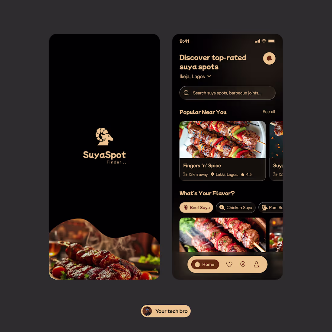
Suya spot finder mobile app ui
1
30
Product details page animation...
0
29
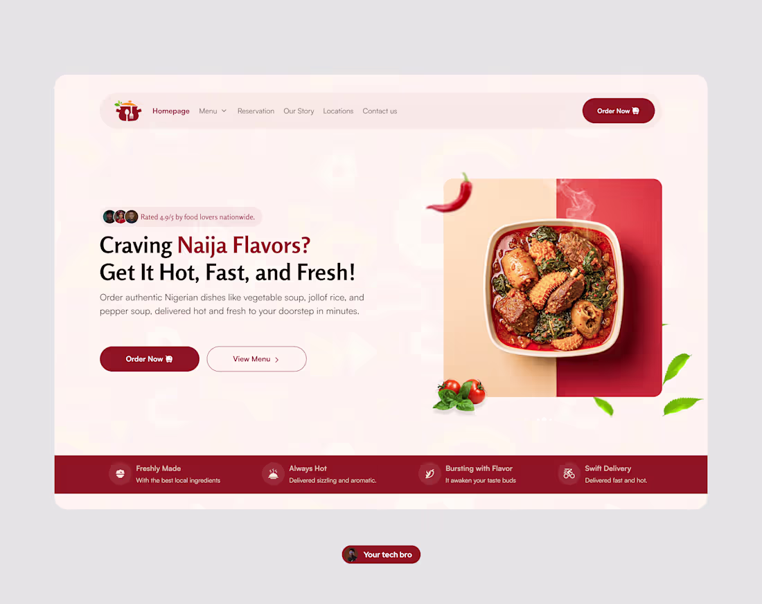
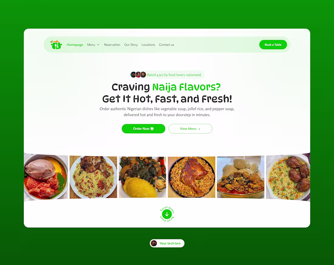
9ja Food hero section ui
0
49
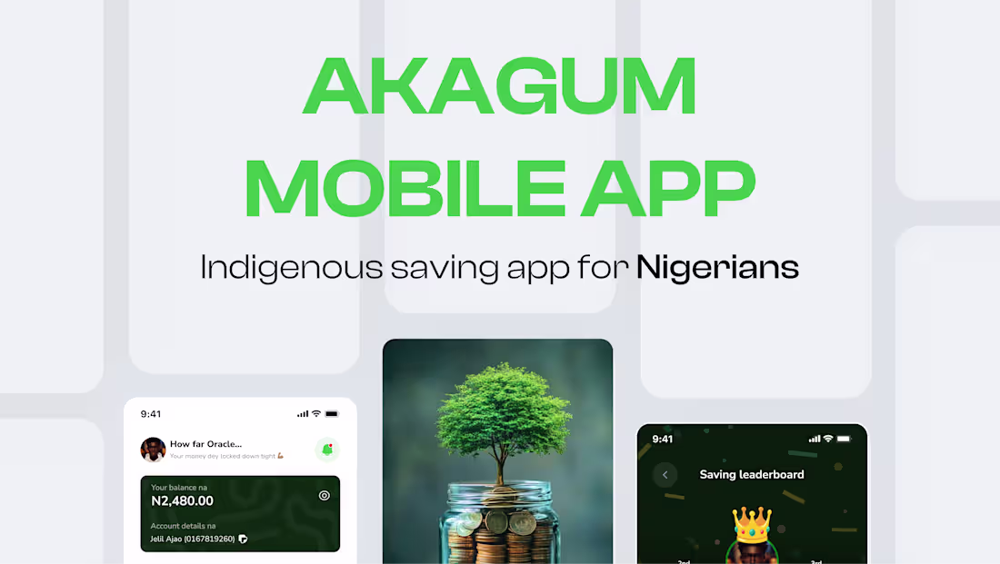
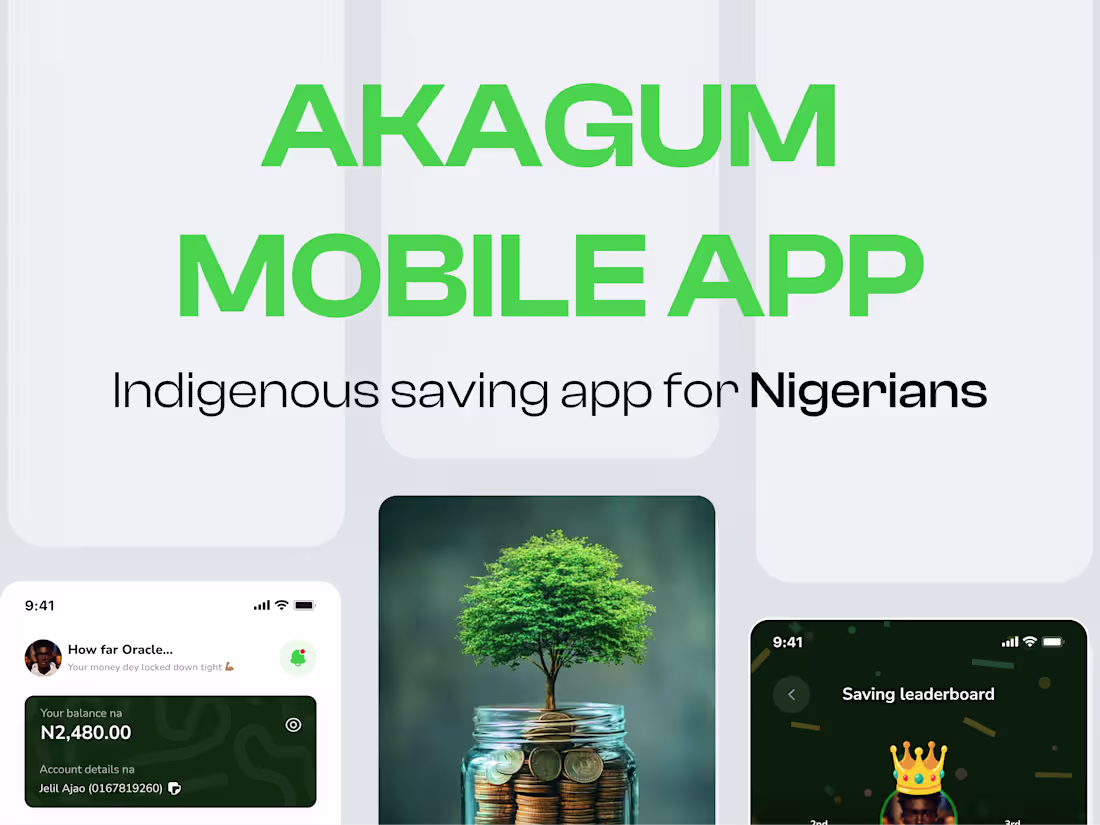
Akagum Fintech mobile app case study
1
2
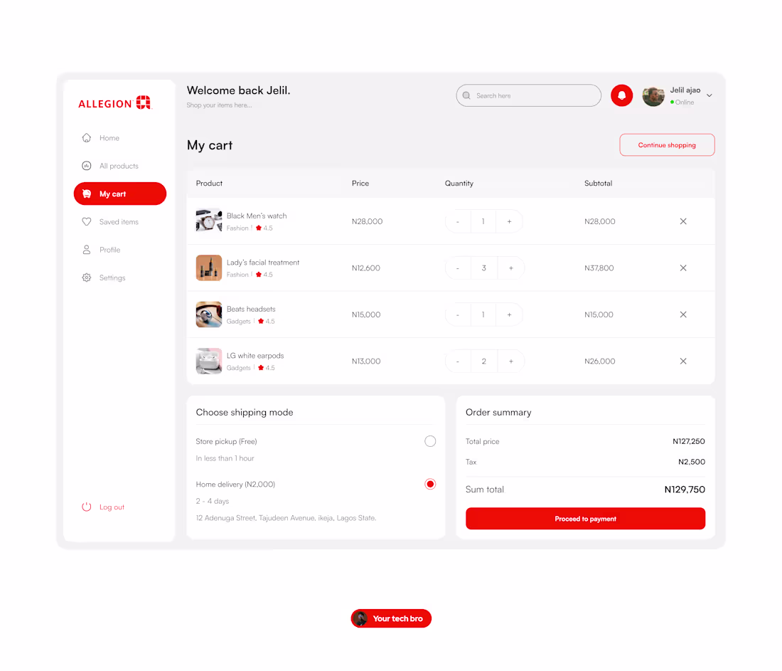
E-Commerce cart page ui screen
0
29
Akagum Fintech mobile app
0
37
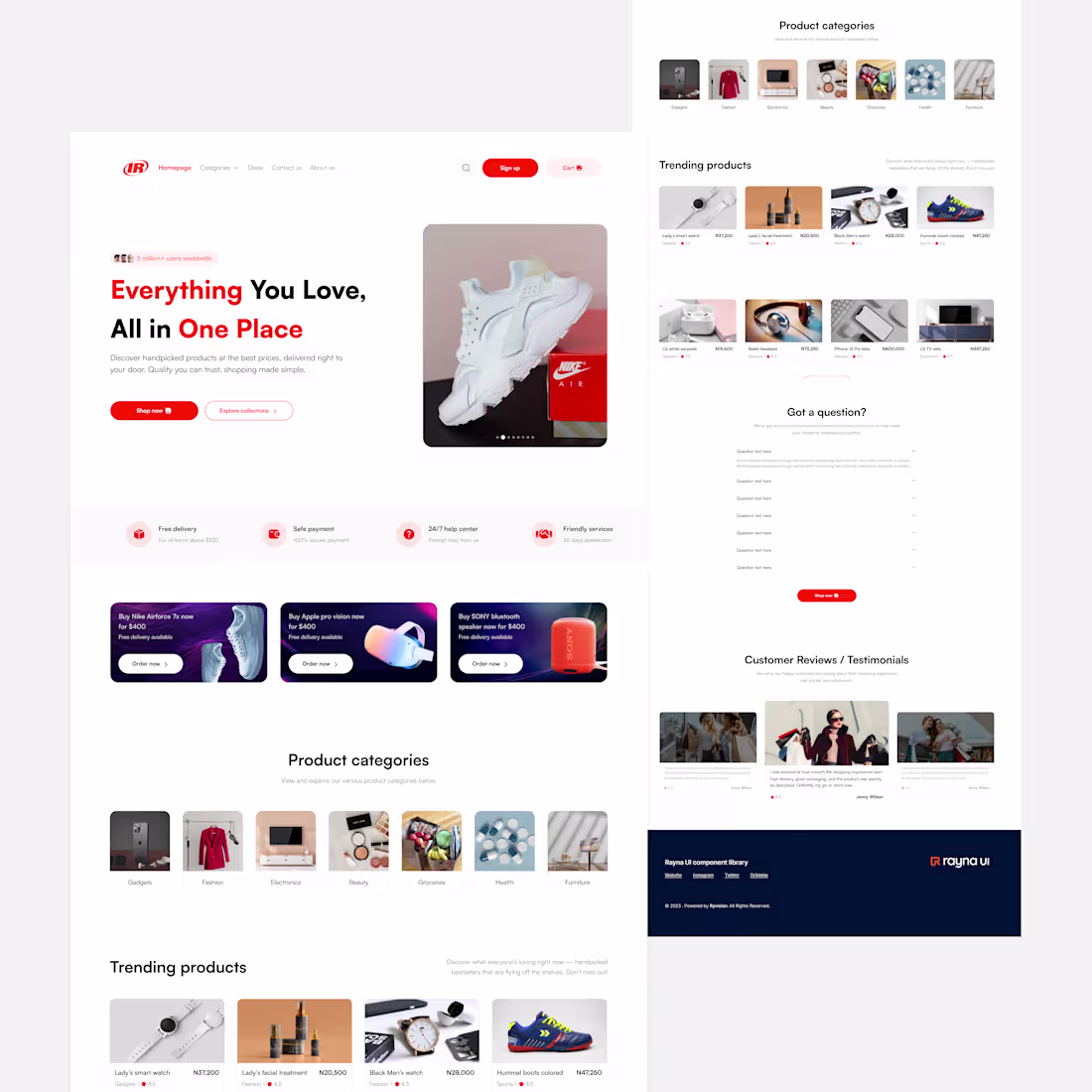
E-Comerce landing page ui design
0
24
E-commerce website ui
0
28
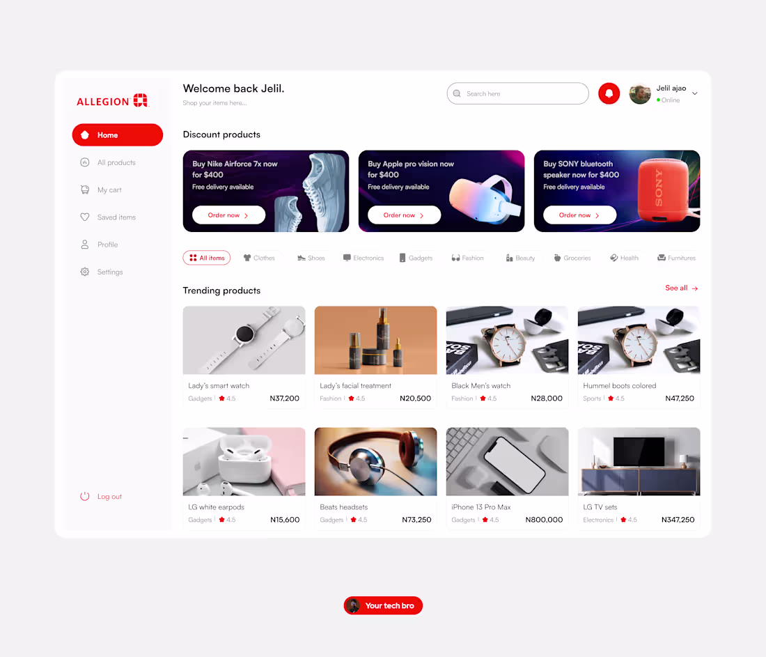
E-commerce web app dashboard ui
0
34