Mahdia Ahmed
Logo and Branding design
New to Contra
Mahdia is ready for their next project!
Brand name: Freelance academy.
What do you think??? i can't decide myself which ver. is actually slayinggg.
Drop your suggestions in the comments.
4
7
212
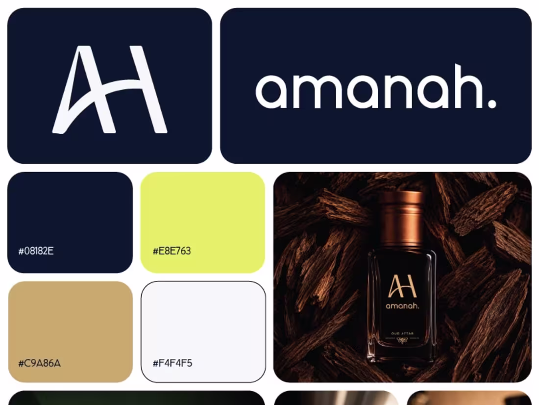
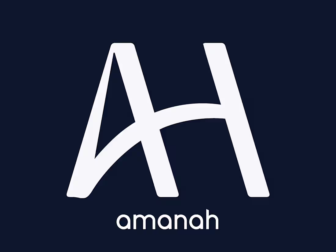
Amanah
Brand Identity for a Men's Attar & Modest Clothing Line
A full visual identity built for Amanah, a men's attar and modest clothing brand rooted in restraint, presence, and quiet luxury.
Lemme know your opinions for this branding in the comment box.
2
81
Ahhhhhh, here with another logo design.
A timeless lettermark for a Attar nd clothing brand
What do you think? A or B???
Should i refine the design or keep this version, lemme know your thoughts in comments!!!
4
4
181
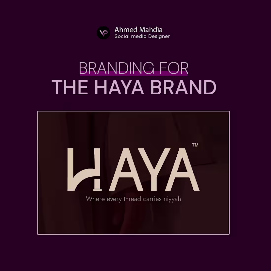
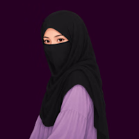
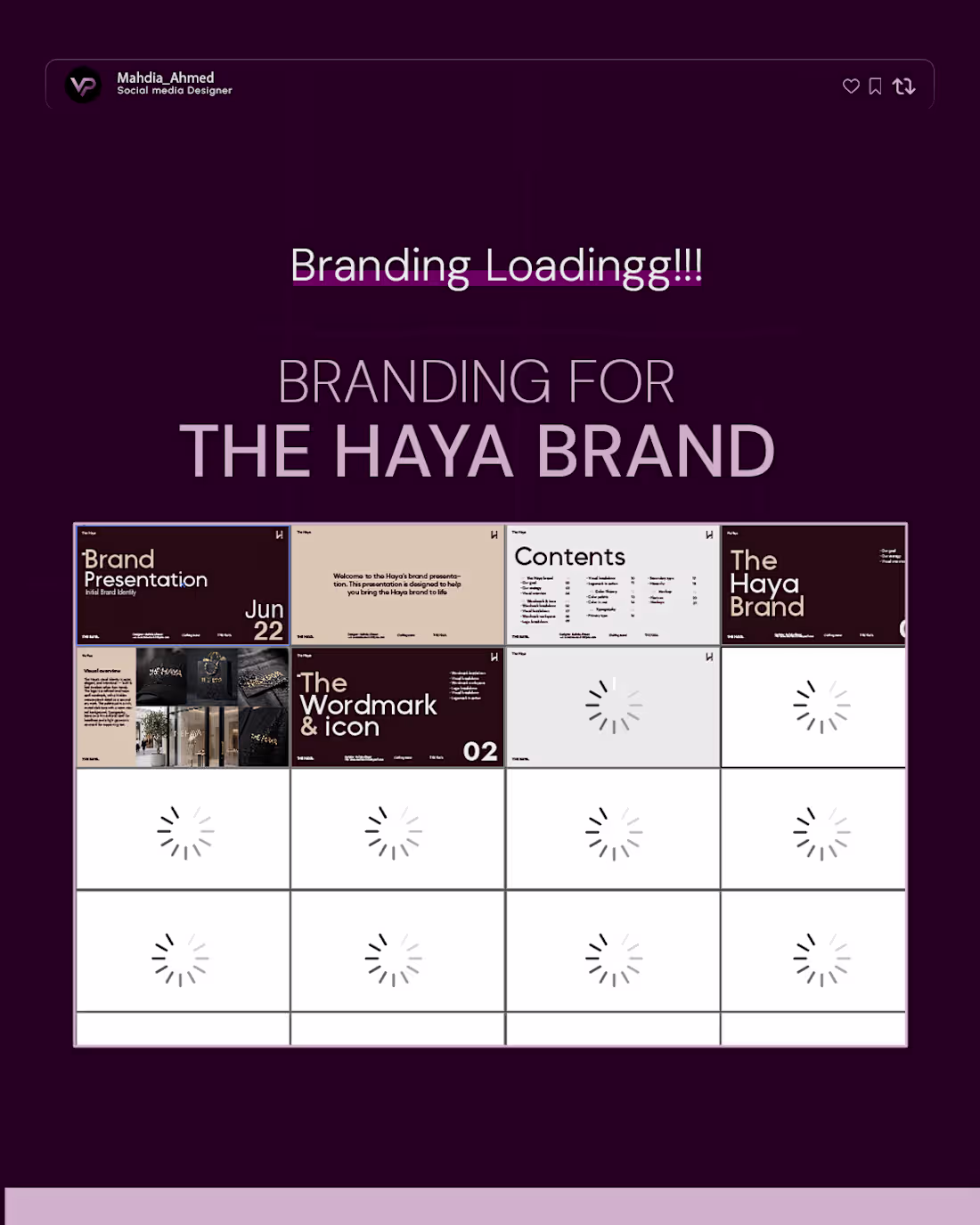
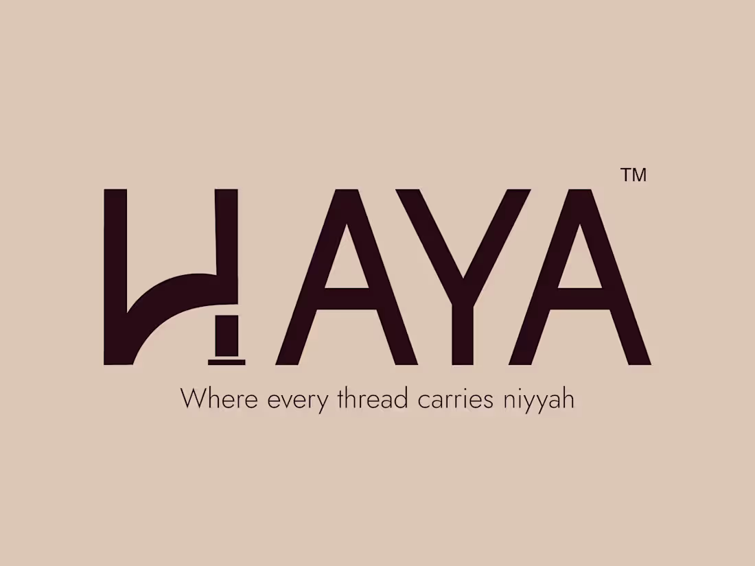
Strategic branding for the haya- A clothing brand!!!
Yehhhh, successfully completed the
strategic branding for the haya brand.
Lemme express some feelings while designing the haya brand.
I'm always scared to design a logo
for any brand, but it was my first time to gather the
strength to design this logo and it's branding
I feel both stuck and scared when it comes to design a logo.
Like, when i was attending a logo design class,
i didn't understand what actually logo design is, but from the beginning of the
design journey, i was always curious to how to design a purposeful logo
Now, am learning how to design a logo
which is able to speak for it's brand without any hesitations.
Tbh, am too lazy to do some design work but now,
i changed. now, i just wanna stay consistent and learn new skills,
which helps me to grow.
Btw, drop your comments and lemme know,
about your opinions towards my design.
See the full branding here
https://lnkd.in/e9UZgRnD
2
2
152
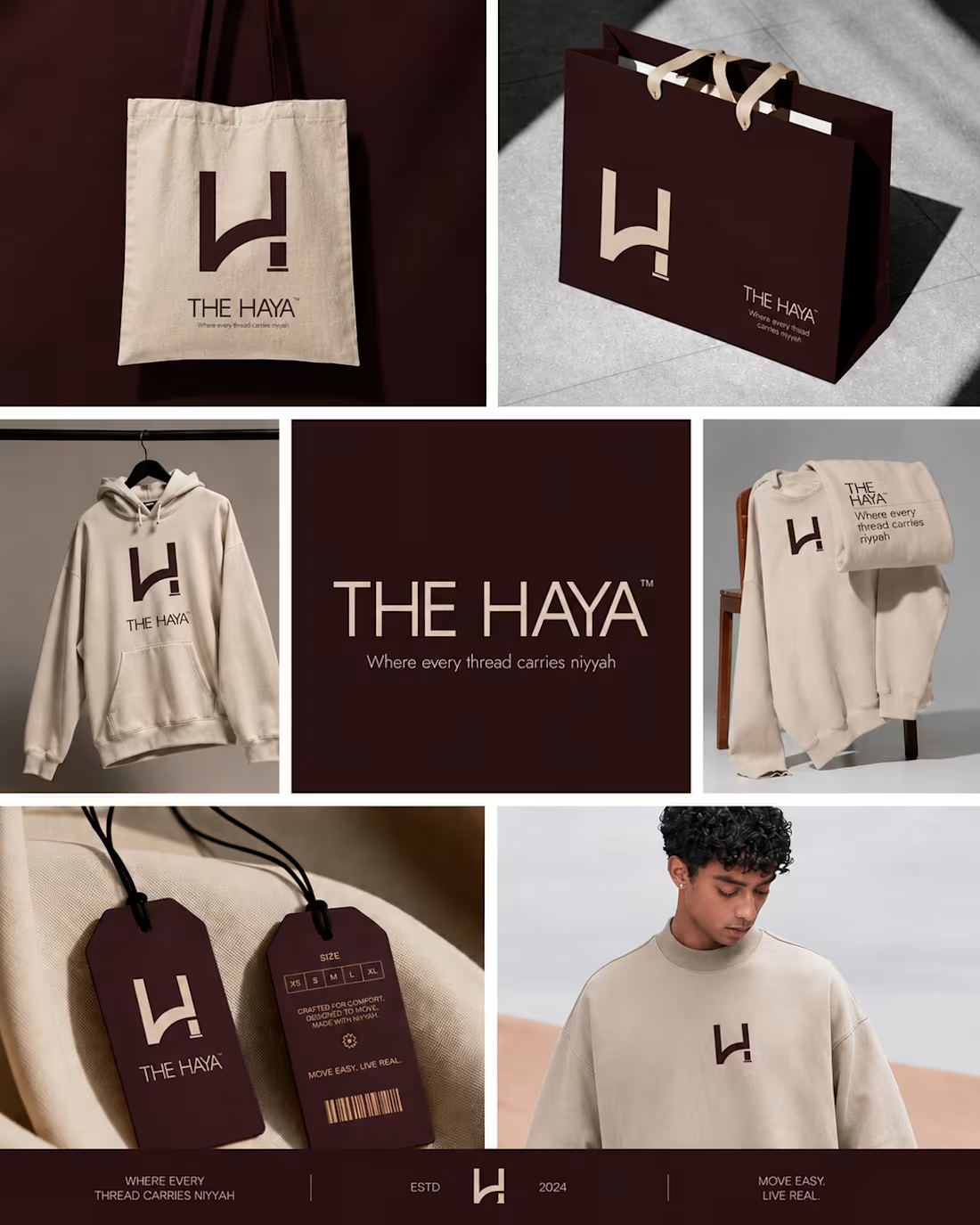
THE HAYA is a strategic modestwear brand built on a refined, premium identity and a clear sense of purpose.
Through a minimalist visual language and cohesive brand system, it combines elegance, comfort, and modern relevance to create a distinctive presence across every touchpoint. The brand is designed to resonate with a style-conscious audience while communicating authenticity, quality, and thoughtful direction.
Feel free to reach me out for your branding work!!!
E-mail: ahmedmahdia1319@gmail.com
2
129
Designed The Haya’s identity
and it changes the way modest fashion speaks.
I’m thrilled to share that the visual identity for 𝗧𝗵𝗲 𝗛𝗮𝘆𝗮 is almost ready.
As the designer behind this brand,
I focused on clean, purposeful forms and a refined minimal
palette that lets dignity and modernity coexist.
Why this matters:
→ The logo is soft yet memorable
a mark that belongs on store fronts, social feeds, and hang tags.
→ Every element was chosen to support versatile
storytelling: editorial imagery, product labels, and digital-first experiences.
→ The design bridges tradition and contemporary
living so the brand can scale confidently across markets.
I’ll be sharing the logo reveal,
process sketches, color systems, and mockups soon
Perfect if you’re building
a brand that needs quiet strength and visual clarity.
Follow for the big reveal and
behind-the-scenes design notes.
Designers, brand founders, and modest-fashion lovers.
stay tuned.
2
127
What do you think guyzzzz!!! 🥹
Am here with a more refine and updated version, even though, it was my first logo branding for a fashion clothing brand.
Lemme know your opinions. Btw, I landed on two directions I genuinely love for different reasons.
And now I'm stuck. 😅 So I'm opening it up — which one says "The Haya" to you?
Drop a 1 or 2 in the comments.
If you're a brand looking for a designer, who treats every project like it's the only one that matters — let's talk. 🤍
6
8
327
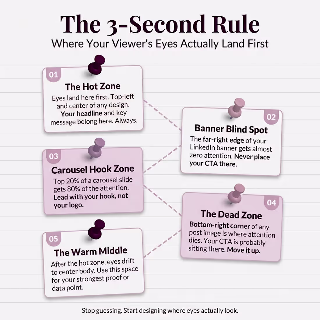
You spent 3 hours on that design.
Your audience spent 3 seconds on it. And in those 3 seconds,
their eyes never even landed on your CTA.
Here is the uncomfortable 𝘁𝗿𝘂𝘁𝗵 most 𝗱𝗲𝘀𝗶𝗴𝗻𝗲𝗿𝘀 and 𝗰𝗿𝗲𝗮𝘁𝗼𝗿𝘀 ignore.
You are designing based on
what looks 𝗴𝗼𝗼𝗱 𝘁𝗼 𝘆𝗼𝘂. Not based on
where 𝗲𝘆𝗲𝘀 actually go.
Then, Lemme tell you something! 🙃
You place your headline in the center because it feels balanced.
You drop your CTA in the bottom-right because that is where it fits.
You fill the top of your carousel with a logo instead of a hook.
Meanwhile, your viewer's brain already decided to scroll past.
The hot zone on any design is the top-left and center.
That is where eyes land first. Every single time. If your most important
message is not sitting there, it is invisible.
The bottom-right corner?
That is the dead zone. Almost nobody
looks there. And that is exactly where most people
put their call to action.
Here is the 3-second rule I follow for every design now.
1. Hot zone gets the 𝗵𝗲𝗮𝗱𝗹𝗶𝗻𝗲.
Top-left and center. No exceptions.
2. 𝗛𝗼𝗼𝗸 first on carousels. The 𝘁𝗼𝗽
𝟮𝟬% of your slide gets 𝟴𝟬% of attention.
3. Move the 𝗖𝗧𝗔 𝘂𝗽. If it is in the
bottom corner, it does not exist.
4. Banner 𝗯𝗹𝗶𝗻𝗱 𝘀𝗽𝗼𝘁 is real. The far-right
edge of your LinkedIn banner gets almost zero eyes.
5. The warm middle earns the proof. After the hook
lands, eyes drift to center body. Put your strongest point there.
Stop designing for
𝗮𝗲𝘀𝘁𝗵𝗲𝘁𝗶𝗰𝘀. Start designing for 𝗮𝘁𝘁𝗲𝗻𝘁𝗶𝗼𝗻.
Save this infographic.
Send it to someone whose CTA is sitting in a dead zone right now.
2
4
193
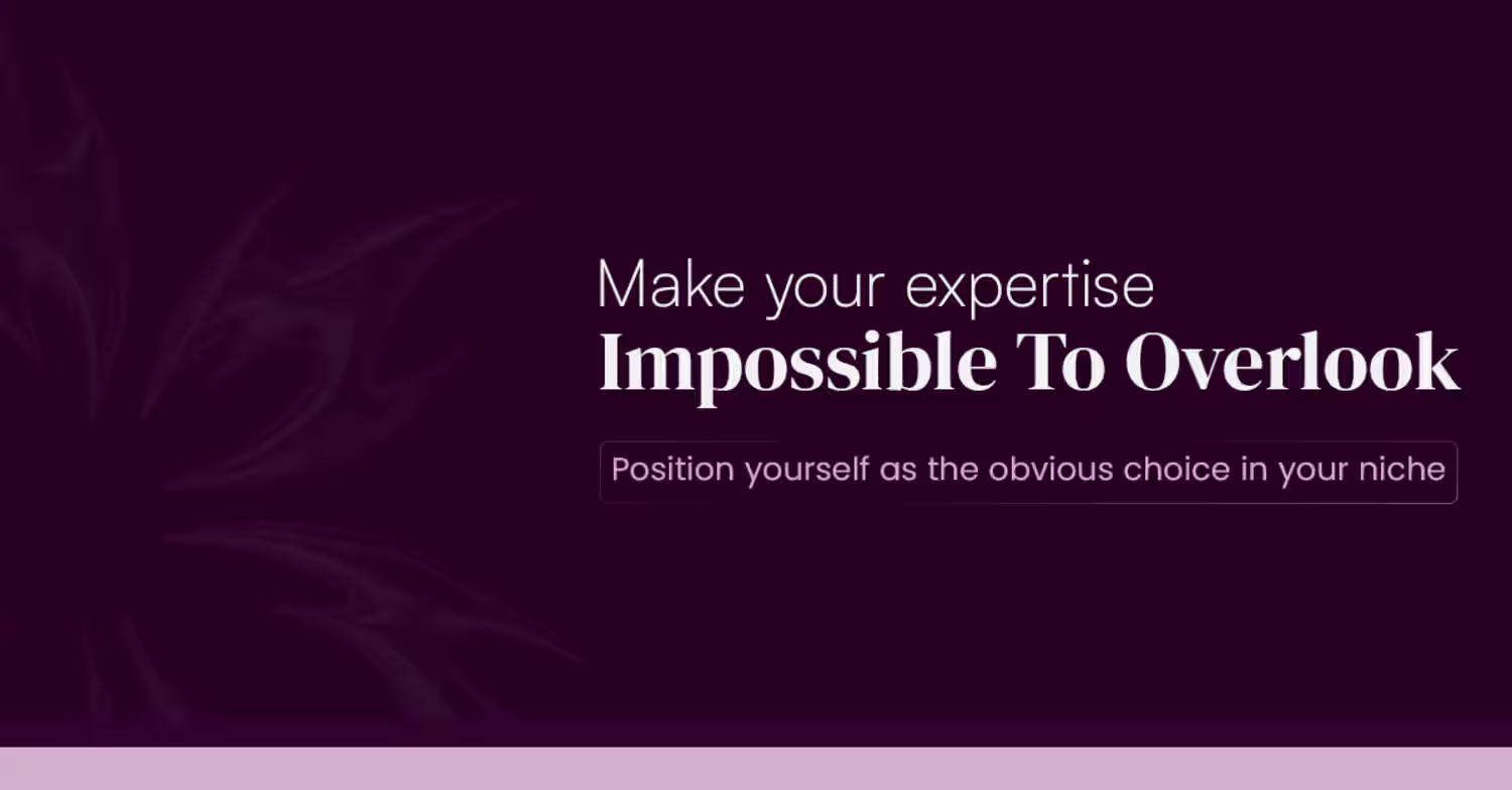
🚀 Is your LinkedIn profile helping you attract clients—or making them scroll past?
Your banner is often the first thing people notice when they visit your profile. In just a few seconds, it can communicate your expertise, build trust, and position you as the obvious choice in your industry.
✨ A strategic LinkedIn banner can help you:
✔ Strengthen your personal brand
✔ Build instant credibility
✔ Stand out from competitors
✔ Create a memorable first impression
✔ Attract ideal clients and opportunities
Stop blending in with generic profiles. Start building a LinkedIn presence that works for you 24/7.
💬 Ready to transform your profile into a client-attracting asset? Let's connect.
#LinkedInBranding #LinkedInBanner #PersonalBranding #LinkedInMarketing #BrandIdentity #DigitalBranding #LinkedInTips #ProfessionalBranding #FreelancerLife #BusinessGrowth #LeadGeneration #MarketingStrategy #Entrepreneurship #SocialMediaMarketing #ClientAttraction #PersonalBrand #BrandStrategy #LinkedInProfile #ContentMarketing #OnlinePresence
2
160
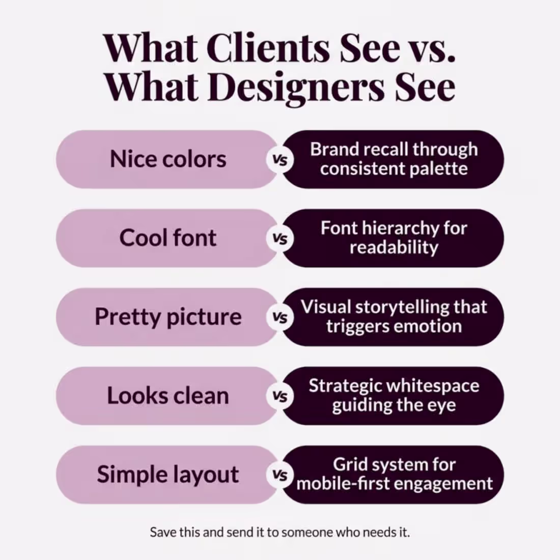
Stop calling it just a nice design.
Every design choice your designer makes has a reason.
You just never asked why.
Here is what is really going on.
You see nice colors. Your designer sees brand
recall built into every post.
You see a cool font. Your designer sees a hierarchy system
that controls where eyes land first.
You see a pretty picture. Your designer sees storytelling that
triggers emotion in under 2 seconds.
You see a clean look. Your designer sees whitespace
engineered to guide attention to the CTA.
You see a simple layout. Your designer sees a grid system
optimized for the screen you are reading this on right now.
The difference between a design that gets scrolled past
and one that stops the thumb?
Strategy you cannot see. But your audience feels.
Next time your designer delivers something simple,
look again. There is nothing simple about it.
Save this. Send it to someone who needs to hear it.
2
2
187
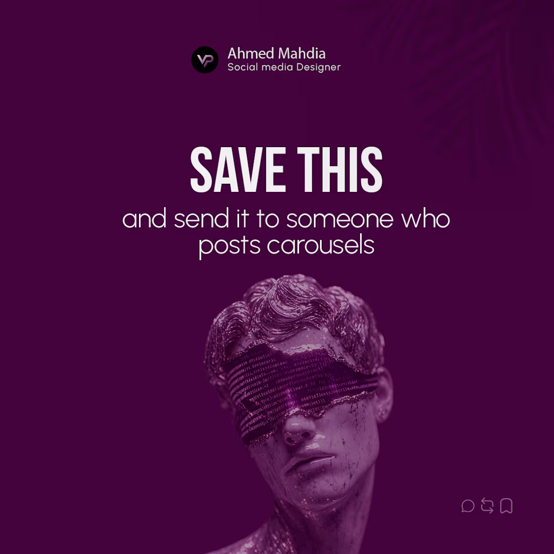
Most carousels get scrolled past in 𝟬.𝟯 𝘀𝗲𝗰𝗼𝗻𝗱𝘀.
Not because the design is bad.
Because the value isn't obvious fast enough.
Here's the 𝗲𝘅𝗮𝗰𝘁 𝗳𝗿𝗮𝗺𝗲𝘄𝗼𝗿𝗸 I use to make every 𝗰𝗮𝗿𝗼𝘂𝘀𝗲𝗹 𝘄𝗼𝗿𝘁𝗵 saving:
1. Lead with a 𝗰𝗹𝗲𝗮𝗿 promise
→ Hook = the result they'll get. No vague intros.
2. Give 𝗰𝗹𝗮𝗿𝗶𝘁𝘆, not content
→ One sharp idea per slide. Cut everything else.
3. Build a 𝘀𝗶𝗺𝗽𝗹𝗲 framework
→ Something they can remember AND repeat.
4. End with a 𝗻𝗲𝘅𝘁 step
→ Tell people exactly what to do. Direction = engagement.
5. Make it 𝗿𝗲𝘂𝘀𝗮𝗯𝗹𝗲
→ A checklist, method, or takeaway they'll come back to.
The goal isn't to 𝗶𝗺𝗽𝗿𝗲𝘀𝘀.
It's meant to be useful fast.
𝗦𝗮𝘃𝗲 this. ⌛
Send it to someone who posts 𝗰𝗮𝗿𝗼𝘂𝘀𝗲𝗹𝘀.
DM for your design!!! E-mail: ahmedmahdia1319@gmail.com (mailto:ahmedmahdia1319@gmail.com)
1
187
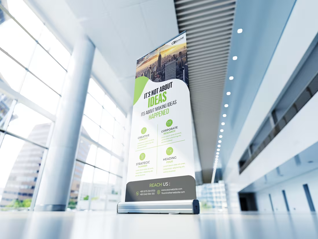
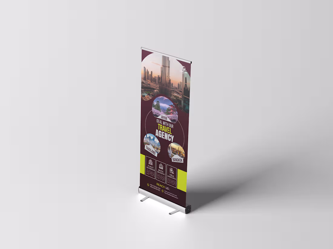
Roll-Up Banner Design | Print-Ready | Corporate & Business
Designed a series of professional roll-up banner layouts tailored for corporate events, exhibitions, and trade shows. Each design follows a structured visual hierarchy—starting with a bold hero image at the top, followed by a strong headline statement, supporting service/feature sections, and a clean contact/call-to-action footer.
Key design features:
High-impact typography with contrasting headline weights to draw attention instantly
Strategic use of brand color accents to guide the viewer's eye through the content
Icon-supported feature sections for quick, scannable communication
Minimal, whitespace-driven layout for a premium, professional feel
Optimized for standard roll-up banner dimensions (85cm × 200cm / 33" × 79")
Print-ready with bleed, safe zone, and CMYK color considerations
Ideal for: corporate agencies, real estate firms, construction companies, travel brands, and service-based businesses looking to make a strong impression at events and exhibitions.
Tools: Adobe Illustrator / Photoshop | Print Design | Brand Identity
DM for your work. and dont forget to comment.
3
241
Connect With People Before You Speak
If you’re a founder, business owner, or startup ready to stand out, your brand needs more than just visibility — it needs results. A strong social media presence helps you capture attention, build trust, and turn interest into action. With the right strategy and design, your brand can look sharper, feel stronger, and convert more people into loyal customers.
Let your brand speak clearly, confidently, and professionally—and make every impression count.
Let’s Make Your Brand Work Harder. Feel free to contact me. E-mail: ahmedmahdia1319@gmail.com (mailto:ahmedmahdia1319@gmail.com)
3
185
Meet the design that knows its purpose and speaks clearly. Bold type, focused imagery, and a steady tone guide you through what matters right now
—why this work exists, who it helps, and how to take the next step. It’s human because it centers real people and real impact. Ready to make a difference? Tap to learn more and take action.
1
183
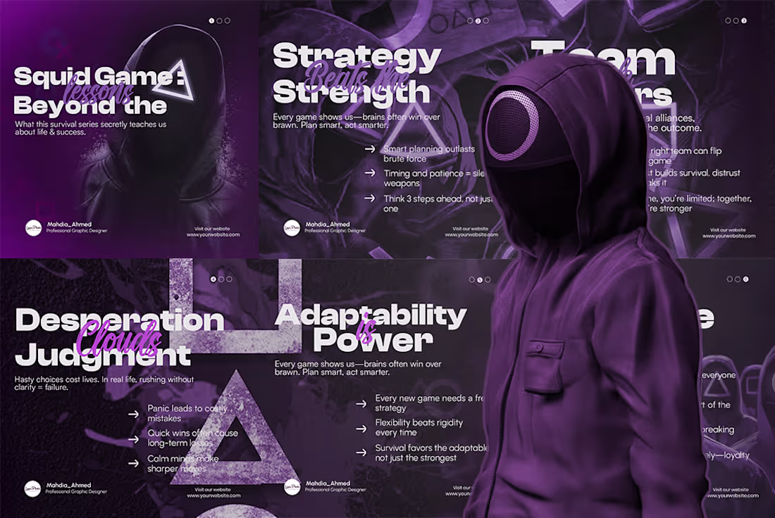
Squid Game wasn't just entertainment. It was a masterclass in survival, strategy, and human nature. Here's what nobody talked about. →
This isn't just a carousel — it's a scroll-stopper.
Designed for creators, educators, and brands who want to turn viral culture into real value, this 6-slide Squid Game-inspired carousel breaks down life and business lessons hidden inside one of the world's most-watched series — and it does it with visuals that demand attention.
Deep purple cinematic backgrounds. Bold editorial typography. Hooded figures that pull the eye and hold it. Every slide is built to make someone stop mid-scroll, read every word, and hit Save.
What's inside the carousel:
Squid Game: Lessons Beyond the Game
Strategy Beats Strength
Team Matters
Desperation Clouds Judgment
Adaptability is Power
And more...
Each slide pairs a punchy headline with real, digestible insights — the kind of content that gets shared, saved, and talked about.
Whether you're a social media manager, content creator, motivational brand, or digital educator, this design speaks the language your audience already loves — and packages your message in a way they won't forget.
2
150
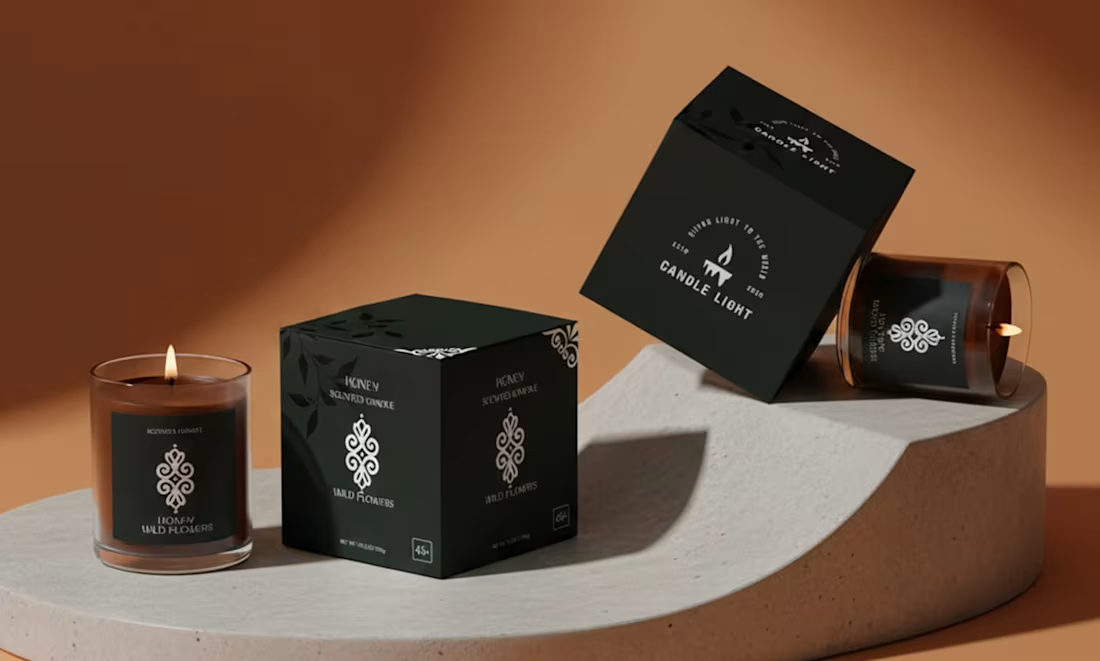
Step into a moment of quiet luxury the second you lay eyes on it.
The matte black boxes feel wonderfully substantial in your hand, smooth and modern with just a whisper of delicate botanical patterns that hint at something natural and soothing inside. Nestled beside them are the glass candle jars—deep, rich amber and warm terracotta tones that catch the light beautifully. When the wicks are lit, soft golden flames dance behind the glass, sending gentle curls of fragrant smoke into the air and filling the room with that cozy, “I’m home” feeling.
The contrast is striking yet effortless: bold black packaging against vibrant candle colors, clean typography, and thoughtful details that make the whole thing feel intentional and premium. It doesn’t scream for attention—it simply invites you in, promising a little ritual of calm and indulgence every time you reach for it. Whether it’s sitting on your shelf or being gifted to someone special, it already feels like a small everyday luxury you’ll want to come back to again and again.
What do you think? If you’re looking for custom packaging designs that truly represent your brand and get results, just send me a message—I'd love to create something special just for you!
1
131
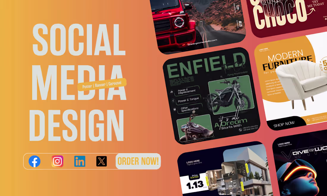
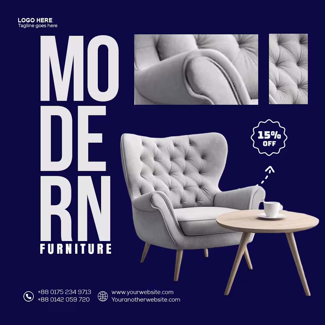
Just finished this fresh social media design, and I’m genuinely loving how it turned out!
It’s a bold, energetic showcase packed with eye-catching visuals that instantly draw you in—from a sleek red off-road truck tearing down a scenic mountain road to a powerful Enfield motorcycle that screams adventure, a super cozy modern white armchair inviting you to relax, a stunning contemporary home with that perfect family vibe, an immersive VR world that feels next-level, and even a mouth-watering chocolate treat calling your name.
What do you think? If you’re looking for custom social media designs that truly represent your brand and get results, just send me a message—I'd love to create something special just for you! 💛
Drop your opinions in comments and lemme know.
2
2
165
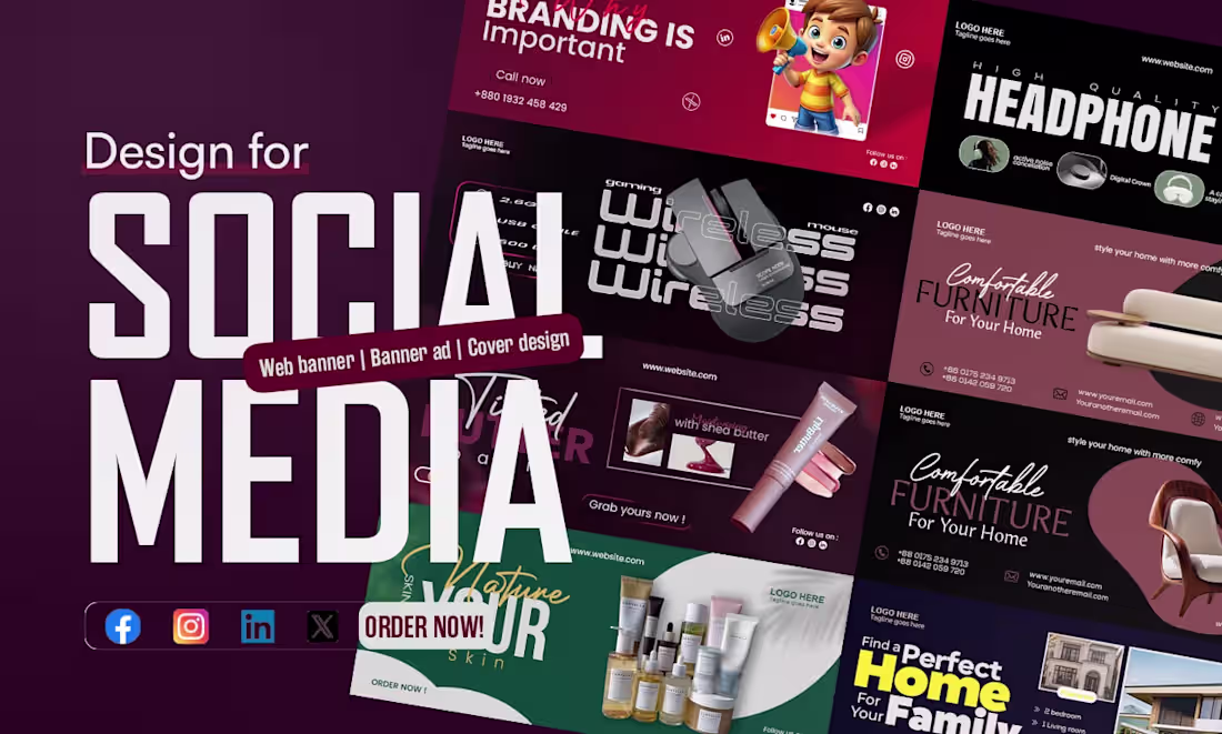
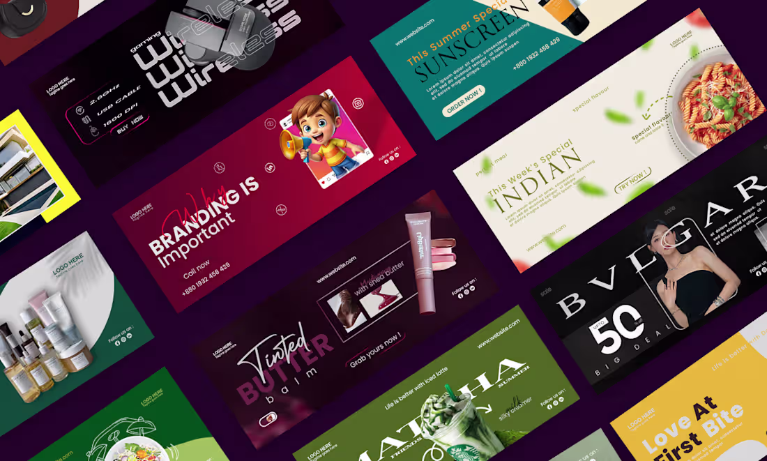
Just wrapped up this vibrant social media banner design, and I’m honestly so excited to share it!
It’s a full showcase of web banners, banner ads, and cover designs made to grab attention instantly across Facebook, Instagram, LinkedIn, and X. You’ll see everything from playful kids’ branding with a cute cartoon character shouting, “Branding is Important,” to sleek high-quality headphone promos, gaming wireless mouse layouts, cozy furniture ads that scream “Comfortable for Your Home,” glowing skincare and beauty products (hello, tinted lip butter with shea butter!), and even dreamy real estate banners saying, “Find a Perfect Home For Your Family.”
I went with bold, modern typography, rich color palettes, clean product shots, and strong call-to-action buttons like “Call Now” and “Order Now!” so every banner feels professional yet super approachable. Whether you’re selling tech, beauty, furniture, or homes, these designs are built to stop the scroll and spark action.
What do you think? Ready to get your own custom banner that actually looks like YOUR brand? Drop me a message — I’d love to create something special for you! 💜
1
121
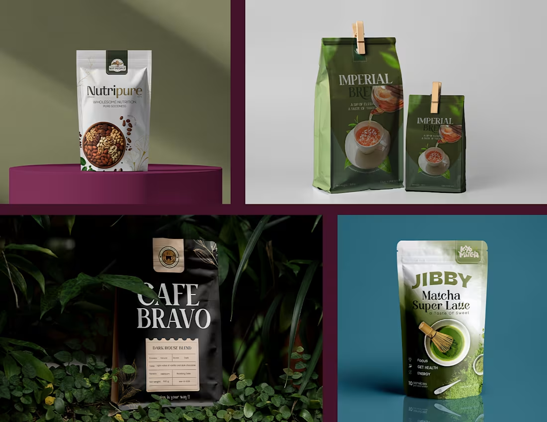
Premium Pouch design
1
6
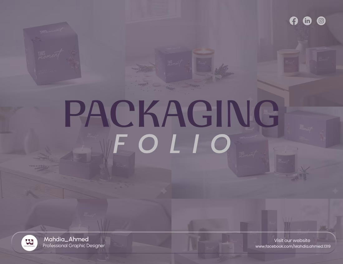
Packaging folio for candle box
1
3
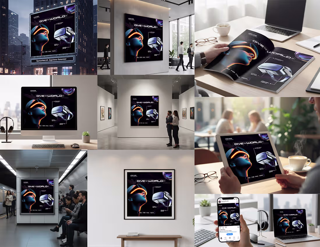
Futuristic Tech social media post
1
3
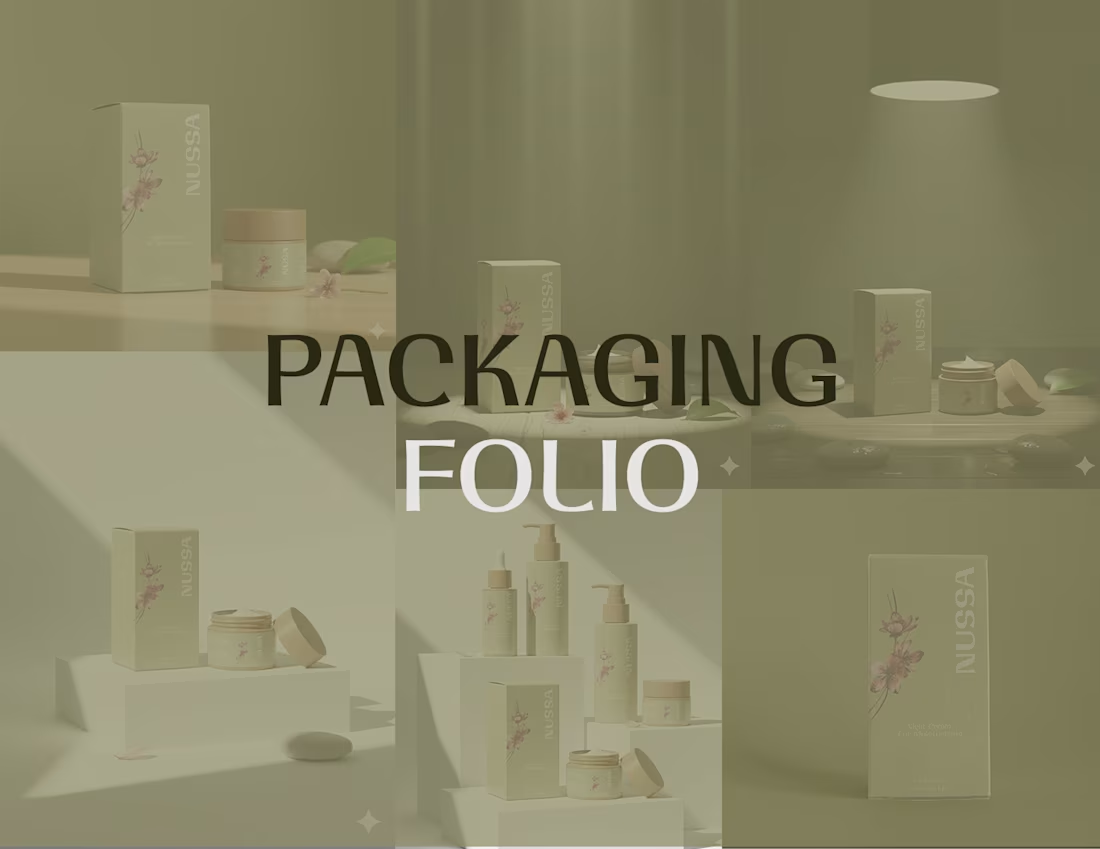
Premium packaging design
1
4
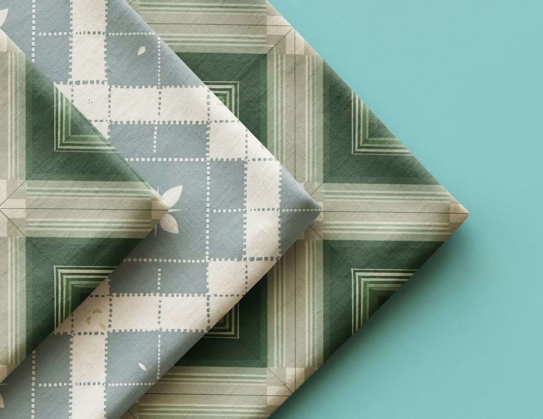
seamless pattern design
1
1
Impactful Creative Banners
1
3
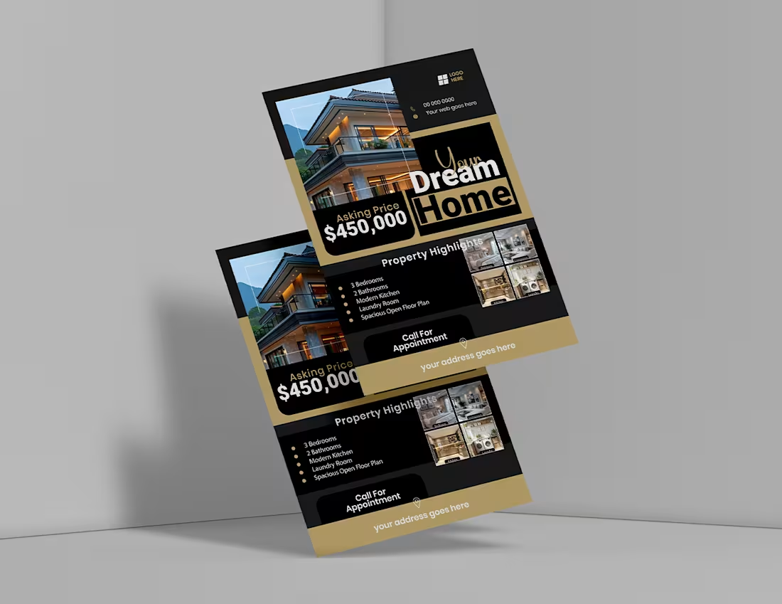
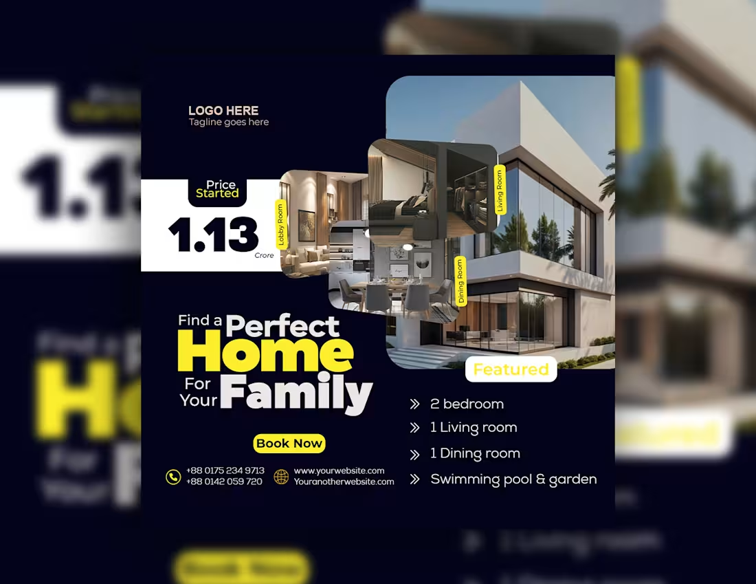
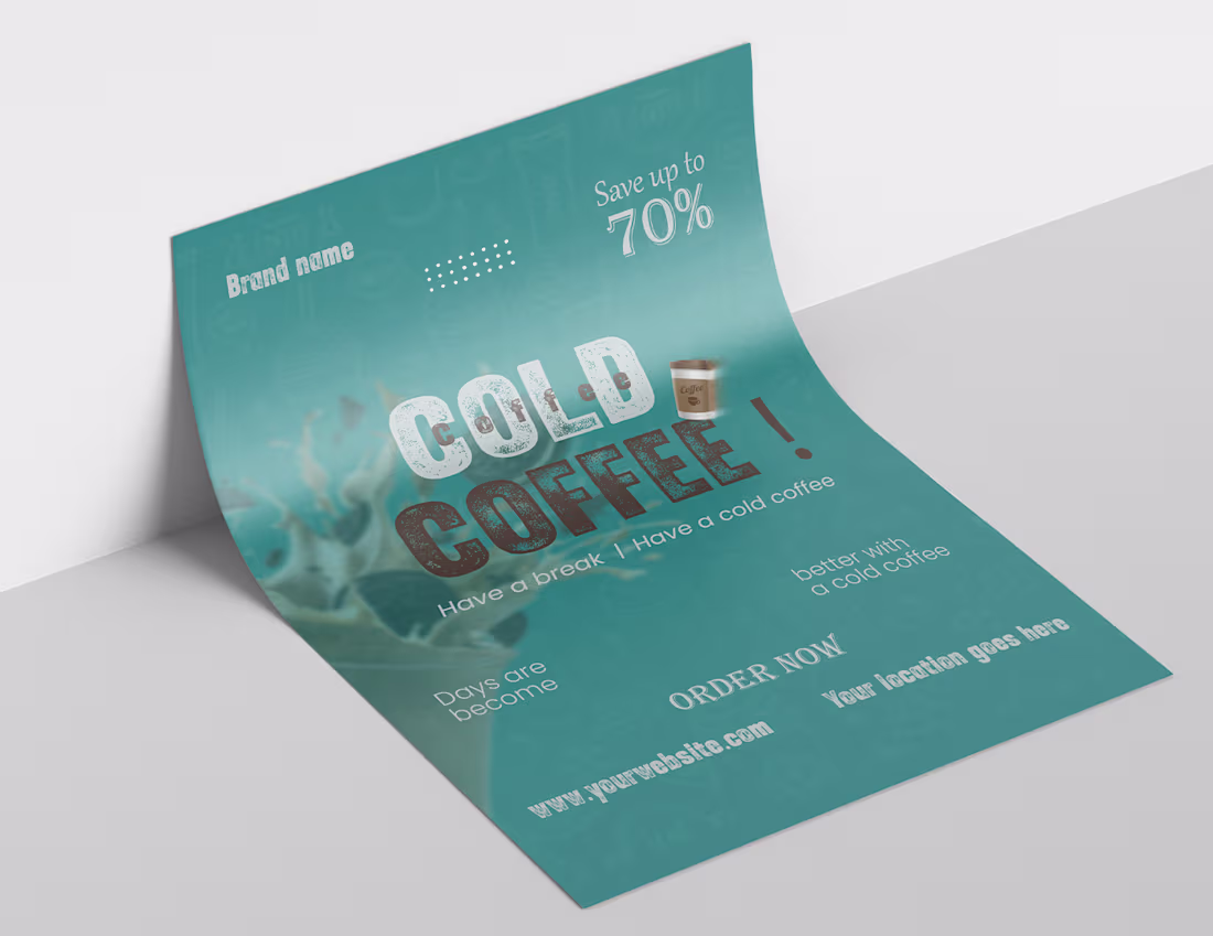
Real estate flyer design
1
4
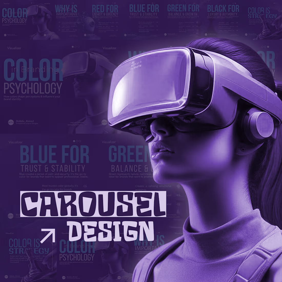
Creative carousel design
1
2
Niche based social media post
1
2
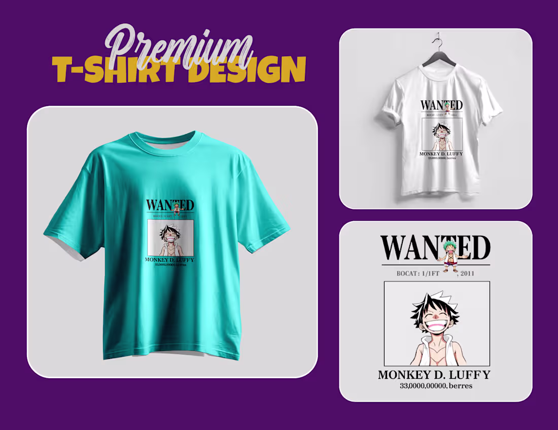
Premium t-shirt design
1
4
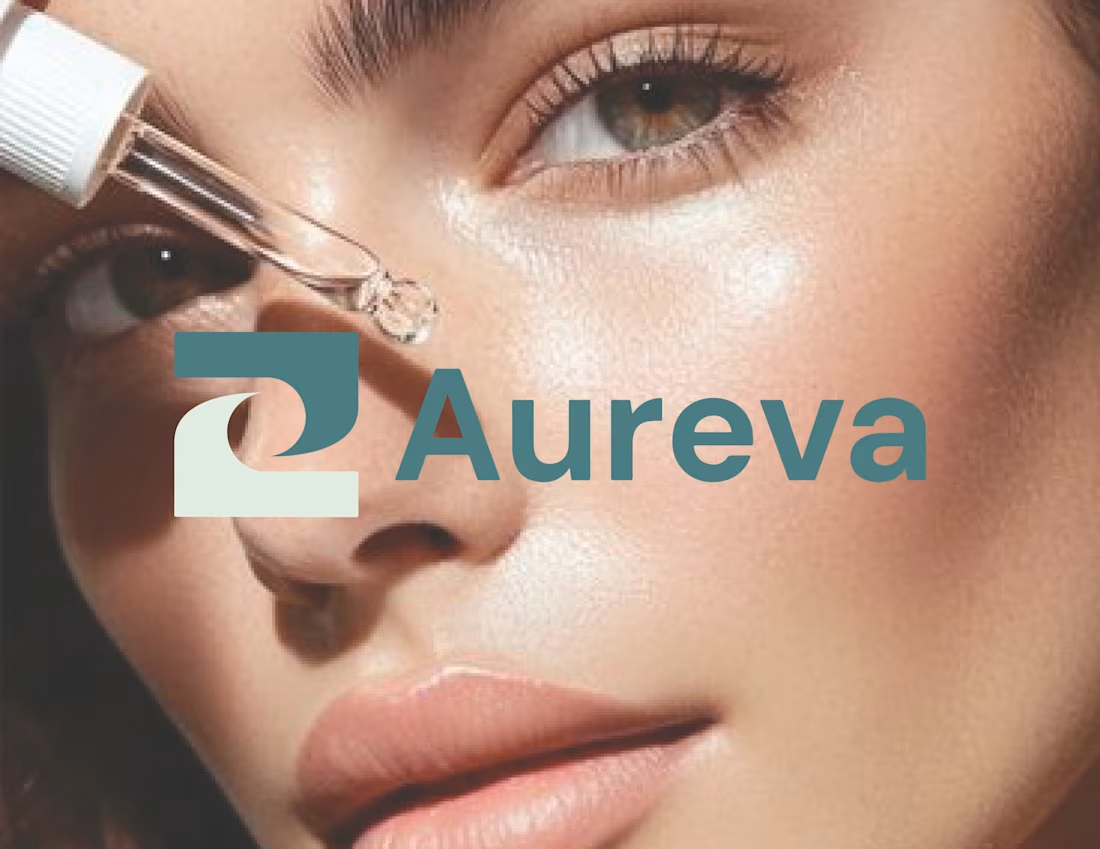
Brand style guide for skincare brand
2
3
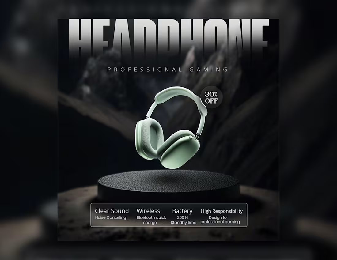
Gadget social media post
1
2
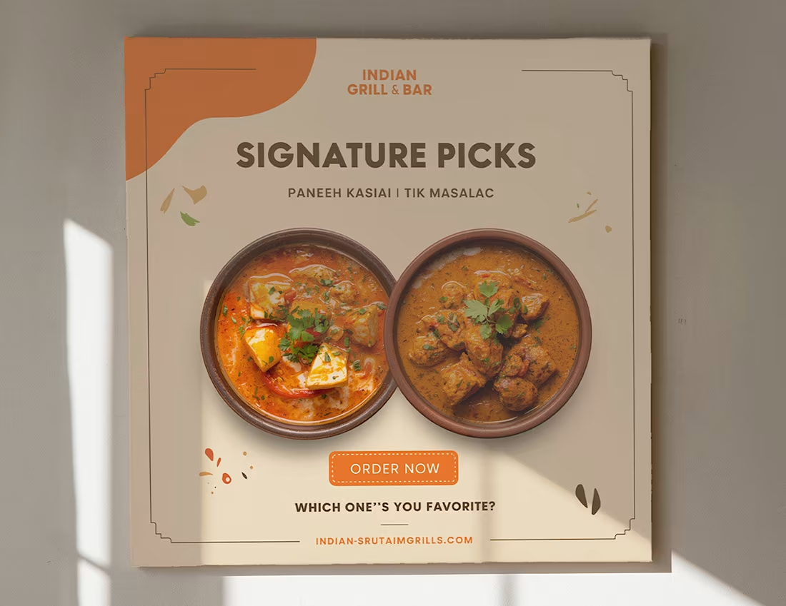
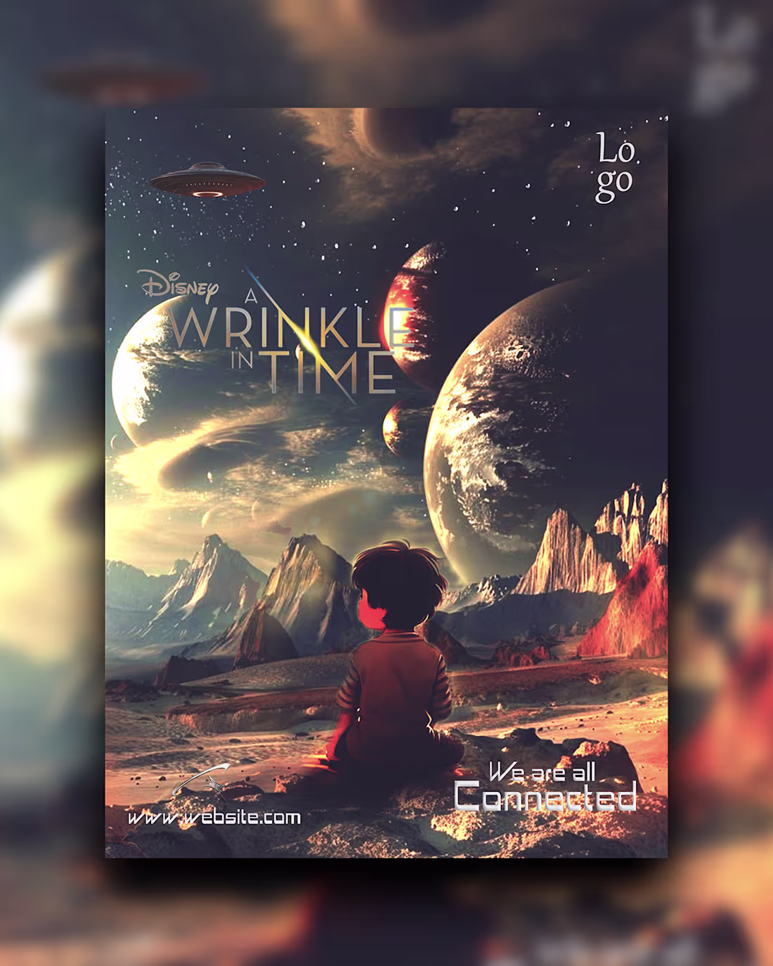
Poster Design
1
3
Poster design !!
1
2
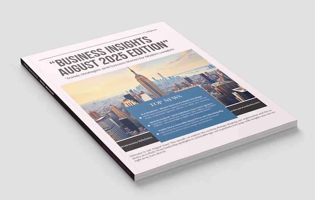
Newsletter design
1
2
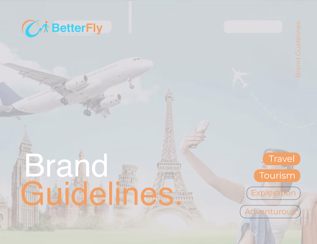
Brand Guidelines for travel and tourism agency
1
3
Manipulation poster design
1
3