The network for creativity
Join 1.25M professional creatives like you
Connect with clients, get discovered, and run your business 100% commission-free
Creatives on Contra have earned over $150M and we are just getting started
Back to feedPost

Amanah
Brand Identity for a Men's Attar & Modest Clothing Line
A full visual identity built for Amanah, a men's attar and modest clothing brand rooted in restraint, presence, and quiet luxury.
Lemme know your opinions for this branding in the comment box.


The network for creativity
Join 1.25M professional creatives like you
Connect with clients, get discovered, and run your business 100% commission-free
Creatives on Contra have earned over $150M and we are just getting started


Related posts

A fresh identity for Flankman, a US-based industrial intelligence company.
The idea was to bring together two different worlds: the credibility of traditional finance and the character of contemporary editorial design.
Really enjoyed exploring this one and giving a traditionally corporate industry a more distinctive visual personality.
Brand identity by Katlan.co ©

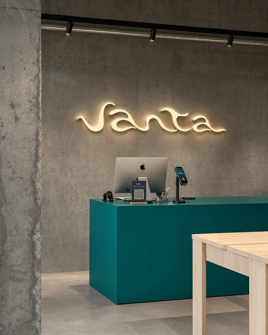
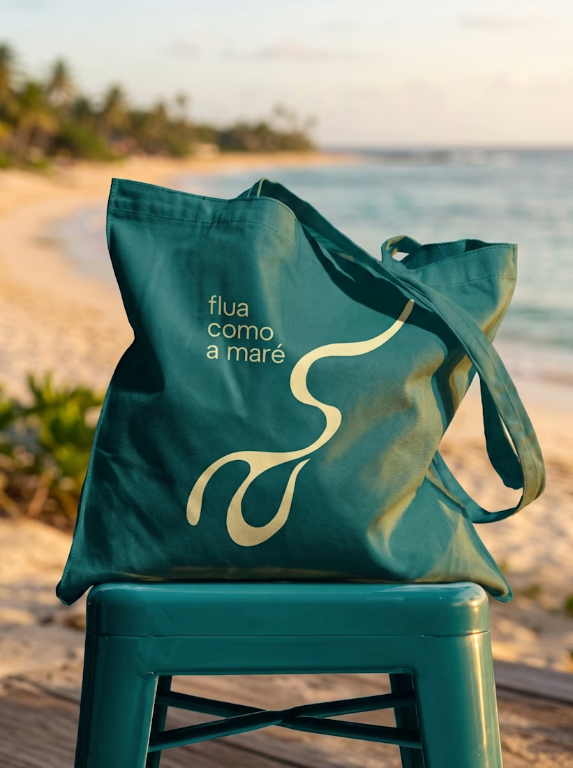
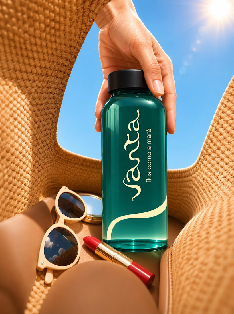
Just wrapped up this brand identity for Vanta and wanted to share a quick peek! Kept the visuals super clean, warm, and fluid, letting the product and textures breathe. Let me know what you think!

Great work!


Built to become an icon.
First or Nothing came to us with ambitions beyond their first product. They wanted a brand mark that could live on a supplement bottle, across apparel, or even become someone's next tattoo.
The result? A bold, distinctive identity with four layers of meaning and a hidden '1' in the wordmark.
Once you see it, you can't unsee it.
A brand built for where they're going, not just where they started.


The hidden 1 in the wordmark is a clever find. I can see that mark working as a tattoo too.


