
pro
Abi Jackson
I build structured brand systems for growing businesses.
- $1k+
- Earned
- 2x
- Hired
- 5.00
- Rating
- 41
- Followers
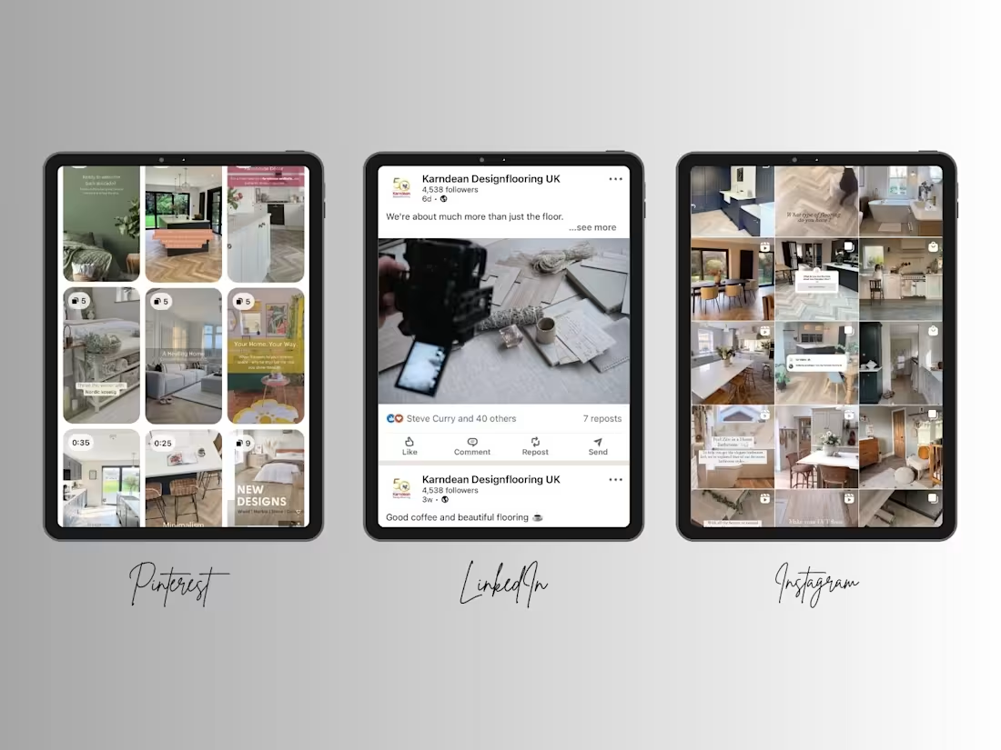
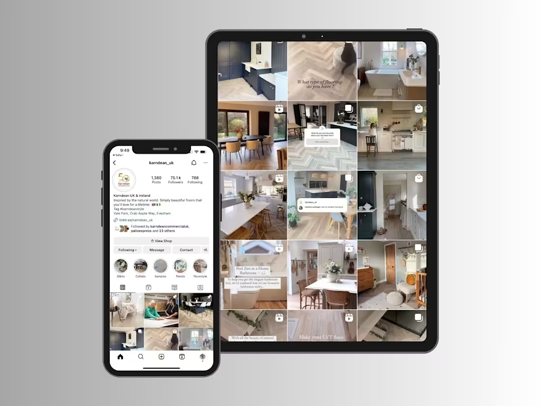
Another case study added to my portfolio Check it out (https://contra.com/p/rZOQ6NgL-social-media-strategy-for-karndean-designflooring)!
This project showcases how I developed and executed a social media strategy for Karndean Designflooring, helping build a recognisable brand across multiple platforms through strategic content, creative direction and consistent storytelling.
The result was a 150.5% increase in impressions year-over-year and a social presence that regularly reached over 500,000 users each month.
5
6
414
Social Media Strategy for Karndean Designflooring
0
9
Website & Brand Development for Bridging The Gap Foundation
0
2
A recent project I’ve been working on a full brand and website system for a logistic consultancy company.
Honestly, this was one of those projects where getting the balance right mattered more than making things look “fancy”.
The industry is highly technical, so the challenge was creating something that felt modern and premium while still maintaining trust, professionalism, and credibility.
A lot of focus went into structure, clarity, user experience, and simplifying complex information without stripping away the expertise behind the company.
Really enjoyed working on this one: Check it out (https://contra.com/p/FRoc3oPg-brand-and-website-system-for-advantaship)
14
11
919
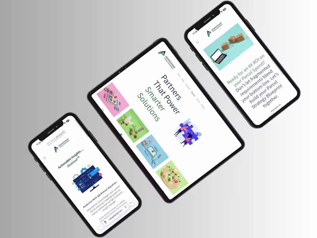
Brand & Website System for Advantaship
1
5
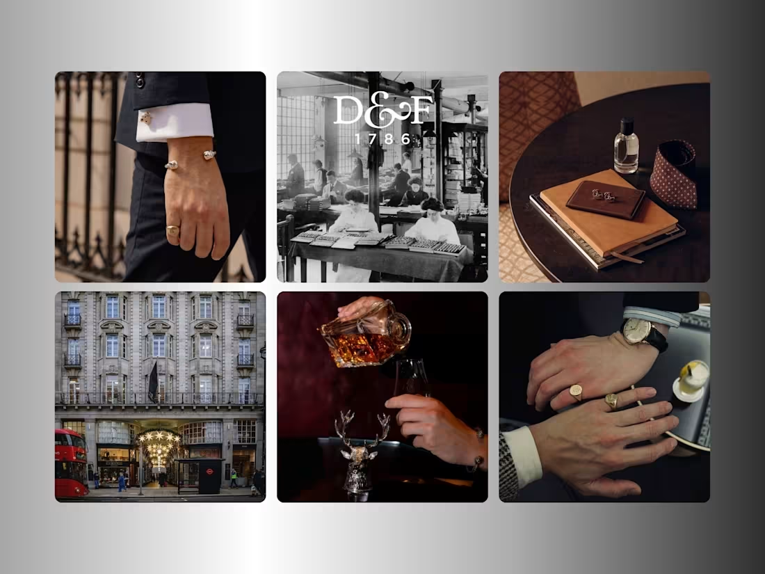
Luxury collaborations are always at their strongest when the storytelling feels just as considered as the craftsmanship behind them.
One of my favourite projects to work on was helping lead the creative rollout for the Deakin & Francis x Jaguar Classic collaboration celebrating the re-launch of the iconic E-Type.
Check it out (https://contra.com/p/3OYrXrEU-luxury-campaign-for-deakin-and-francis-x-jaguar-classic)
A project bringing together British automotive heritage, luxury craftsmanship, bespoke design details, and a global campaign rollout across digital and press.
The campaign went on to generate 100,000+ engagements, international press coverage, and contributed to a private vehicle sale valued at $532,000.
Really proud to finally share this one.
2
4
575
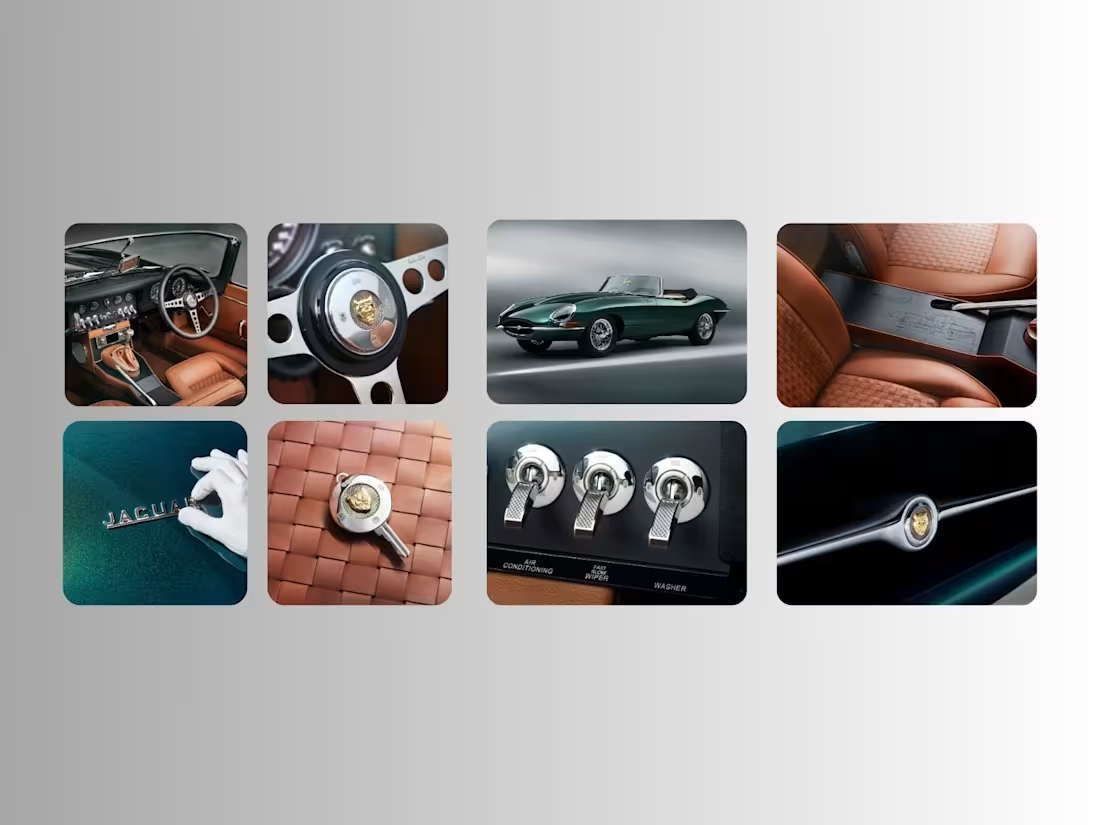
Luxury Campaign for Deakin & Francis x Jaguar Classic
1
6
Working on something a little different behind the scenes lately.
I’ve been developing a full brand identity and website for a local non-profit focused on supporting the community and it’s genuinely been one of the most rewarding projects I’ve worked on.
A lot of strategy, structure, and intentional design has gone into making sure the platform feels approachable, clear, and built to serve real people.
Still finishing up the final details, but here’s a small preview before the full case study drops soon.
3
500
Content Direction for Vybz Football
1
12
Video-First Social Media Strategy for Deakin & Francis
1
16
People often see the finished campaign. What they don’t see is the system behind it.
The decisions that shape it:
- What gets shown first.
- What gets removed.
- How information is layered.
- How consistency is maintained across every touchpoint.
It’s making sure the same level of clarity and intention exists throughout. This carousel was designed to guide the viewer from initial concept to the design process, in a way that feels clear, considered, and easy to follow.
3
781

Social Media Strategy for Milo Ritchey
1
5
Most websites aren’t designed, they’re decorated. Everyone talks about fonts, colors, animations.
Almost no one talks about decision flow.
If you remove your colors, animations, and images - does your website still convert?
If not, it wasn’t designed, it was styled.
2
13
867
Structured Brand & Website System for A.R.T.
1
9
A new case study just went live, breaking down how I built the brand, website and social system for Vybz Football: Check it out (https://contra.com/p/cqvlvrgm-structured-brand-and-website-development-for-vybz-football)
The biggest shift wasn’t design - it was structure. Clear positioning, defined offers, and a website built to guide decisions, not just display information.
When the brand, messaging, and user journey actually connect, everything starts working harder.
When you look at your own work, what’s doing more heavy lifting: design or structure?
2
3
789
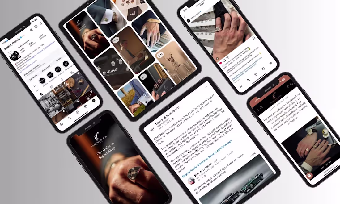
Just shared a new case study on how I restructured Deakin & Francis social media platforms into a more consistent, story-led feeds: Check it out (https://contra.com/p/Z3PrW6Fc-social-media-strategy-for-deakin-and-francis-jewelry)
Working on Deakin & Francis the social media wasn’t about “posting more.” It was about building a system where every piece of content actually means something.
When the brand is clearer, people engage differently.
2
780
Social Media Strategy for Deakin & Francis Jewelry
2
17
Structured Brand and Website Development for Vybz Football
2
9