
Abhishek Sharma
Designing scroll-stopping creatives for product brands.
New to Contra
Abhishek is ready for their next project!
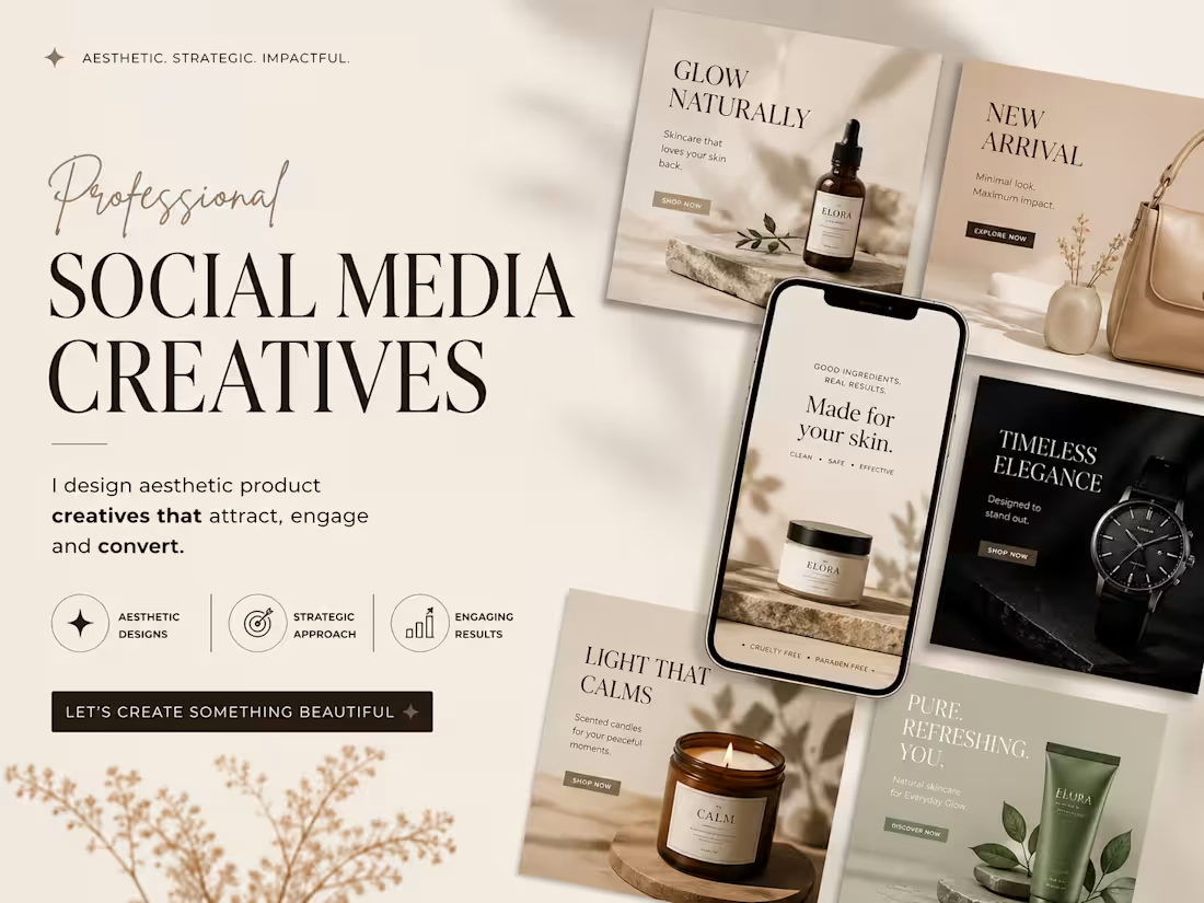
This project showcases a premium presentation layout highlighting a series of high-conversion Social Media Creatives. The design approach is engineered for direct-to-consumer (DTC) e-commerce brands in the wellness, beauty, and luxury lifestyle sectors, focusing on a seamless blend of elevated aesthetics and strategic marketing.
Design Strategy & Layout Highlights
Typography Hierarchy: The main presentation utilizes an elegant, high-contrast serif typeface for the headers ("SOCIAL MEDIA CREATIVES"), paired with a fluid, organic script accent for a touch of luxury. The ad creatives use clean, accessible sans-serif typography designed for maximum readability on mobile feeds.
Color Story & Tone: A deeply cohesive, warm neutral color palette dominates the canvas—utilizing soft cream, warm beige, muted sage green, and striking contrast accents of deep charcoal and rich espresso brown.
Multi-Product Mockup Integration: As showcased in the image, the composition features an array of modular square grid layouts alongside a central smartphone UI mockup. This setup effectively demonstrates how the campaign assets transition seamlessly from Instagram grid posts to high-impact mobile stories or reels.
Visual Styling: The entire layout leverages soft, natural leaf and window-pane shadow overlays, raw stone styling elements, and warm, minimalist photography to communicate a sense of "quiet luxury" and organic purity.
0
28
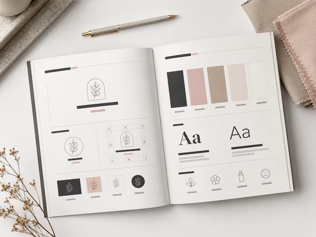
This spread showcases the editorial layout of the CALMÉA Botanical Skincare Brand Style Guide. Designed to serve as the definitive blueprint for the brand's visual identity, the layout maintains a high-end, editorial feel with a focus on generous negative space and clear information hierarchy.
Spread Layout & Specifications
Left Page (Logo Systems & Usage): Dedicated to the structural core of the brand. It outlines the primary arched botanical logo mark, alternative circular sub-marks, and the precise clear-space grid construction. The lower section demonstrates icon versatility across dark, light, and inverted color blocks.
Right Page (Color & Typography): Focuses on the core design systems. The top half displays the refined, earthy color palette blocks (charcoal, dusty rose, warm taupe, soft cream, and crisp white). The midsection dictates the typographic hierarchy, contrasting a bold serif display typeface with a clean, light serif/sans-serif body pairing. The bottom row highlights custom brand iconography for packaging use.
Art Direction: Styled in a flat lay format featuring raw tactile fabric swatches, a minimalist matte pen, and delicate dried florals to reflect the organic essence of the brand.
0
37
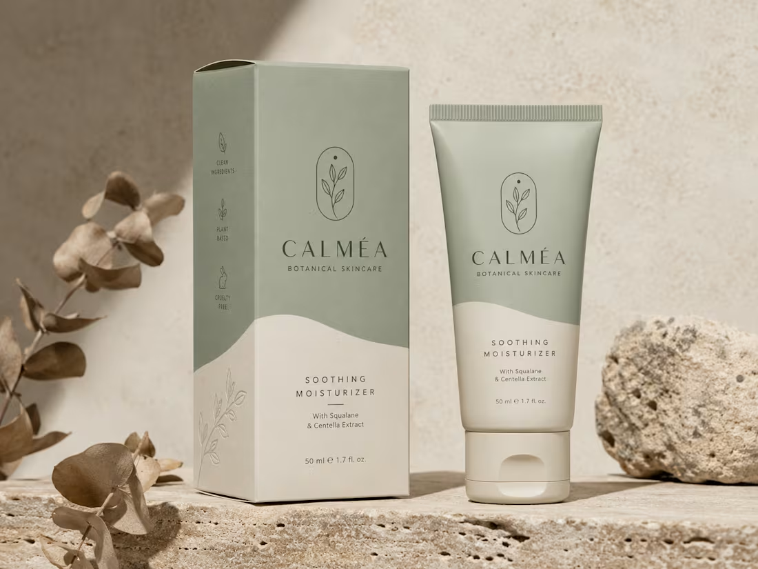
This project showcases the visual identity and packaging design for CALMÉA Botanical Skincare. The goal was to translate the brand’s core philosophy- gentle, plant-based, and science-backed skin nutrition—into a physical product experience that feels deeply calming and luxurious.
Design Strategy & Key Elements
Color Palette: A soothing, nature-inspired palette featuring a muted sage green and a warm, textured cream tone. The split-tone layout uses organic, fluid curves that mimic natural landscapes or gentle waves.
Typography & Visual Assets: The brand name "CALMÉA" is set in an elegant, high-contrast serif typeface, paired with clean, architectural sans-serif typography for product details. The primary logo icon features a minimalist botanical branch enclosed in a delicate arch.
Packaging Layout: As seen in the image, the outer box features structured side-panel iconography ("Clean Ingredients," "Plant Based," and "Cruelty Free") and a subtle line-art botanical illustration on the lower section. The theme carries over seamlessly to a matte-finish squeeze tube.
Art Direction: The staging emphasizes raw, tactile textures - rough travertine stone, natural direct sunlight, and dried eucalyptus branches- to highlight the organic origin of the product.
0
40
Project Overview
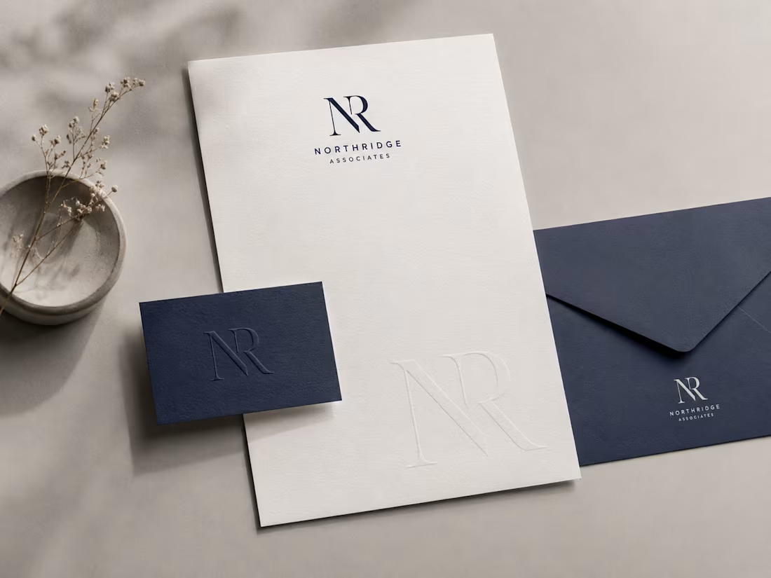
This project features a comprehensive brand identity system showcased through a premium corporate stationery suite. The design focuses on a refined, sophisticated aesthetic tailored for professional services.
Design Elements & Execution
Palette: A high-end color scheme pairing textured, crisp off-white stock with deep corporate navy blue.
Typography & Assets: The brand utilizes a sharp, intertwined "NR" serif monogram, balanced by a clean, geometric sans-serif for the primary logotype ("Northridge Associates").
Mockup Highlights: Featured items include a minimalist letterhead with a subtle, blind-debossed watermark of the monogram, an elegant textured business card with a matching deep-deboss finish, and a coordinating corporate envelope.
Aesthetic: The presentation relies on soft, natural organic shadows, tactile paper grains, and a minimalist stone accent to bring a modern, premium feel to the final presentation as shown in the image.
0
55
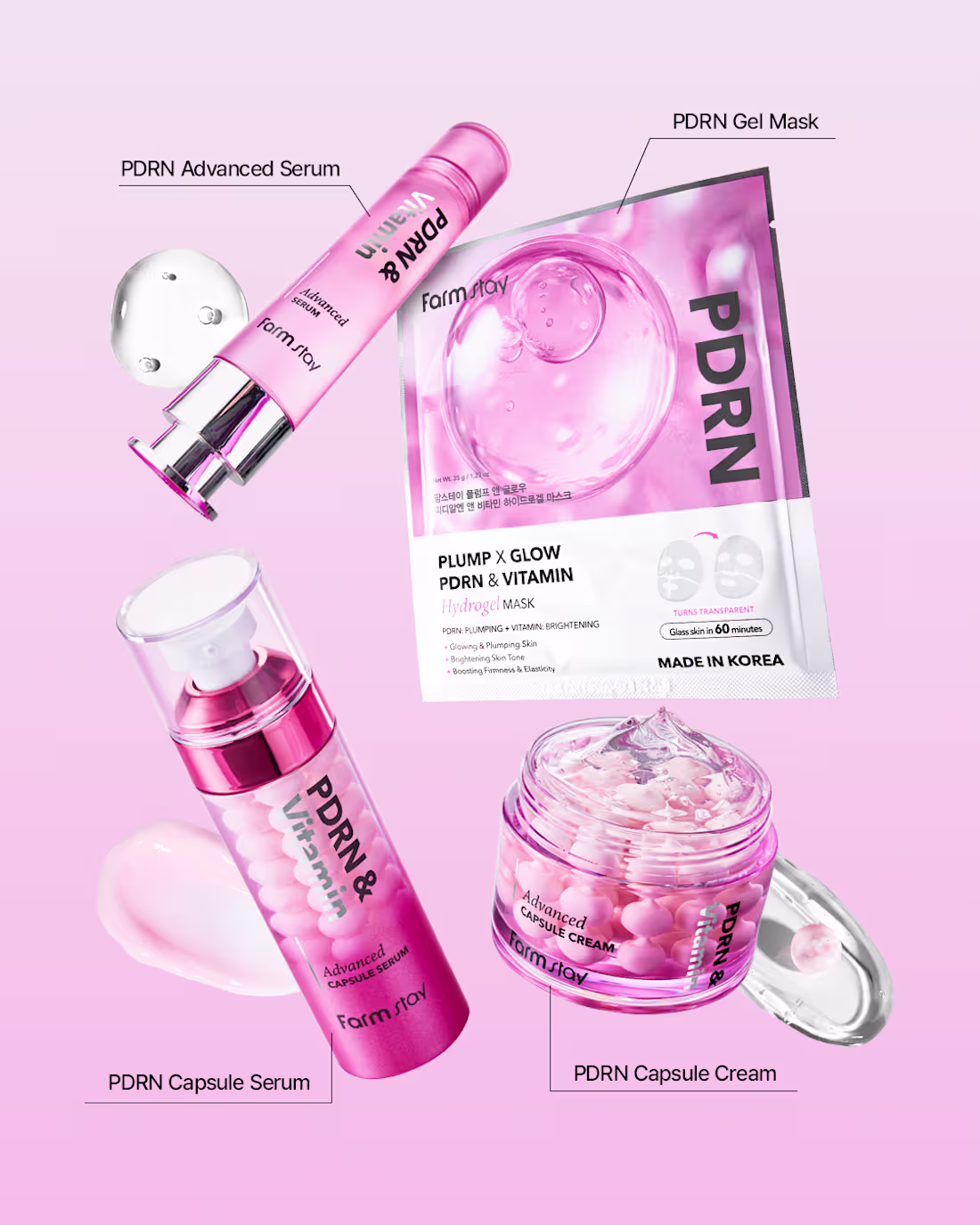
For this Farmstay PDRN creative, I laid out four products from the range (advanced serum, gel mask, capsule serum, and capsule cream) in a scattered grid so each item stayed clearly visible and labeled, making it easy for viewers to see the full collection at a glance. I added small product swatches near a couple of the items to hint at texture and application. The entire composition sits on a soft pink gradient background to match the brand's signature pink tone, keeping the set feeling cohesive and on-brand while each product still gets its own moment with a clean label callout.
0
47
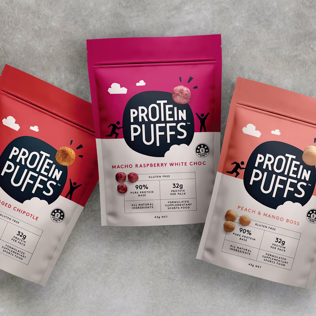
For this Protein Puffs creative, I arranged the three flavor packs in a fanned-out, slightly overlapping layout with the center pack raised higher to draw the eye to it first, then naturally guide attention to the two side packs. I placed them on a textured stone/concrete-style background to give the shot a grounded, lifestyle feel rather than a flat studio look. The angled, scattered arrangement keeps the composition dynamic and makes the range feel more like a real product lineup than a static catalog shot, while the bright pack colors stay the clear focal point against the neutral background.
1
1
83
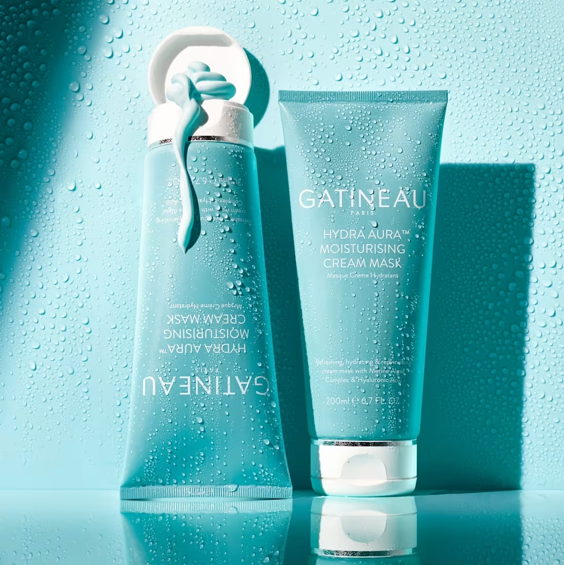
For this Gatineau creative, I placed the product on a reflective surface to create a mirrored duplicate beneath it, adding depth and a premium, editorial feel. I kept the entire scene in a cool teal tone to match the brand's packaging and added water droplets across the background to reinforce the "hydrating" and "moisturising" positioning of the product. The reflection and water texture work together to make the shot feel fresh, clean, and spa-like, while the lighting keeps the focus on the product without losing the mood of the scene.
0
50
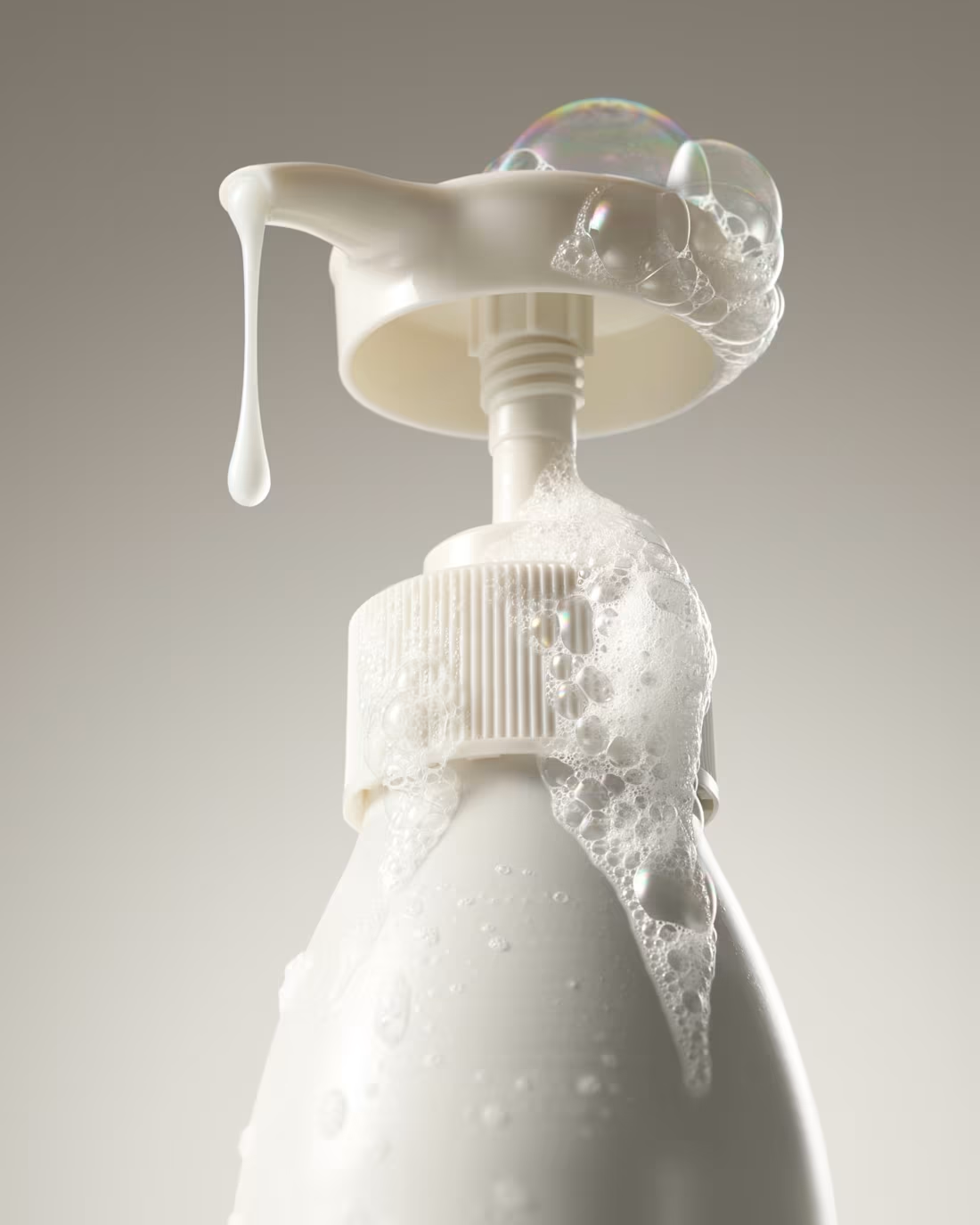
For this creative, I focused on a close-up macro shot of the pump bottle to highlight texture and detail — the soft foam, bubbles, and a single drip running down the nozzle. I kept the background in warm neutral tones so the white bottle and foam stood out without any distractions, giving it a clean, almost minimalist product photography feel. The bubbles on top add a playful, fresh touch that suggests the product's lathering quality, while the muted lighting keeps the overall look premium and soft rather than harsh or clinical.
0
55
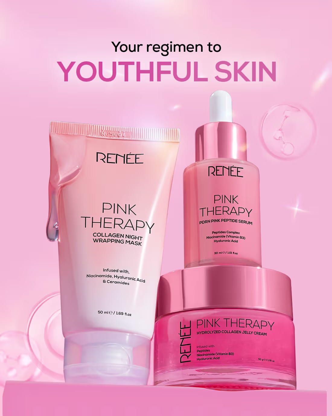
For this RENEE Pink Therapy creative, I arranged the three-product lineup (collagen night mask, peptide serum, and collagen jelly cream) in a layered composition so each product stayed clearly visible while still feeling like one cohesive set. I built a soft pink gradient background with subtle bokeh and a faint molecular/collagen graphic to reinforce the "collagen" and "youthful skin" theme without distracting from the products. The bold "Your regimen to YOUTHFUL SKIN" headline was placed at the top in a deep pink-purple to match the brand's color palette and immediately communicate the routine's benefit.
1
1
98
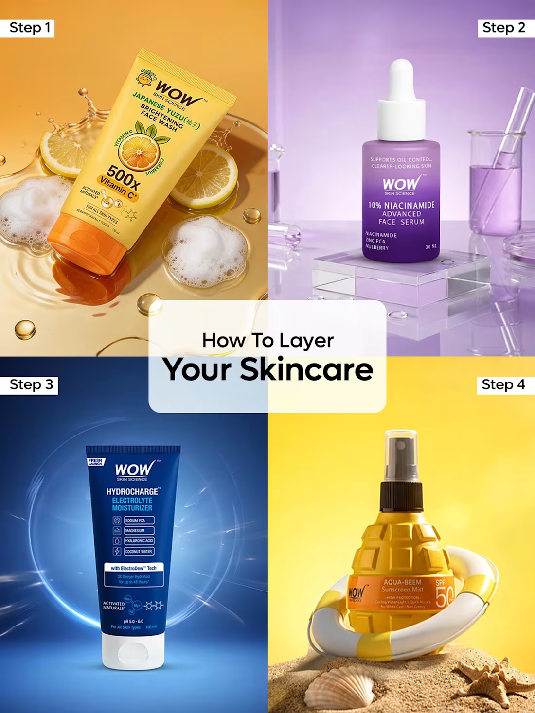
For this WOW Skincare routine creative, I designed a 4-step grid layout to walk viewers through a skincare layering routine in one glance. Each quadrant features a different product shot — vitamin C face wash, niacinamide serum, hydrating moisturizer, and SPF spray — placed against its own themed background (citrus and ice cubes, purple lab-style props, blue gradient, and a beach/sand setup) so each step felt distinct while staying visually connected as a set. I added "Step 1, 2, 3, 4" labels in the corners for easy scanning, and placed a clean text overlay in the center — "How To Layer Your Skincare" — to tie all four panels together as one cohesive routine. The goal was to make a slightly complex topic (skincare order) feel simple and easy to follow in a single scrollable post
1
1
81
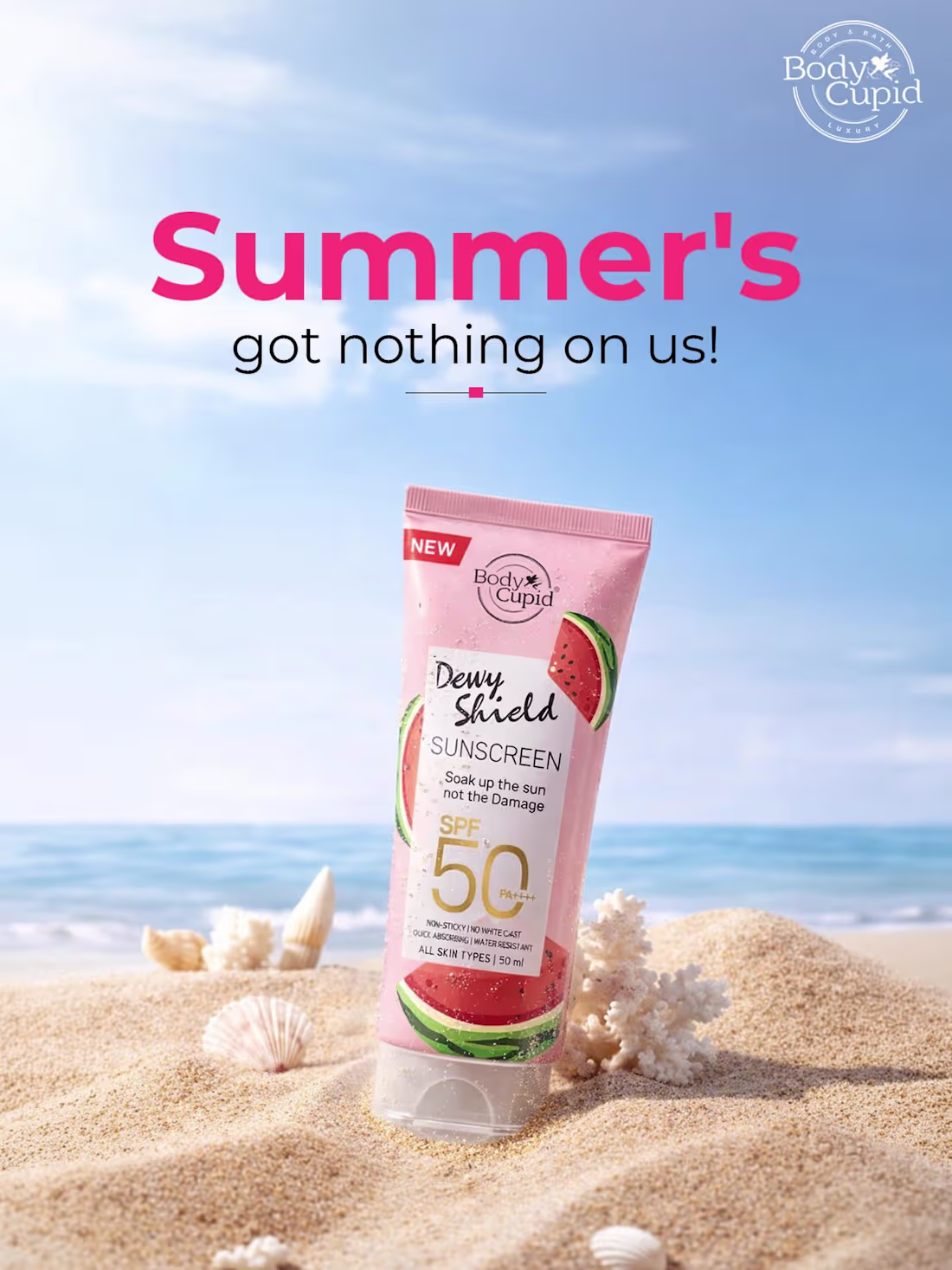
For this Body Cupid sunscreen creative, I started by selecting a bright, sunny beach background to set a summer mood. I then placed the product shot into the scene, blending it naturally into the sand using shadows and lighting adjustments so it looked like it belonged in the setting rather than pasted on top. I added shells and a watermelon slice around the product to reinforce the summer theme and tie into the "Dewy Shield" watermelon-inspired branding. For the headline, I used bold, playful typography in the brand's pink tone to grab attention immediately, then balanced it with a clean subheading. Finally, I made sure the SPF 50 and key product details stayed clearly visible so the creative looked appealing but also communicated the product's main benefit at a glance.
1
75
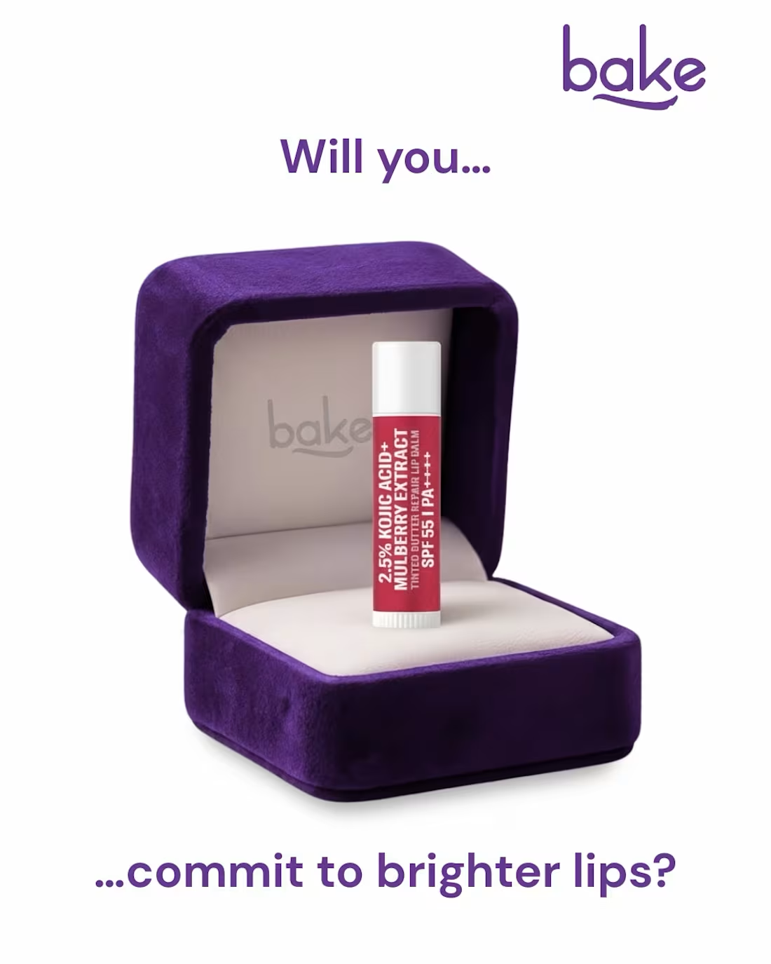
A playful product creative for Bake's lip care line - using a "proposal" concept (lip balm presented in a ring box) to turn a simple skincare product into something memorable. The "Will you commit to brighter lips?" tagline ties the visual metaphor together while keeping the focus on the product's key ingredient highlights.
2
88