
Nimit Design
Brand Identity & Visual Systems Designer
Ready for work
Nimit is ready for their next project!

SÓLUM — Mineral Skincare Brand Identity
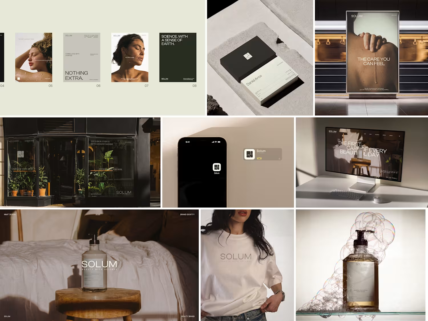
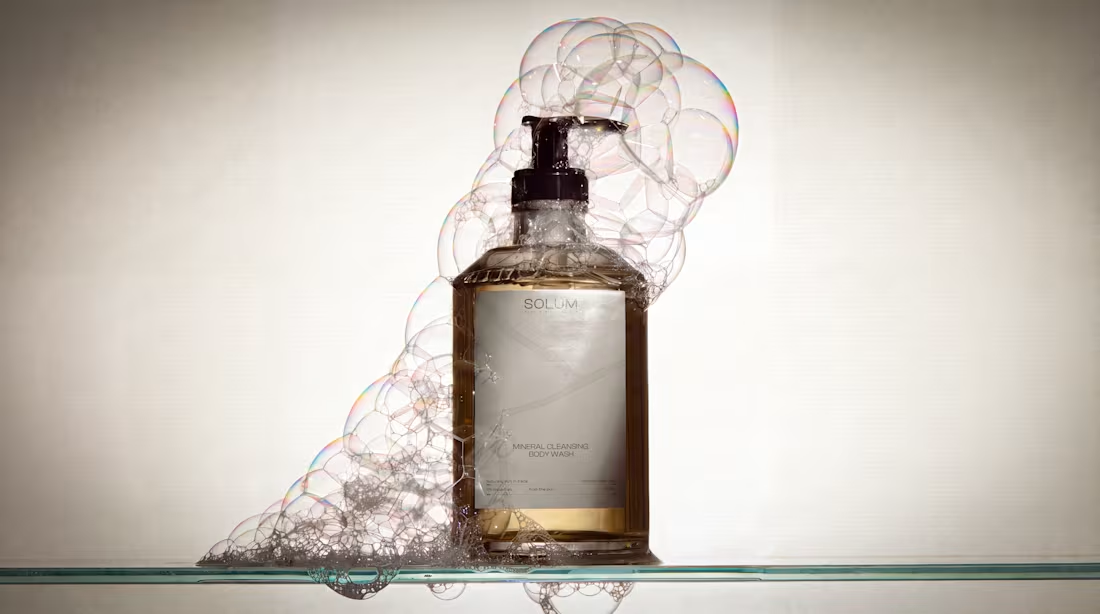
SÓLUM is a premium mineral skincare brand built around a simple belief: some of the most powerful ingredients for skin already exist in the earth.
I developed this brand identity around the intersection of earth science and skin science, creating a visual language that feels precise, refined, and deeply connected to natural materials. Instead of following the typical organic skincare aesthetic, the direction takes inspiration from volcanic ash, geological formations, fractured stone, and mineral textures.
The SÓLUM logomark is built from a structured square divided by irregular, crack-like forms — a visual reference to fractured volcanic rock and cooling ash. The contrast between the controlled outer structure and organic internal fractures gives the mark a balance of precision and geological permanence.
The typography is clean and restrained, allowing the natural textures and imagery to carry the emotional character of the brand. A mineral-inspired visual system, paired with raw geological imagery and refined layouts, creates a sense of quiet luxury without feeling overly decorative.
The goal was to position SÓLUM as a skincare brand that feels scientific yet human, natural yet sophisticated, and rigorous without losing its connection to the earth.
Services
Brand Identity
Logo Design
Art Direction
Typography
Visual System
Brand Strategy
Packaging Direction
Tools
Adobe Illustrator
Adobe Photoshop
Adobe InDesign
Project Type
Branding / Visual Identity
FULL PROJECT : https://www.behance.net/gallery/254419423/SOLUM-Brand-Identity
2
1
136
SÓLUM — Beauty Brand Identity
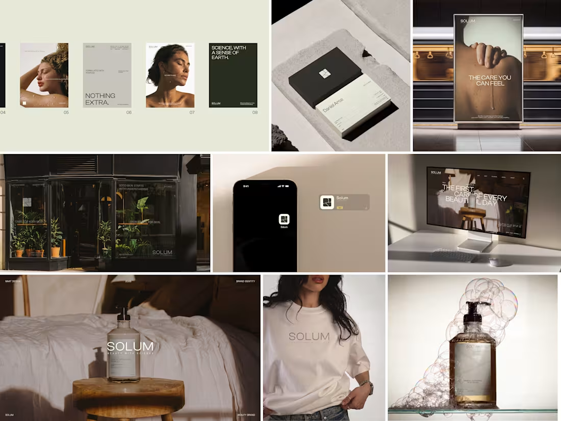
A visual identity built around the idea of quiet science, natural materials, and everyday care.
For SÓLUM, I explored a minimal and grounded visual language that feels premium without becoming overly polished. From the identity and packaging to digital touchpoints and campaign applications, every element was designed to feel calm, tactile, and intentional.
The goal was simple: make skincare feel closer to nature, while keeping the science visible.
Brand Identity · Packaging · Art Direction · Digital · Campaign
0
79
JIVA — Premium Indian Kombucha Brand Identity
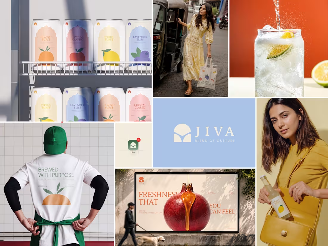
JIVA was built around a simple thought: Indian kombucha can feel premium, modern, and proudly rooted in where it comes from.
The challenge was to move away from the usual clinical or overly craft-market look and create a brand that feels like a global product with an unmistakably Indian soul.
The identity takes inspiration from Indian craft, traditional arches, and the natural movement of fermentation. The rounded dome-like symbol gives the mark a sense of warmth and heritage, while the flowing curves represent fermentation as something living, active, and constantly transforming.
The visual language keeps things minimal and refined, using earthy tones and a warm off-white to create a balance between tradition and modernity. The result is an identity that feels calm and premium, but still has character.
At the heart of JIVA is the idea of “Blend of Culture” — bringing together Indian heritage, natural fermentation, and contemporary design.
Alive. Authentic. Artisanal. Indian at heart.
Services
Brand Identity
Logo Design
Art Direction
Typography
Color Palette
Visual System
Packaging Design
Tools
Adobe Illustrator
Adobe Photoshop
Project Type
Branding / Visual Identity / Packaging
0
94
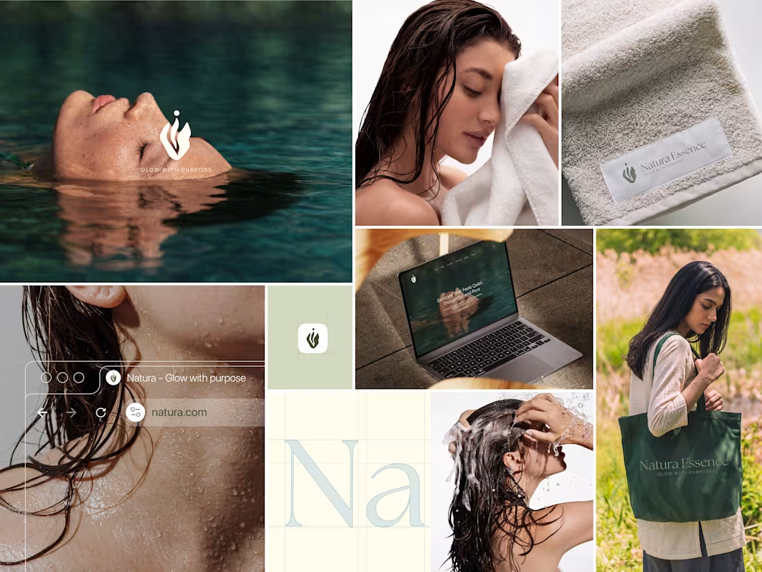
Natura — Natural Beauty Brand Identity
Natura started with a simple idea: natural skincare shouldn’t feel like a luxury that only a few people can afford.
I developed this brand identity around the feeling of calm, honesty, and connection with nature. The visual direction uses soft organic forms, flowing leaf-inspired curves, and a gentle color palette to make the brand feel natural without becoming overly rustic or predictable.
The logo was shaped around the movement of leaves and natural growth, creating a mark that feels soft, balanced, and easy to recognize. I paired it with warm neutrals, sage greens, deeper botanical tones, and a subtle blossom pink to bring a little warmth and personality into the system.
The goal was to create a beauty brand that feels clean, approachable, thoughtful, and trustworthy—something that feels natural without trying too hard to look “natural.”
Services
Brand Identity
Logo Design
Art Direction
Typography
Color Palette
Visual System
Tools
Adobe Illustrator
Adobe Photoshop
Project Type
Branding / Visual Identity
Full project: https://www.behance.net/gallery/252237679/Natura-Beauty-brand-branding
0
116