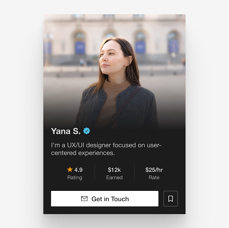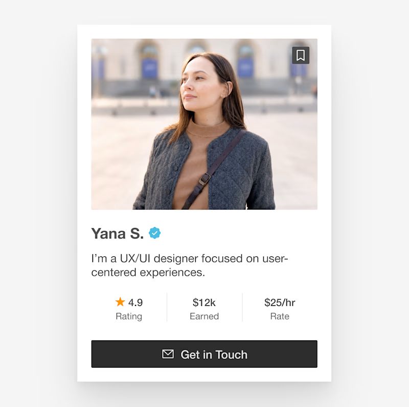
Yana S.
UX/UI Designer •AI Products • SaaS • Internal Tools • Framer
Ready for work
Yana is ready for their next project!


I love working with small businesses because the work feels personal. ✨
It’s not just about redesigning a website, it’s about helping a business look more professional, build trust, and grow online.
I’m always excited to be part of that journey and see the real impact of good...
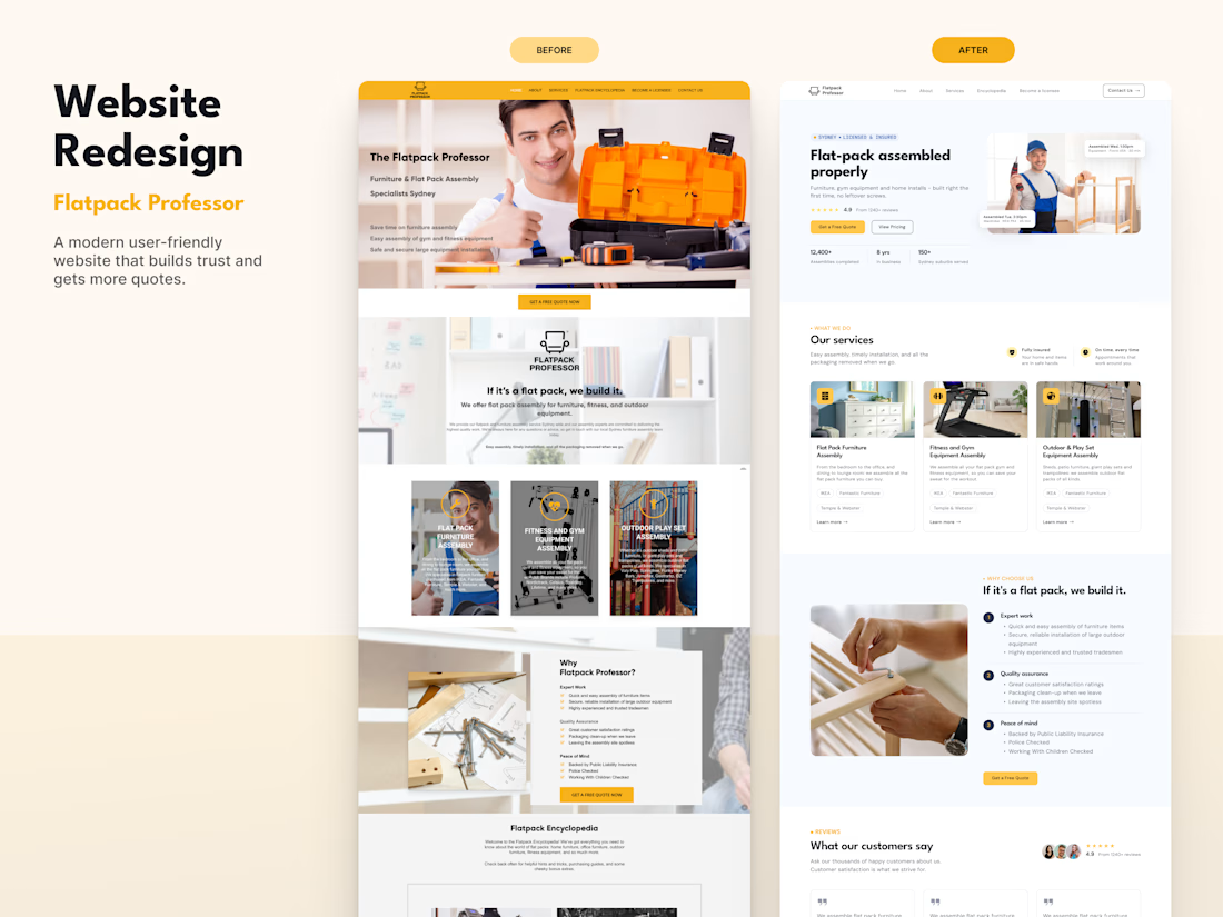
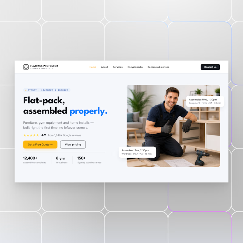
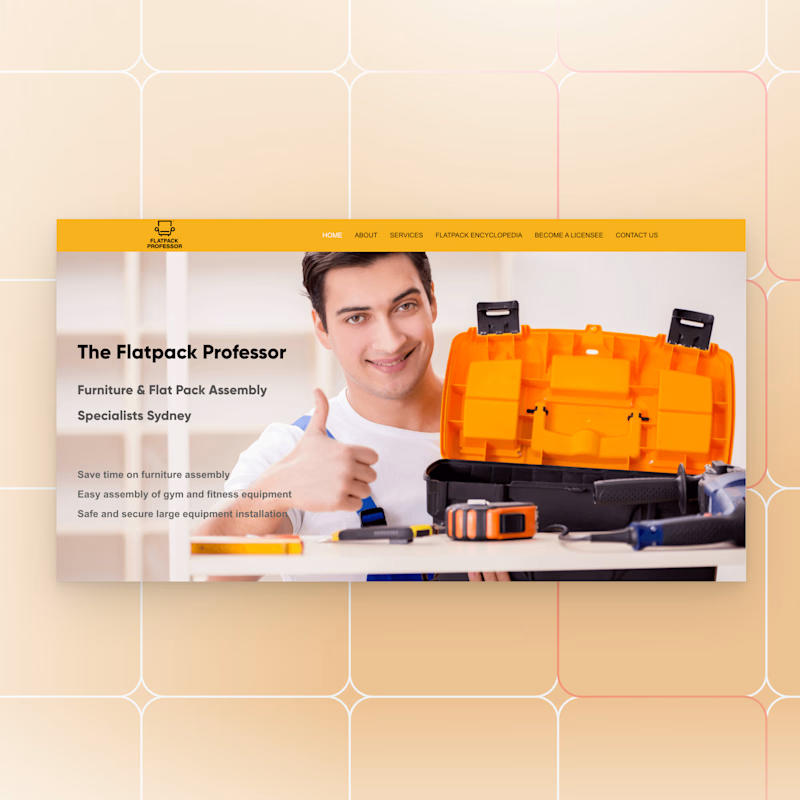
A modern redesign for a flat-pack assembly business focused on one goal: building trust and increasing conversions.
Sometimes a thoughtful redesign is all it takes to make a business look as professional as the service it provides.
Open for new projects!


5 voted
56%
4 voted
44%
9 votes
Closed
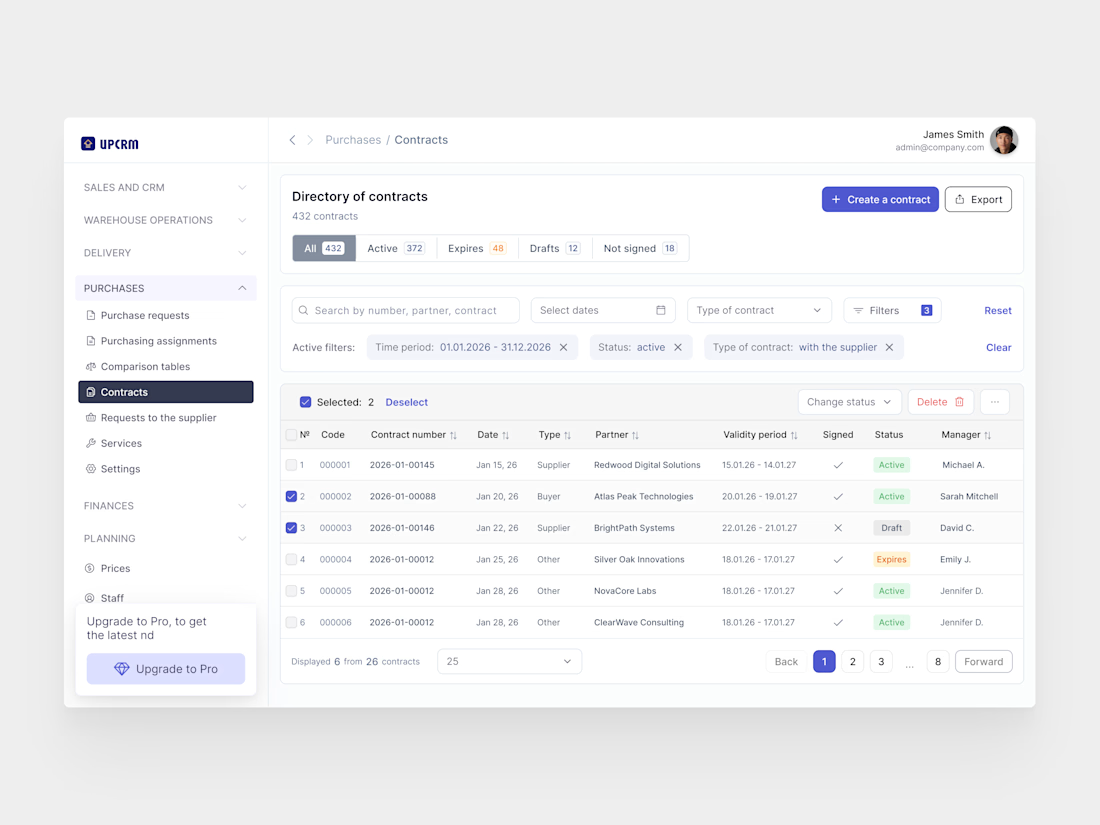
Currently designing a CRM system, and it’s been a great reminder that good UX is about making complexity feel simple. I really enjoy solving these kinds of UX challenges, especially for CRM, ERP, and other data-heavy products ✨