The network for creativity
Join 1.25M professional creatives like you
Connect with clients, get discovered, and run your business 100% commission-free
Creatives on Contra have earned over $150M and we are just getting started
Back to feedPost
Taste Test

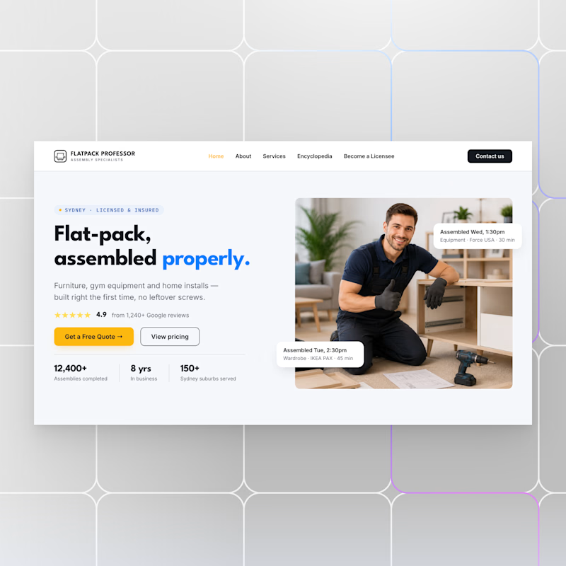
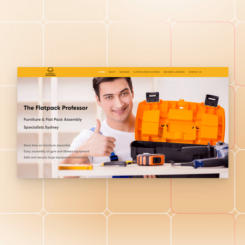
A modern redesign for a flat-pack assembly business focused on one goal: building trust and increasing conversions.
Sometimes a thoughtful redesign is all it takes to make a business look as professional as the service it provides.
Open for new projects!


5 voted
56%
4 voted
44%
9 votes
Closed


looks so much more legit now

The before and after here genuinely reads as more trustworthy on the flat-pack shots alone. Was this driven by actual conversion data, or more of a gut call that the old site wasn't landing?


Option 1 all the way. The cleaner layout reads way more trustworthy and premium.

Looks great! What was the biggest challenge during the redesign?

Option 1 is Strong
The network for creativity
Join 1.25M professional creatives like you
Connect with clients, get discovered, and run your business 100% commission-free
Creatives on Contra have earned over $150M and we are just getting started





Related posts

Winder is a bold brand identity built around a geometric W-inspired symbol, combining sharp angles and forward movement to represent progress, speed, and direction.
The identity uses a striking red and deep burgundy palette, supported by clean typography and a consistent visual system across brand guidelines, digital applications, and product mockups.
Progress in Motion.




Great logo it feels it really has an identity 🎉🎉


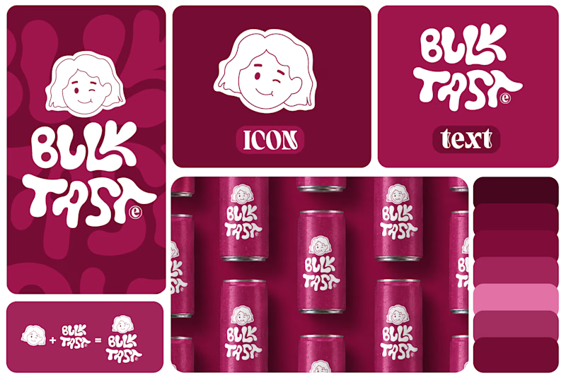
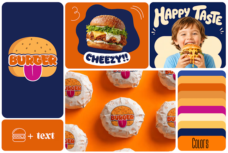
Which One Brand Identity Is looing good? A or B..
7 voted
50%
7 voted
50%
14 votes
Closed

Both look good, but I’d go with B. The colors and playful visuals feel more energetic. 🔥

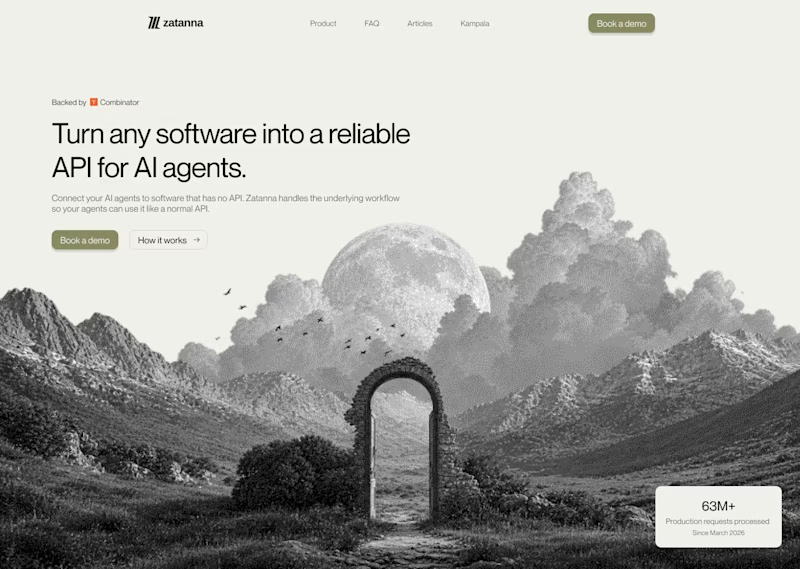
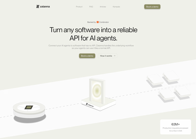
Which one brings more clarity to the hero section?
I was exploring a hero section concept for an AI product and tried two different visual directions.
Visual-led — focuses on explaining the idea through the interface/visual.
Isometric — uses a visual system to represent how the product works.
Both look good, but the real question isn't which one looks better.
Which one helps you understand the product faster?
That's something I always try to think about when designing hero sections — the visual should help explain the product, not just make the page look good.
Which one would you choose?
7 voted
58%
5 voted
42%
12 votes
Closed
The visual direction looks great, but I think Isometric does a better job of explaining the product.