pro
Zanoni Melo
Packaging & Brand Identity Designer | Consumer Products


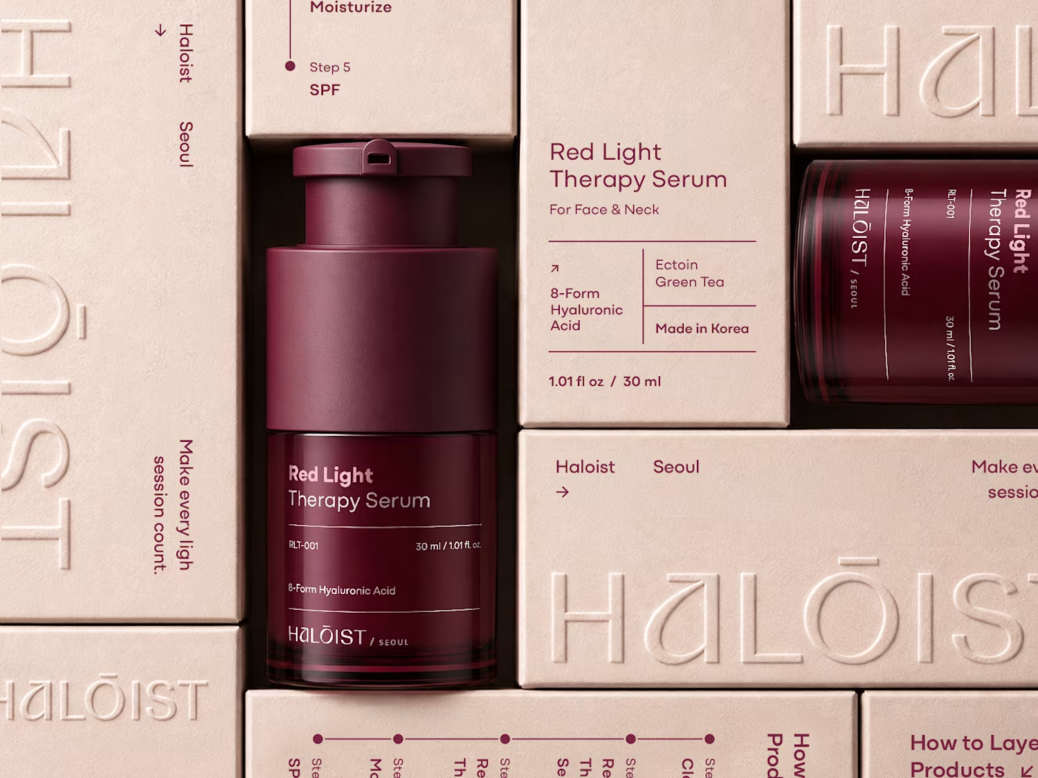

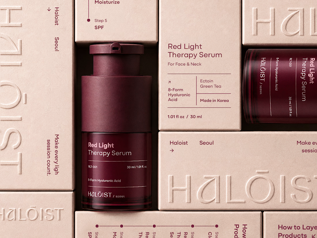
A strong packaging system should make one product distinctive—and the next ten unmistakably part of the same brand.
Haloist pairs a deep burgundy palette with clear information architecture, refined typography, and elevated production finishes. The system is designed to preserve...
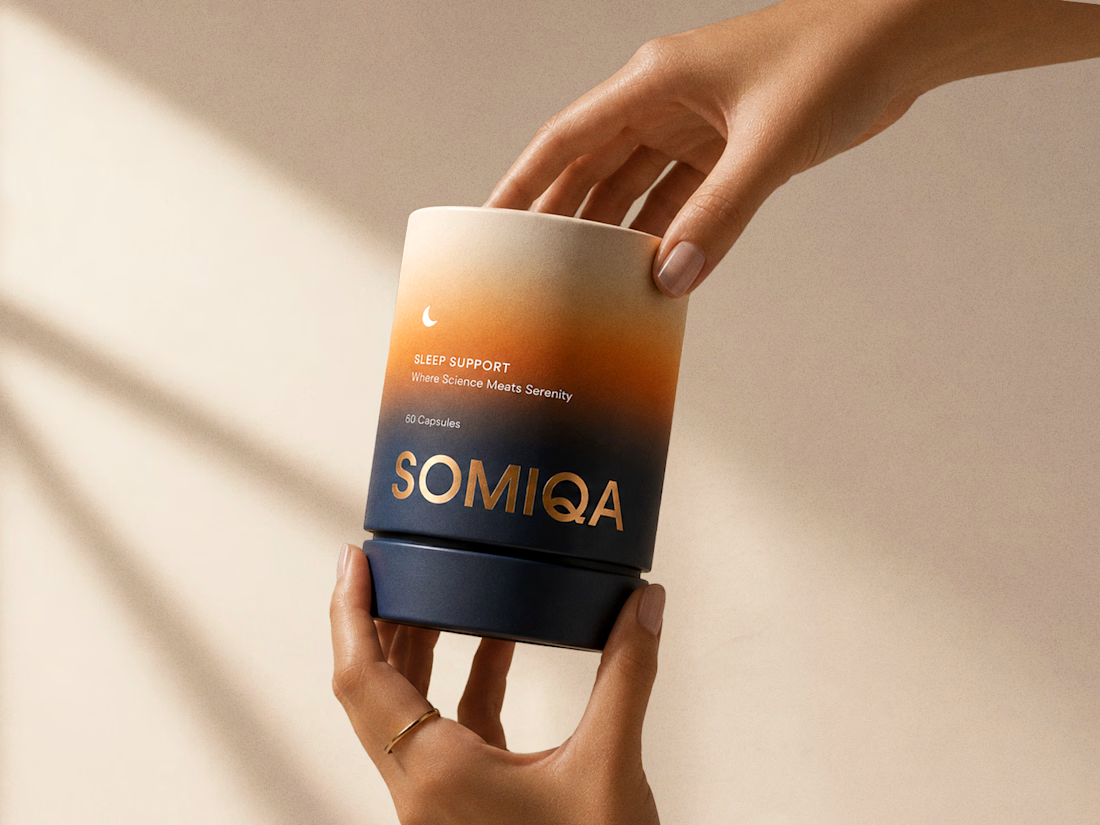
How do you make sleep-support packaging feel scientific and serene at the same time?
Somiqa uses a warm-to-deep gradient, calm typography, and subtle metallic details to translate the product promise into a premium identity—trustworthy enough for wellness, distinctive enough to...
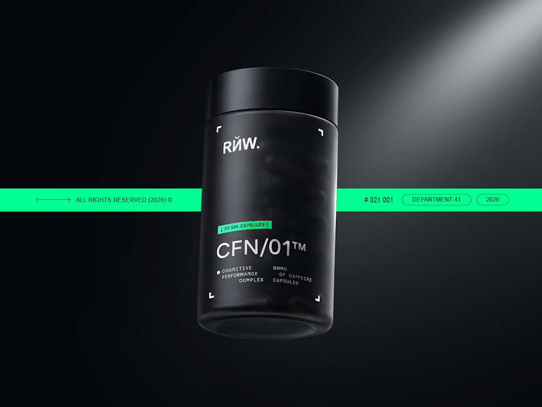
Performance supplements often look either overly clinical or aggressively loud. CFN/01 explores a sharper middle ground.
Minimal typography, a dark material palette, and a high-contrast green accent build a technical identity designed for instant recognition across shelf and...
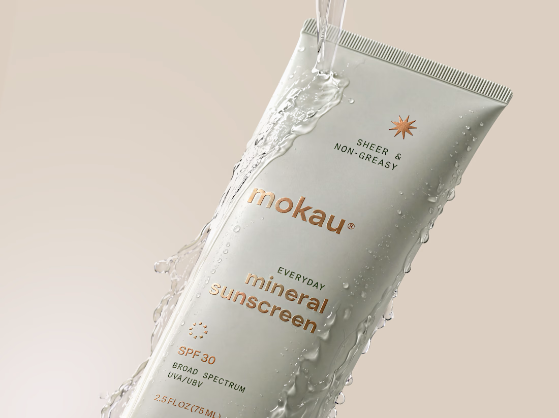
Sunscreen packaging has to do two jobs at once: communicate protection clearly and earn a place in a skincare routine.
For Mokau, I balanced a minimal information hierarchy with a soft neutral palette, fluid product imagery, and distinctive copper details—creating a mineral...
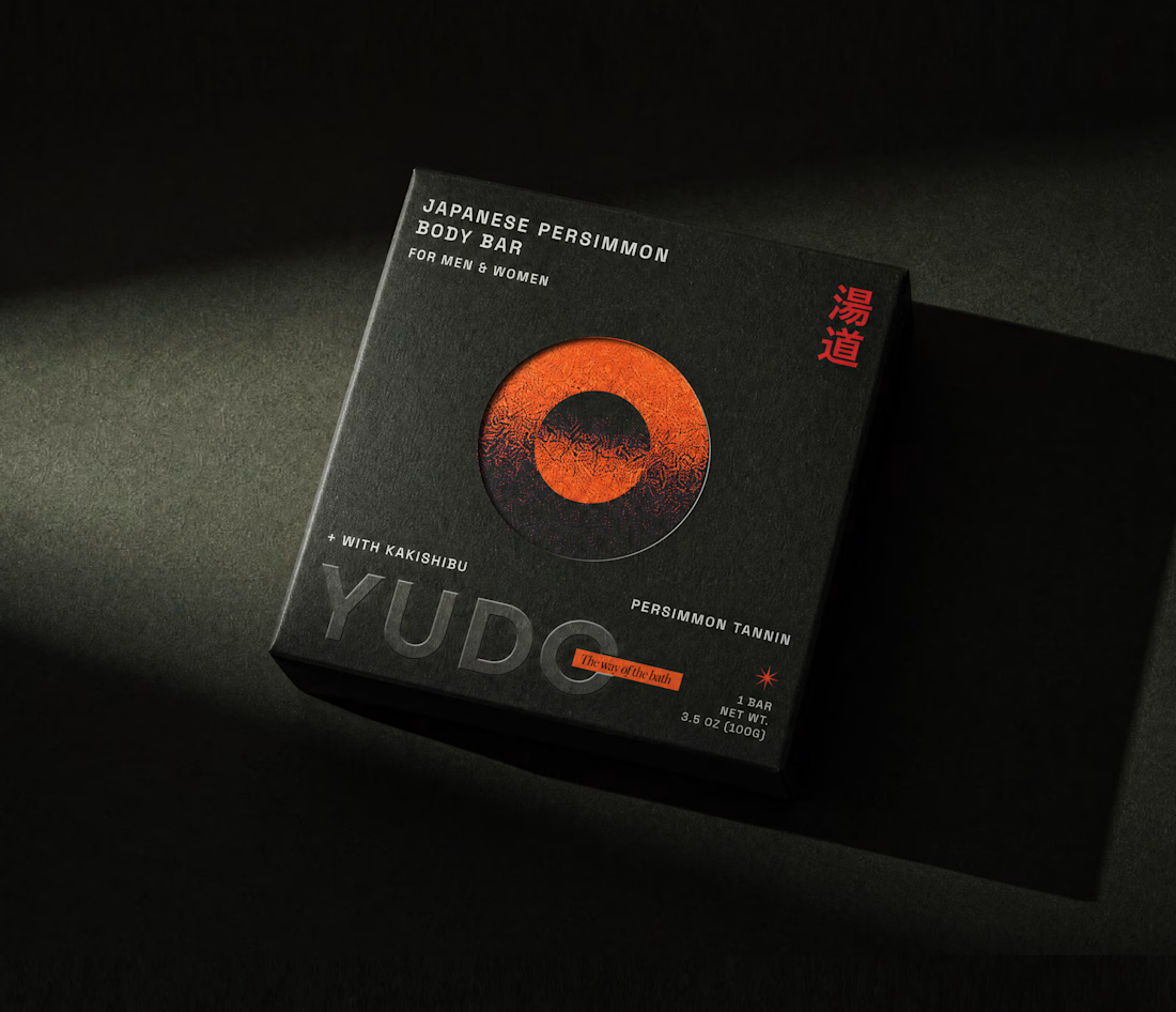
What if everyday body care felt more like a ritual?
Yudo is a Japanese-inspired packaging concept that combines bold typography, tactile dark materials, and carefully selected cultural references. The goal: transform a functional body bar into a distinctive premium experience...