
Lyndsey Yoo
Quiet design with big thoughts



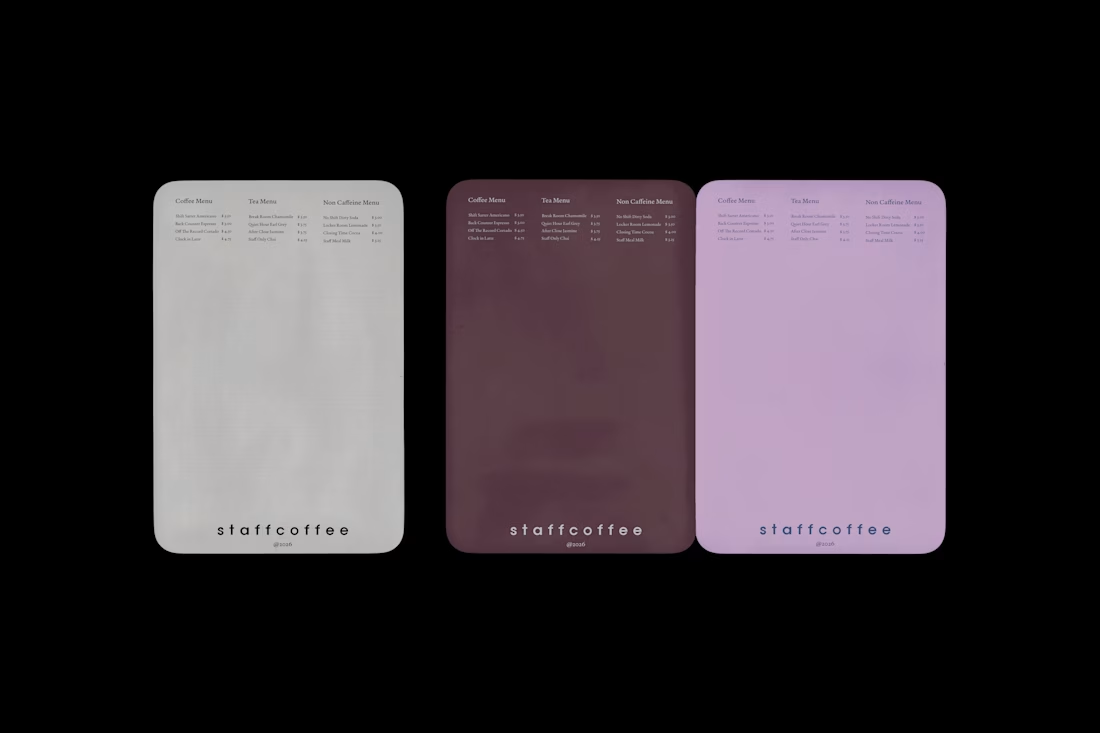
Staff Coffee is a fictional cafe brand built around one idea, the coffee staff actually drink during a shift becomes the only thing sold to customers. This card menu translates that logic into a physical object rather than a promotional print, treating each surface like something found behind the counter. Coffee, tea, and non caffeine selections are named after moments inside a shift, from clocking in to closing time, and the three colorways read as different lighting conditions of the same room rather than seasonal variants. A self directed brand identity project.
1
65
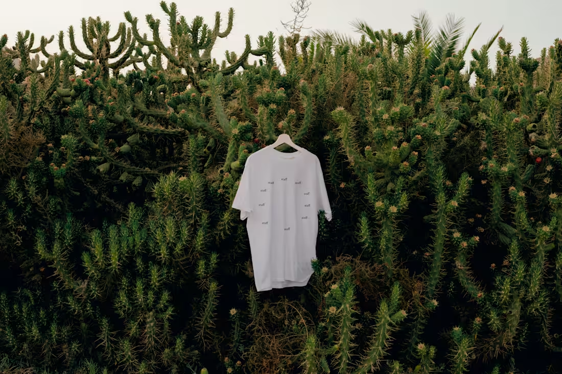
STAFF | Uniform T-Shirt
A uniform built around a single word, repeated. Staff, printed in small, unevenly spaced marks across the shirt. Each one placed at a different angle, mapped loosely to the twelve positions on a clock face.
The idea behind it: hospitality work doesn't run nine to five. It runs in shifts, around the clock, someone always on. Instead of a logo or a shift schedule printed somewhere, the shirt turns that into a pattern. No hands, no numbers, just "staff" standing in for every hour on the dial.
Kept deliberately unbranded: no color, no icon, nothing that reads as merch. Just enough repetition that the word stops being a word and starts reading as a mark you'd recognize across a room.
4
12
399
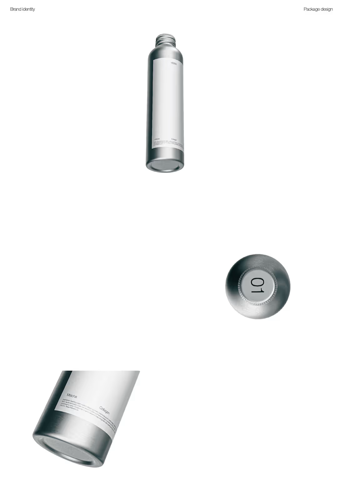
VESSA | Beauty Beverage & Packaging
Vessa was built around the idea that a beauty routine doesn't have to stop at what you put on. It can be something you drink. The brand sits between skincare and functional beverage: collagen dosed and labeled like an active ingredient, not a supplement gimmick.
The visual direction leans on a single material story: brushed aluminum, a small centered label, and typography set like a spec sheet rather than a slogan. Restraint does the branding work here. One wordmark, one accent per flavor, and fine print that reads like an ingredient list because it is one.
Rather than treating the bottle, the label and the range as separate decisions, the identity was built as one system. The numbered cap (01, 02, 03) carries the same logic across all three flavors, so the range reads as a set without needing color blocked packaging or flavor illustrations to tell them apart.
A closer look at the range and the details that hold the system together.
1
155