Philip Gerrits
AI Graphic Designer/Brand Designer
New to Contra
Philip is ready for their next project!
Kasar E-Magazine — a digital magazine UI concept I built using Figma Make.
The name says it all: raw, bold, and a little rough around the edges — intentionally. I wanted to explore an editorial aesthetic that doesn't feel too polished or corporate, something with texture and attitude.
Still learning and experimenting, but this one felt like a fun direction to push into.
Project Link : https://www.figma.com/make/Qbq3U3oQc2lREwvsm5Uoii/KASAR-Editorial-Magazine-Design?t=mPAFzu77EnJmapUp-1
0
8
A small side project born out of boredom and being a keshi fan. 🎶
I wanted to try designing a fanpage concept for him — something clean, moody, and true to his aesthetic. Built the UI using Figma Make, then refined the layout, spacing, and interactions until it felt right.
Nothing fancy, just a fun exercise in design exploration. Sharing it here in case other keshi fans (or fellow designers) enjoy it too.
Project Link : https://www.figma.com/make/LC5tRo2VXl8H11xKYcD2dv/Keshi-Fanpage-Website?t=sf7YrRg0ODTS5sUD-1
0
24
Built a full restaurant website for Ayam Geprek Jawara — an Indonesian grilled chicken brand — entirely with Figma Make, and I want to be honest: the first draft was rough. 😅
Flat layouts. Buttons getting clipped. The navbar burying the hero section. It looked like a default template, not a real product.
But that's where the real work began.
I iterated — pulling in open-source GitHub repos to extend what Figma Make generated: a UI/UX enhancement layer, a taste-driven design system, and Framer Motion for fluid animations. One by one, the bugs got squashed:
✅ Navbar overlap — fixed
✅ Clipped CTAs — fixed
✅ Flat, lifeless layout — gone
What replaced it: a responsive, cinematic restaurant experience with smooth scroll animations, bold typography, and a visual identity that actually feels like food worth ordering.
Figma Make didn't just speed up my workflow — it changed how I think about the gap between a rough idea and a polished UI. The AI handles the scaffolding; you bring the vision.
This is what happens when you don't stop at the first draft.
Project Link : https://www.figma.com/make/XWFECOYe75C3j1yvGOiInD/Restaurant-Website-UI-Design?t=Ny2ovtkWr7bu5USr-1
Community Link : https://www.figma.com/community/file/1649295933022097263/restaurant-website-ui-design
2
1
162
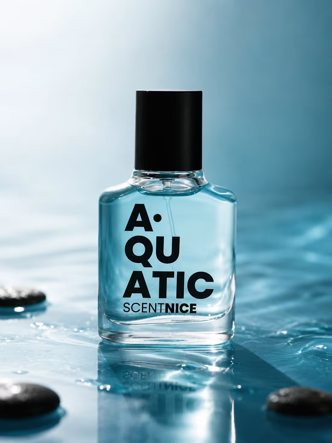
Three bottles. Three worlds. One common thread — the art of scent.
Shelby by Kerésahan Parfumé was made for the quiet ones. The ones who walk into a room and don't say a word, yet somehow leave a mark. Dark, intense, and completely unapologetic.
Sweet Lucifer by Monacruz is for those who live in contradictions. Sweet but dangerous. Classic but bold. A special edition that doesn't follow rules — it writes its own.
Aquatic by ScentNice is the breath of fresh air you didn't know you needed. No noise, no excess — just clean, open, and effortlessly cool.
Three different moods. Three different people. But one thing they all share — a scent worth remembering.
Which one are you wearing today?
0
60
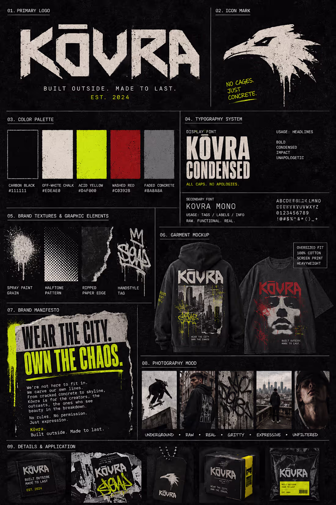
Brand Board Drop ✦ Kōvra
Some brands ask for your attention. Kōvra takes it.
Built from the underground — skate culture, graffiti walls, and the raw energy of the city. Kōvra is a streetwear label that doesn't follow trends, it breaks them. Concrete textures, acid yellow, a distorted wordmark, and a manifesto written like a war cry.
Wear the city. Own the chaos.
Is this your kind of brand? 🔥👇
1
71
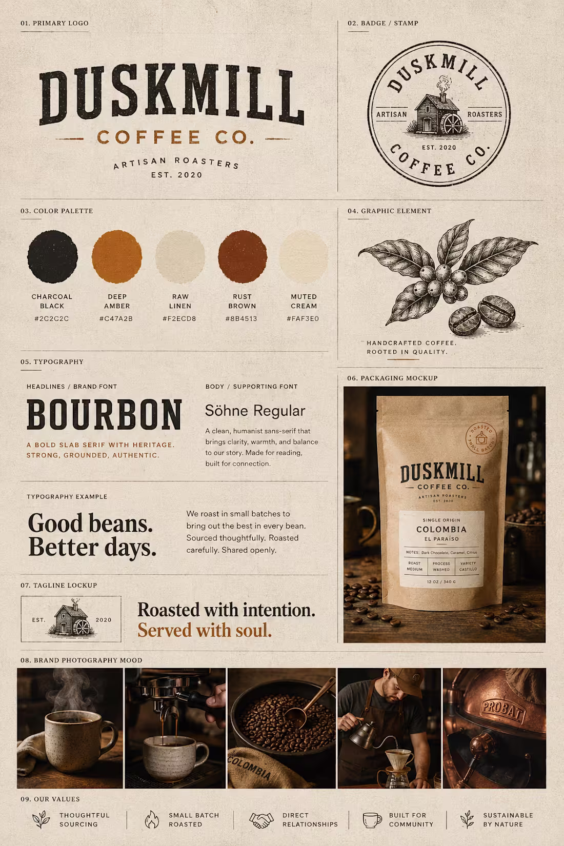
Brand Board Drop ✦ Duskmill Coffee Co.
What if a coffee brand felt like a place you never want to leave?
Duskmill Coffee Co. is an artisan roastery built on craft, intention, and the belief that every cup tells a story. From the vintage slab serif to the kraft paper packaging — every design decision was made to feel handcrafted, warm, and deeply human.
Roasted with intention. Served with soul.
Would you grab a bag? ☕👇
0
62
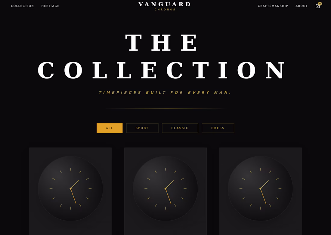
Web Design Practice: Luxury E-Commerce Concept ⌚✨
To practice working with high-end luxury aesthetics, I used MagicPath AI to design a multi-page e-commerce website concept for a fictional watch brand named "Vanguard Chronos." The focus was on combining dark backgrounds with gold accents and classic serif typography to create a premium feel.
Here is a quick look at the interface layouts:
Home Screen: A muted, sophisticated landing page featuring a bold slogan and clear navigation paths.
Collection Screen: A clean product catalog grid with filter tabs for different watch styles.
Watch Detail Screen: A structured e-commerce product page layout showcasing image thumbnails, pricing, description, and action buttons.
About Screen: A dedicated brand section highlighting a bold, central statement over a background texture.
This project was a great way to practice handling editorial typography and learning how to align visual hierarchies for premium brand concepts.
Project Link : https://www.magicpath.ai/projects/407367124005302272?token=645a870557abf2824a91a51ae4aa4882ac3ff2c9b2176d1426a67c7007bdb338
🛠️ Tools Used: MagicPath AI
1
106
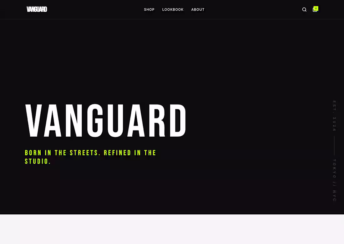
Web Design Practice: Streetwear E-Commerce Concept ⚡🖤
To practice designing for the fashion industry, I used MagicPath AI to experiment with a bold, edgy layout for a fictional streetwear brand called "Vanguard." My goal was to create a high-contrast interface using strong typography and neon accents.
Here is a quick look at the multi-page layout:
Home Screen: A minimalist, dark hero section featuring a striking call-to-action button.
Shop Screen: A clean e-commerce grid displaying product categories like tees, hoodies, and outerwear.
Lookbook Screen: An editorial-focused layout designed to present collection archives and photography details.
About Screen: A bold, text-based section showcasing the brand's tagline and origins.
This project provided great practice in learning how to use high-contrast color choices and compressed fonts to establish a specific brand mood.
Project Link : https://www.magicpath.ai/projects/407360050756202496?token=17eb96c0995b5fc0ae803d4d7fd760017434fbc7015ff58b28c4549f176f6b0b
🛠️ Tools Used: MagicPath AI
1
86
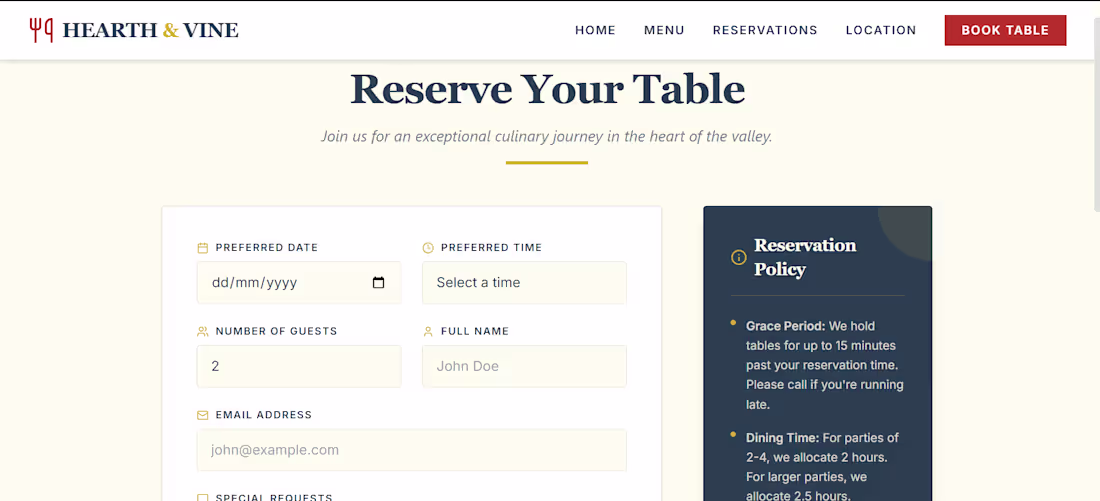
Web Design Practice: Restaurant Website Concept 🍷🍽️
For this project, I wanted to practice designing for the food and hospitality industry. I created a multi-page website concept for a fictional restaurant called "Hearth & Vine," focusing on a warm, elegant, and inviting atmosphere.
Here is the page breakdown:
Home Page: A bold hero section showcasing the restaurant's core mood and call-to-action buttons.
Menu Page: A clean header layout designed to introduce a curated culinary selection.
Reservations Page: An organized, user-friendly form system to handle bookings and reservation policies smoothly.
Location Page: A functional layout featuring essential contact details, hours of operation, and a mock map integration.
This project was great practice for learning how to structure informational layouts and align typography with a specific brand mood.
Project Link : https://www.magicpath.ai/projects/406271106283089920?token=bbc85504b7b7072137d5399ae07c88fc9d8ad84f0988600fd433e69af9c8436e
🛠️ Tools Used: MagicPath AI
2
3
126
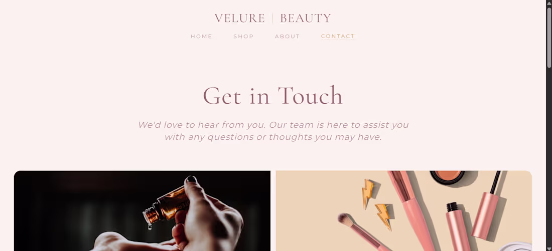
Web Design Practice: Velure Beauty E-Commerce Concept 💻✨
Taking the "Velure Beauty" brand guidelines a step further, I used MagicPath AI to experiment with website layouts and designed a clean, minimal e-commerce concept.
Here is a quick look at the multi-page interface:
Home Page: A soft, welcoming hero section focusing on the brand's core message.
Shop Page: A simple grid layout featuring skincare products, lips, eyes, and sets.
About Page ("Our Story"): A minimal, typography-focused space for the brand's narrative.
Contact Page: A clean layout paired with soft imagery for customer inquiries.
This was a great learning experience in translating a visual identity system into a functional web interface design.
1
60
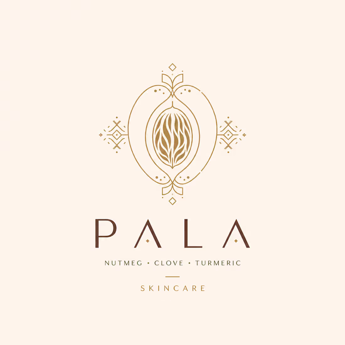
Project Description:
PALA is a conceptual premium natural skincare brand rooted in Maluku, Indonesia — the birthplace of the world's finest spices. The brand harnesses the power of traditional Nusantara ingredients like nutmeg, clove, and turmeric, reimagined through a modern, elegant visual identity. This project was built entirely on Melius as a complete brand kit: logo concept, product packaging, and campaign poster — all unified under one cohesive aesthetic direction.
Project Link : https://app.melius.com/projects/f9703198-5429-46f4-a33a-a911e824b013/canvas/5f7d4d34-ae73-414d-9b4b-8b741972b9f4
Process Steps:
1.Brief — Wrote a full brand brief directly to the Melius Agent, defining brand name, origin story, ingredients, visual direction, and color palette.
2.Agent Execution — Melius Agent autonomously generated three creative assets node by node: logo concept, product packaging, and campaign poster using GPT Image 2.
3.Refinement — Manually adjusted and rewrote prompts for the campaign poster to achieve a higher-quality, editorial aesthetic using GPT Image 2 (High).
4.Canvas Review — Reviewed the full canvas, ensured visual consistency across all assets, and made final tweaks to align with the brand's premium identity.
Feedback on Melius:
Melius completely changed how I approach creative projects. As a visual designer, I'm used to jumping between multiple tools — but Melius let me run an entire brand identity workflow in one canvas. The agent understood my brief immediately and produced coherent assets without me needing to micromanage every step. The node-by-node structure made it easy to spot where to step in and refine. The only thing I'd love to see improved is model selection being more upfront — switching to GPT Image 2 made a massive difference in output quality. Overall, Melius feels like having a creative team inside a single tab.
1
74
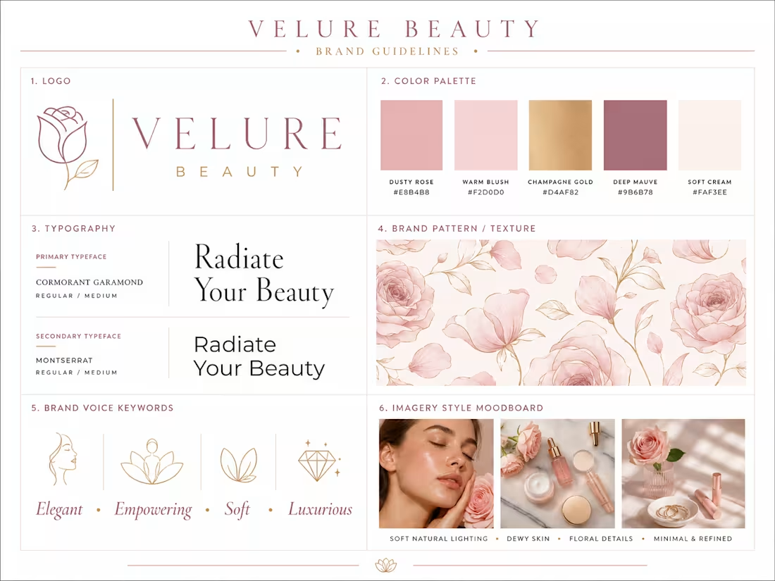
Here is a quick brand guidelines concept I put together for a fictional beauty brand, "Velure Beauty". My goal was to create a cohesive visual identity that feels elegant, soft, and premium.
The guidelines include:
Logo & Typography: Pairing clean lines with Cormorant Garamond and Montserrat.
Color Palette: A soft mix of Dusty Rose, Warm Blush, Champagne Gold, and Deep Mauve.
Brand Elements: Developing a floral pattern and a minimal, dewy imagery style.
This project was a great way for me to practice layout formatting and building a consistent brand voice across different assets.
2
2
236
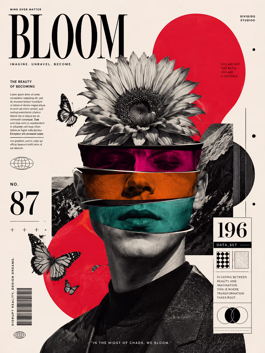
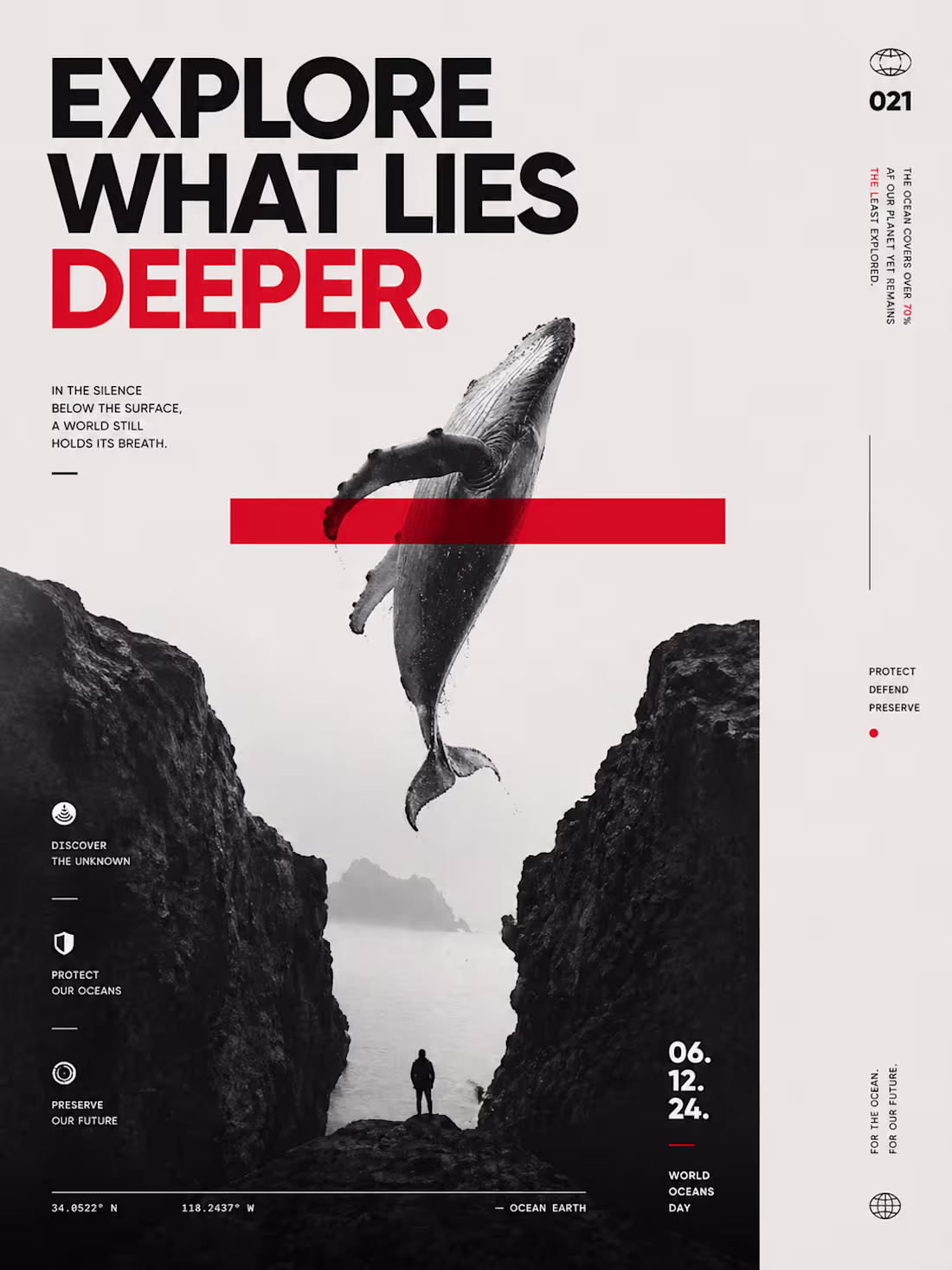
As a junior designer, I love experimenting with new tools to expand my skills. For this series, I used AI to generate the base images and textures, then brought them into design software to fix the layouts, typography, and compositions.
Here are the 4 different aesthetics I tried to capture:
1.DEEP (Minimalism): Clean typography and heavy contrast for a marine theme.
2.JEZEBEL (Dark Victorian): Mixing a vintage portrait look with modern digital grids.
3.GODS (Y2K Aesthetic): Combining a classic statue with gritty social media elements.
4.BLOOM (Surrealism): A colorful, mixed-media slice effect.
This was a great exercise in learning how to blend AI assets with graphic design principles.
2
1
90
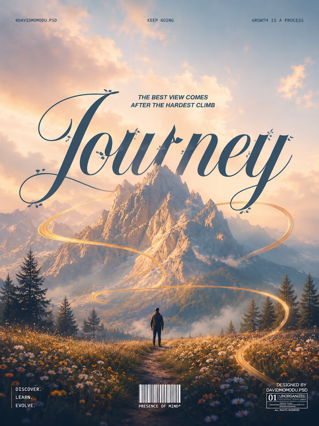
I just created this poster design using AI. It really makes graphic design work so much easier.
0
43
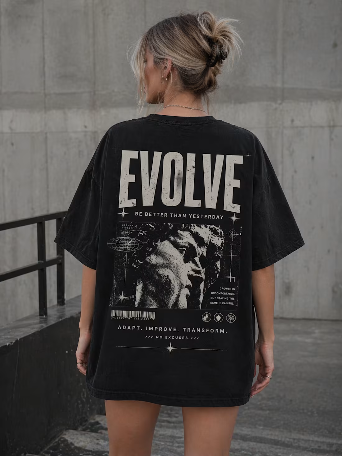
This is a T-shirt design project I created on my own using AI
0
64
This is a poster project I created on my own using AI
0
76
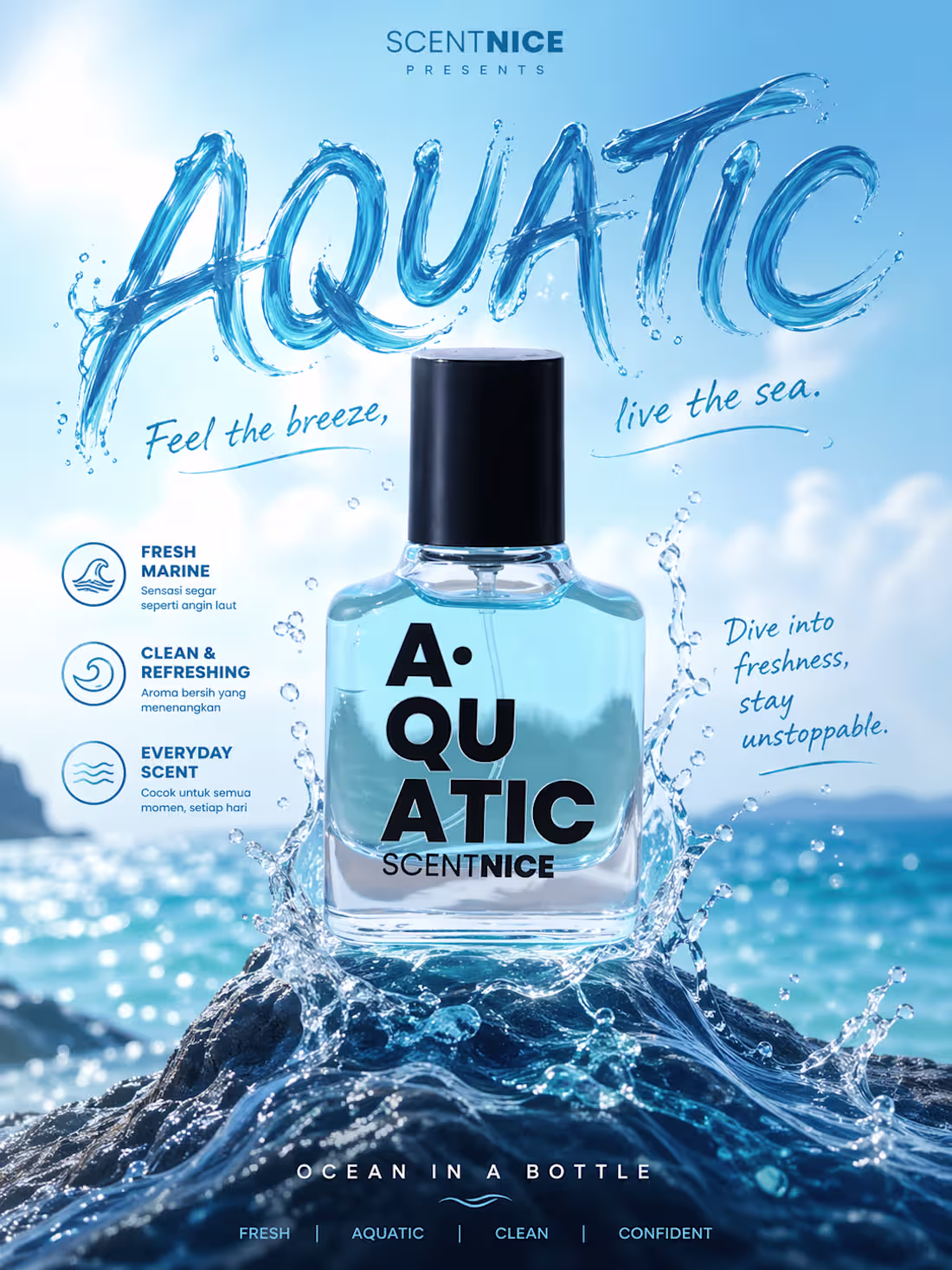
This is a self-managed product promotion post project that I created using AI🚀
0
71