
Philip Gerrits
AI Graphic Designer/Brand Designer
New to Contra
Philip is ready for their next project!

Kasar E-Magazine — a digital magazine UI concept I built using Figma Make.
The name says it all: raw, bold, and a little rough around the edges — intentionally. I wanted to explore an editorial aesthetic that doesn't feel too polished or corporate, something with texture and...
A small side project born out of boredom and being a keshi fan. 🎶
I wanted to try designing a fanpage concept for him — something clean, moody, and true to his aesthetic. Built the UI using Figma Make, then refined the layout, spacing, and interactions until it felt right.
...
Built a full restaurant website for Ayam Geprek Jawara — an Indonesian grilled chicken brand — entirely with Figma Make, and I want to be honest: the first draft was rough. 😅
Flat layouts. Buttons getting clipped. The navbar burying the hero section. It looked like a default...
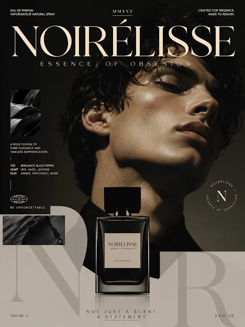
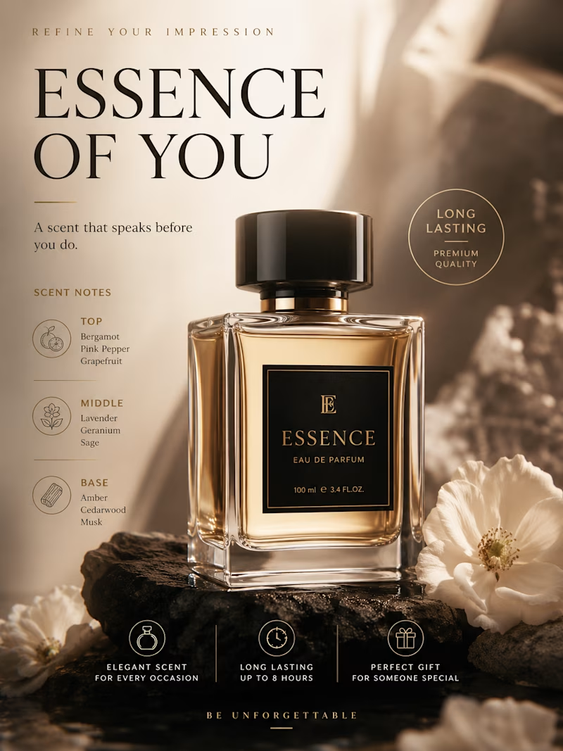
Exploring two contrasting visual moods for a fragrance campaign concept. 📸✨ Dark & Bold vs. Warm & Elegant. I'd love to hear your thoughts! Which aesthetic catches your eye more? Let me know in the Taste Test below. 👇
1 voted
50%
1 voted
50%
2 votes
Closed
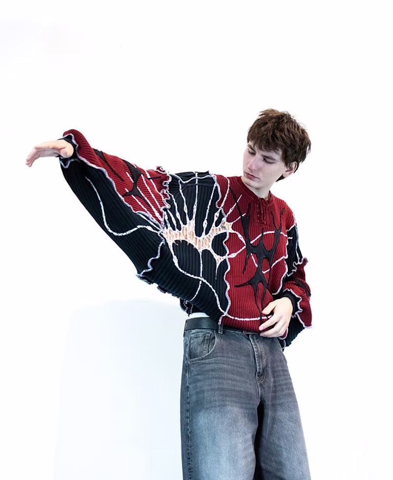
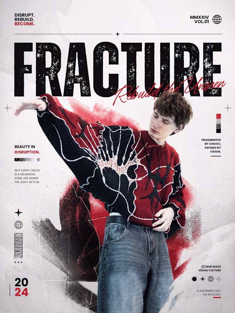
Experimenting with editorial poster design in Canva. Wanted to explore how disruption and structure can coexist — rough textures, bold type, a limited palette.
Open for poster design projects — offering it free for my first client. DM me if you're interested.
1 voted
33%
2 voted
67%
3 votes
Closed