
Vincent Olusola
UI/UX, Framer & B2B Websites | Product Designer
Ready for work
Vincent is ready for their next project!


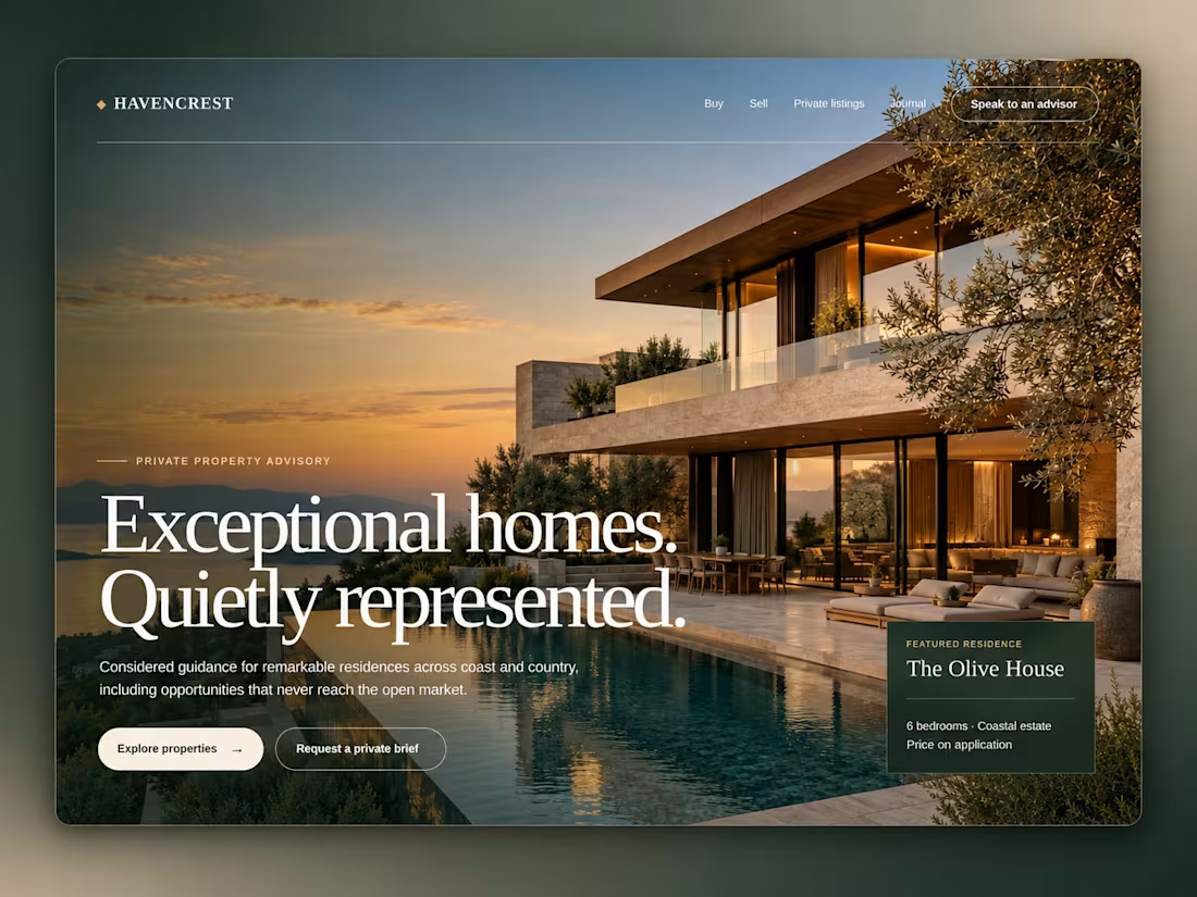
Havencrest | Luxury Real Estate Website 🏡✨
Havencrest is a luxury property website designed around privacy, elegance and personalised advisory.
The goal was to create an experience that feels exclusive without becoming complicated or difficult to navigate.
Special attention was given to:
• immersive property photography that immediately sets the atmosphere
• large editorial typography that gives the brand a premium identity
• a deep forest and warm neutral colour palette
• clear actions for exploring properties or requesting a private brief
• a featured residence card that introduces an exclusive listing naturally
• simple navigation with direct access to a property advisor
• balanced spacing that keeps the experience calm and refined
Does your property brand need a website that feels as premium as the homes you represent? Send me a message and let’s create it.
1
2
35
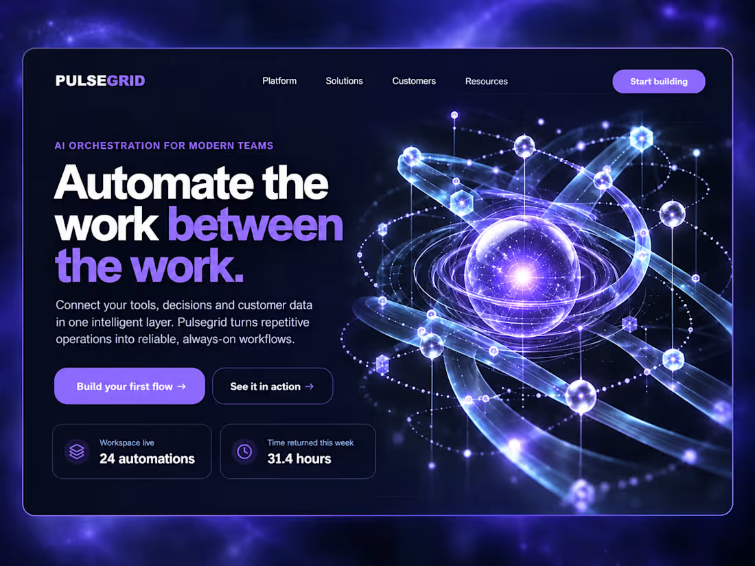
Pulsegrid | AI Workflow SaaS
Pulsegrid is a SaaS hero concept designed to make complex automation feel clear, intelligent and easy to understand.
The design combines a dark interface, glowing data visuals and bold typography to create a strong first impression.
Special attention was given to:
• a violet intelligent-network visual that represents connected systems
• bold messaging built around “Automate the work between the work.”
• visible proof points including 24 automations and 31.4 hours returned
• a clear split between product explanation and visual storytelling
• strong actions for building a first flow or seeing the platform in action
The result is a confident product experience that explains the value quickly while still feeling advanced.
Need a SaaS website that explains a complex product and moves people to try it? Let’s build it.
0
103
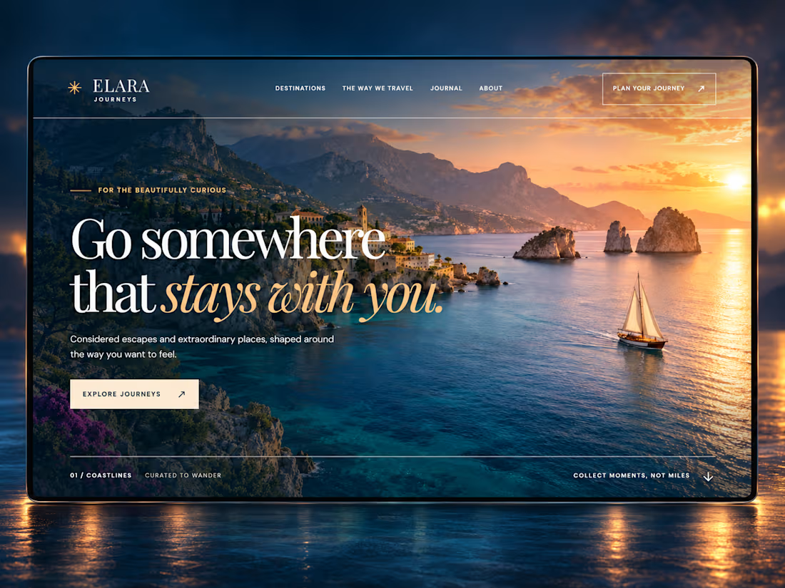
Elara Journeys | Luxury Travel Hero Concept 🌅✈️
Elara Journeys is a luxury travel brand built around meaningful escapes, beautiful destinations and experiences that stay with you.
The design combines a cinematic coastal image, elegant typography and a rich midnight-blue and sunstone palette to create an emotional first impression.
Special attention was given to:
• A destination-focused visual that immediately creates a desire to travel
• A strong headline built around emotion and lasting memories
• Elegant typography that gives the brand a premium editorial feel
• Clear navigation for destinations, travel experiences and the journal
• Simple actions that guide visitors towards exploring or planning a journey
• Warm sunset lighting that adds atmosphere and a sense of adventure
The result is an immersive travel experience that feels personal, refined and unforgettable.
Looking to give your travel, hospitality or lifestyle brand a website that inspires visitors and turns interest into bookings? Let’s create it.
2
145
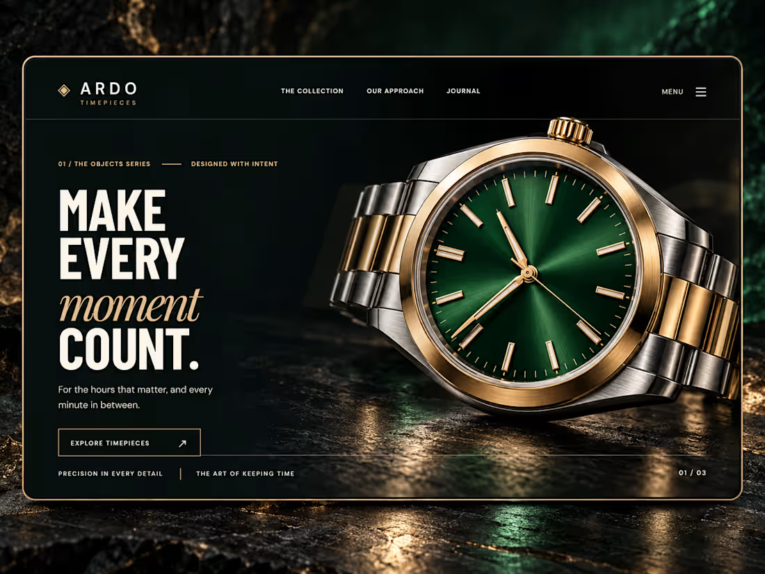
ARDO Timepieces | Luxury Watch Hero Concept ⌚✨
ARDO is a luxury wristwatch brand built around precision, intention and making every moment count.
The design combines a deep onyx background, forest-green watch face and champagne-gold details to create a bold, premium atmosphere.
Special attention was given to:
• A detailed product image that places the watch at the centre
• Strong typography that communicates confidence and precision
• A dark colour palette that makes the metallic details stand out
• Clean navigation that keeps attention on the collection
• A simple action that guides visitors towards the timepieces
• Controlled lighting and reflections that strengthen the luxury feel
The result is a powerful watch experience that feels precise, exclusive and memorable.
Looking to give your luxury or product brand a website that commands attention and drives customers towards your collection? Let’s create it.
2
2
190