
Venkata Vyshnavi Bondalapati
Social Media Management, Content & Marketing
New to Contra
Venkata Vyshnavi is ready for their next project!

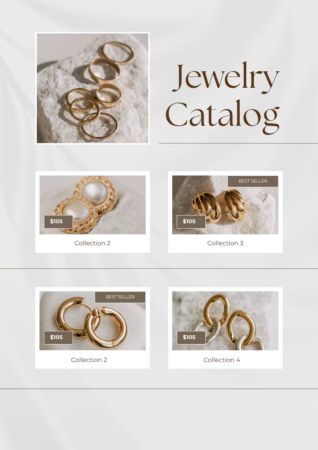
Title: Jewelry Catalog — Product Line Sheet with Best Seller Tags
Description:
Designed a jewelry product catalog for an e-commerce brand, featuring four pieces across different collections (pearl-and-gold earrings, chunky gold hoops, mixed-metal chain earrings, and hoop earrings) with pricing and "Best Seller" callouts. The layout is structured like a lookbook/line sheet — clean, editorial, and built to translate easily into a multi-slide Instagram carousel.
I focused on:
Grid + lookbook hybrid layout — a large hero product shot paired with a 2x2 grid below gives the catalog both an editorial opening and a scannable browsing structure
Best Seller badges — used sparingly on only 2 of 4 products to guide purchase decisions without cluttering every card, a common social-proof technique in e-commerce catalogs
Consistent pricing placement — every product card follows the same price-tag position and style, so the eye can quickly compare across items
Warm, neutral palette — soft beige/stone tones and a serif "Jewelry Catalog" title reinforce a premium, minimal jewelry-brand aesthetic rather than a discount/sale feel
Tools used: Canva
Skills: Catalog Design, Graphic Design, E-commerce Merchandising, Layout & Typography
One-line thumbnail caption: "A premium jewelry lookbook-style catalog with best-seller callouts and pricing."
0
4
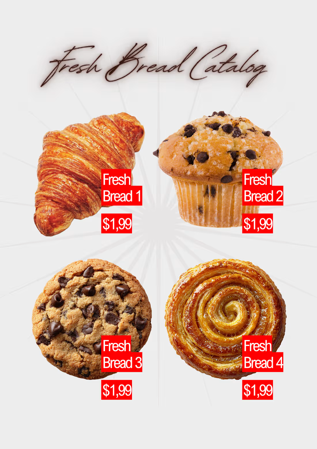
Project 1 — "Freshly Bread Catalog" (editorial overlapping-grid layout)
Title: Fresh Bread Catalog — Product Line Sheet Design
Description:
Designed an A4 product line sheet/catalog for a bakery, showcasing four bread items (braided challah, sesame-poppy wreath bread, and a cinnamon roll) alongside their pricing. The layout uses an editorial, overlapping-image grid rather than a rigid product grid, giving it a more premium, artisanal feel suited to a bakery brand rather than a generic price list.
I focused on:
Editorial grid layout — images are staggered and overlapping rather than boxed, so the page feels styled like a food magazine spread instead of a plain catalog
Clear pricing tags — clean label-and-price boxes placed directly on each product so pricing is easy to scan without cluttering the visuals
Typography contrast — bold condensed headline ("FRESHLY BREAD CATALOG") balanced against clean sans-serif product labels for hierarchy
Subtle background texture — a soft geometric tile pattern behind the images adds depth without competing with the bread photography
Tools used: Canva
Skills: Catalog Design, Graphic Design, Layout & Typography, Product Merchandising
0
8
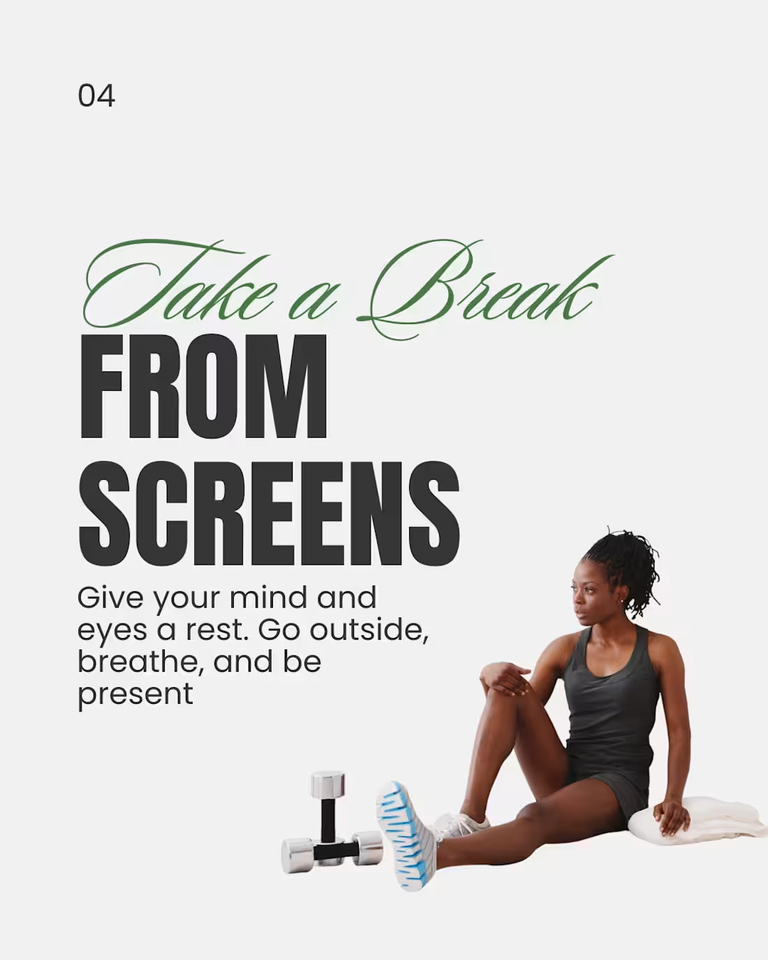
Title: 5 Simple Wellness Tips — Instagram Educational Carousel
Description:
Designed a 4-part educational carousel series sharing simple, actionable wellness habits — hydration, daily movement, screen breaks, and (originally) sleep. The goal was to make everyday wellness advice feel approachable and shareable rather than preachy or overly "fitness-influencer" in tone.
I focused on:
Consistent visual system — each slide follows the same layout (script accent word + bold black headline + short supporting copy), so the series feels cohesive even though each slide stands alone
Numbered progression — slide numbers (02, 03, 04...) encourage swipe-through behavior, which boosts carousel completion rate and reach
Typography-led design — paired an elegant script font with a bold condensed sans-serif to balance a calming wellness feel with strong readability at small (mobile feed) sizes
Minimal, breathable layout — plenty of white space and one clear supporting image per slide keeps each tip easy to absorb in a quick scroll
Tools used: Canva
Skills: Social Media Content Creation, Graphic Design, Content Strategy, Copywriting, Carousel Design
0
14
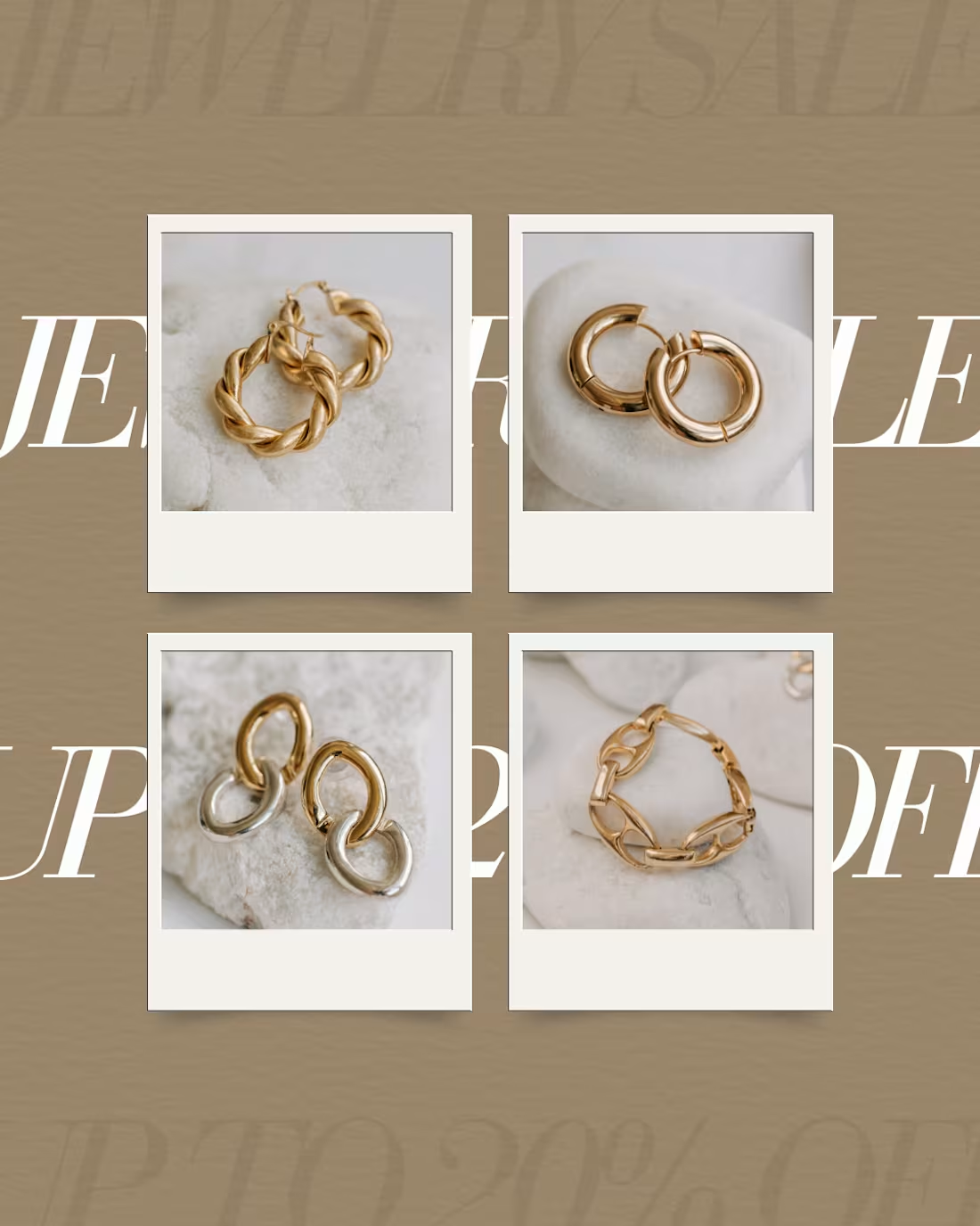
Project 1 — "Modern Jewellery Sale" (elegant editorial banner)
Title: Modern Jewellery Sale — Instagram Promotional Post
Description:
Designed a promotional Instagram post for a jewellery brand's seasonal sale campaign. The goal was to create an editorial, high-end feel — using warm gold tones, elegant serif typography, and callout labels highlighting the "Flat 20% off + Extra Festive Benefits" offer on featured pieces (a pendant necklace and a ring).
I focused on:
Visual hierarchy — bold "MODERN" headline paired with a small "Jewellery Sale" tag to instantly communicate both brand tone and offer
Product callouts — used clean label-and-line pointers so the discount feels informative, not spammy
CTA placement — a clear "Shop Now" button positioned where the eye naturally lands after reading the offer
Brand consistency — soft cream/gold palette to match luxury jewellery positioning rather than a loud discount-sale look
Tools used: Canva
Skills: Social Media Content Creation, Graphic Design, Content Strategy, E-commerce Marketing
0
20