
Vaishnavi Mudlapur
Multidisciplinary Designer | UI/UX, Branding and Biz PPTs!
New to Contra
Vaishnavi is ready for their next project!
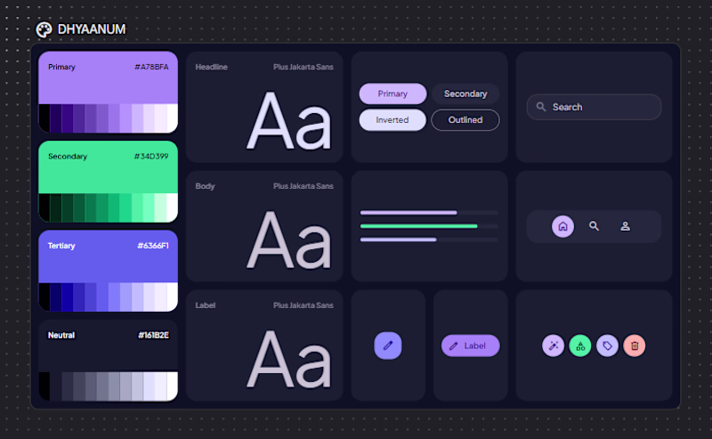
PROJECT NAME:
DHYAANUM: Mental Wellness DASHBOARD created in a span of 48 hours.
Wellness for anxious brains. Track Mood, Sleep, Focus.
Get supportive reminders to drink water, take breaks, go for walks and overall; just be a HEALTHY HUMAN BEING, no matter your...
Hello Contra fam!
Here is my approach to the "Bloom with Bubble" challenge,
The brief: To build an app that incoperates the spring season into business or lifestyle application design! oh and also, how can we forget the quick monetisation angle to it! This was a fun new...
bloomwithbubblewireframedesignArt DirectionAI Application DevelopmentUX DesignBubbleClaudePerplexity
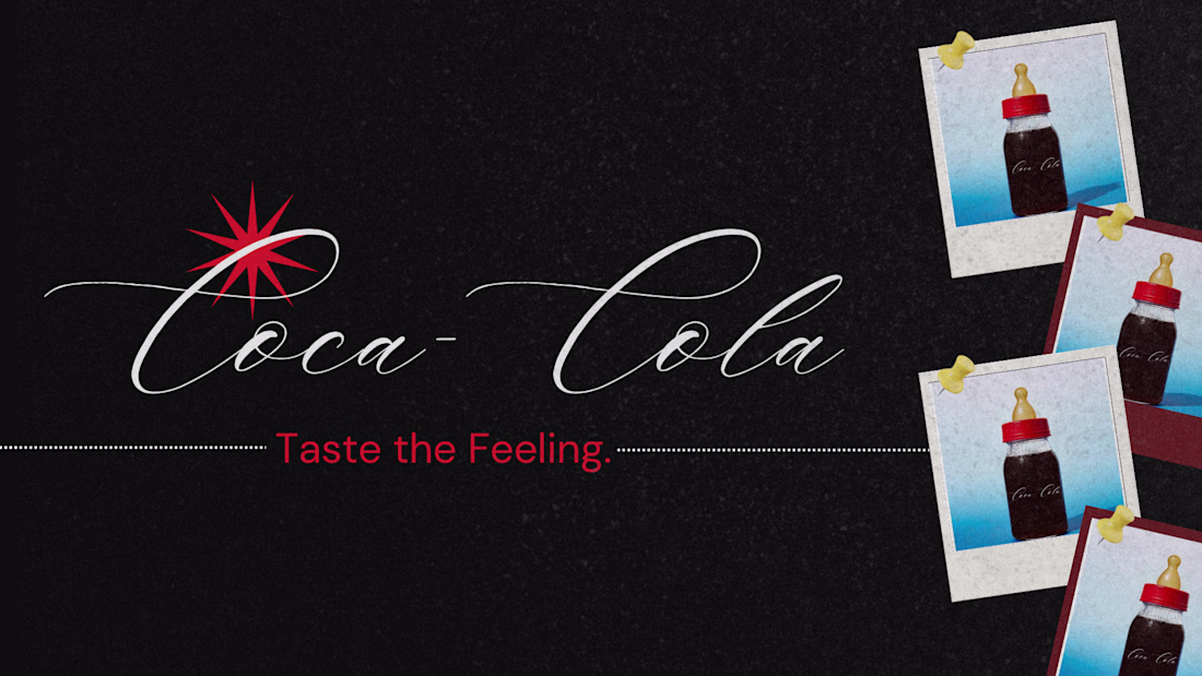
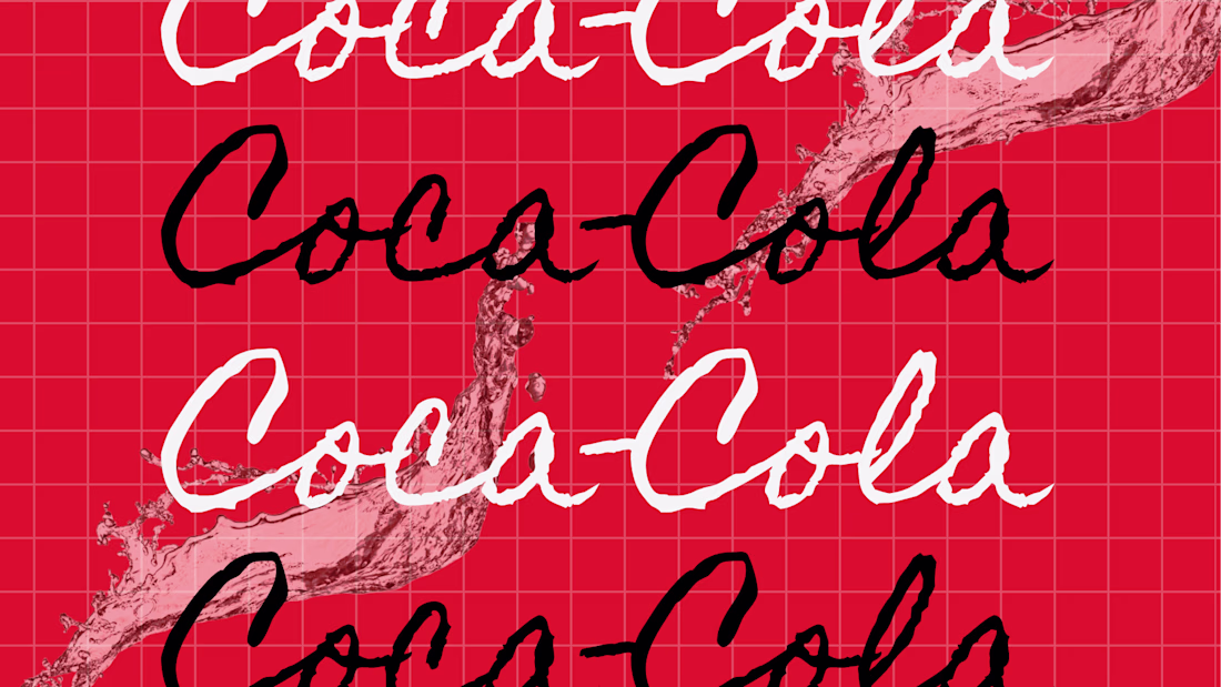
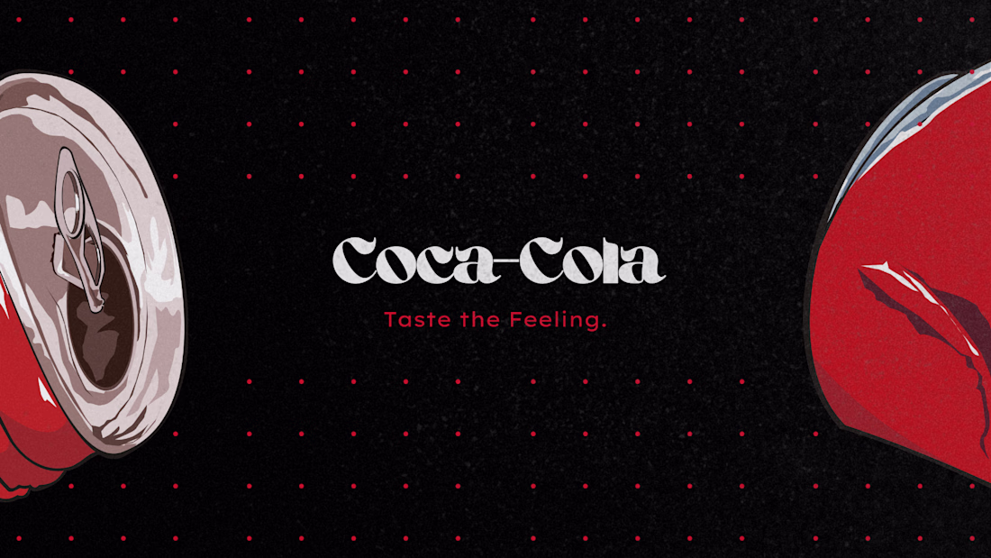
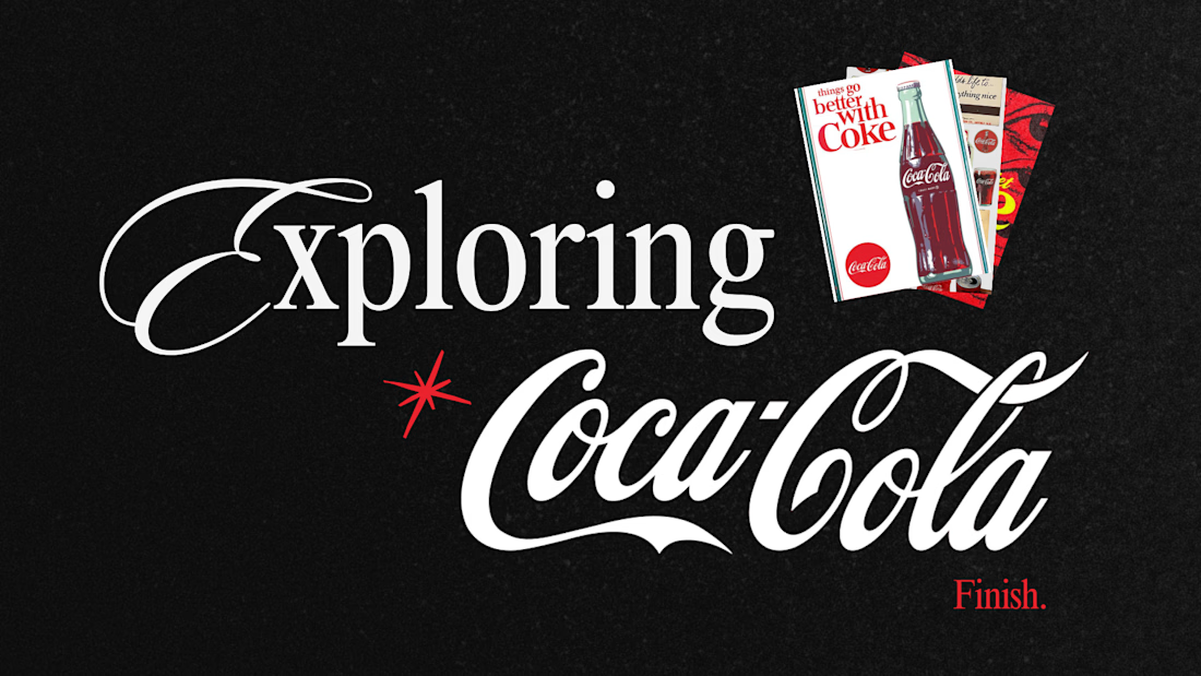
Pt 2 on the Coca-Cola brand explore!
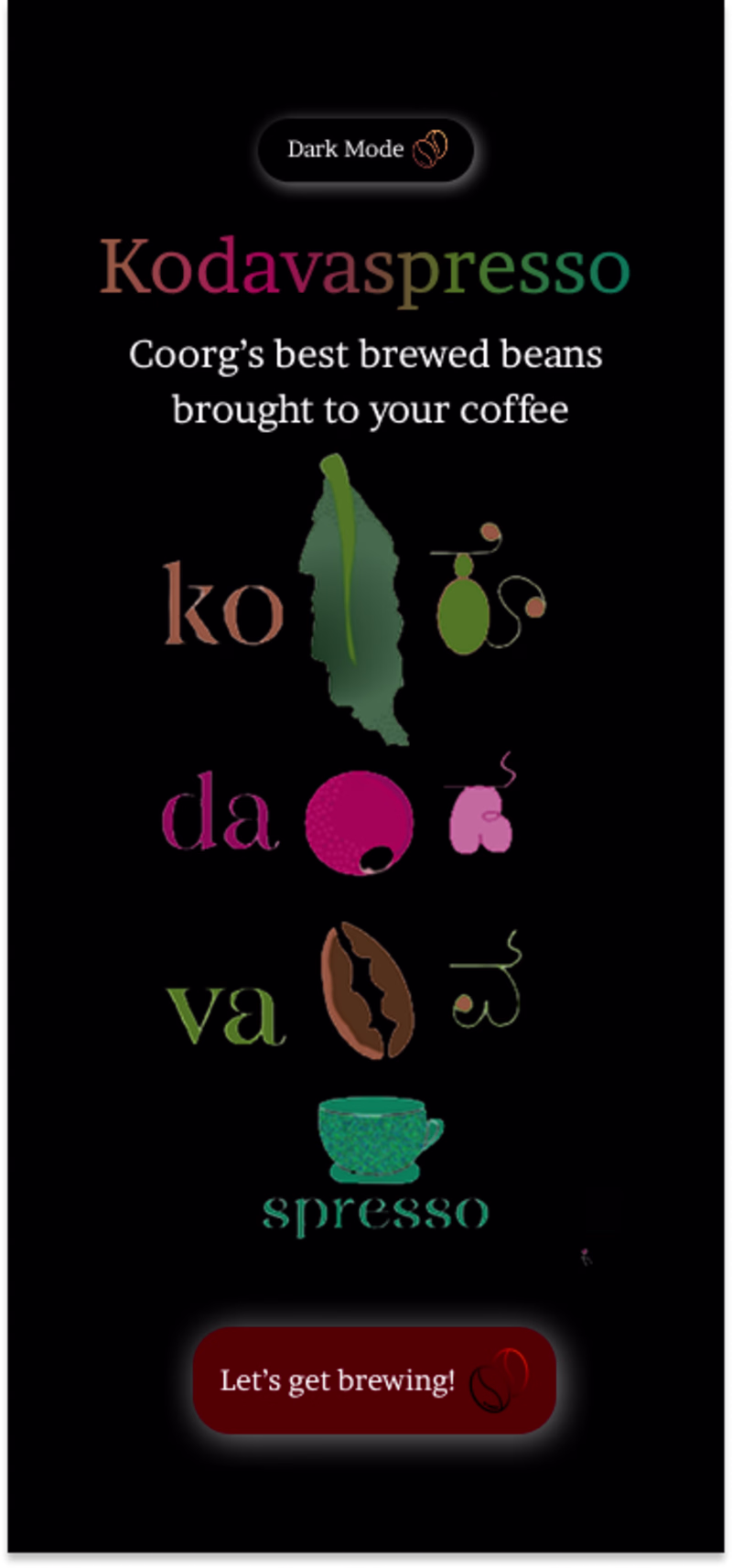
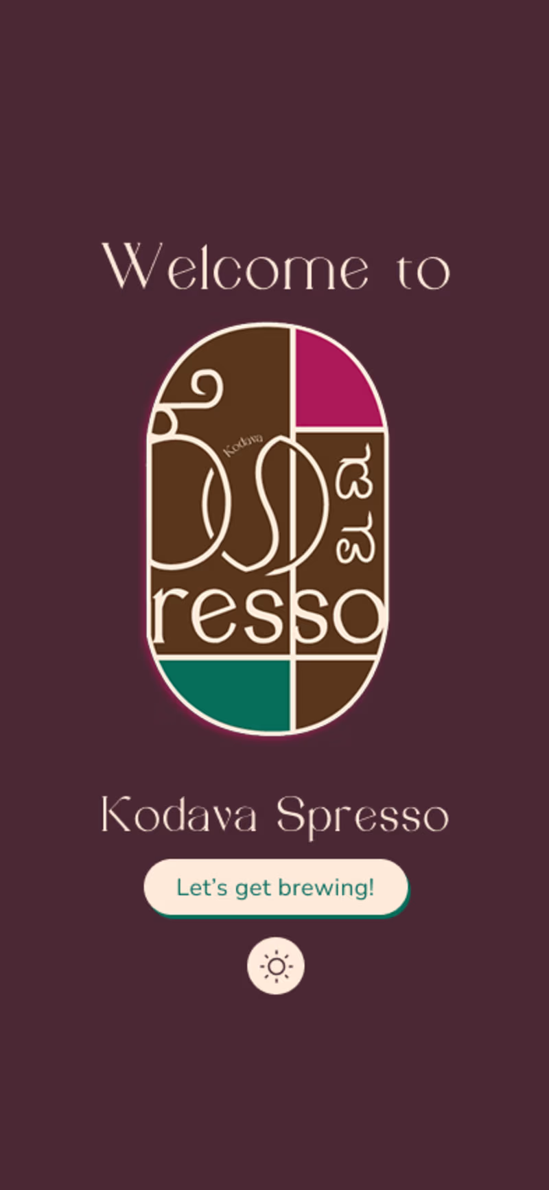
A quick before n after of a coffee app welcome screen redesign. Focused on simplifying the layout, improving hierarchy, and creating a warmer first impression for users. ☕
Which one works better for you, before or after?
1 voted
25%
3 voted
75%
4 votes
Closed