Vaishnavi Mudlapur
Multidisciplinary Designer | UI/UX, Branding and Biz PPTs!
New to Contra
Vaishnavi is ready for their next project!
https://dhyaanumv2.netlify.app/
Check it out guysss🌟
2
1
64
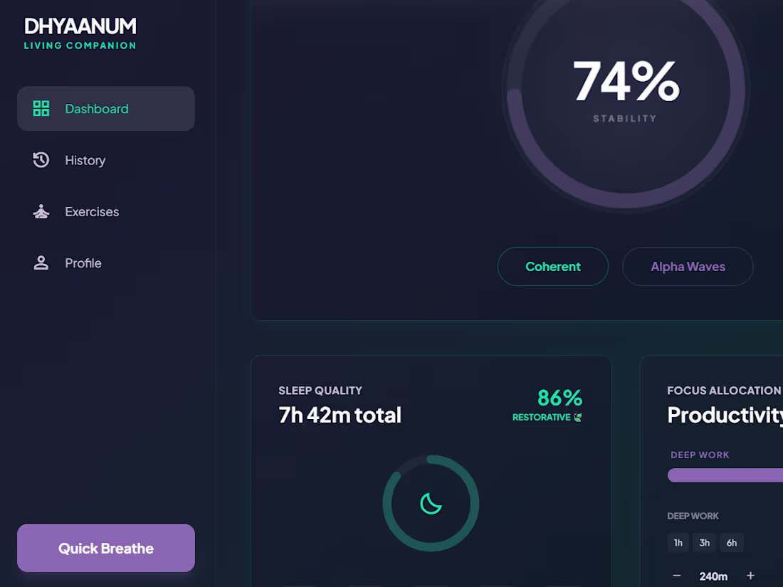
Version 2 of DHYAANUM:
https://dhyaanumv2.netlify.app/
Soo, which one is the Contra fav?! Drop in your comments below😊
0
124
PROJECT NAME:
DHYAANUM: Mental Wellness DASHBOARD created in a span of 48 hours.
Wellness for anxious brains. Track Mood, Sleep, Focus.
Get supportive reminders to drink water, take breaks, go for walks and overall; just be a HEALTHY HUMAN BEING, no matter your circumstances.
Desktop-first, No overwhelm. Only wellness and Dhyaan.
Why DHYAANUM?
Dhyaan (ध्यान) is Sanskrit for "mindful attention."
Your wellness dashboard is literally asking you to bring DHYAAN to:
How you feel (mood)
How you sleep (rest)
How you focus (work)
With Dhyaan (your AI friend) paying attention to your patterns.
Stop autopiloting. Your mental health deserves DHYAAN. ✨
WHAT I BUILT:
1. A focused wellness dashboard that solves Gen-Z mental health anxiety
through simplicity.
2. Three core metrics (1. mood, 2. sleep, 3. focus) + AI companion
3. (Dhyaan) + smart reminders for hydration, breaks, walks + desktop/extension
integration.
WHY I think it is UNIQUE: (what say guyss? 👀 )
1. The "Dhyaan" AI Companion (supportive, contextual messages to keep you running for the day, energized no matter what.)
2. Guided Inputs (preset buttons which is better than confusing sliders, providing accuracy.)
3. Desktop-Optimized (sidebar always visible, keyboard-first)
4. Daily Habit Material (smart reminders + streaks + MAX. 3-second logging)
HOW I USED GOOGLE STITCH:
Streamed the entire UI from design prompts, refined animations with AI edits,
deployed directly to Netlify. No code needed for the creative part!
LIVE LINK:
https://dhyaanum.netlify.app/:
KEY FEATURES:
1. Quick mood/sleep/focus tracking, LATEST PULSE TRACKER WHEN YOU OPEN IT!
2. "Dhyaan AI" companion with contextual support at all times!
Can be altered to your liking, anytime!
3. Smart reminders (water, breaks, walks, sleep, everything important for a real human, haha.)
4. 7-day trend visualization
5. Streak counter (habit reinforcement, everydayyy!)
HOW I USED THE NEW FEATURES ON STITCH:
Loved the streaming generation; watching the UI build was the "oh my gah moment" for me!
In-place AI edits made refinement frictionless and so smooth overall.
Export to Netlify was instant and easy to implement, specially for a person like me who is a comparatively slow learner than the usual crowd, loved it!
Have also shared a few iterations and streaming below, enjoy!
Drop in your thoughts in the comments :)
7
3
268
Hello Contra fam!
Here is my approach to the "Bloom with Bubble" challenge,
The brief: To build an app that incoperates the spring season into business or lifestyle application design! oh and also, how can we forget the quick monetisation angle to it! This was a fun new challenge I decided to get my brain digging into and expand my knowledge about no code app developing and designing.
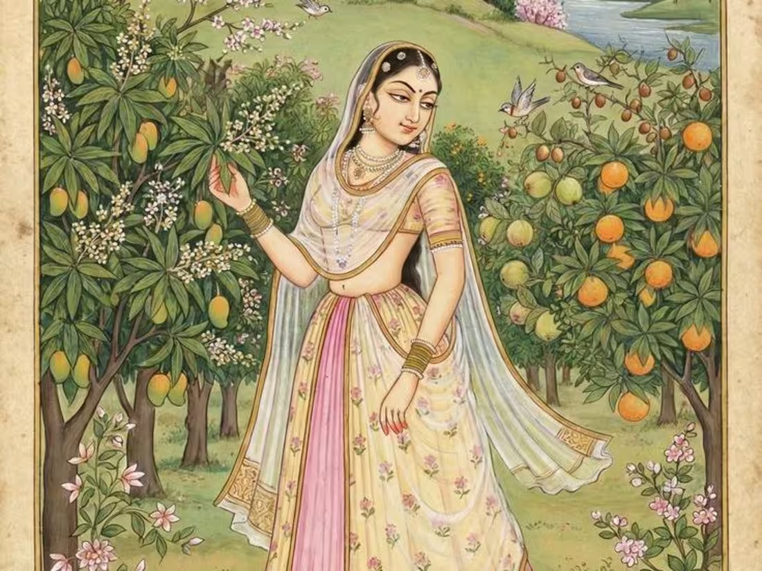
My submission: "VASANTI, your spring sculpted your way."
What it is: A luxury lifestyle mobile app that connects Gen-Z with classical Indian art forms through a modern, fashionable lens.
How it works: Discover classical art by aesthetic (Tanjore, Warli, Chikankari, Pattachitra etc.)
Get paired with a complementary food/beverage (e.g., Tanjore painting → South Indian filter coffee)
Shop directly from verified artisans
Join experiences (workshops, gallery pop-ups, meetups with artists)
Share & earn as a community
Target Audience: Gen-Z (16-25) in Bangalore who care about culture, consciousness, and community.
Core Delivery to target audience:
"Find your aesthetic. Live it. Appreciate and support the art, artisan and culture behind it."
Link to preview: https://vaishnavimudlapur-45165.bubbleapps.io/version-test/api/1.1/mobile/preview?debug_mode=true&preview_view=Home
Please note, this is my first time working my way through this application so did whatever was in my capacity! was real fun to be a part of it!
Thanks😊
2
3
324
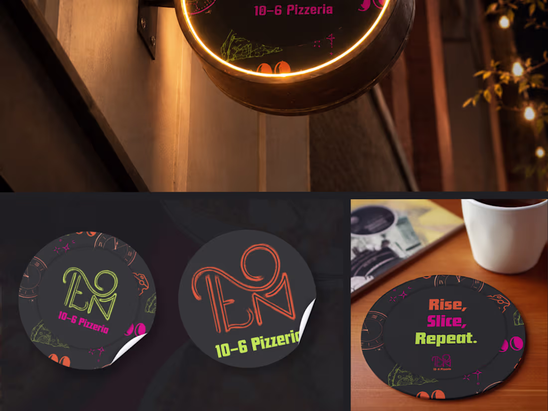
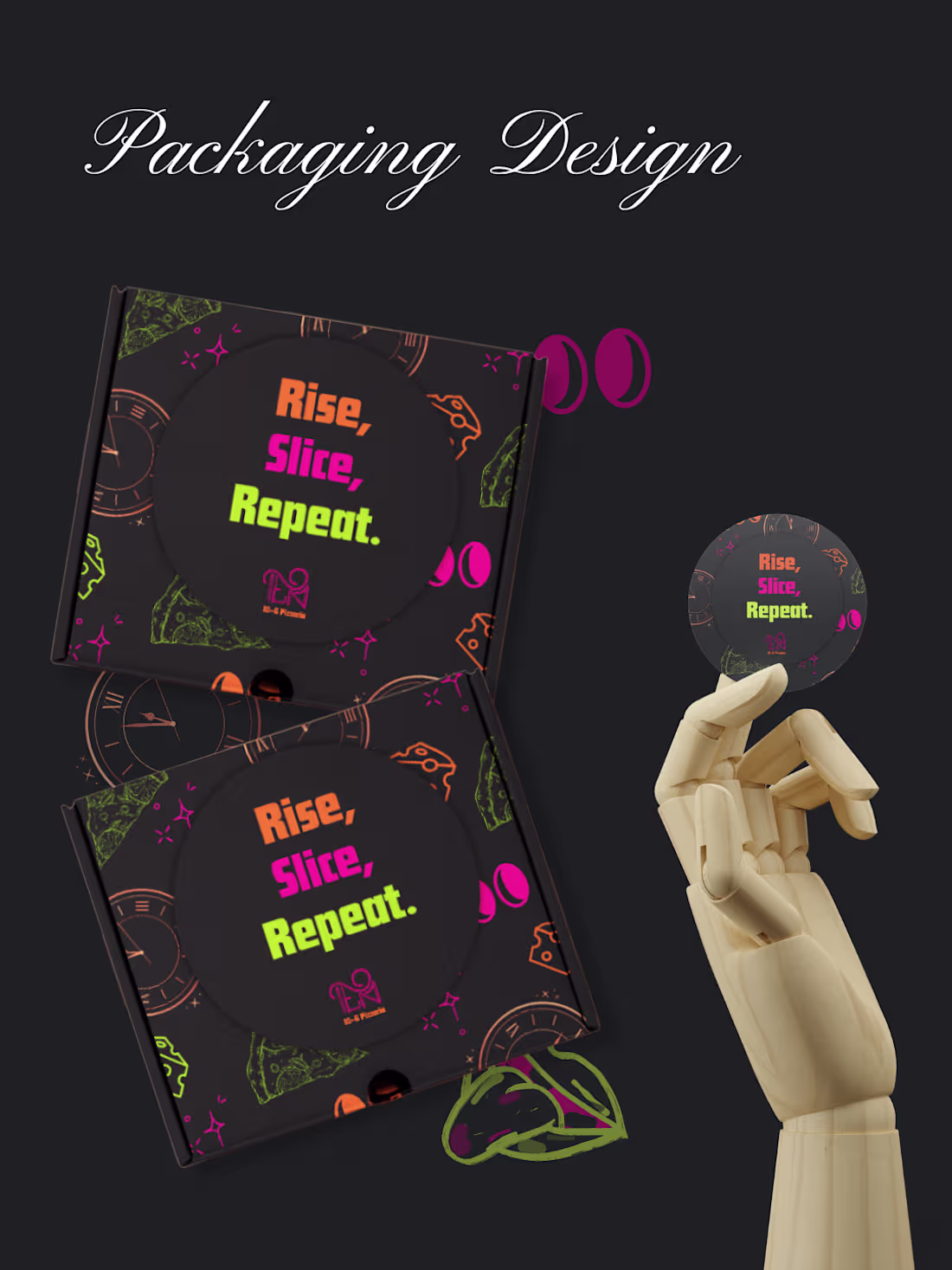
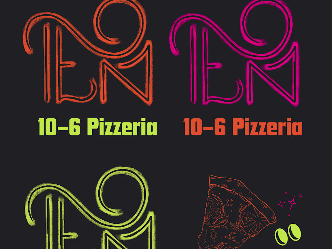
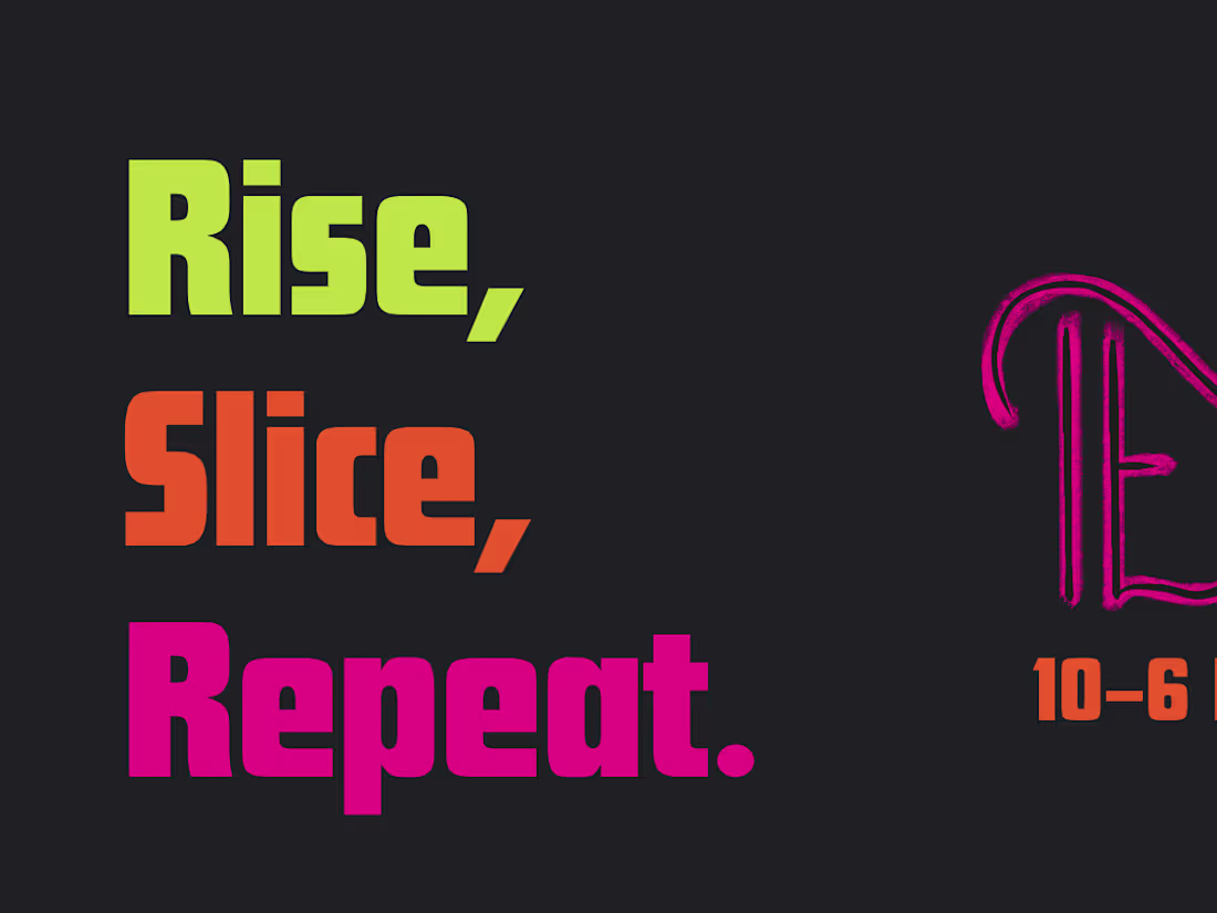
Pt. 4 AND THE FINALLL, I promise! and that is the end of my contribution to this brief for creating a late night brand language for a pizza stop.
Don't forget to drop in your thoughts!
(Along side a mid night pizza n a chilled beer maybe🍕🍻? )
0
131
Pt 3 of 10-6 Pizzeria.
Check out my feed to see how I reached so far on this process!
0
127
Pt 2 of 10-6 Pizzeria
0
120
Hello creative freaks! Long time, haha!
I have come here to present something I recently worked on to boost my creativity and challenge myself than the usual. So one can say that I took a random brief I got on instagram PRETTTTY seriously and made it a "weekend" fun activity for me to be indulged in.
The brief was: "10–6 Pizza" is a late-night pizza brand built for people who live on the opposite schedule. Designed for night shift workers, late-night creatives, and anyone awake while the rest of the world sleeps
Alongside its core pizza offering, the brand also provides thoughtful, healthier sides, giving customers lighter, more balanced options during long shifts.
Anddd, here was my take on the brief!
Loud, banging, basically inviting all the nigh owls to fuel up for the hours coming ahead of them! No lousy worked allowed, only pumped up, well fed and well hydrated workers moving forward...
Check out the whole design in my feed and do drop in your comments on what you all think on this approach I took to create 10-6 Pizzeria's overall brand and visual identity design.
0
100
Psst, looking for a designer? That's me! I'm Vaishnavi and I'm currently open to freelance projects in logo and brand identity, business presentations, and UI design. I obsess over the right details so you don't have to. Drop me a message, let's make something worth looking at!
Yours Truly🫰
0
114
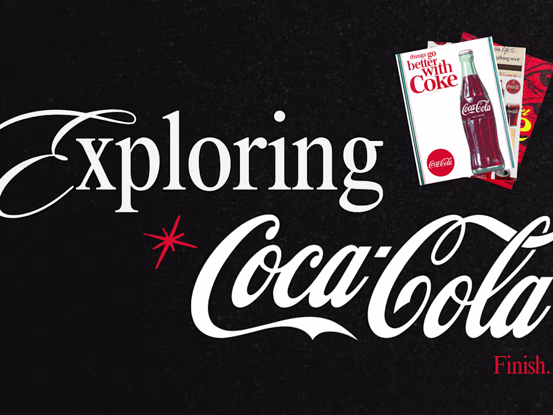
Pt 2 on the Coca-Cola brand explore!
2
144
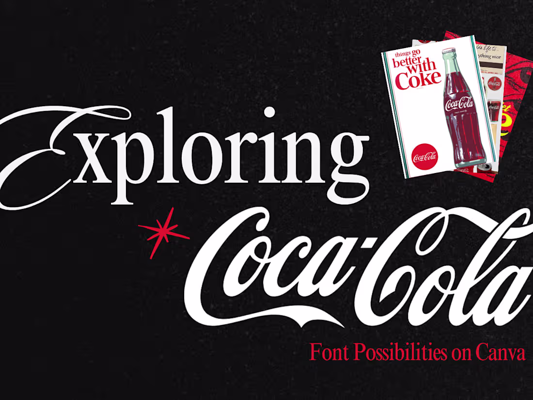
Over the weekend, I spent some time exploring the newly updated Canva to see how much it has evolved over the past year. Out of curiosity, I tried redesigning the Coca‑Cola logo using only this simple yet surprisingly powerful tool, just to see how far it could go.
What started as a quick exploration turned into an interesting exercise in reinterpreting a globally recognized identity while still respecting its character. It was also a reminder that sometimes the tool matters less than the thinking behind the design.
Curious to know what you think of this ideation outcome!🧠
0
107
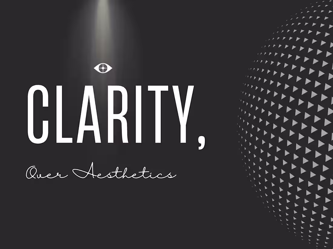
Design Tippani of the day Pt 5: One small habit that improves my UI design process.
Before finalizing any screen, I ask one question:
“If a user saw this for the first time, would they know what to do next?”
Clarity almost always wins over aesthetics.
1
109
A quick before n after of a coffee app welcome screen redesign. Focused on simplifying the layout, improving hierarchy, and creating a warmer first impression for users. ☕
Which one works better for you, before or after?
6
3
162
Design Tippani of the Day Pt 4:
Users don’t read interfaces.
They scan them.
Design for scanning, not reading.
0
109
Tippani of the Day Pt. 3:
No design tip today, just a quick question. If a coffee brand wanted to stay rooted in its rich cultural heritage while still feeling relevant today, which logo would you choose and why?
Drop your votes below. Happy Brewin n Sippin!☕
2
4
187
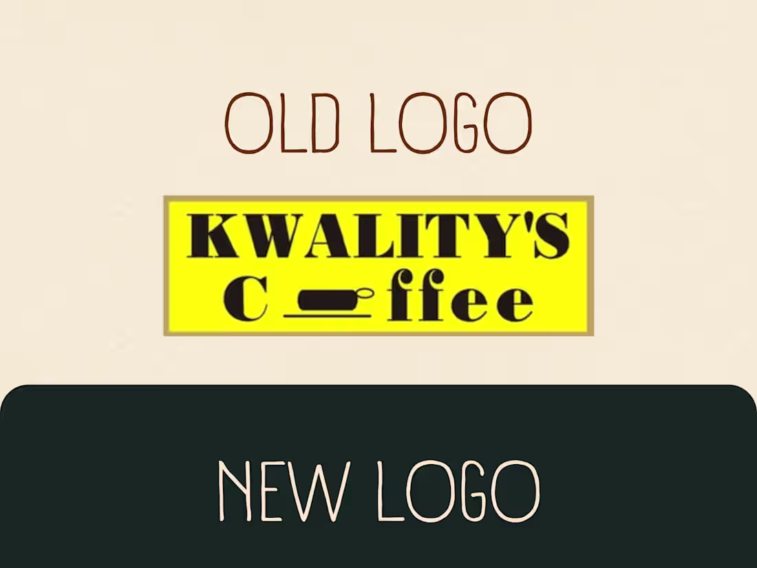
Part 2: More Ideations and *Drumrolls* Final Logo Reveal!
After exploring multiple concepts, we refined the direction to create a logo that balances heritage with modern simplicity for Kwality’s Coffee.
Sharing the final directions here. Which one do you like the most and why? I’d love to hear your thoughts.
1
1
137
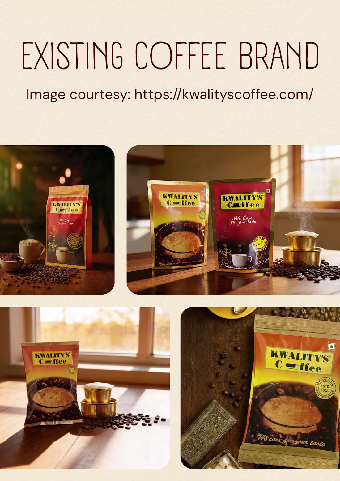
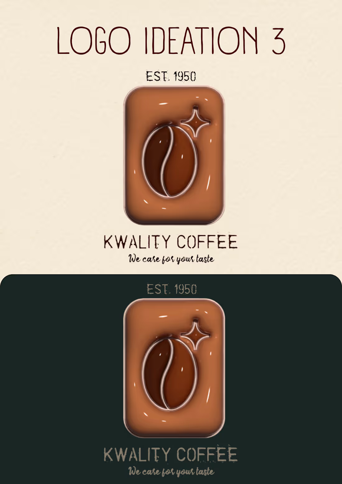
Kwality’s Coffee Rebrand: Collaborative Semester Case Study
This was a conceptual rebranding project for Kwality’s Coffee, a Bengaluru-based heritage coffee brand established in 1950. The project was completed with two fellow designers, where we researched, explored concepts, and developed a refreshed brand direction.
Our approach focused on creating a vintage yet modern identity through logo redesign, thoughtful typography, a coffee-inspired color palette, and a cohesive visual system for digital and packaging.
The goal was to reflect the brand’s legacy, craftsmanship, and quality while making it more relevant for today’s audience.
This is just PART ONE! 🚀 ☕ ♥️
Go check out my profile to see the finalised logo!
2
117
My tippani of the day:
Whitespace is not empty space.
It is what allows important elements to breathe and stand out.
What say?💯 ? Nah?
1
118
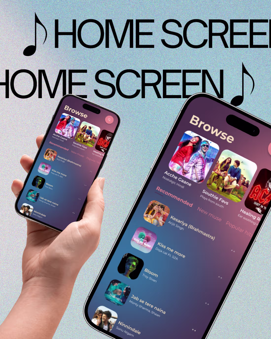
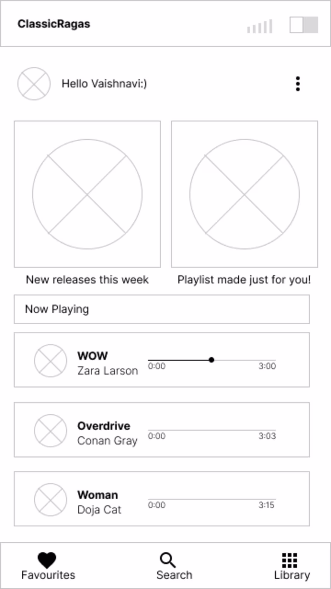
Final High-Fidelity Screens
After multiple iterations and refinements, here are the final high-fidelity prototypes for my Music Application Interface Design.
The goal was to simplify navigation, improve hierarchy, and create a smooth listening experience.
Drop in your thoughts!
1
3
117
Sharing a small WIP from my Music Application Interface Design while working toward the final screens. Would love your thoughts.
The final design is already live on my profile if you'd like to see how it turned out!! 🎶 🚀
0
94
What I look for when designing a new interface design:
Whenever I start designing a product, I focus on three things:
• Clarity – Can users understand it instantly? ⁉️
• Hierarchy – Does the layout guide attention?👑
• Flow – Does each step feel natural?🫗
Design decisions should make the product easier to use, not just nicer to look at.
Something I .earned while Designing Interfaces:
One thing I’ve realized while designing products: Users rarely struggle because of COMPLEX features, they struggle because of UNCLEAR interfaces.
Clarity is often the most powerful design tool.
Keep it complex, but always be CLEAR.
Drop in your insights as well! 🚀🧠
1
90
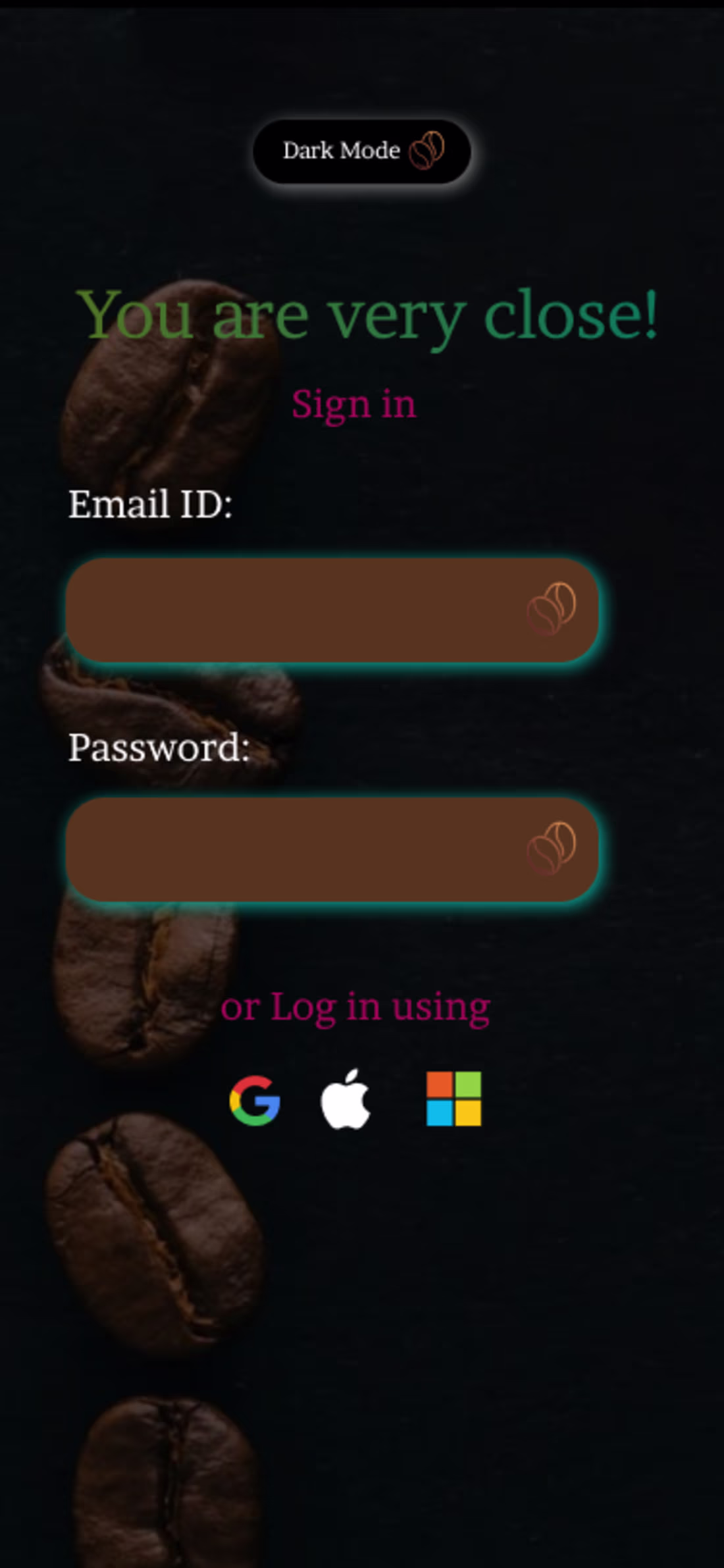
Before vs After: Improving a Coffee App Interface
I recently explored how my old design could be made a gazilion times better and could be simplified through better hierarchy and spacing.
Before
• Dense layout
• Weak visual hierarchy
• Hard to scan quickly
After
• Clear grouping of information
• Improved spacing and typography
• Faster visual scanning
SMALL design decisions can make a BIG difference in usability.
0
83
Good design does not happen by accident. Every project I work on follows a structured process that keeps ideas clear and decisions intentional. Since I am currently open to new projects, I thought I wou:ld share how I usually approach a design problem.
1. GET the problem: I begin by identifying the product goal, users, and what their approach looks and tastes like.
2. INSPO n research: I review competitors and design patterns to see what works and where we can improve.
3. PLAN before visuals: Wireframes define layout, hierarchy, and user flow before aesthetics.
4. THE design: Once the structure is clear, I design the UI using the basics: spacing, typography, and visual hierarchy to create a clean design.
5. ITERATE n refine: Design improves through feedback. Refine, deliver, REPEAT until you agree upon the final design.
4
93
Branding Identity Design for Hypothetical Coffee Business and Cafe
0
94
Semester Project
0
72
Personal Branding
0
72