
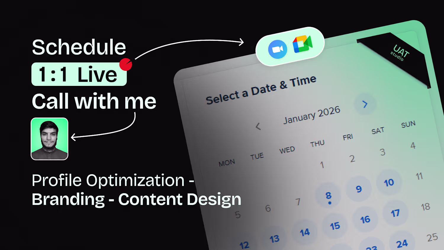
Usman Ali
Content Design Partner for your Personal Brand
New to Contra
Usman is ready for their next project!
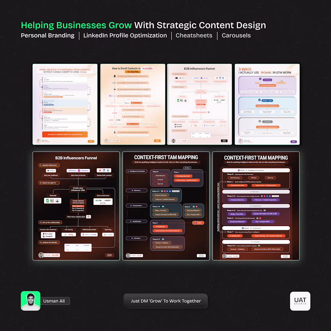
Most founders have the strategy in their head.
They just can't show it clearly.
I take their raw ideas and turn them into one clean cheatsheet, structured, visual, ready to post on LinkedIn.
No fluff. No back and forth. Just clarity on one page.
That's what content design actually does.
1
73
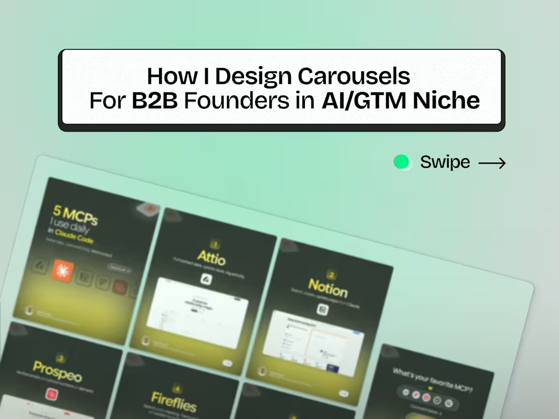
Most people scroll past carousels. Not because they're boring.
Because the structure is broken often.
One sharp & bold cover.
One idea per slide.
One CTA at the end. That's it.
No walls of text and crowded graphics inside slides. White space is a must thing here.
1
77
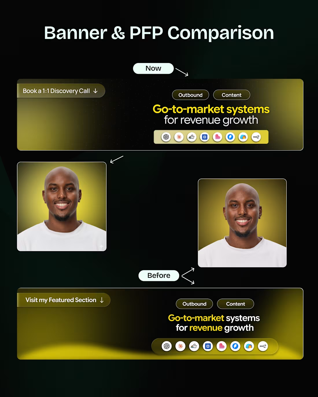
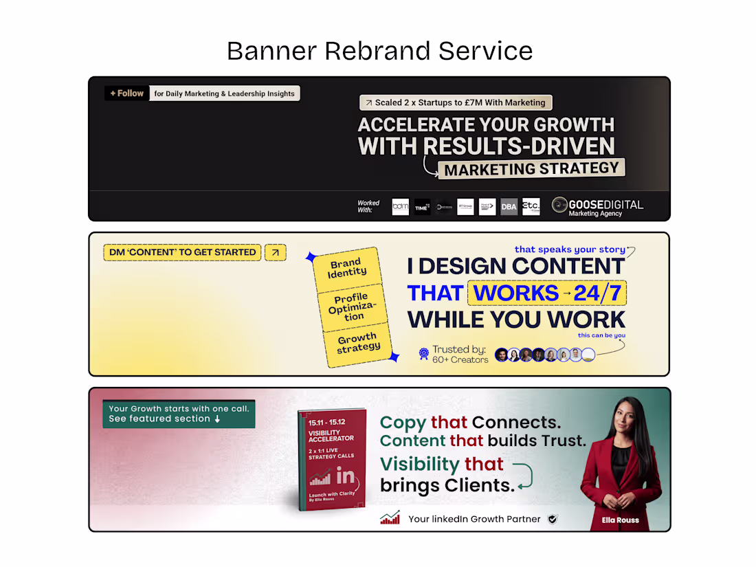
Your banner is not just design.
It decides if people stay or leave.
I checked multiple banners recently.
Most miss the basics.
If it’s not clear in 5 seconds, it fails. No proof, no trust. No direction, no action.
And mobile view? It's Mostly broken.
Good banners don’t look fancy.
They feel clear and positioned.
Fix this once.
Your profile starts working for you. This one I redesigned for my recent Client Yassin with comparison variations. Let's fix yours today.
1
75
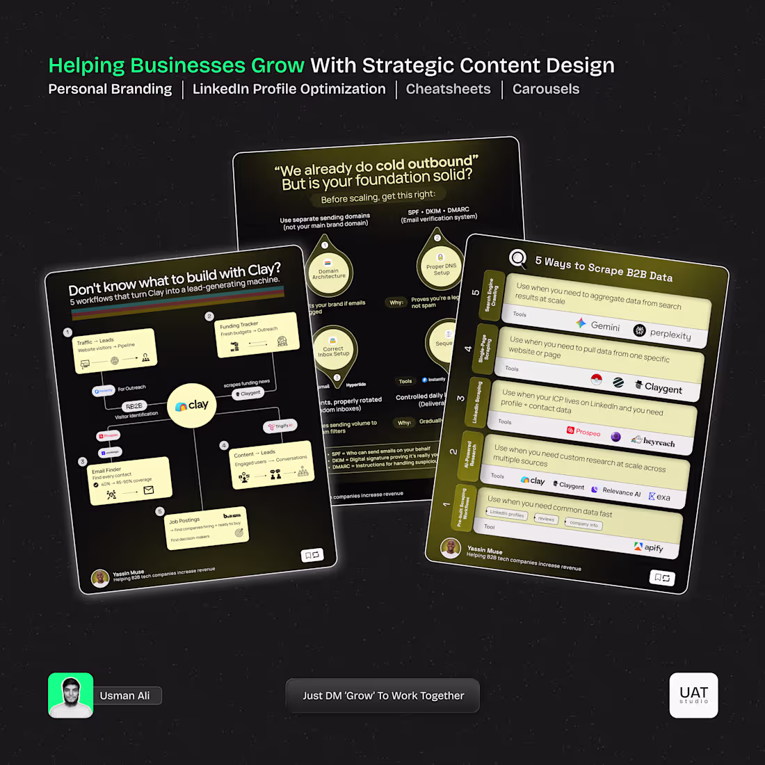
LinkedIn Cheatsheet & Workflows Designs for GTM & AI Specialists
2
141
Cheatsheet Designs for AI Outbound & GTM Niche Yassin M.
2
3
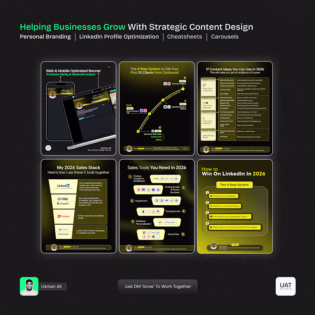
316
Cheatsheet Designs For GTM/AI Founders & Specialists
2
1
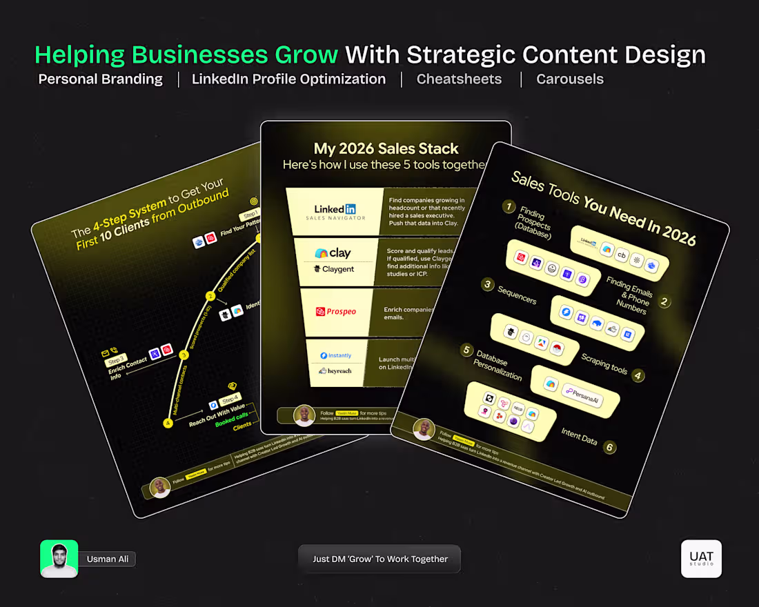
Cheat Sheet Designs For GTM - AI Founder
3
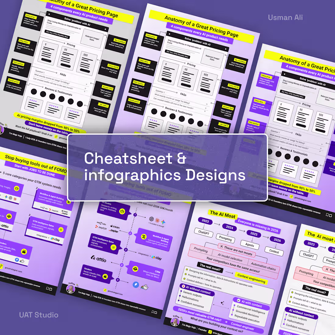
429
Personal Branding for Coaches & Busy Founders/Freelancers on LinkedIn, Instagram & Substack #linkedinprofile
4
491
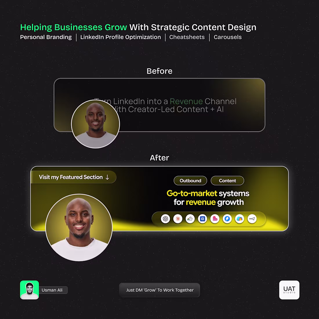
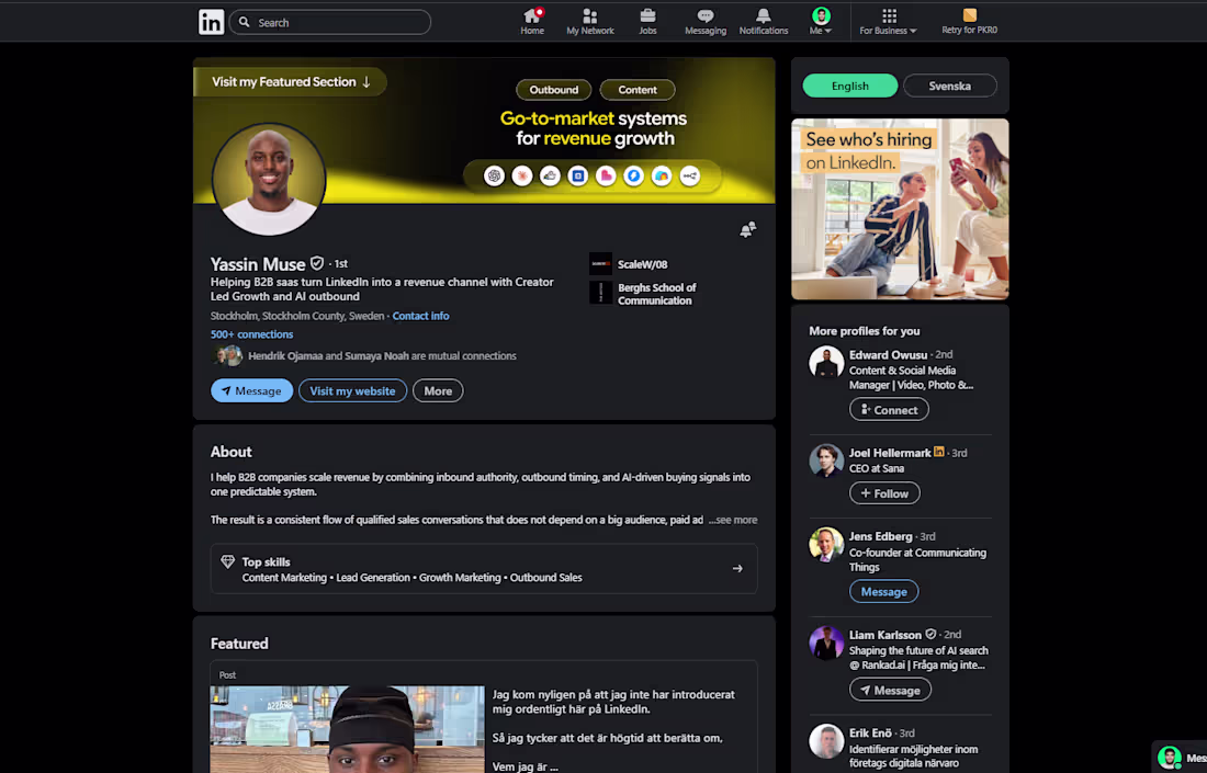
LinkedIn Profile Rebrand & Revamp For Yassin M.
We worked together to refresh his profile.
Now Web & Mobile Optimized.
3
426
LinkedIn Profile Revamp and CheatSheet Designs
3
2