
Usama Tariq
Full-stack engineer shipping AI-powered products end to end
- 5
- Followers


Drop 02 of the Premium UI Factory is live.
Three new components, three different design philosophies — each one built to feel physical, not just functional.
Swipe Card Stack (Neobrutalism)
Drag-to-approve task cards with velocity detection and spring physics. Raw thick borders, hard offset shadows. The kind of UI that feels satisfying to interact with.
Try out ---> https://ui-factory-zeta.vercel.app/card-swipe
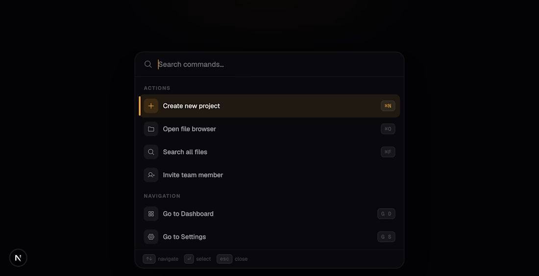
Command Palette (Dark Luxury)
⌘K spotlight with staggered entry animations, full keyboard nav, and a gold selection indicator that slides between items. Near-black glass. Electric gold accent. Press a key, feel in control.
Try out ---> https://ui-factory-zeta.vercel.app/command-palette
Onboarding Stepper (Aurora Morphism)
Aurora blobs shift color as you progress through steps. Frosted glass card floats above the glow. Spring-driven transitions between steps.
Try out ---> https://ui-factory-zeta.vercel.app/onboarding-stepper
Every component in this series gets a different design philosophy — no two consecutive builds share an aesthetic. Claymorphism → Neobrutalism → Dark Luxury → Aurora Morphism.
Built with React 19, Next.js 15, and motion/react. Zero CSS animations — every interaction is physics-driven.
#ReactJS #UIDesign #Frontend #MotionDesign #WebDevelopment #DesignEngineer #OpenSource
2
6
683
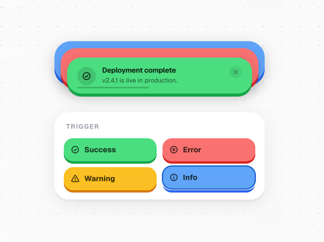
UI Factory — The Alert Component
I've been building interfaces for a while now. And for most of that time, I did what everyone does — reached for a library, dropped in a component, tweaked the colors, shipped it. Job done.
But I kept noticing something. No matter how polished the product, the UI always felt borrowed. Like you could see the seams of whatever design system was underneath. Everything started looking the same.
So I decided to start building my own things from scratch. No templates, no defaults. The rule I set for myself: every component has to have its own identity. Its own material, its own physics, its own personality. A notification alert shouldn't feel anything like a pricing card. A dock shouldn't feel like a modal. Each one is its own experiment.
This alert component was the first one I finished. I wanted it to feel physical — like something you could reach into the screen and peel off. That drove every decision: the shadows, the spring physics, the way the stack fans out when you hover it, the way each card exits with a little spin. Nothing about it is accidental.
But claymorphism is just one direction. The library I'm building will go everywhere — glass, depth, brutalism, motion-first, 3D. The point was never an aesthetic. The point is that UI can feel crafted instead of assembled.
I'm in the early stages of building my own UI component library. If this work gets traction, the plan is to open-source the full code so designers and developers can use these in their own products. Every component ships with its own philosophy — no two will feel the same.
This is just the beginning. Follow along.
→ Try it yourself: https://ui-factory-zeta.vercel.app/notification-stack
Stack: React 19 · Next.js 15 · Framer Motion · TypeScript
#SoftwareArchitecture #SystemDesign #FullStack #SaaS #AIEngineering #DistributedSystems #React #PostgreSQL #NodeJS #Python #ProductEngineering #WebDevelopment
2
3
188


1
1
17
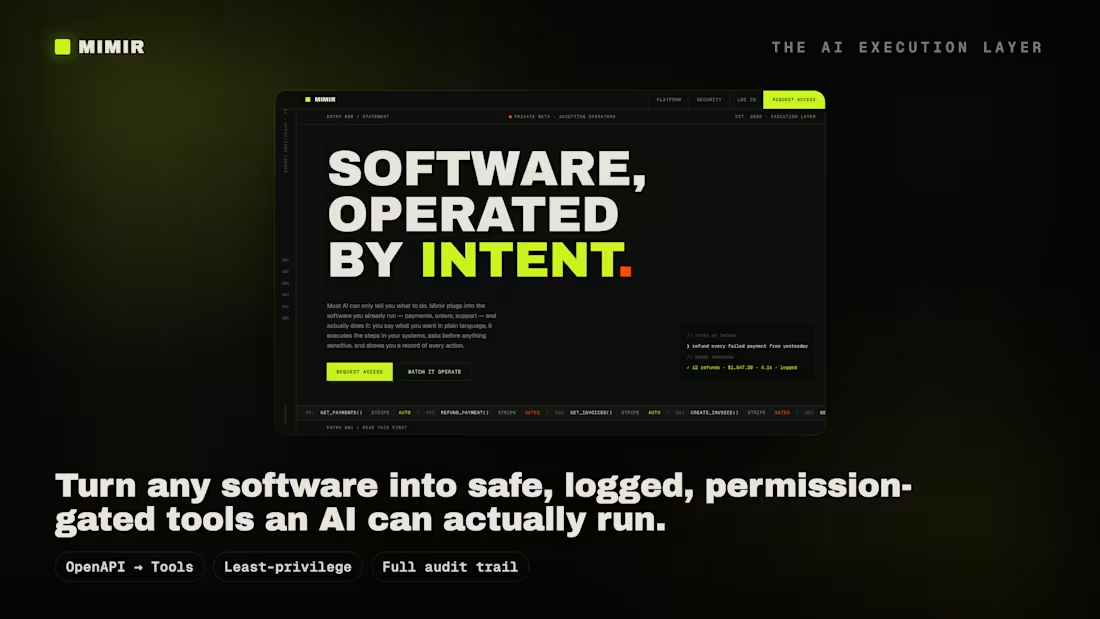
Mimir: AI Agent That Operates APIs by Intent
0
15