The network for creativity
Join 1.25M professional creatives like you
Connect with clients, get discovered, and run your business 100% commission-free
Creatives on Contra have earned over $150M and we are just getting started
Back to feedPost

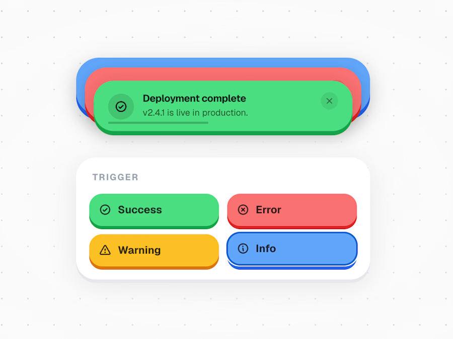
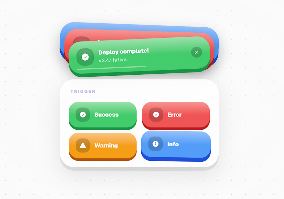
UI Factory — The Alert Component
I've been building interfaces for a while now. And for most of that time, I did what everyone does — reached for a library, dropped in a component, tweaked the colors, shipped it. Job done.
But I kept noticing something. No matter how polished the product, the UI always felt borrowed. Like you could see the seams of whatever design system was underneath. Everything started looking the same.
So I decided to start building my own things from scratch. No templates, no defaults. The rule I set for myself: every component has to have its own identity. Its own material, its own physics, its own personality. A notification alert shouldn't feel anything like a pricing card. A dock shouldn't feel like a modal. Each one is its own experiment.
This alert component was the first one I finished. I wanted it to feel physical — like something you could reach into the screen and peel off. That drove every decision: the shadows, the spring physics, the way the stack fans out when you hover it, the way each card exits with a little spin. Nothing about it is accidental.
But claymorphism is just one direction. The library I'm building will go everywhere — glass, depth, brutalism, motion-first, 3D. The point was never an aesthetic. The point is that UI can feel crafted instead of assembled.
I'm in the early stages of building my own UI component library. If this work gets traction, the plan is to open-source the full code so designers and developers can use these in their own products. Every component ships with its own philosophy — no two will feel the same.
This is just the beginning. Follow along.
→ Try it yourself: https://ui-factory-zeta.vercel.app/notification-stack
Stack: React 19 · Next.js 15 · Framer Motion · TypeScript
#SoftwareArchitecture #SystemDesign #FullStack #SaaS #AIEngineering #DistributedSystems #React #PostgreSQL #NodeJS #Python #ProductEngineering #WebDevelopment


The network for creativity
Join 1.25M professional creatives like you
Connect with clients, get discovered, and run your business 100% commission-free
Creatives on Contra have earned over $150M and we are just getting started

Challenges
View all


Related posts


Web Design for Contra Labs — an extension of the Brand Identity we created.
Translating the visual language, principles, and character of the identity into a cohesive digital experience.


I've been busy building Snew. it's already live, create your account now.


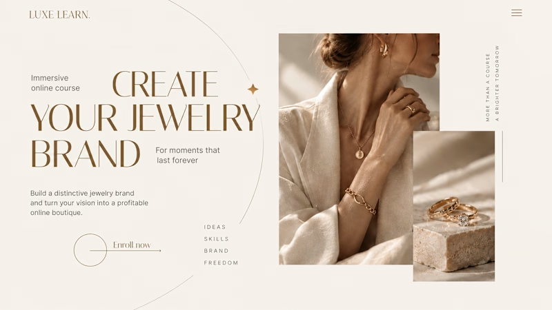
Same course. Same content. But two completely different feelings ✨
Which version would you choose?
27 voted
59%

19 voted
41%
46 votes
Closed

Option 2 is more practical ❤️❤️


