
Lovepreet Singh
Senior Product Designer | SaaS | AI | Figma Expert


Playnex — Immersive Gaming Website UI Design
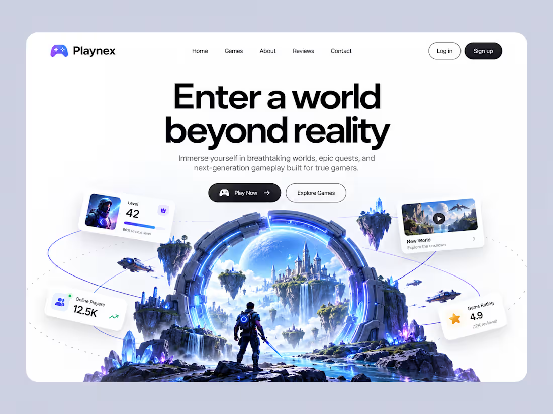
Introducing Playnex, a next-generation gaming website concept designed to bring immersive digital worlds to life.
Featuring a clean, modern interface, bold typography, vibrant neon accents, and a cinematic fantasy environment, Playnex blends premium web design with the excitement of gaming. The layout showcases player stats, featured game worlds, online players, and engaging calls to action in a visually captivating experience.
Design Highlights:
Modern gaming landing page UI
Immersive 3D fantasy visuals
Clean layout with bold typography
Floating cards with player stats
Electric blue and purple color palette
Premium, conversion-focused hero section
Tools: Figma, AI-assisted Visual Design
Designed to explore the intersection of gaming, immersive visuals, and modern digital experiences.
2
13
NUTRIVO | Premium Protein Bar E-commerce Website Concept
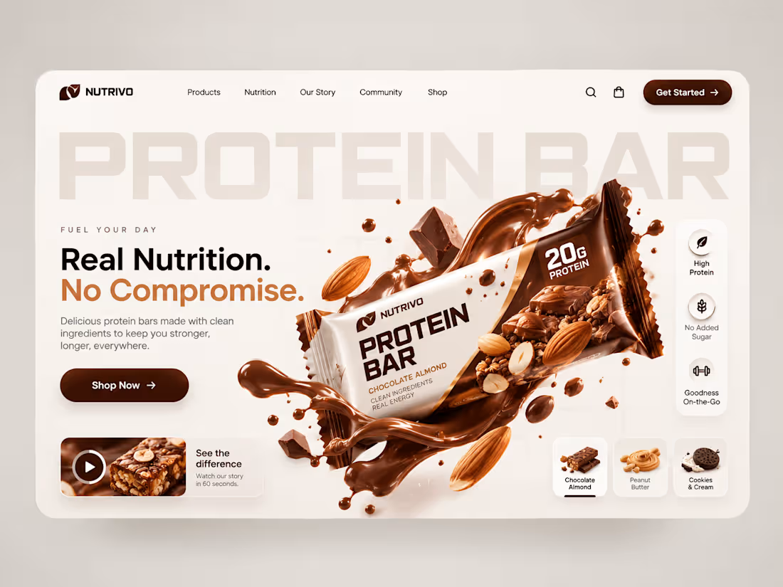
A premium e-commerce web design concept created for NUTRIVO, a modern protein bar brand focused on nutrition, taste, and performance.
The goal was to create a visually engaging digital experience that highlights the product through bold typography, rich chocolate-inspired colors, high-impact 3D visuals, and a clear shopping journey.
My Approach:
UI/UX design and visual direction
E-commerce landing page design
Product presentation and flavor discovery
Conversion-focused CTA placement
Premium brand aesthetics and visual storytelling
Project Type: Conceptual Web Design
Focus: UI/UX Design, E-commerce, Product Branding, Web Design
0
8
Play Your Cards — 3D Gaming Website Design
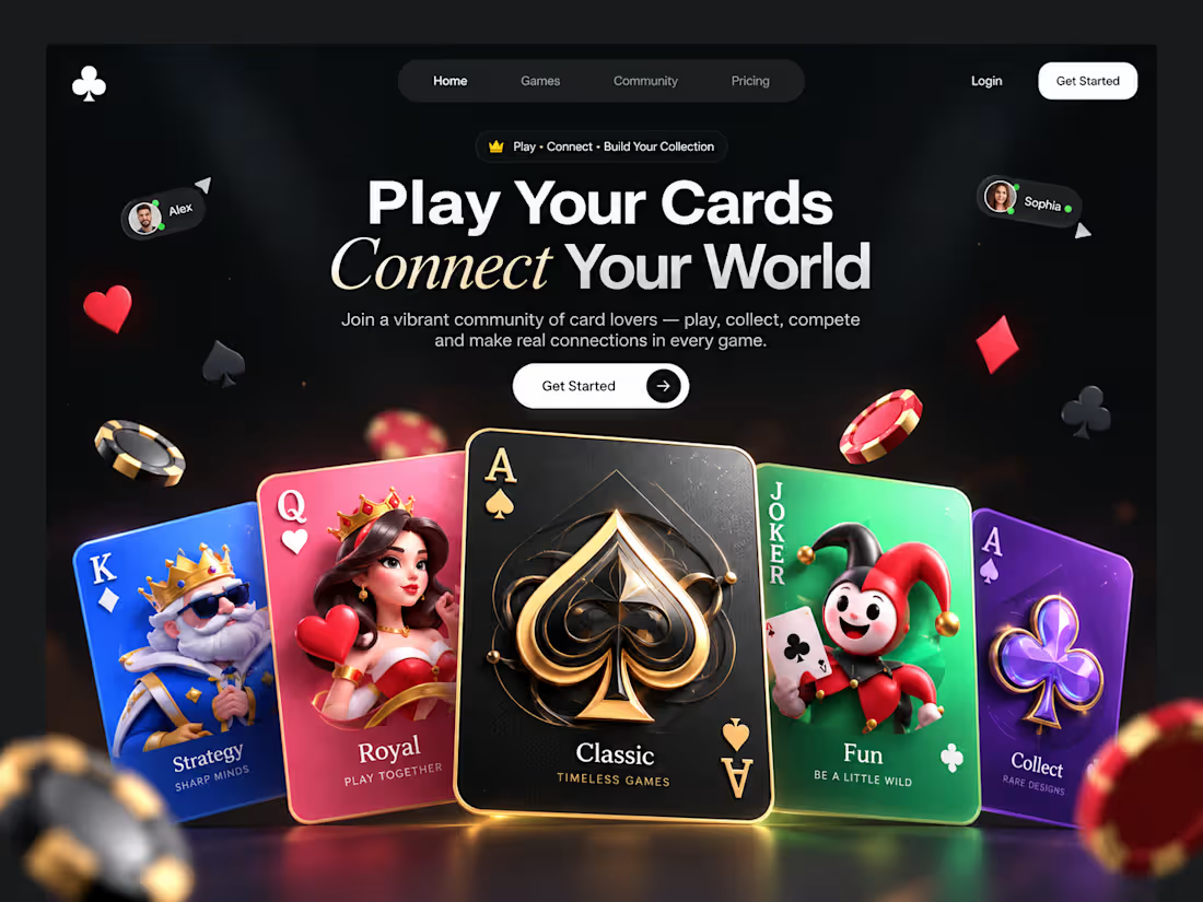
A premium gaming website concept built around the world of playing cards. This landing page combines bold typography, immersive 3D visuals, vibrant card illustrations, and a sleek dark UI to create a memorable digital experience.
Designed to showcase creative direction, modern UI/UX, and engaging visual storytelling for gaming brands and digital products.
0
11
NeoCredit — Fintech Website & Credit Card UI Concept
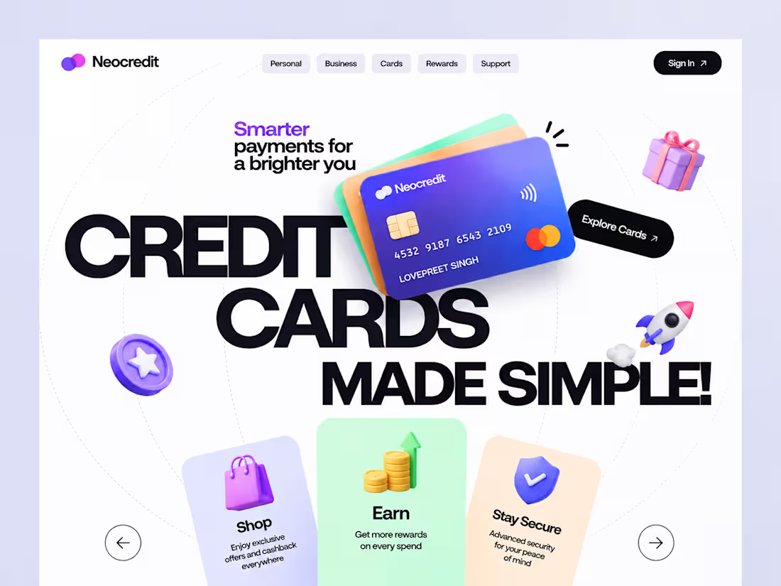
A modern fintech website concept designed to make credit card experiences feel simple, engaging, and visually distinctive.
NeoCredit combines bold typography, colorful 3D visuals, clean layouts, and intuitive navigation to present credit card benefits, rewards, shopping perks, and security features in a memorable way.
What I designed:
Landing page UI and visual direction
Credit card hero visuals
Feature cards for rewards, shopping, and security
Navigation and CTA components
Color palette and typography system
Focus: UI/UX Design, Fintech, Web Design, Visual Storytelling
Designed to demonstrate a fresh, contemporary approach to digital banking experiences.
0
22