Tommaso Bellagamba
Graphic Designer specializing in logos & branding.




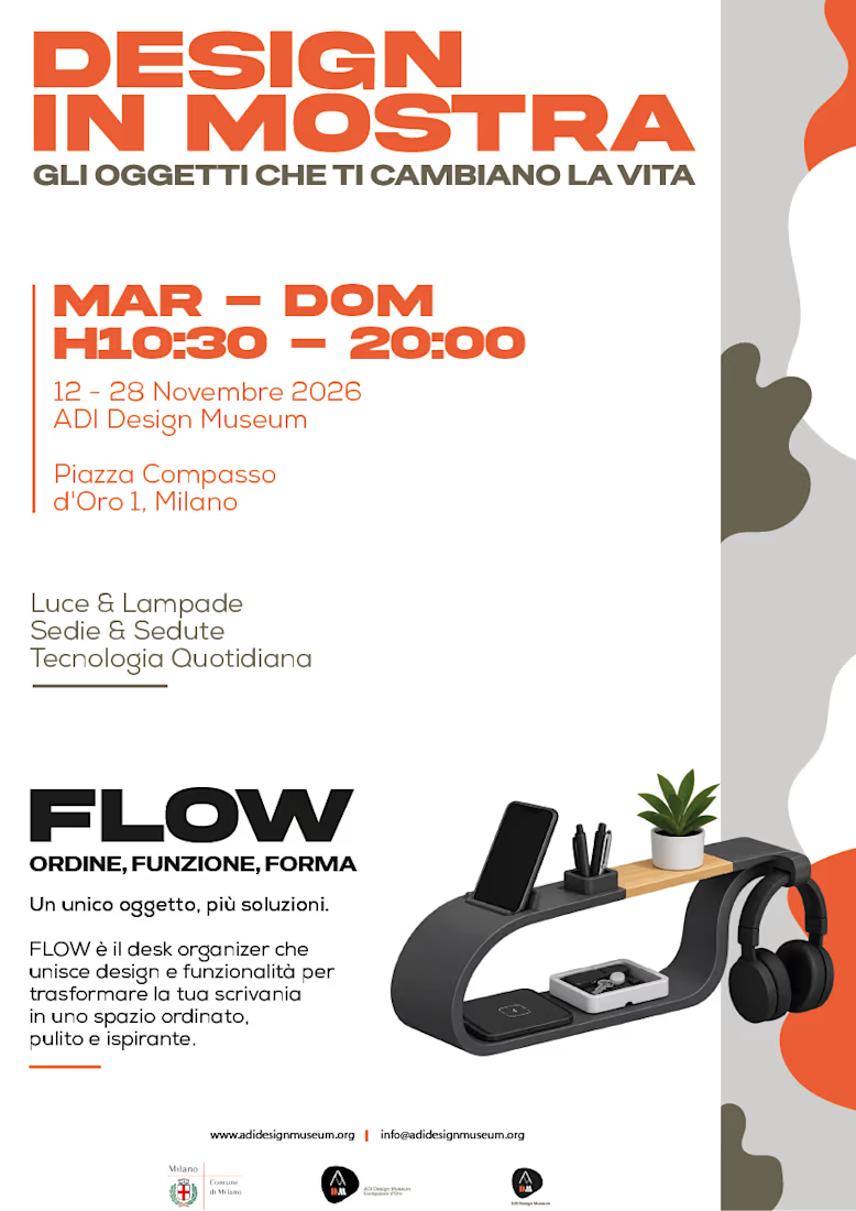
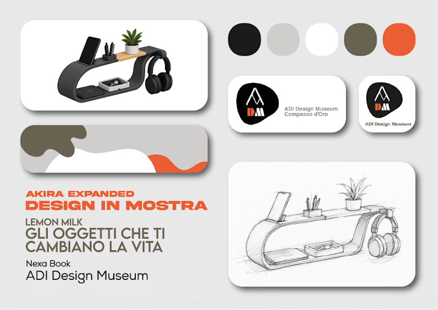
🧡Design in Mostra ✨
A graphic design project exploring visual communication, typography, and creative composition. 🖤💡
#GraphicDesign #VisualDesign #Typography #DesignInMostra #CreativeProcess


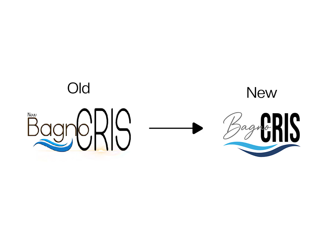
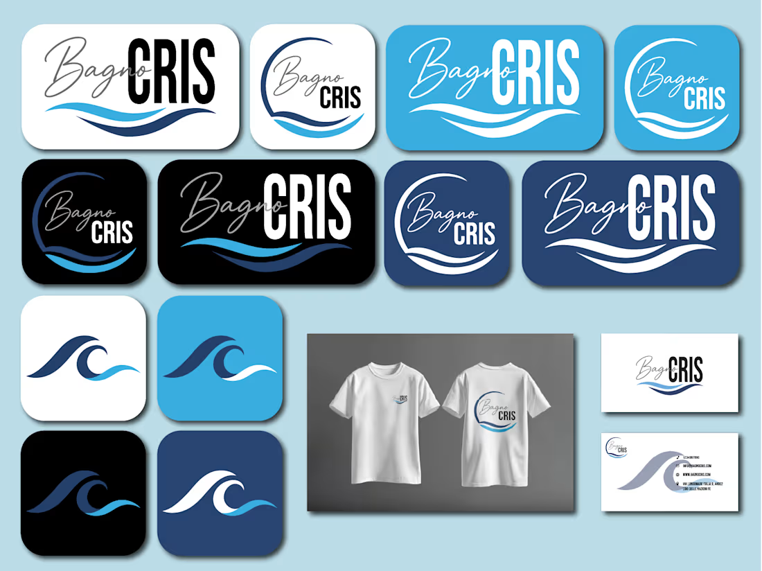
🌊 A logo restyling project for Bagno Cris, reimagining the existing identity with a fresh, modern and more recognizable visual style.
☀️ The new direction combines a playful beach-inspired aesthetic with a clean and versatile logo, designed to work across different applications while keeping the identity welcoming and memorable.

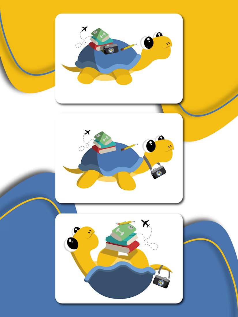
🎨 A character design project created for my school, developing a mascot that could represent the identity and personality of the institution in a fun and recognizable way.
✨ The project focused on character design, visual identity and creating a versatile mascot suitable for different applications and communication materials.
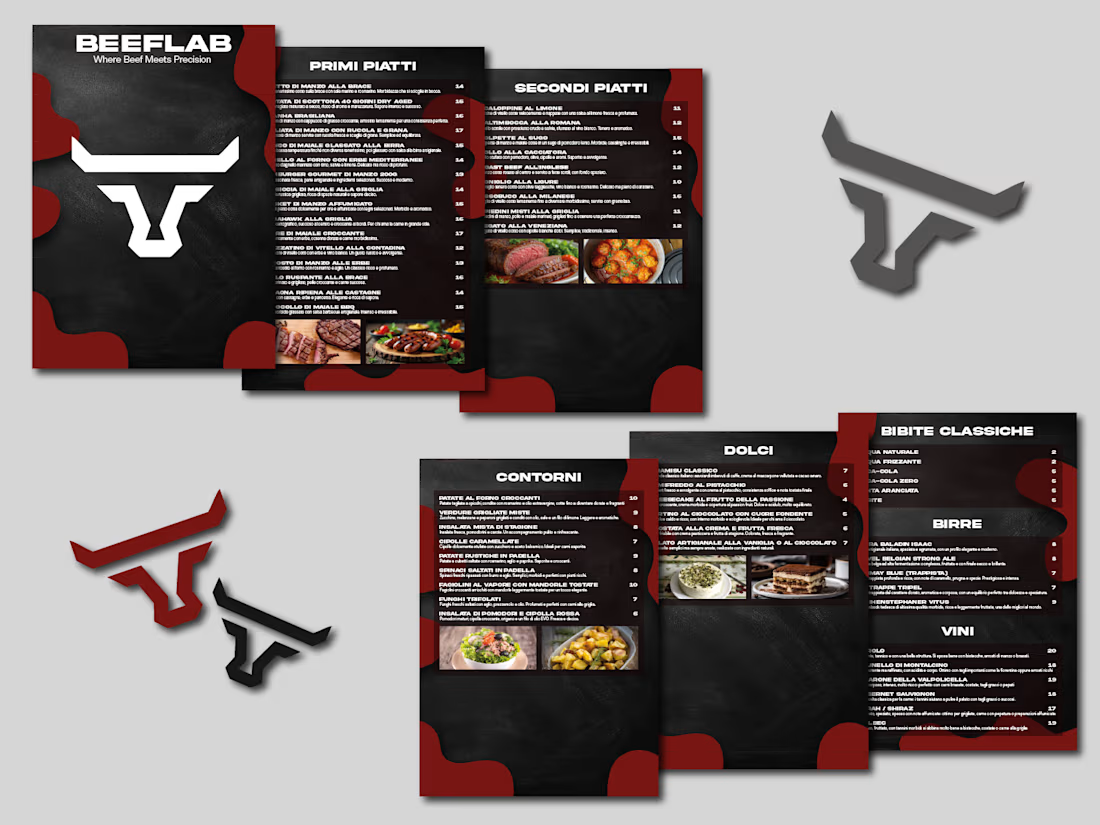
🥩 A menu design project created for Beef Lab, focusing on a bold and modern visual style that reflects the identity of the restaurant.
📋 The menu was designed to keep the information clear and easy to navigate, while giving the food and brand a strong visual presence.
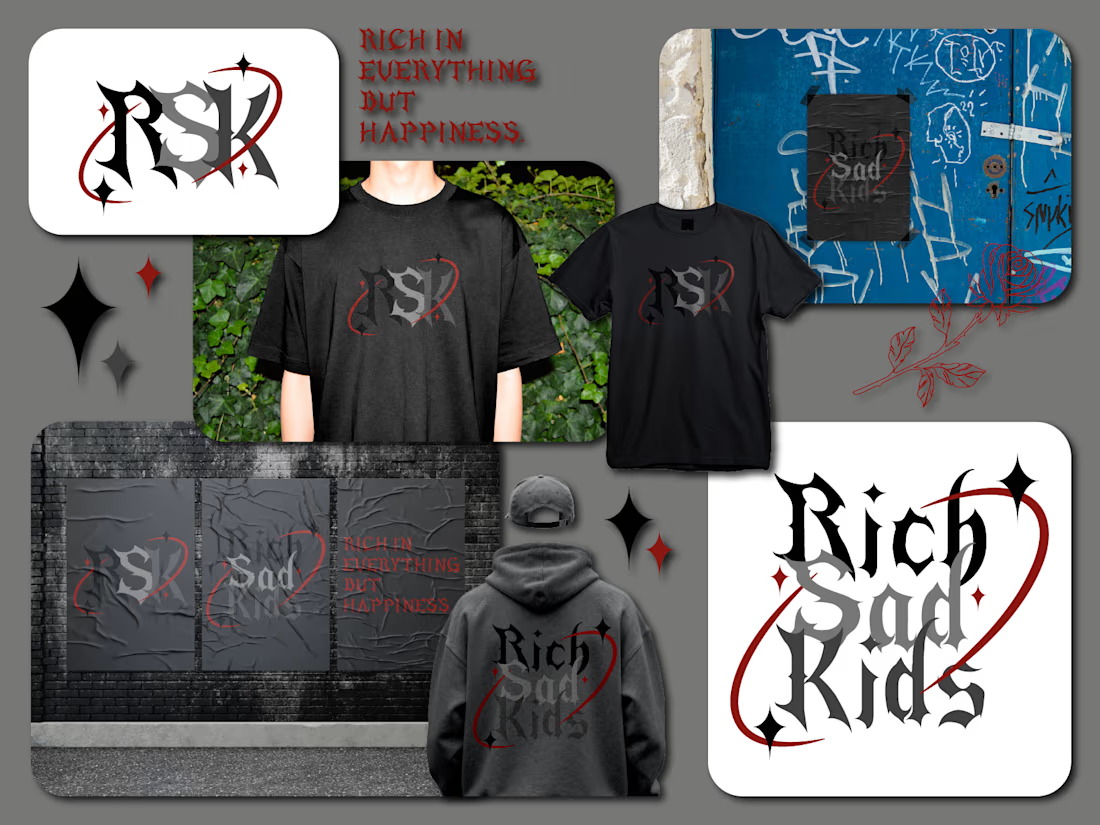
🖤 A visual identity concept for RSK — Rich Sad Kids, built around a dark, raw and contemporary aesthetic.
🔥 The project explores a bold typographic direction, contrasting deep blacks with blood-red accents and graphic elements inspired by streetwear and underground culture.