
David Tomiwa
Conversion Focused Websites | Wix Studio | Framer website


Can I ask you something?
When was the last time you visited a yacht rental website and immediately wanted to book?
Not because it looked expensive.
Not because it had fancy animations.
But because everything made booking feel effortless.
That's exactly what I wanted to achieve with my latest project.
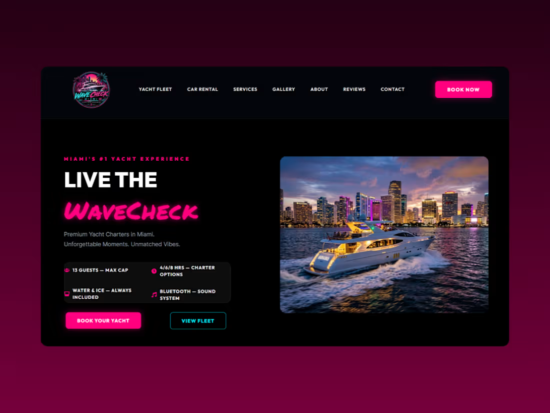
I recently wrapped up a website for a Miami luxury yacht & exotic car rental brand, and every design decision came back to one question:
Will this help someone book faster?
Instead of overwhelming visitors with flashy effects, I focused on removing friction.
- Yacht fleet with smart search & filtering (search by yacht size and guest capacity)
- Dedicated exotic car rental section
- Mobile-first responsive experience
- Miami-inspired visual identity with vibrant colors and luxury aesthetics
- Conversion-focused layouts, clear CTAs, and a booking flow designed to turn visitors into customers
One thing I enjoyed the most was balancing two different luxury services. yachts and exotic cars, without making the experience feel cluttered. Each section has its own personality while still feeling like one premium brand.
As designers, we sometimes celebrate beautiful interfaces.
Clients celebrate something else.
📈 More inquiries.
📞 More bookings.
💰 More revenue.
That's the difference.
A beautiful website catches attention.
A conversion-focused website grows a business.
Curious.. If you were redesigning a luxury booking website, what's the first thing you'd optimize for conversions?
I'd genuinely love to hear how other designers approach projects like this.
1
206
Most landing pages don’t fail because of traffic.
They fail because they don’t guide people to act.
Designed this for a 15-min fitness program, every section built to remove doubt and drive action.
What do you think?
1
366
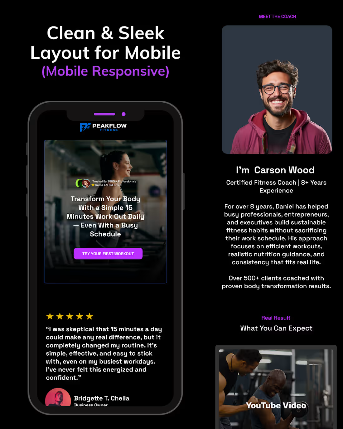
Recently, I worked on a landing page for Peak Fitness.
The idea was simple, help busy individuals and business owners stay fit
with just 15 minutes a day, no gym equipment needed.
But the real challenge wasn’t the design.
It was making people believe it actually works.
So instead of just making it look clean,
I focused on how each section could remove doubt.
From the first headline, to the testimonials,
to the coach section and walkthrough
everything is placed to answer a question before it’s asked.
Why should I trust this?
Will this work for me?
Is it really that simple?
Even the mobile version wasn’t just scaled down, it was simplified to help users make faster decisions
without unnecessary friction.
Because at the end of the day,
a landing page isn’t just there to be seen.
It’s there to move people.
If it doesn’t do that, it’s just decoration.
Curious what you think about this approach.
1
364
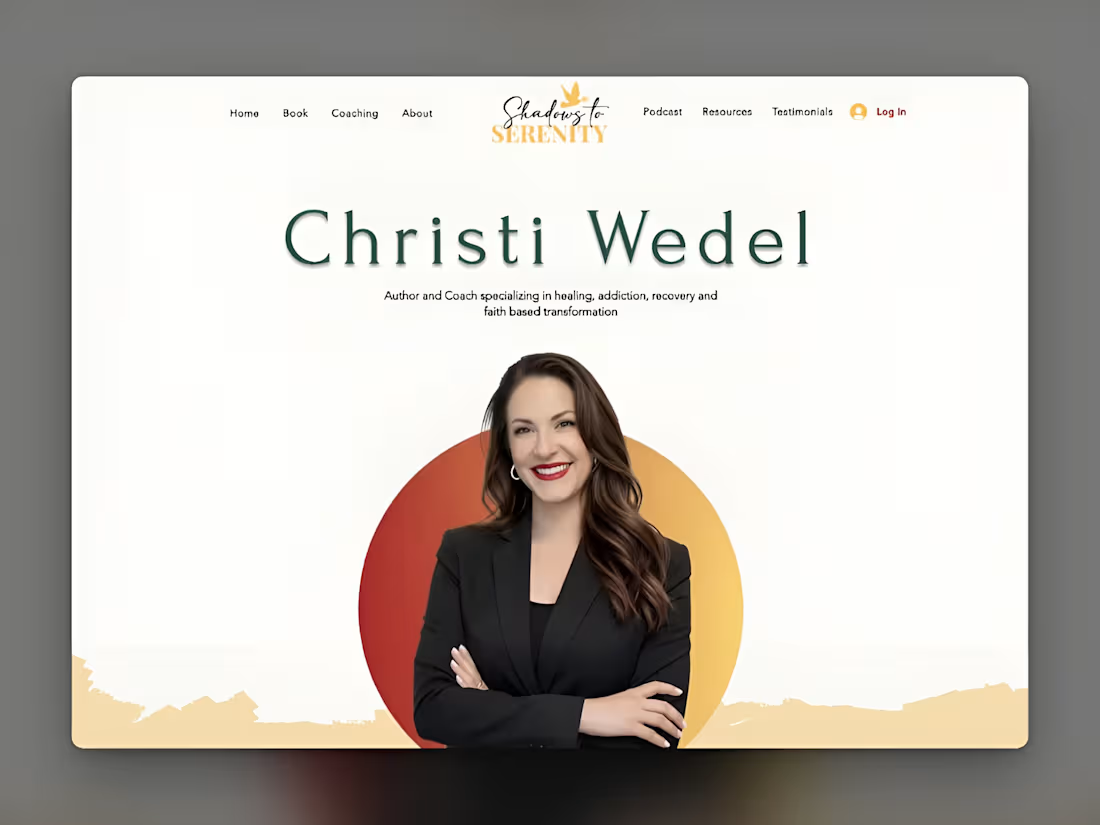
Christi Wedel's One-Page Website Design
1
8