
Tobi K.
Mobile App Designer | Fintech & SaaS
Ready for work
Tobi is ready for their next project!
I designed the live score update of this basketball app
Inspired by Apple
What do you think?
2
1
105
I did this prototype flow of how you can add an AI-image using your mobile phone
2
1
113
This project was an eye opener!
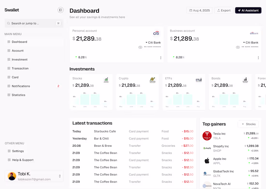
𝗦𝘄𝗮𝗹𝗹𝗲𝘁 — 𝗔 𝗦𝗺𝗮𝗿𝘁𝗲𝗿 𝗪𝗮𝘆 𝘁𝗼 𝗠𝗮𝗻𝗮𝗴𝗲 𝗙𝗶𝗻𝗮𝗻𝗰𝗲
I recently designed this dashboard for Swallet, a modern finance management tool that helps users track savings, investments, and transactions in one intuitive space.
𝗠𝘆 𝗴𝗼𝗮𝗹 𝘄𝗮𝘀 𝘀𝗶𝗺𝗽𝗹𝗲:
💡 𝗠𝗮𝗸𝗲 𝗱𝗮𝘁𝗮 𝗳𝗲𝗲𝗹 𝗲𝗳𝗳𝗼𝗿𝘁𝗹𝗲𝘀𝘀. Users should see what matters — not dig for it.
📊 𝗖𝗿𝗲𝗮𝘁𝗲 𝘃𝗶𝘀𝘂𝗮𝗹 𝗵𝗮𝗿𝗺𝗼𝗻𝘆. Clean typography, balanced white space, and consistent iconography make numbers easy to digest.
🧭 𝗗𝗲𝘀𝗶𝗴𝗻 𝗳𝗼𝗿 𝗰𝗹𝗮𝗿𝗶𝘁𝘆. Every card, label, and graph guides users toward smarter financial decisions.
This project taught me a lot about information hierarchy, visual accessibility, and how to build design systems that scale with product growth.
6
5
150
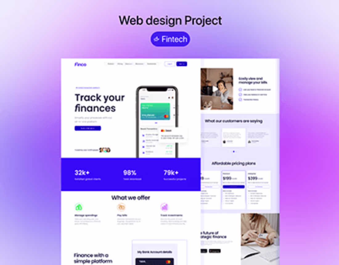
Fast & Reliable Web Hosting — Secure, Easy, and Scalable
1
0
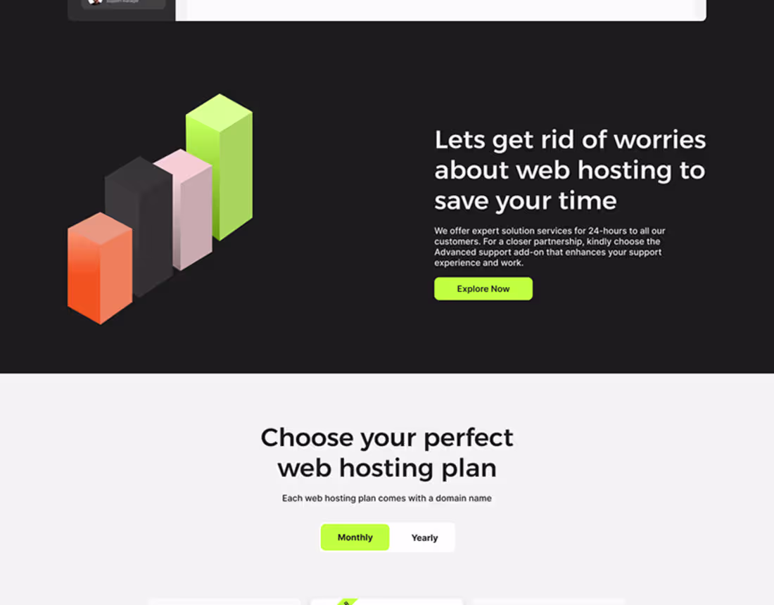
A Full landing page of a web hosting platform
2
0
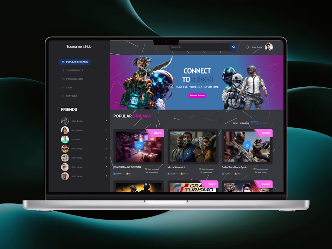
Tournament Hub: A game streaming website
1
0