The network for creativity
Join 1.25M professional creatives like you
Connect with clients, get discovered, and run your business 100% commission-free
Creatives on Contra have earned over $150M and we are just getting started
Back to feedPost
This project was an eye opener!
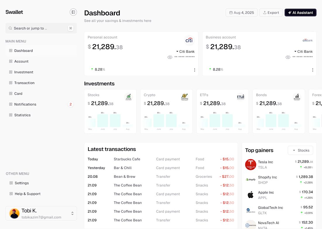
𝗦𝘄𝗮𝗹𝗹𝗲𝘁 — 𝗔 𝗦𝗺𝗮𝗿𝘁𝗲𝗿 𝗪𝗮𝘆 𝘁𝗼 𝗠𝗮𝗻𝗮𝗴𝗲 𝗙𝗶𝗻𝗮𝗻𝗰𝗲
I recently designed this dashboard for Swallet, a modern finance management tool that helps users track savings, investments, and transactions in one intuitive space.
𝗠𝘆 𝗴𝗼𝗮𝗹 𝘄𝗮𝘀 𝘀𝗶𝗺𝗽𝗹𝗲:
💡 𝗠𝗮𝗸𝗲 𝗱𝗮𝘁𝗮 𝗳𝗲𝗲𝗹 𝗲𝗳𝗳𝗼𝗿𝘁𝗹𝗲𝘀𝘀. Users should see what matters — not dig for it.
📊 𝗖𝗿𝗲𝗮𝘁𝗲 𝘃𝗶𝘀𝘂𝗮𝗹 𝗵𝗮𝗿𝗺𝗼𝗻𝘆. Clean typography, balanced white space, and consistent iconography make numbers easy to digest.
🧭 𝗗𝗲𝘀𝗶𝗴𝗻 𝗳𝗼𝗿 𝗰𝗹𝗮𝗿𝗶𝘁𝘆. Every card, label, and graph guides users toward smarter financial decisions.
This project taught me a lot about information hierarchy, visual accessibility, and how to build design systems that scale with product growth.


@Tobi Kazim An example of Learn by doing.

@Tobi Kazim I really love it! Good job! :) Looking forward to seeing more from you :)

@Arsène S Thank you. I appreciate this. Alright.
@Tobi Kazim you're welcome :) Followed you
@Arsène S Thank you.
The network for creativity
Join 1.25M professional creatives like you
Connect with clients, get discovered, and run your business 100% commission-free
Creatives on Contra have earned over $150M and we are just getting started







