
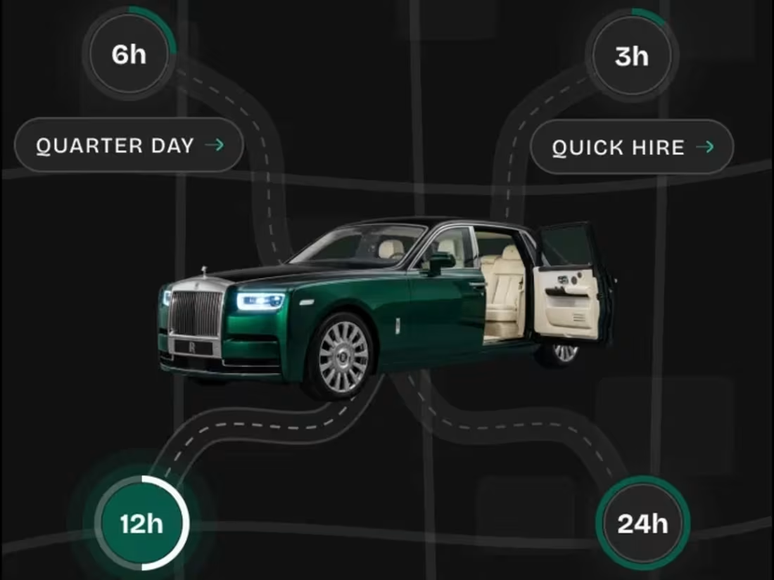
Pradini is a chauffeur-driven vehicle marketplace in Lagos. I used Claude as my design partner to move from idea to finished screens quickly, without cutting corners on UX. The home screen turns booking duration into the first decision (3h, 6h, 12h, 24h), so guests start with “How long do you need us?” instead of a form. The listing page puts trust up front: verified host and chauffeur, what’s included in the price, cancellation and insurance. The payment screen shows a hold timer, overtime cost and a clear breakdown, and the confirmation receipt shows exactly where every naira went. I also designed the edge cases, like the paused OTP screen with a timer and an email fallback, so users are never stuck.
1
67
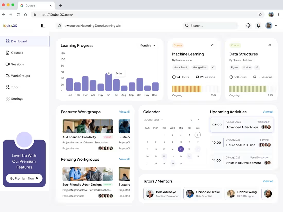
iQube.OX brings courses, live sessions, workgroups and mentors into one place. The challenge was density. A learner needs to see progress, what’s coming up, and who can help, without feeling buried.
The dashboard answers “where am I?” first, with a monthly learning chart and course cards that show hours, lessons and a progress bar at a glance. Featured and pending workgroups, a calendar and upcoming activities sit side by side, so planning your week takes one look. The Courses page uses color coded cards and progress bars to show what’s ongoing, completed or not started, so the next step is obvious.
Upcoming Activities opens as a focused panel instead of a new page. Learners browse sessions on the left and read the full agenda, speakers, time and a “Join Now” button on the right, without losing their place.
Learning also needs people, so I designed the Workgroup space like a lightweight Slack. A slim rail on the left switches between groups. The main feed has Discussion, Resources and Tasks tabs, with role badges for mentors and advisors so learners know whose advice they’re reading. Each post supports reactions, replies, saving and pinning, and a rich text composer sits at the bottom so starting a conversation is always one tap away. The right side keeps the group’s context nearby: the project overview, the next session with a Register button, and saved messages.
I designed everything manually, from the layout grid and components to the states and spacing, which gave me full control over the details.
1
34
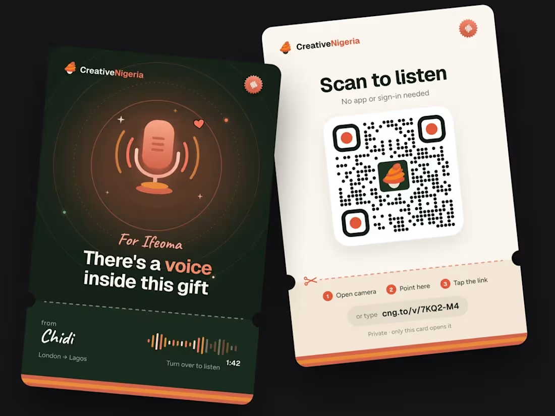
Creative Nigeria connects people with 3D artists in Lagos who turn photos and stories into custom gifts, like a family bust or a wedding cake topper. The hard part of buying a handmade gift online is trust and waiting, so I designed around both.
The artist profile builds trust before any money moves: a real portfolio, reviews, reply time and average preview time, with one clear action, “Message Tobi”. After paying, the order page replaces anxiety with clarity: a live countdown to the 3D preview, a four stage progress bar, the artist one tap away, and locked style references so nothing changes mid sculpt. The “Your gifts” screen lets a sender manage several orders in one swipeable stack and flags the one that needs a reply. The last piece is the voice note card. A printed card in the gift box carries a QR code, so the recipient can hear a personal message with no app or sign in.
I designed and iterated all of this with Claude, which let me explore, refine and ship the flows and the physical card much faster than my usual process.
1
45
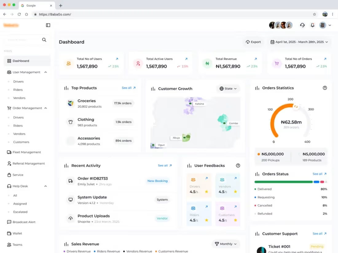
BabaGo has four kinds of users, each with their own orders, payments and support needs. The admin team needs to see the health of the whole business at a glance and still drill into one person quickly. That tension shaped every screen.
The main dashboard answers “how are we doing?” in layers. Headline numbers sit at the top, followed by top products, a customer growth map, an order gauge, live status breakdowns and recent activity. Support tickets, promotions and feedback scores sit alongside, so problems surface early instead of waiting in a report.
The Customers Management screen pairs eight summary metrics with a searchable, filterable table. Tier, spend, flags and status are color coded, so the people who need attention stand out in a long list. The Wallet Overview applies the same thinking to money: balance, revenue, earnings and pending payouts on top, a transaction chart and payout split beside it, and a detailed history below that breaks down card, transfer and offline payments.
The Regional Role screen keeps a heavy permissions task simple. Admins add regional leads, switch roles from inline dropdowns, and see who is active, pending or deactivated, filtered by region.
Across all four screens I kept one consistent sidebar, one table pattern and one set of status colors, so an admin who learns one screen already knows the rest.
1
18