
pro
Sundas R.
Design-led Shopify & Framer Developer - Full Stack Expertise
- $1k+
- Earned
- 1x
- Hired
- 5.00
- Rating
- 26
- Followers
Brand & Framer Website Design
0
4
I built Unscatter for the @Bubble Prompt and Circumstance Challenge.
It is an ADHD-friendly focus dashboard that turns messy voice or text brain dumps into a prioritized task queue, then protects you from the noise by showing only one task at a time.
The flow is simple:
You dump everything on your mind.
AI turns it into clear tasks with tiny first steps.
You review and reorder the queue.
Then Unscatter locks the chaos away and gives you one next thing.
It's not a productivity system. Not another task list.
Just one calm place to unload, sort, and start.
Built on top of a Bubble AI-generated foundation, then shaped by hand:
→ Started with one prompt to Bubble AI
→ Bubble generated the base pages, UI, and data structure
→ Rebuilt the workflows into a real end-to-end app
→ Added voice transcription
→ Added AI task sorting from messy brain dumps
→ Added queue approval and reprioritization
→ Added One Thing Mode
→ Added task progression, queue history, loading states, and a softer pastel interface
What I love about this build is that it does not try to help you manage your whole life. It simply helps you begin.
Because sometimes the problem is not that you are lazy.
Sometimes your brain just needs the world to get quieter for a minute.
Try Unscatter (https://unscatter-60680.bubbleapps.io/).
Built with Bubble AI, OpenAI, and a deeply personal amount of debugging.
Walkthrough video and AI baseline video in the comments.
7
28
2.4K
I just built BentoFlux, a premium animated bento grid component for Framer.
It includes magnetic hover, 3D tilt, animated glare, glow effects, glass-style cards, dark/light mode, and 4 responsive variants for SaaS, portfolio, agency, and product websites.
Built for designers and founders who want a high-end interactive section without spending hours wiring custom motion.
Now available for Framer: https://contra.com/products/ltw2jObn-bento-flux-premium-framer-bento-component
1
196
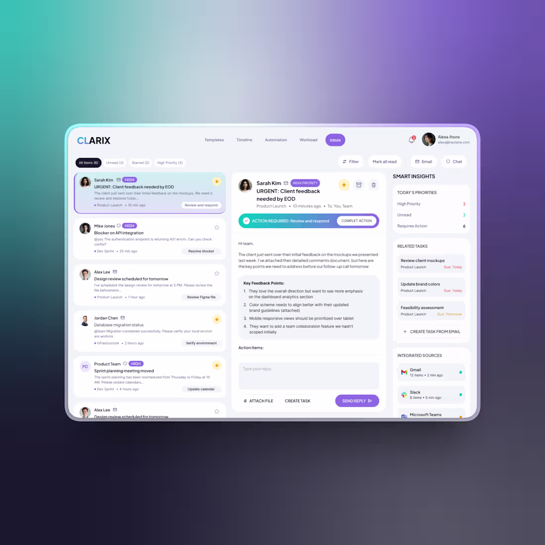
Project Management Web App Design
What would you change in this design for the better?
2
1
279
3D jellyfish and Glassmorphism for a website design. Built using Nextjs & Threejs. How does this look?
1
2
242
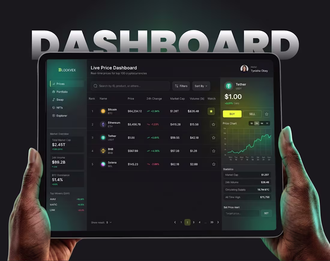
Blockvex is a comprehensive Web3 platform designed for serious NFT collectors and analysts. It serves as a centralized hub to discover, track, and analyze top-tier NFT collections across multiple blockchains.
The NFT market is fragmented across numerous marketplaces (OpenSea, Magic Eden, LooksRare) and multiple blockchains. This fragmentation makes it difficult for users to get a consolidated view of market health, compare performance, or find specific assets without juggling dozens of tabs.
The Blockvex UI provides a dark-mode, high-density information display tailored for power users, offering clarity in a chaotic market.
Would love to know your thoughts on the design and experience.
2
2
267
Web App Design & Development for an AI Powered LMS.
0
218
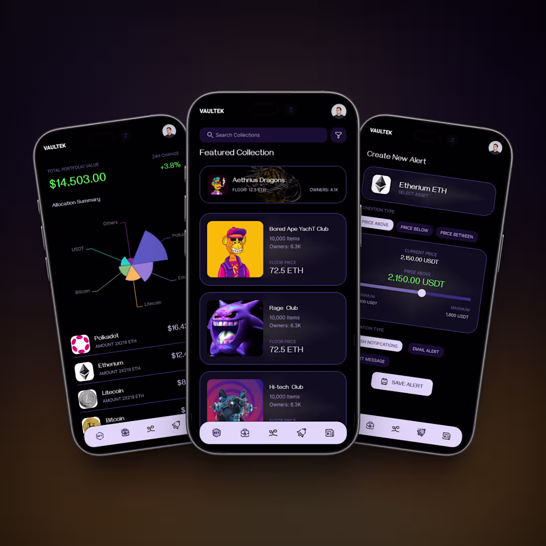
Recently did this dark mode NFT Marketplace App Design for a client. Complete app case study available to view on the attached link.
1
2
223
Did this website using Framer for a parenting startup. How does it look?
1
2
219
Designed and developed a mobile app for developers that helps them prepare for their interviews in a gamified way. What do you think of the idea and the design?
1
2
204
Built this landing page for a SaaS startup where the complete design & development was AI assisted. What do you think?
1
3
207
Designed an immersive landing page experience for a lighting company. Showcasing their products using a parallax effect and subtle animations. Do you think this would work better than a normal product showcase?
#framer
1
2
243
Designed this product display for AllBirds Sneakers.
Showing multiple product images in a creative way, closer to a showroom display. What do you think of this experience as an immersive product display?
This is a personal project and not directly related to allbirds.
1
240
Redesigned The Ordinary website as a personal exploration of clarity, restraint, and honest skincare communication.
The focus was on:
Ingredient-first content instead of marketing stories
Clear hierarchy for formulations, percentages, and usage
Editorial product imagery designed for subtle motion and depth
A layout system that adapts to intent, not symmetry
No gimmicks. No exaggerated claims. Just structure, whitespace, and information that respects the user.
Personal project. Not affiliated with The Ordinary.
1
1
228
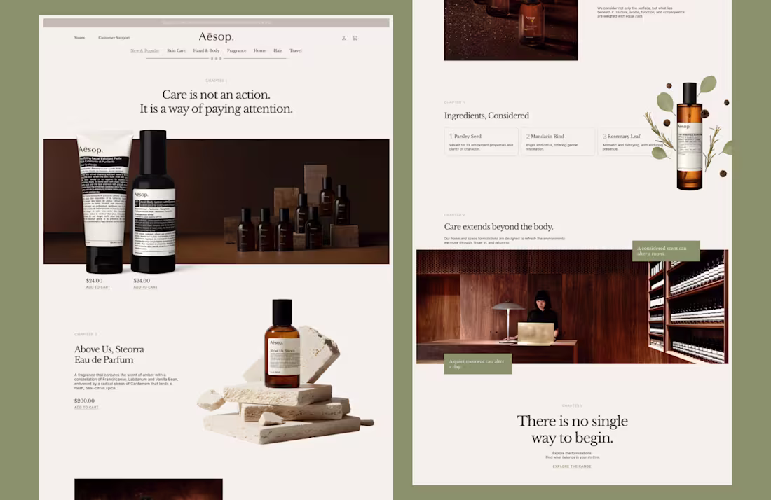
How's this for a website redesign for Aesop?
0
253
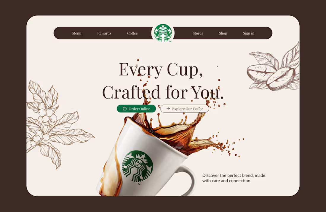
This started as a simple question I couldn’t shake off.
What if the Starbucks website felt less like a corporate platform and more like the experience of actually being in a Starbucks?
So I treated this as a personal exploration, not a client brief. I focused on mood, rhythm, and storytelling instead of cramming information into predictable sections.
I played with:
- Editorial layouts that breathe and guide the scroll naturally
- Floating, transparent product visuals that move subtly with the page
- Warm coffee-inspired tones that feel calm and premium
- Micro-moments that make the site feel alive, not static
This project reminded me how much design improves when you slow down and design for feeling, not just function.
Would genuinely love to hear thoughts or feedback from other designers.
11
36
382
Shopify Store design for an Aronia berry juice brand.
The hero leads with the product itself. As you scroll, the bottle moves with you, flowing into the next section instead of abruptly disappearing. It’s meant to feel continuous, almost like pouring the experience downward.
The design leans into richness and freshness. Deep berry tones, clean typography, and smooth motion to mirror the product’s natural, premium feel. Nothing loud. Nothing forced. Just enough movement to keep you engaged without stealing focus from the product.
The idea was to make the product feel alive on the page, not just placed there.
Curious to hear thoughts.
Does the flow work for you, or does it feel distracting?
0
239
This is the new website for That Nerd Studio.
The hero is the core of the experience. Built around a subtle magic theme, it’s designed to feel immersive without being gimmicky. Motion, light, and depth work together to pull you in and set the tone instantly.
The goal was simple: make the studio feel powerful, intentional, and a little mysterious, without sacrificing clarity or usability. Every animation serves a purpose. Every interaction nudges the user forward.
This project focuses on visual storytelling, modern UI, and a hero section that actually earns attention instead of begging for it.
Let me know what do you think of the idea.
2
1
237
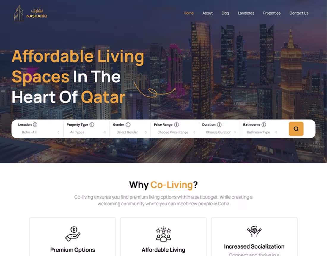
Property Management System & Website
0
6
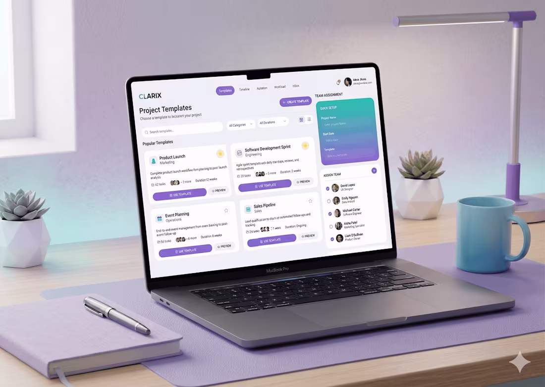
Project Management Web App UI/UX Design
0
0