The network for creativity
Join 1.25M professional creatives like you
Connect with clients, get discovered, and run your business 100% commission-free
Creatives on Contra have earned over $150M and we are just getting started
Back to feedPost

This started as a simple question I couldn’t shake off.
What if the Starbucks website felt less like a corporate platform and more like the experience of actually being in a Starbucks?
So I treated this as a personal exploration, not a client brief. I focused on mood, rhythm, and storytelling instead of cramming information into predictable sections.
I played with:
- Editorial layouts that breathe and guide the scroll naturally
- Floating, transparent product visuals that move subtly with the page
- Warm coffee-inspired tones that feel calm and premium
- Micro-moments that make the site feel alive, not static
This project reminded me how much design improves when you slow down and design for feeling, not just function.
Would genuinely love to hear thoughts or feedback from other designers.


it captures the vibe!

Awesome Sundas 🙌
Looks modern and elegant 🔥

Stunning 🙌

very balanced design :) I really like it 10/10


Nice

@Sundas R. looks very clean and modern🙌

good starting point 👍


aesthetic and goated;

great work sundas🙌


More relatable

Love this design philosophy. Shifting from function to feeling transforms the experience. The mood, rhythm, and micro-moments you described are what make digital spaces resonate. Great exploration.
The network for creativity
Join 1.25M professional creatives like you
Connect with clients, get discovered, and run your business 100% commission-free
Creatives on Contra have earned over $150M and we are just getting started



Related posts

Solar Energy Website
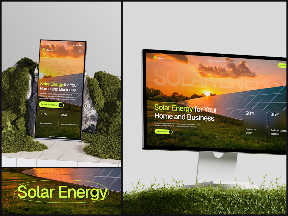
A thin lime circle tells you which two words this page is about.
The headline sits over a sunset photo of a panel field. The "Get started" and "Explore innovations" buttons share the circle's lime, so the eye moves from the circled words straight to the next step.
Large faded capitals repeat those two words across the sky, faint enough to stay inside the photo. On mobile they break onto two lines, and the headline and button stack above two frosted cards.
Only two words of "Solar Energy for Your Home and Business" are lime, and the whole page follows them.
Designed by the Hue & Machine team.
#SolarEnergy #RenewableEnergy #CleanTech #WebDesign #LandingPage #HeroSection #UIDesign #ResponsiveDesign #MobileDesign #FigmaDesign



This is really cool, Nice job Dmytro

FORMA | Creative Studio Website Design
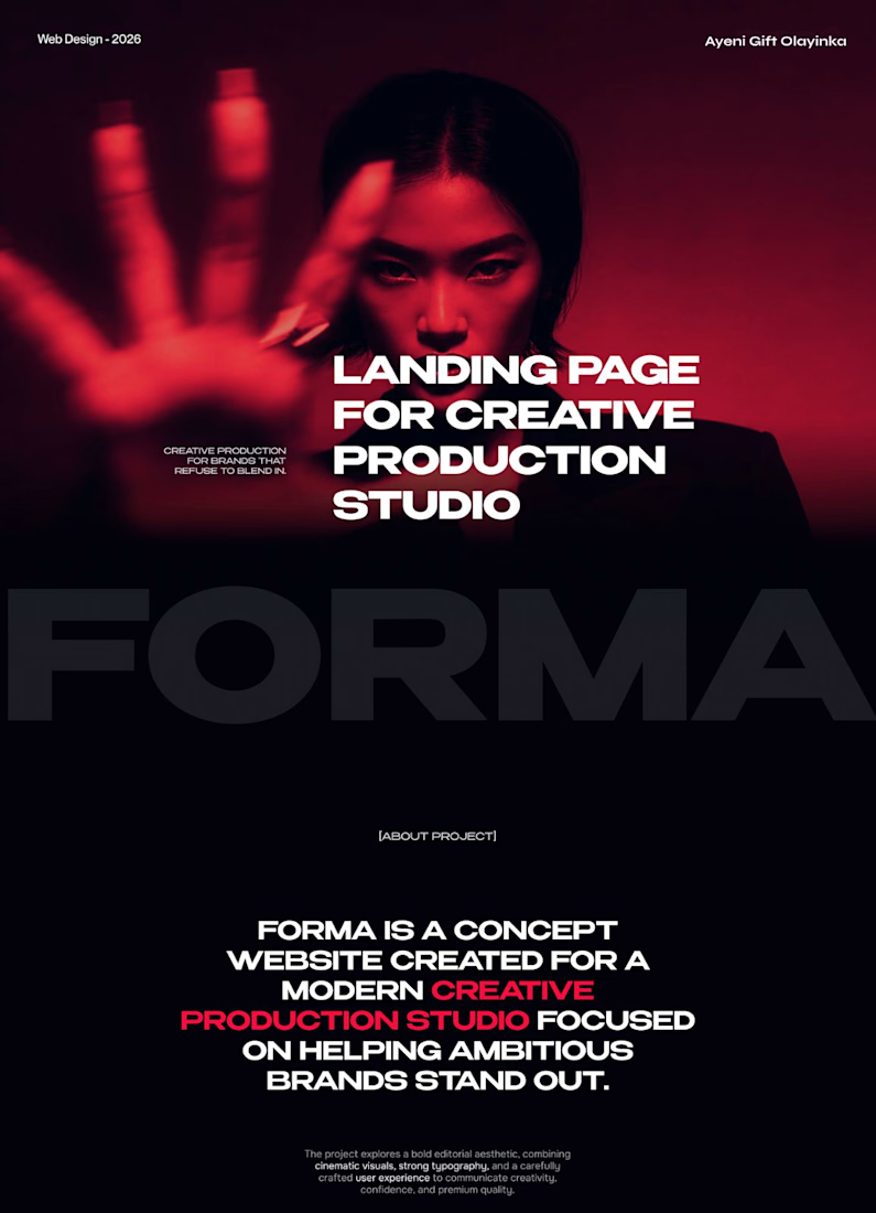
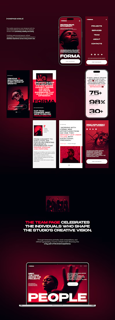
A bold, cinematic website concept for a modern creative production studio.
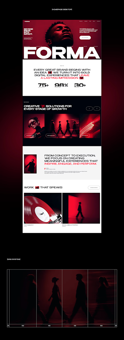
FORMA is a concept website that shows how strategy, design, and digital production come together in one immersive brand experience. The design is built on three things:
Editorial layouts that give the content room to breathe and set a confident, magazine-style rhythm
Cinematic red-lit photography that gives the brand a dramatic, memorable visual identity
Expressive typography that carries the studio’s voice and guides the eye through each section
The goal was a site that feels like the studio’s work: striking, intentional, and made to leave an impression.
My role: UI/UX Design, Visual Direction, Landing Page Design
Tools: [Figma / Photoshop / etc.]
#CreativeAgencyWebsite #CreativeStudio #LandingPage #WebDesign #WebsiteDesign #UIUX #UIDesign #EditorialDesign


Cool direction for the studio.

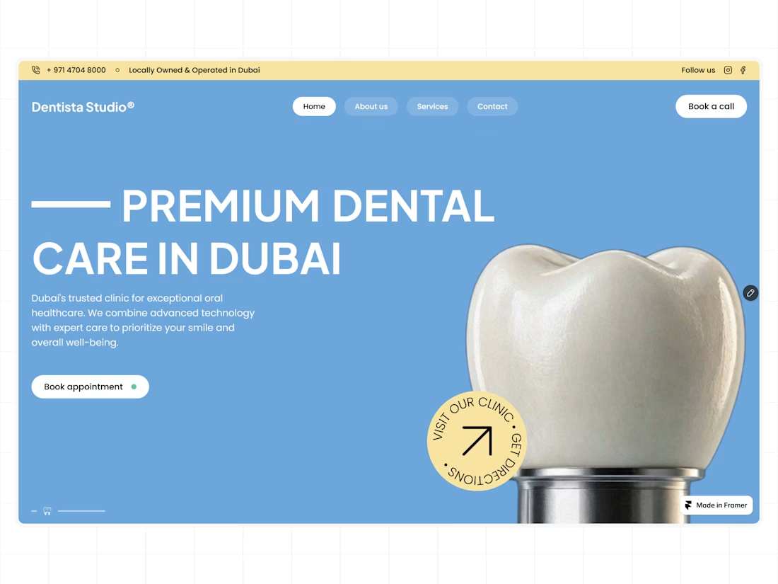
A clean hero section for a modern dental clinic, designed and built with Figma and Framer.
That blue works nicely.