AdamStav Branding Studio
Brand Designer & Illustrator



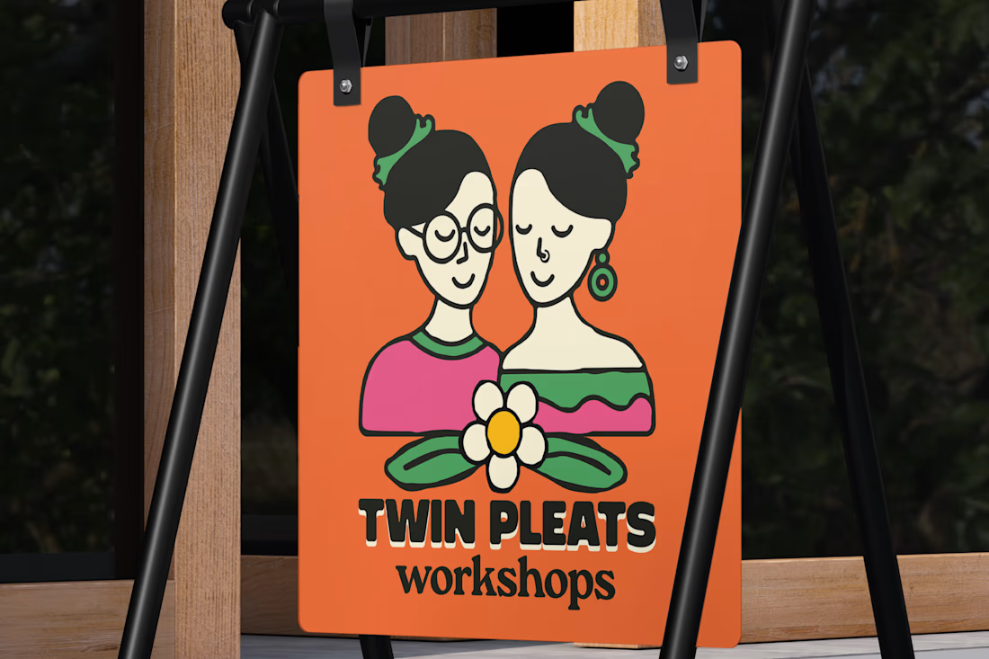
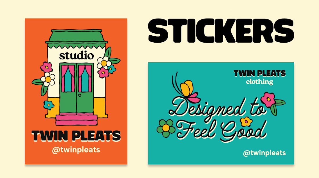
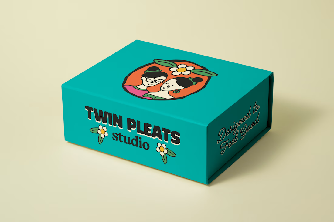
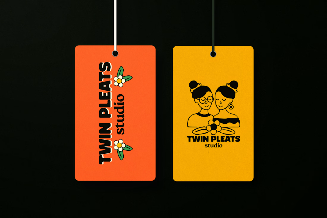
Brand identity for Twin Pleats. We went for a fun, playful, and modern retro vibe, packed with colour and personality to match their creative spirit.
View the complete case study here: https://www.behance.net/gallery/256767901/BRAND-IDENTITY-TWIN-PLEATS-STUDIO

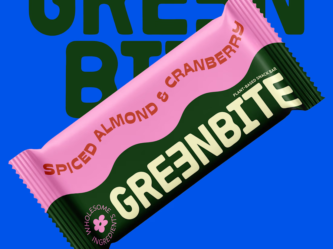
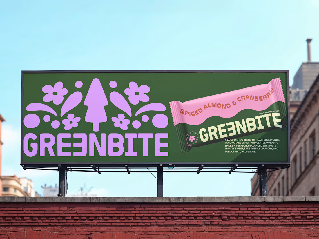
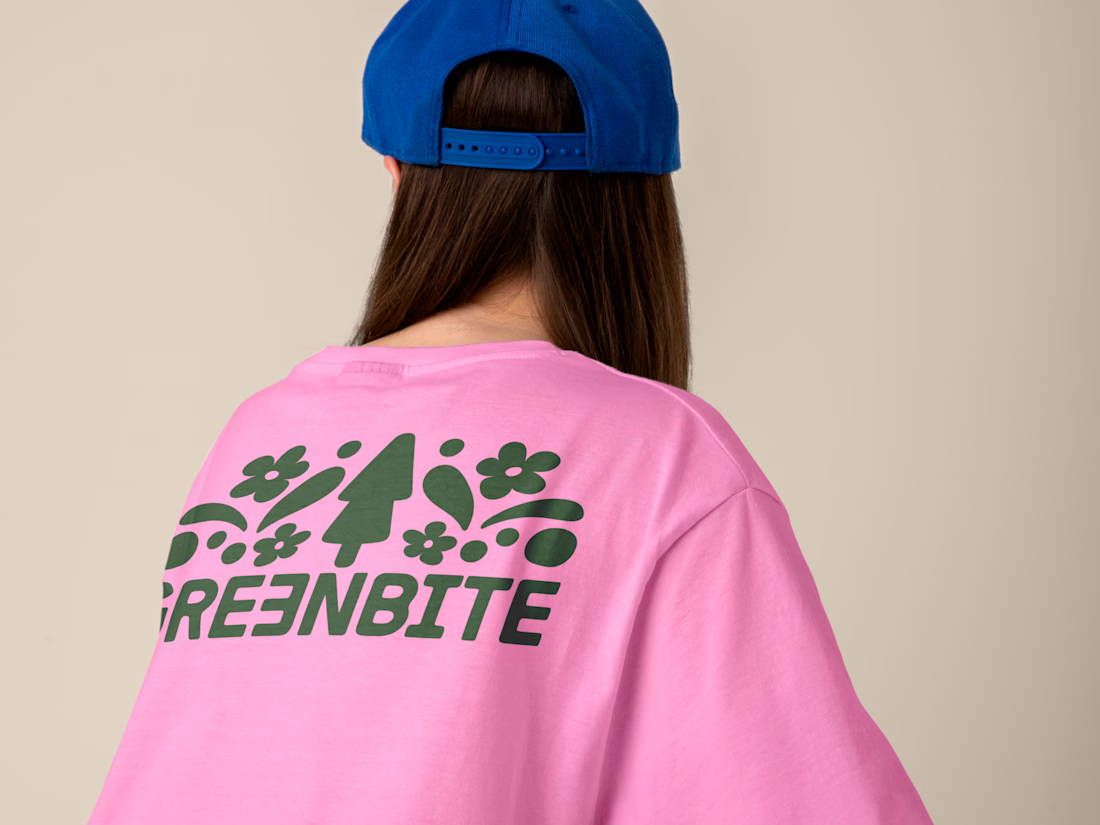
Brand identity and packaging design for Greenbite, a plant-based snack brand.
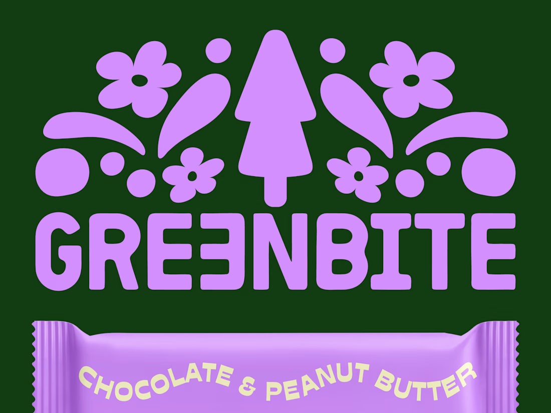
The goal was to blend organic typography with a vibrant, modern retro vibe to reflect "wholesome energy". Every element evokes natural flavors and feel good ingredients.
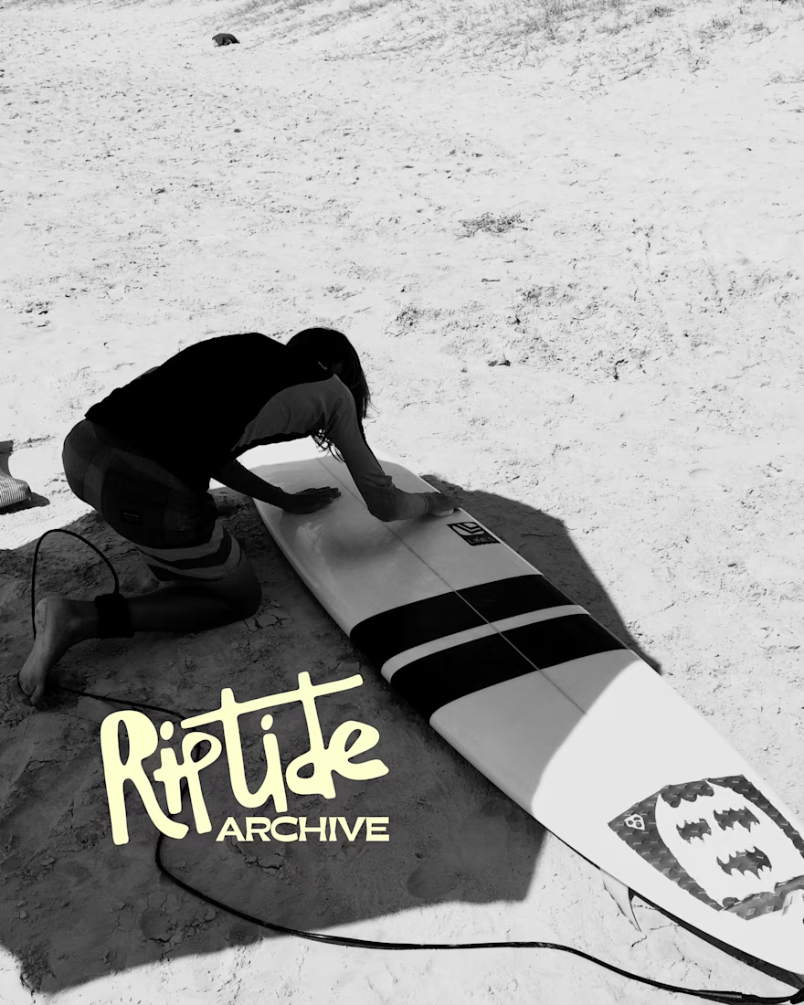
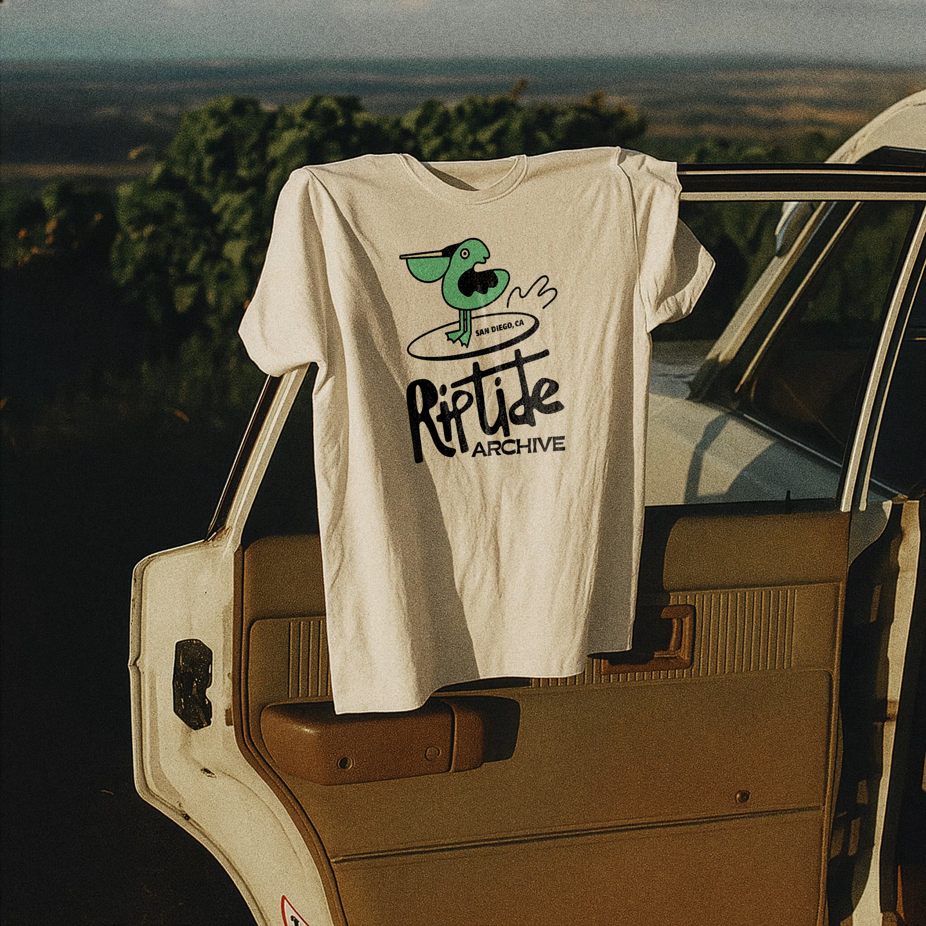
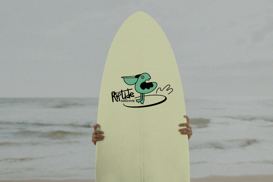
Logo for Riptide Archive. They document underground surf culture through limited run apparel, photo zines and short films.
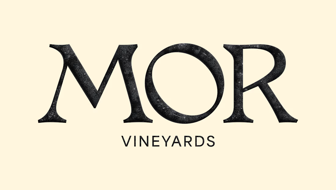
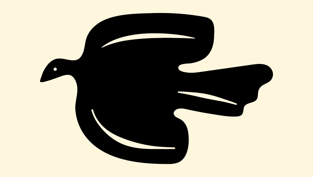
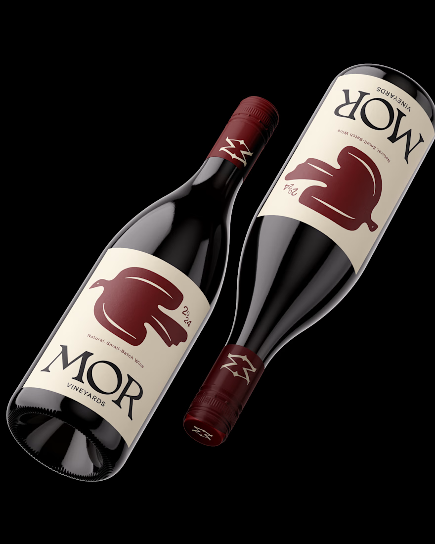
Brand design for MOR Vineyards. A small-batch winery specializing in natural wines.The identity combines elegant customized serif typography with an organic bird icon designed to attract the wine enthusiasts and eco-conscious foodie audience.
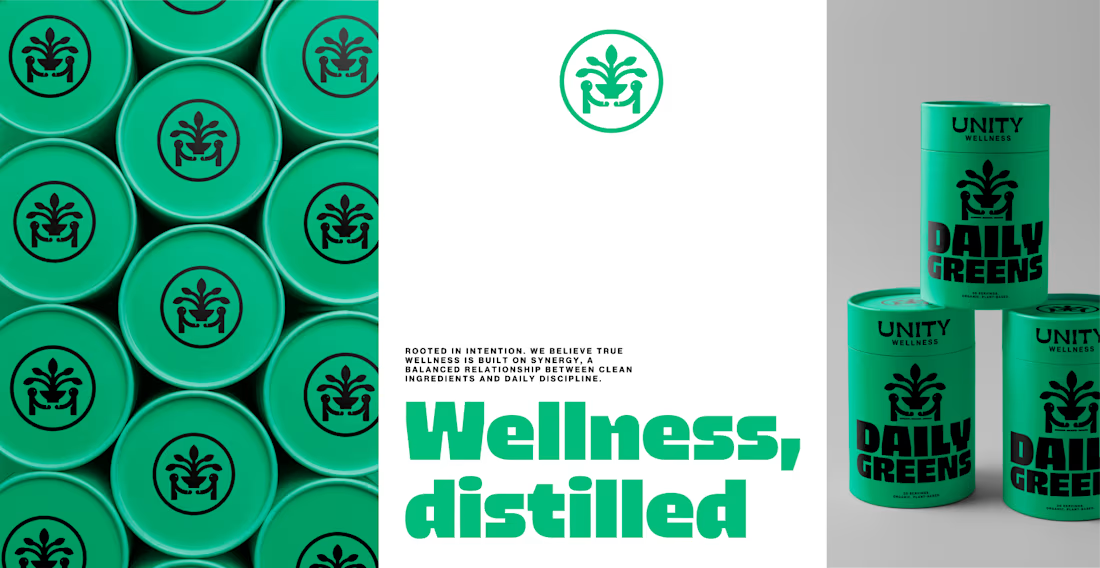
Brand identity and packaging for Unity Wellness.