The network for creativity
Join 1.25M professional creatives like you
Connect with clients, get discovered, and run your business 100% commission-free
Creatives on Contra have earned over $150M and we are just getting started
Back to feedPost

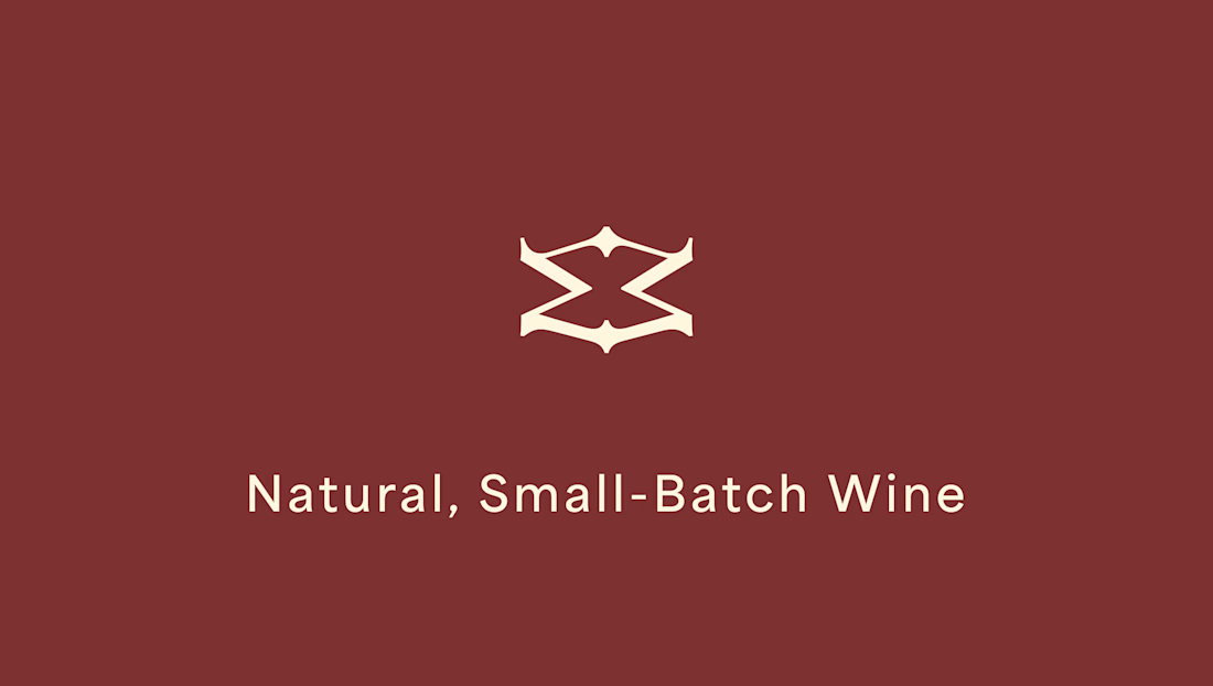
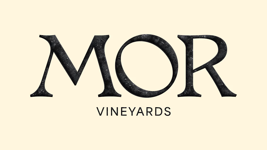
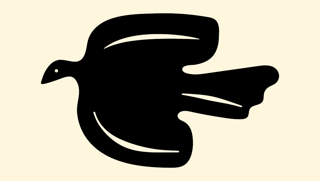
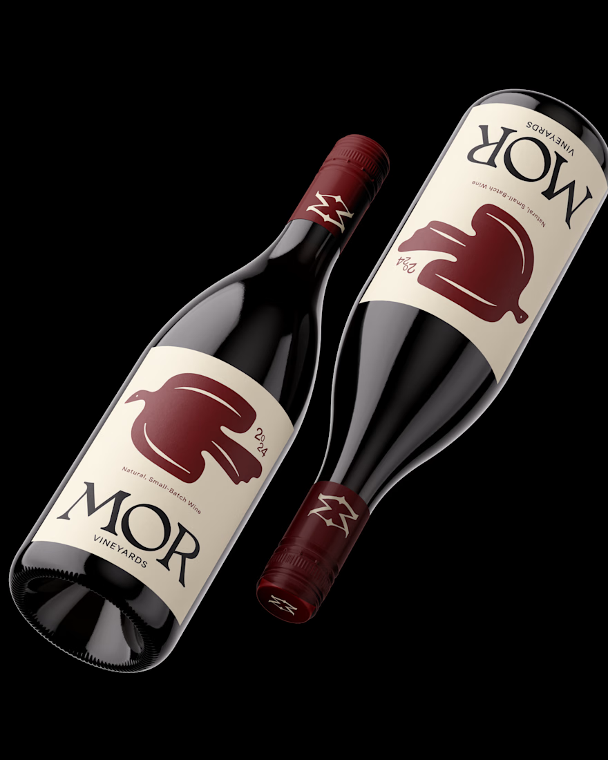
Brand design for MOR Vineyards. A small-batch winery specializing in natural wines.The identity combines elegant customized serif typography with an organic bird icon designed to attract the wine enthusiasts and eco-conscious foodie audience.


i love so much!!

beautiful design!

Pairing a custom serif with that bold, almost hand-cut bird mark is a smart way to split the difference between elegant and approachable for a natural wine brand. Did the bird come out of research into the vineyard itself, or was it more of a broader natural-wine visual language?

Love this, super fresh look and feel!

loving this mark

Great design! So detailed and comprehensive ❤

Love how this came together.
The network for creativity
Join 1.25M professional creatives like you
Connect with clients, get discovered, and run your business 100% commission-free
Creatives on Contra have earned over $150M and we are just getting started











Related posts



Aryna, that golden symbol pops so nicely against the plum background ✨

The team is cooking
Motion design for the logo we are making for Nation e-commerce


Wou

Finally a Contra Top Independent!
Been part of this community for a few years now, sharing my work, joining challenges, meeting some great people, and even picking up a few wins along the way.
I've genuinely enjoyed being part of Contra and seeing how much the platform has grown.
This one means a lot. Big thanks to the Contra team for the recognition!
More to come!
