pro
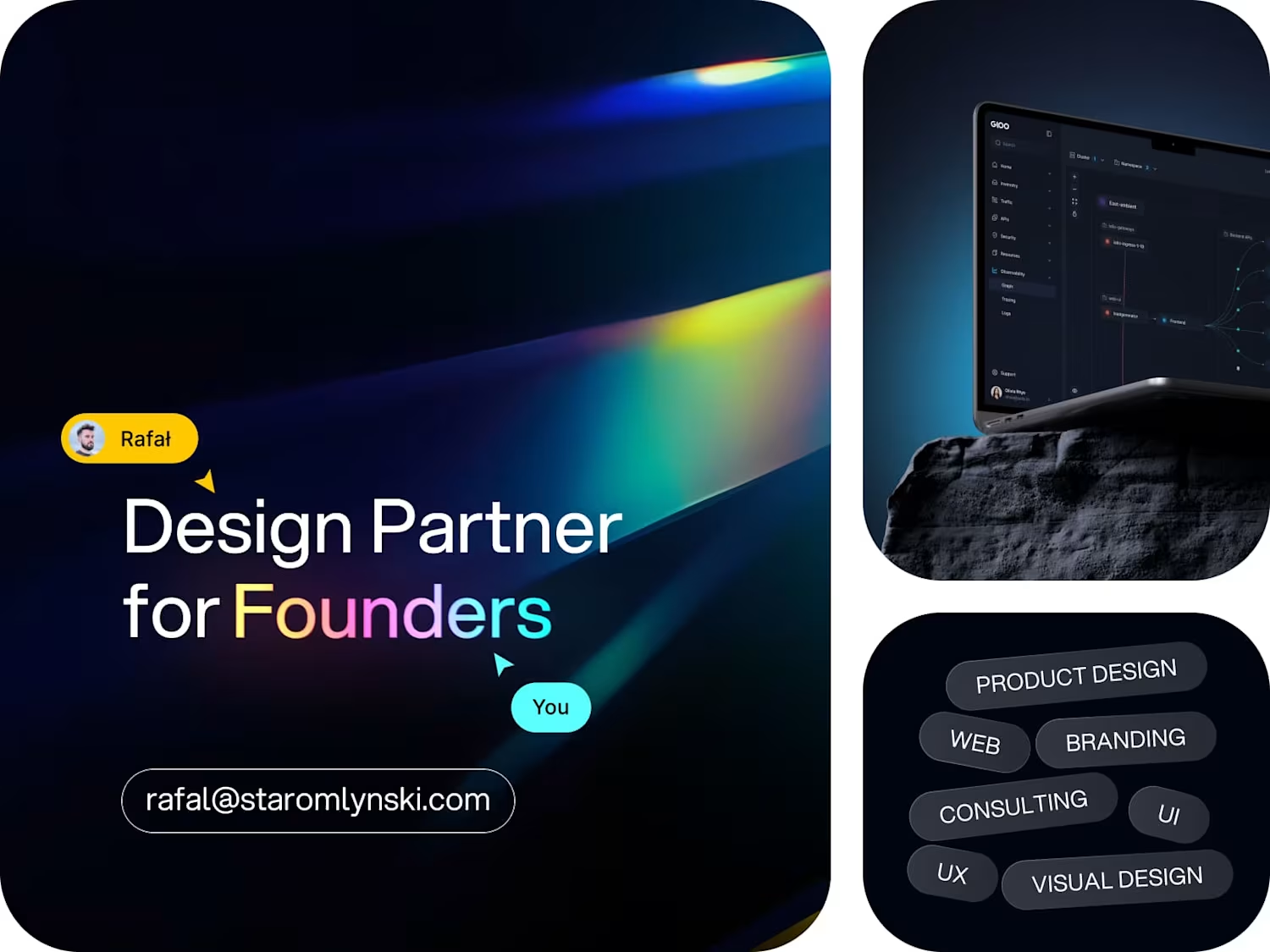
Rafał Staromłyński
Product Design Partner For Founders
Ready for work
Rafał is ready for their next project!
Tradex Landing page entrance animation. What would you tweak?
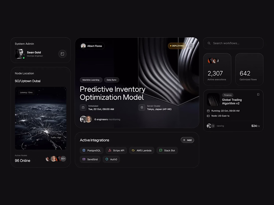
Designing observability dashboards is less about “showing data” and more about reducing cognitive load. If you can’t answer “are we OK right now?” in 3 seconds, the dashboard isn’t done.