The network for creativity
Join 1.25M professional creatives like you
Connect with clients, get discovered, and run your business 100% commission-free
Creatives on Contra have earned over $150M and we are just getting started
Back to feedPost

Designing observability dashboards is less about “showing data” and more about reducing cognitive load. If you can’t answer “are we OK right now?” in 3 seconds, the dashboard isn’t done.
The network for creativity
Join 1.25M professional creatives like you
Connect with clients, get discovered, and run your business 100% commission-free
Creatives on Contra have earned over $150M and we are just getting started





Related posts

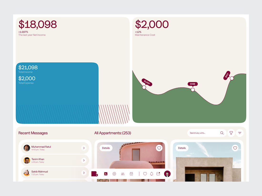
Real Estate Analytics & Listing Dashboard
A PropTech dashboard concept combining property listing management with real estate analytics.
The workspace is structured around the information a real estate team needs to monitor and act on — property inventory, listing activity, performance metrics and business insights.
The design approach puts hierarchy first, keeping a data-heavy product organized without making it feel overwhelming.
Design focus:
• Real Estate SaaS
• Analytics Dashboard
• Property Listing Management
• Data Visualization
• PropTech UI/UX
• Product Design
• Business Intelligence
Designed by WaxyWeb.


Nice

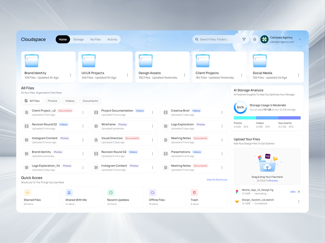
Cloudspace brings cloud storage, file organization, folder management, AI storage analysis, upload tracking, and quick access shortcuts into one clean dashboard experience. With soft blue visuals, glassmorphism cards, intuitive filters, spacious layouts, and clear file categorization, the interface makes managing digital assets feel simpler, faster, and more enjoyable.
📩 Collaborate with Us? Contra Cansaas Agency


Dashboard and MCP request design for sales platform
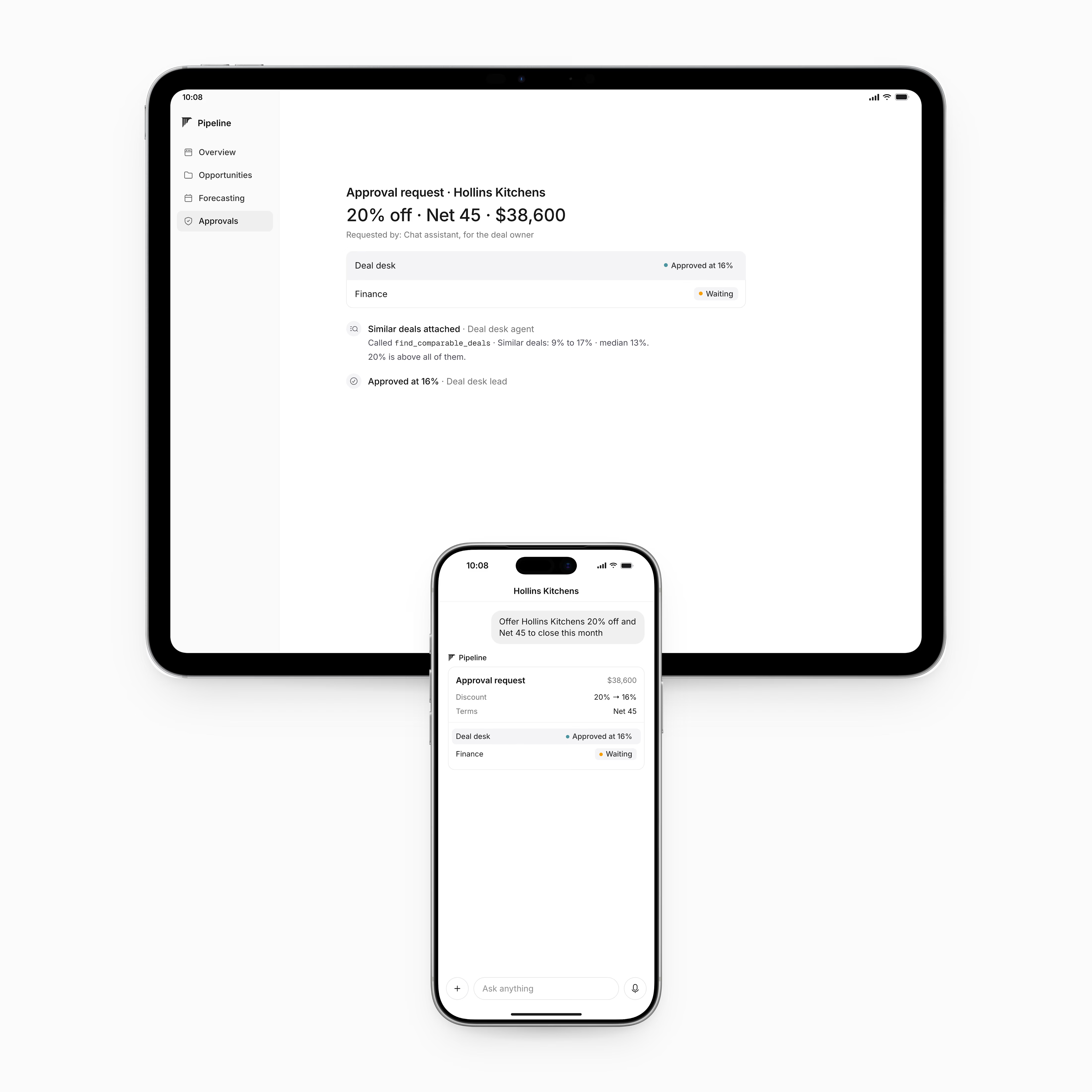
The goal was the keep the experience simple for the users. Dashboards contain the majority of the information while the MCP request flags what's needed.
Check it out


I love this clean design 😍