
Stanislav Ryabchik
Brand and Web Designer for fashion and culture brands.
New to Contra
Stanislav is ready for their next project!
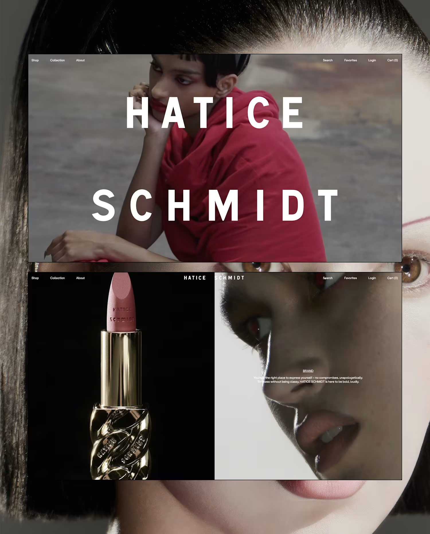
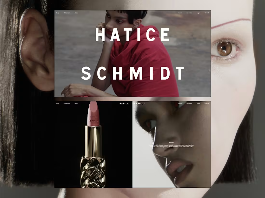
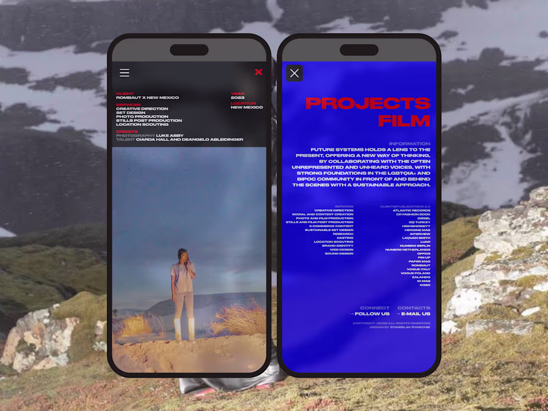
E-commerce interface built around full-bleed imagery and restrained typography, visual storytelling and minimalism.
1
72
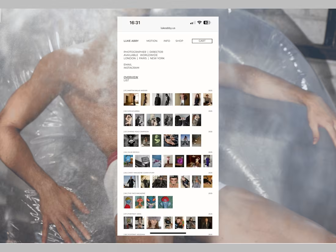
Minimal portfolio interface built around a clean grid and restrained typography prioritizing image flow, clarity, and editorial structure across desktop and mobile.
1
64

A raw, deconstructed aesthetic that merges utilitarian graphics with underground street energy. The URBANPULSE branding expresses a fusion of analog imperfection and cyberpunk futurism.
1
48
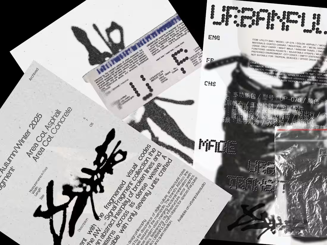
A raw, deconstructed aesthetic that merges utilitarian graphics with underground street energy. The URBANPULSE branding expresses a fusion of analog imperfection and cyberpunk futurism.
0
20
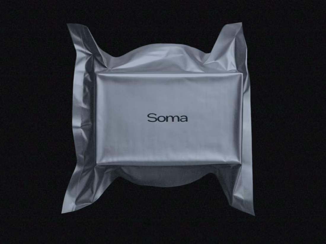
The Soma visual identity feels like a meditation on material, memory, and the body. It’s sterile and sensual at once evoking beauty rituals, medical precision, and poetic detachment.
1
54
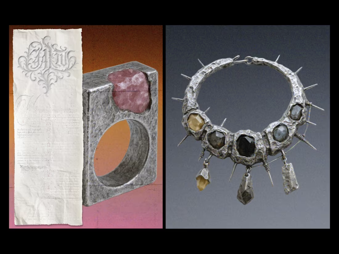
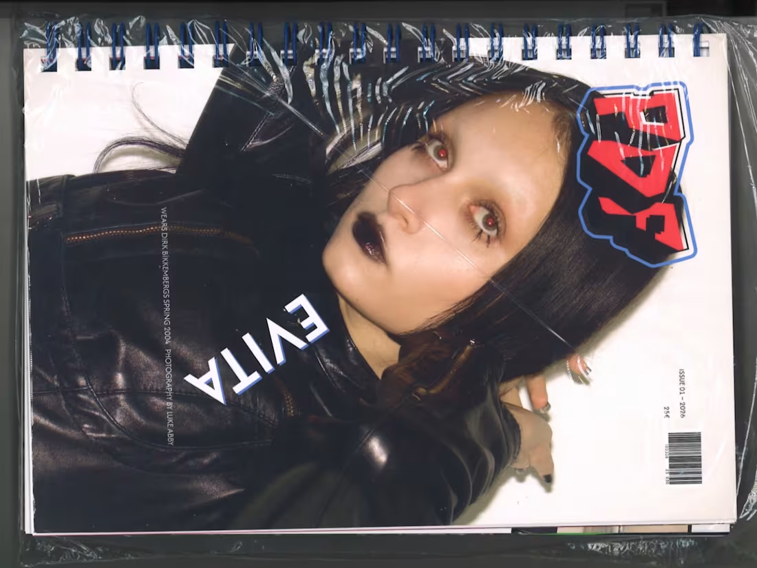
gothic editorial aesthetic combining artifact-like jewelry photography, ritual typography, and distressed textures — creating a dark.
1
56
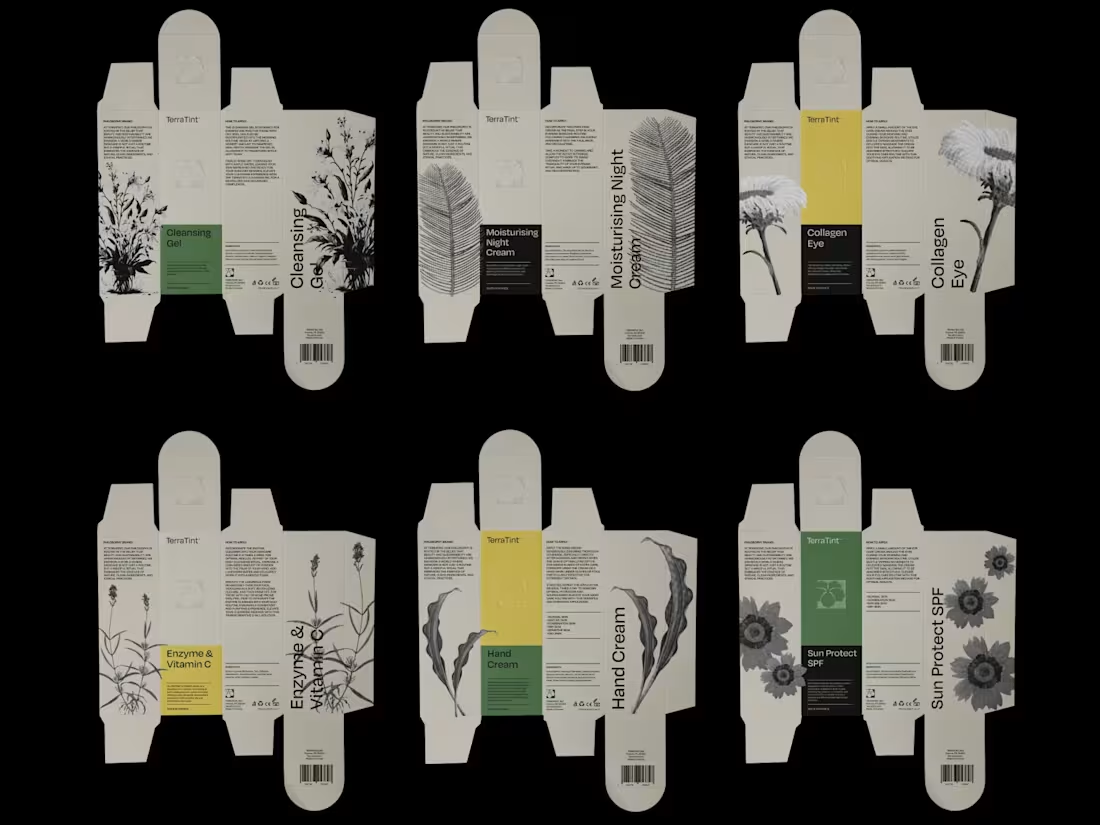
Eco-editorial brand system built around botanical imagery, muted earth tones, and layered typography — merging packaging design with atmospheric visuals to communicate a calm, nature-driven identity.
2
2
66
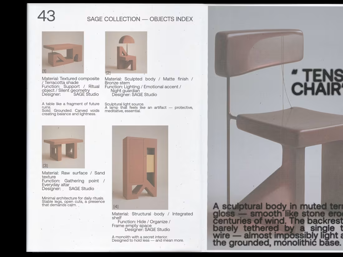
This design approach blends clean, editorial layouts with subtle nods to object-oriented brutalism.
0
18
The inspiration comes from magazines of the 60s, 70s, and 80s, known for their chaotic, free-form structures and the way each story created its own distinct mood. Every page avoids a fixed grid or repeated layout, allowing the content to define its own visual rhythm.
1
58

Designed the visual identity for CHILUTA, a fashion label shaped by corsetry, curated vintage, and a confident feminine aesthetic.
1
30
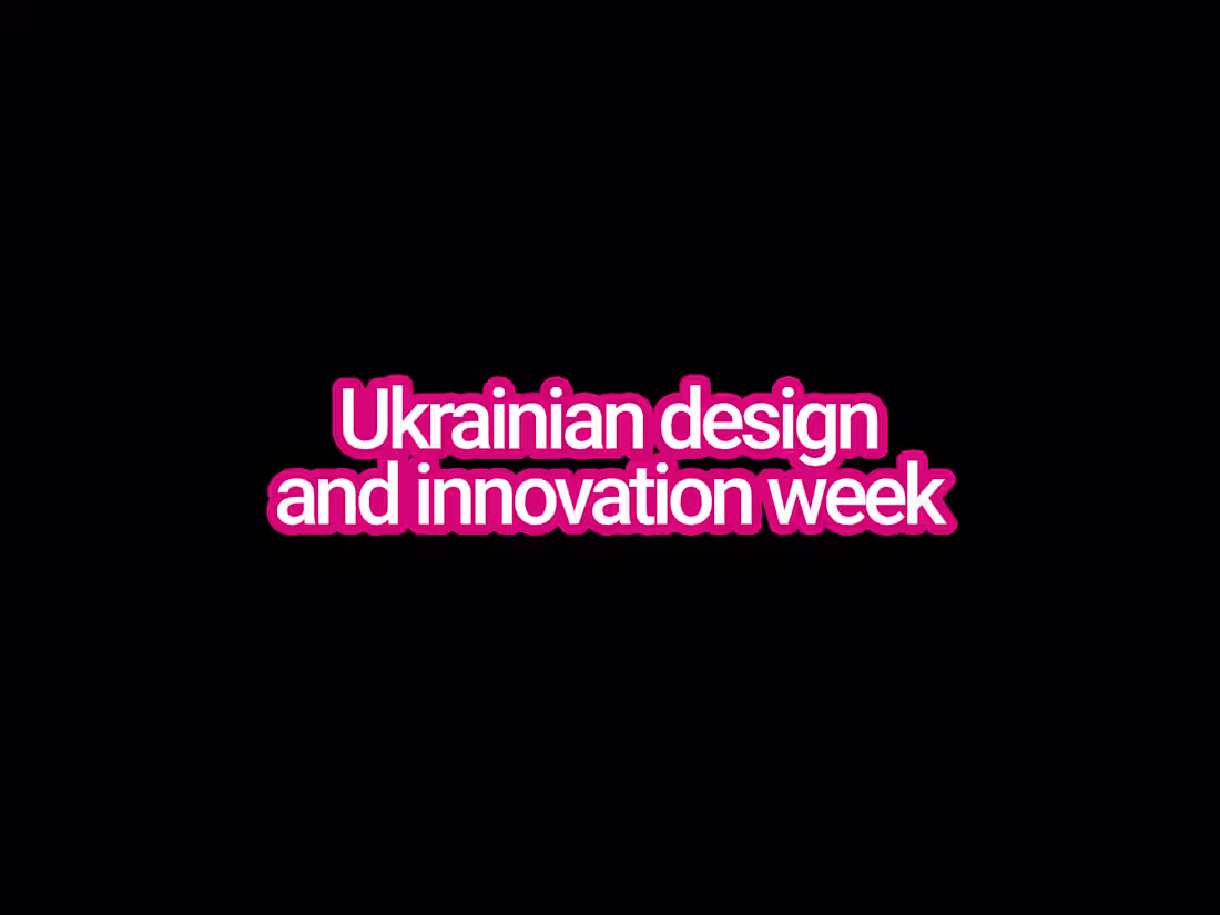
The biggest design festival in Ukraine. I created the full identity across all touchpoints and assets.
1
30

Oliver Bainbridge is a London-based photographer with a knack for capturing the essence of modern British culture.
0
5
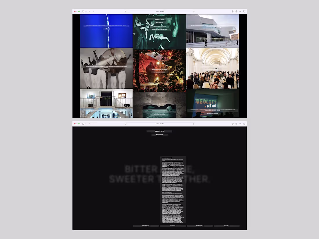
A minimalist digital editorial interface with a modular grid and contrasting typography. The black background, dense image gallery, and accent blue blocks create the feeling of an archival system and curatorial platform. The visual language combines fashion-editorial aesthetics with a utilitarian structure: clean navigation, a focus on content, and the feeling of a technologically advanced catalog of the future.
1
55
Minimal layout, intuitive navigation, and a clear grid that keeps full focus on the work. Neutral backgrounds, subtle glass effect, gentle motion.
1
37