The network for creativity
Join 1.25M professional creatives like you
Connect with clients, get discovered, and run your business 100% commission-free
Creatives on Contra have earned over $150M and we are just getting started
Back to feedPost

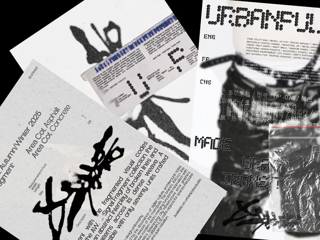
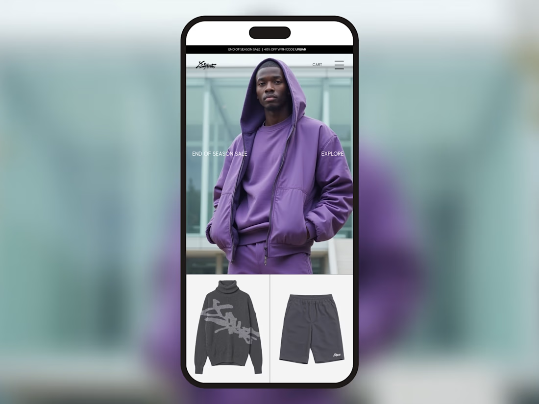
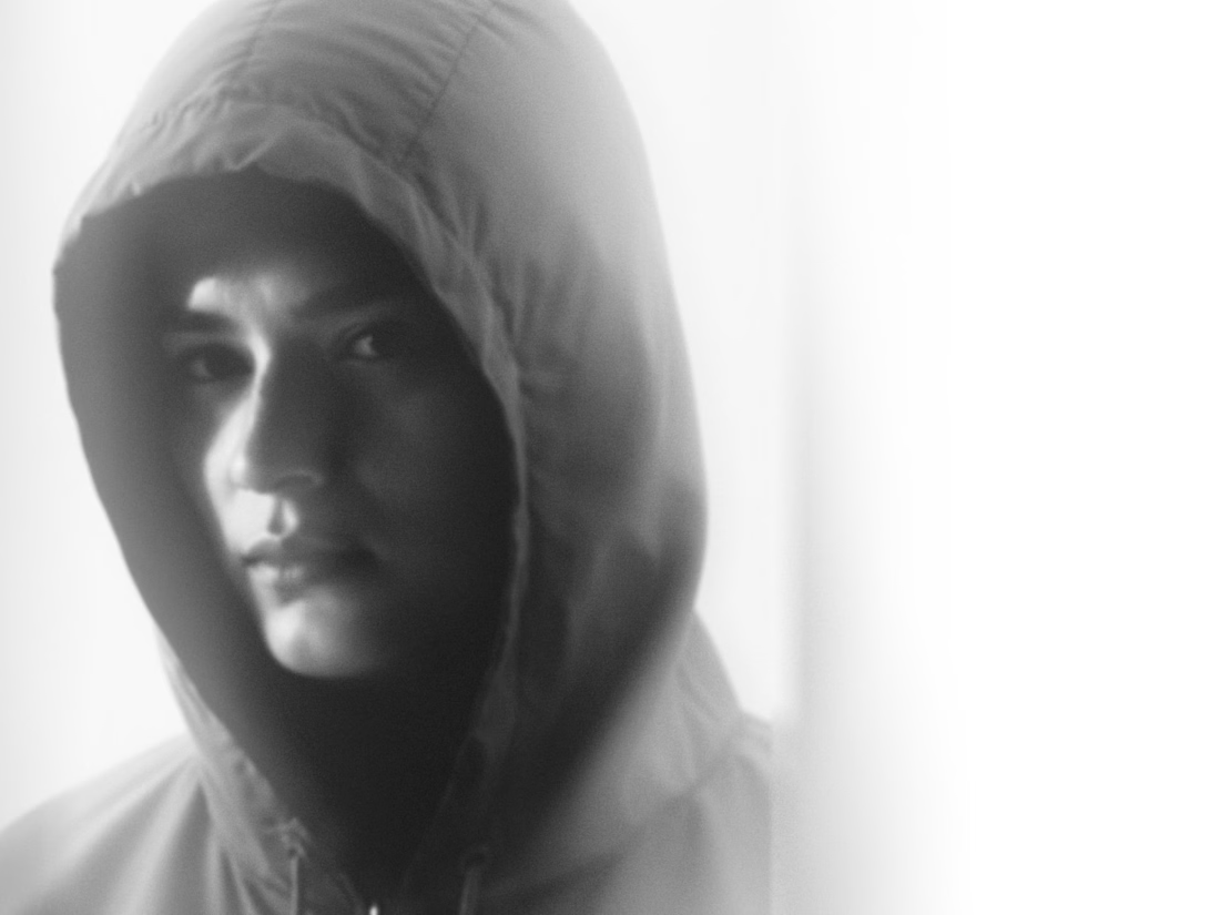
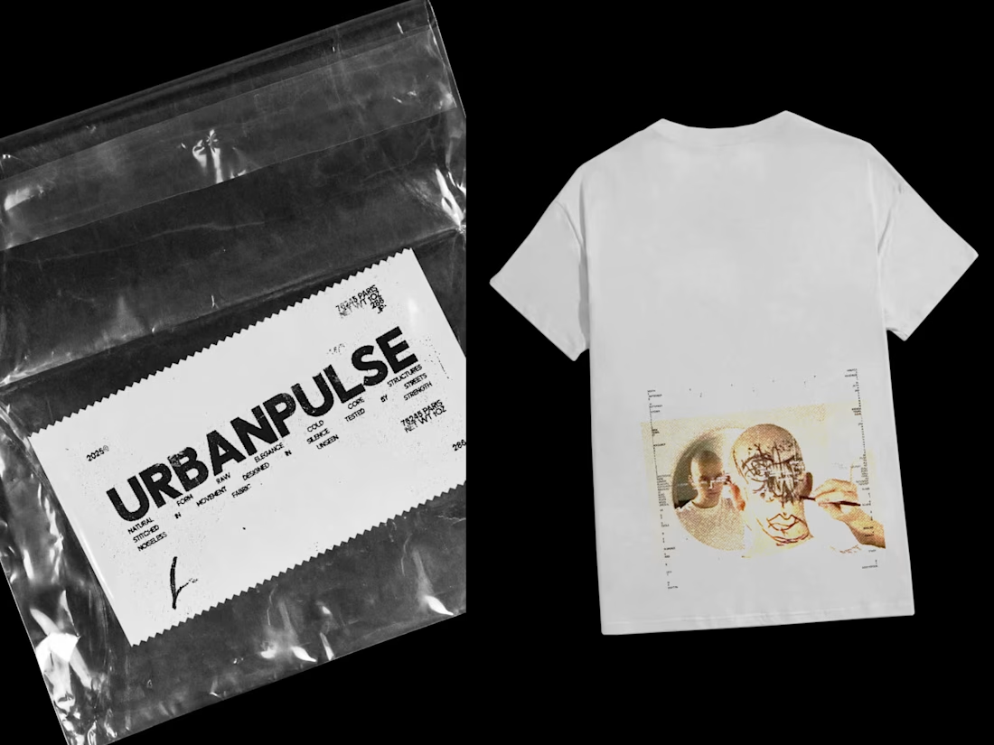
A raw, deconstructed aesthetic that merges utilitarian graphics with underground street energy. The URBANPULSE branding expresses a fusion of analog imperfection and cyberpunk futurism.


The network for creativity
Join 1.25M professional creatives like you
Connect with clients, get discovered, and run your business 100% commission-free
Creatives on Contra have earned over $150M and we are just getting started

Challenges
View all


Related posts

Client’s choice vs. Designer’s choice 👀
I’m currently working on a branding project for Massage & Mocktails — a concept built around couples learning massage together in a relaxed, social atmosphere.
These are two early, black & white directions from Stage 2 of my branding process, before moving into color, typography, and the full visual system.
The interesting part?
My client chose Concept 1. I chose Concept 2.
Now I’m curious what other creatives think.
Which direction would you choose — 1 or 2? And why?
Sometimes the most interesting part of branding is seeing how differently a client and a designer respond to the same brief.
21 voted
44%
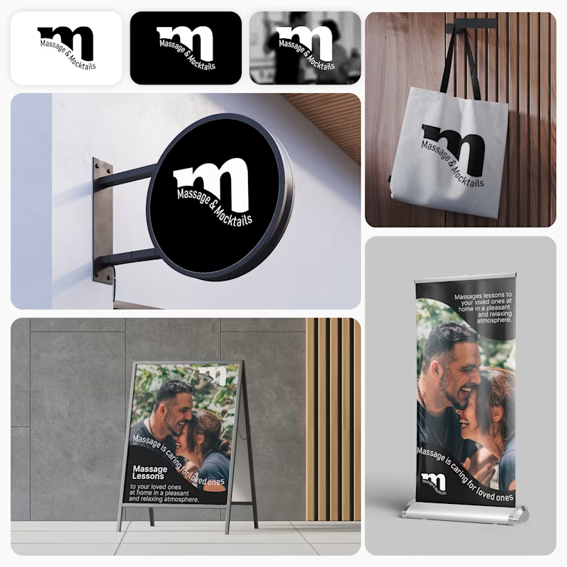
27 voted
56%
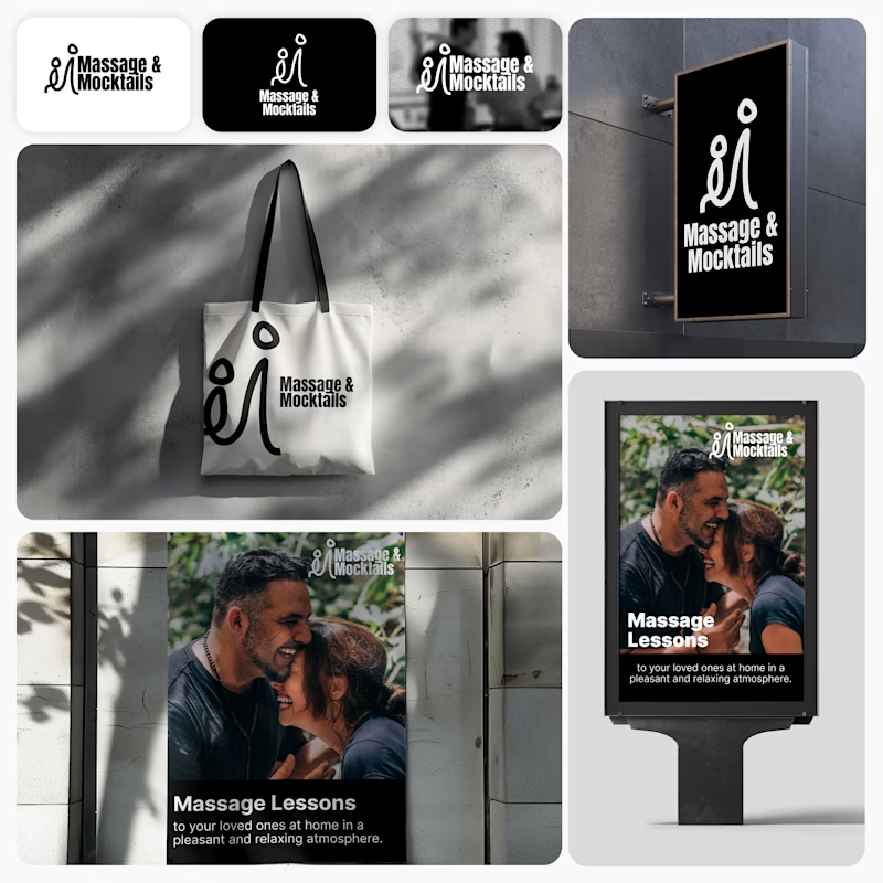
48 votes
Closed

Concept 2 for me. That interlocking figure mark reads as two people meeting, which is the actual brief here, so it gives you more to build a system on. Concept 1 is the safer, more literal pick, which is usually why clients reach for it.


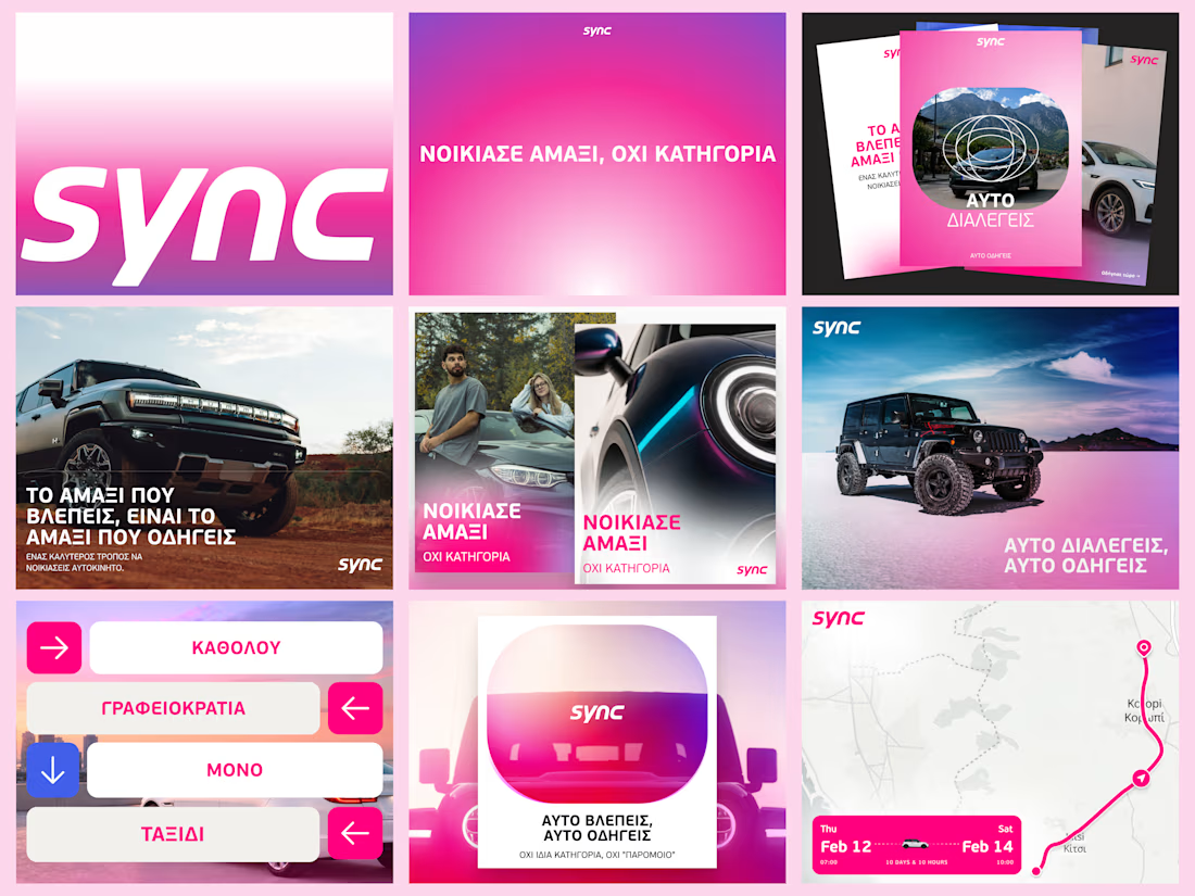
A few more pieces from my work on Sync’s identity.
The idea was to give this Greek car rental brand enough polish to sit next to the big names, with a personality of its own.
The pink was already there. I gave it more space and paired it with bold Greek typography and a frame inspired by a car’s side mirror.
Here’s a closer look at how it works across the layouts.

Logo Design and Brand identity design for pilates studio SILHOUETTE
Silhouette is a Pilates studio built around movement, balance and self-care.
We create a calm and welcoming environment where every movement is intentional, helping our clients feel stronger, more confident and connected to their bodies.🔥
Our mission is to make mindful movement a natural part of everyday life.

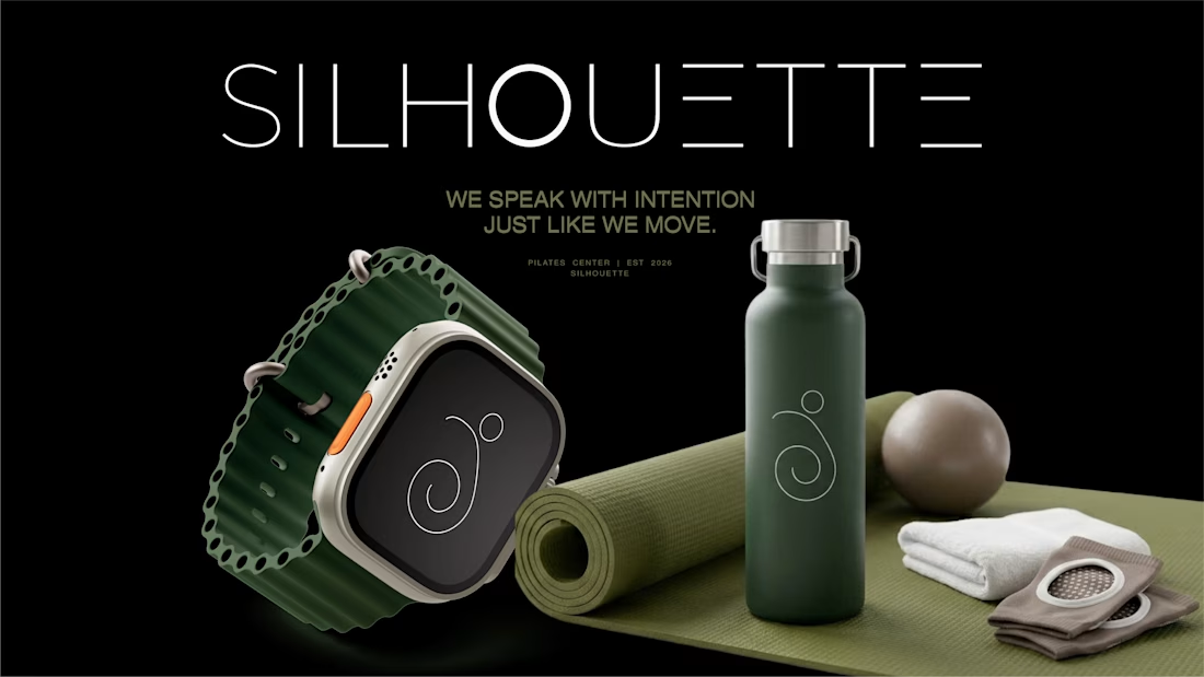
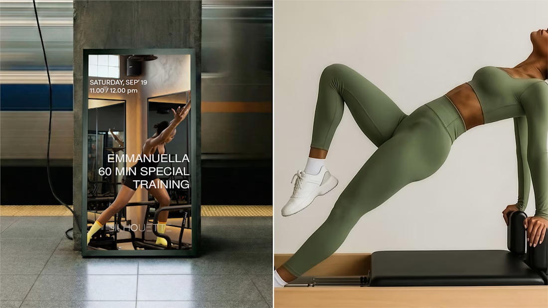
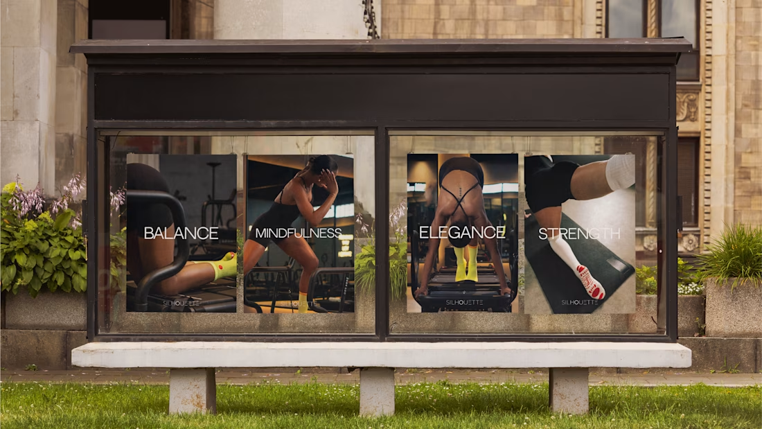
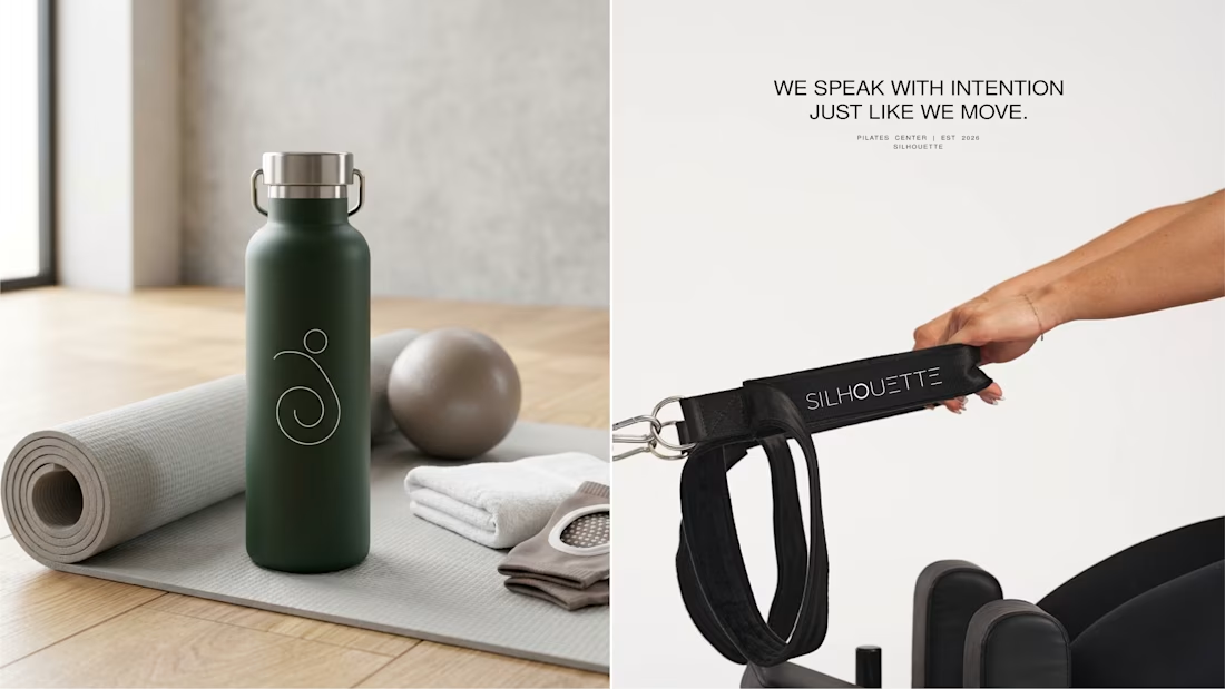

The visual system feels especially cohesive—the restrained palette and movement-led imagery make the brand feel calm, premium, and active.