


new component added to the lab
this time i tried to build a simple crypto card with a clean web3 feel and some small interactions
check it out https://souravchhimpa.com/lab/crypto-card


new component added to the lab
this time i tried a sphere based hero with a simple layout and some smooth movement kept it clean and focused on the visual
check it out https://www.souravchhimpa.com/lab/sphere-hero
new component added to the lab
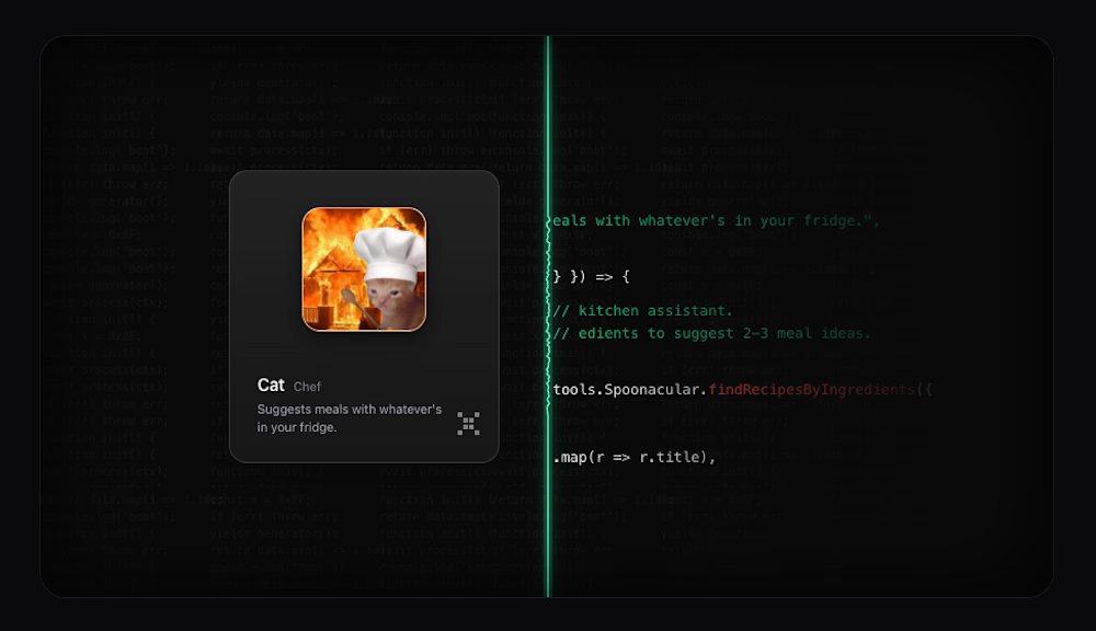
kept this one simple with a canvas background and some svg path work to make the interaction feel alive
inspired by AlbiaHossain and recreated it in my own style with a few small tweaks
check it out https://souravchhimpa.com/lab/focus-card