
sgh.group
Logos. Brand. Posters. Systems. Designed with precision.
Ready for work
sgh.group is ready for their next project!
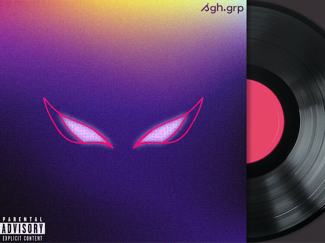
Spiderman-inspired eyes. Noise-driven gradients. Not just visual polish — this project explores how a single icon and colour gradient can anchor brand presence across formats. Same concept, optimised for album cover, laptop, and mobile screens.
4
343
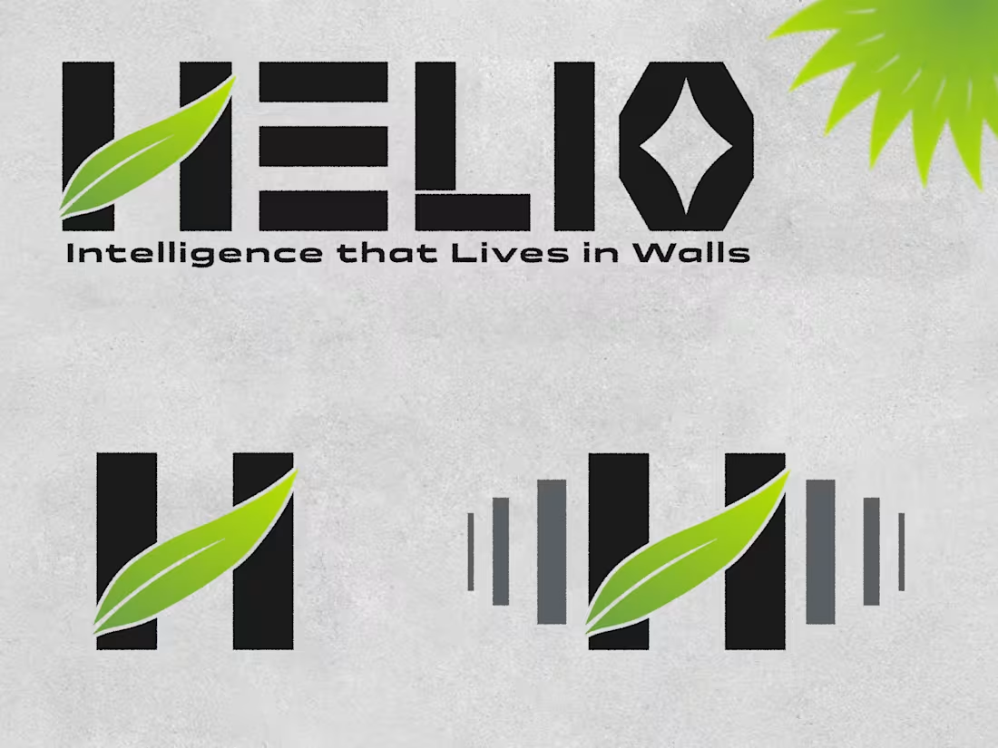
Helio Systems Brand Design
1
3
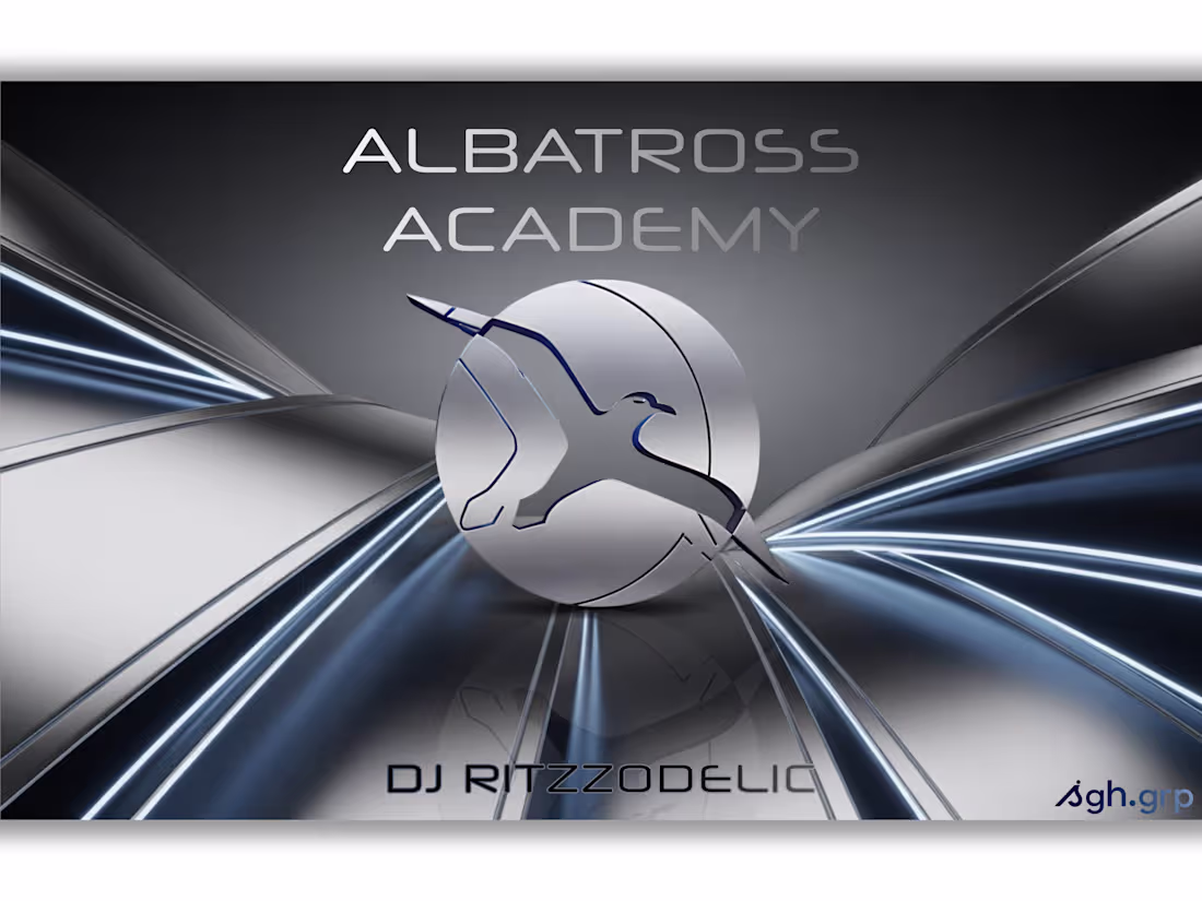
Turning rhythm into design. The Albatross Academy covers were refined to capture that metallic, futuristic energy — fluid chrome surfaces, clean reflections, and light beams that feel alive. Every curve now mirrors motion and music, giving the visuals a sound of their own.
2
316
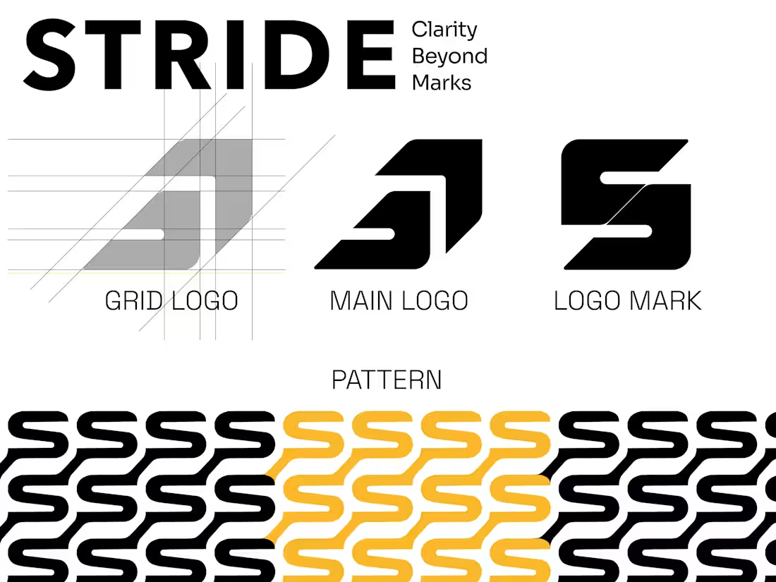
STRIDE is a data-driven student growth system that tracks behavior, discipline, and consistency each month — turning teacher feedback into visual analytics that show how a student is improving, not just performing.
2
239
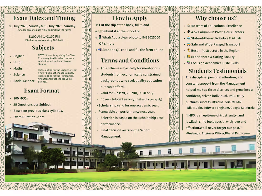
Condensing this much information — exam details, fee waivers, terms, and testimonials — into a single A4 was nearly impossible without losing clarity. So I restructured it into a roll-fold leaflet, balancing density with design. Every panel tells its part of the story — clear, compact, and complete.
2
193
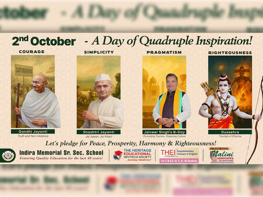
A cultural-educational campaign uniting Gandhi Jayanti, Shastri Jayanti, Dussehra, and Jaiveer Singh’s birthday under one theme — A Day of Quadruple Inspiration. Each symbolizes courage, simplicity, pragmatism, and righteousness. Designed to transform October 2 into a visual lesson in Indian values, blending heritage, education, and design-driven storytelling for IMPS.
2
163
A brand advertisement created for IMPS School — built around emotion, credibility, and clarity.
The video captures the school’s philosophy of full-time mentorship, real results, and future-ready education.
Designed, scripted, and directed to turn trust into enrollment. 🎬
2
122

A semi-transparent card concept that feels modern, weightless, and quietly futuristic. ✦
The result of getting bored of paid work — a little experiment in glass, light, and calm gradients.
2
114
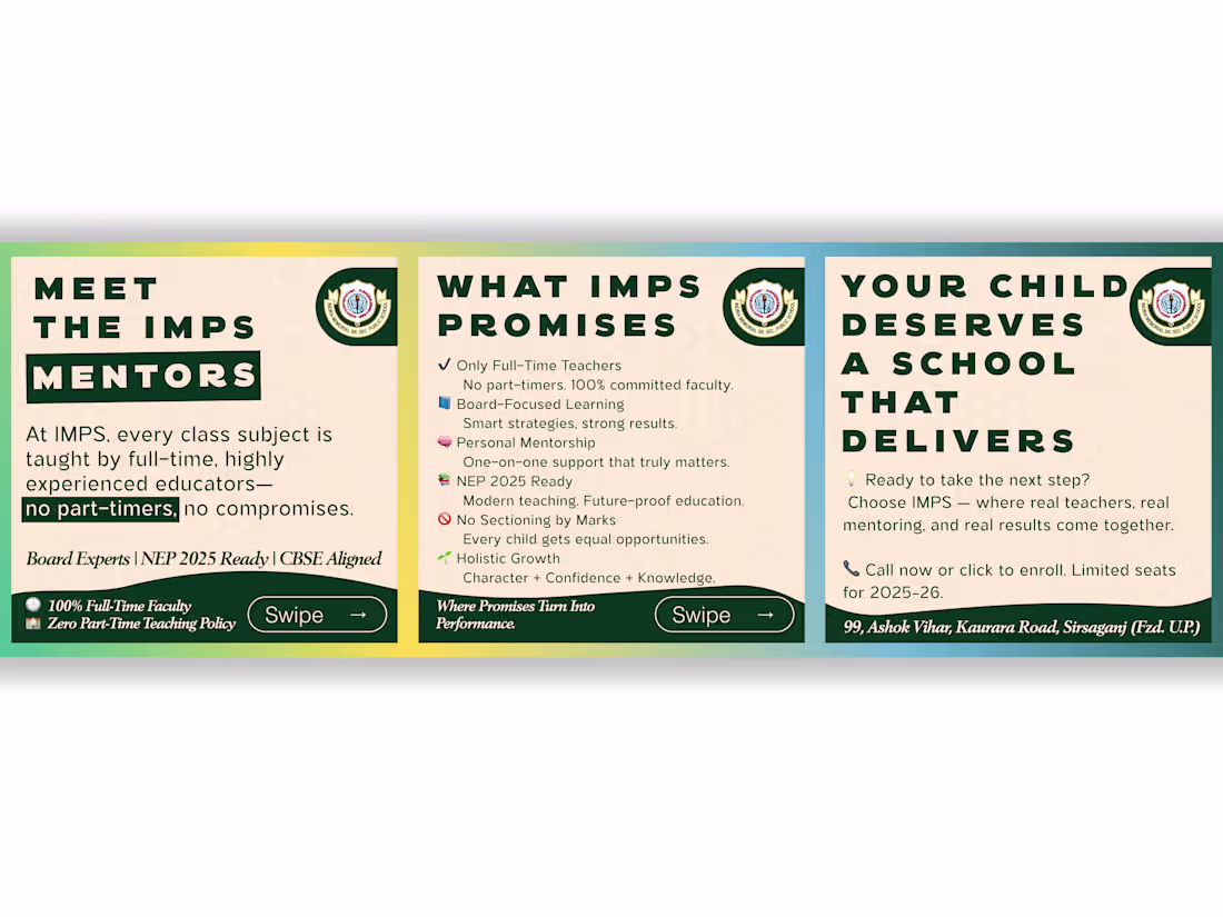
A clean, information-dense carousel designed for IMPS School — focused on clarity, credibility, and flow.
Each frame communicates one core message, balancing hierarchy and white space for smooth readability.
2
107
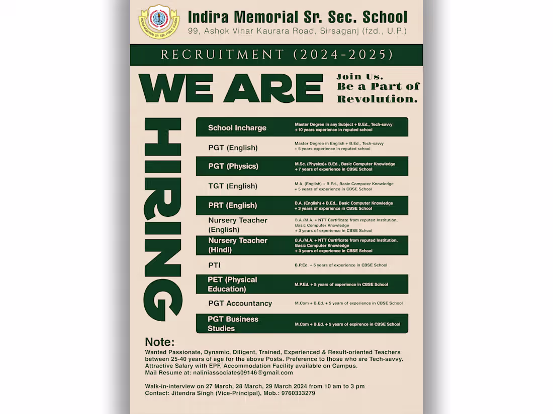
A clean, recruitment-focused poster design— crafted for high visibility, readability, and trust.
The layout balances hierarchy and typography to make every qualification stand out clearly.
Delivered in both colour and monochrome for print, web, and newspaper distribution.
2
89
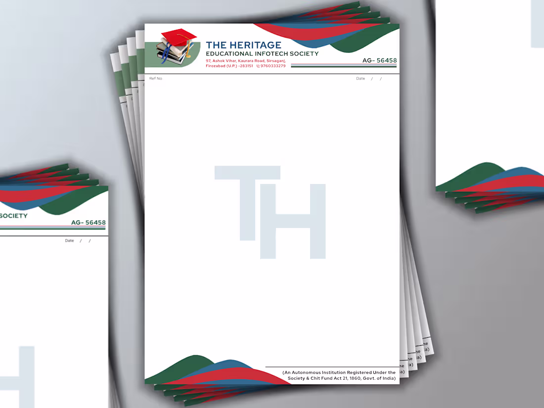
A formal letterhead design created for The Heritage Educational Infotech Society.
Built around structure, clarity, and institutional balance — combining brand colors with a minimal layout and strong document hierarchy.
Designed for professional correspondence and official communication.
2
93