Helio Systems Brand Design
sgh.group
1. Project Overview
Helio Systems is a conceptual brand representing the fusion of technology and organic intelligence in architecture — “Intelligence that Lives in Walls.”
The project was conceived as a complete 0-to-100 brand design journey, starting from conceptual ideation and strategic definition, leading to logo design, colour architecture, typography system, system,and iconography.
2. The Challenge
To create a brand system that communicates:
Precision and intelligence without cold “tech” stiffness
A sense of living control — technology that feels natural
Scalability across hardware, UI and digital systems
The brand needed to function both as a B2B technological identity and as a human-centric system interface.
3. The Approach
The design process followed a structured 6-phase method:
1. Discovery & Strategy – Defining core values, tone, and audience.
2. Concept Development – Translating abstract nouns (energy, walls, AI, control, precision, nature) into symbolic sketches.
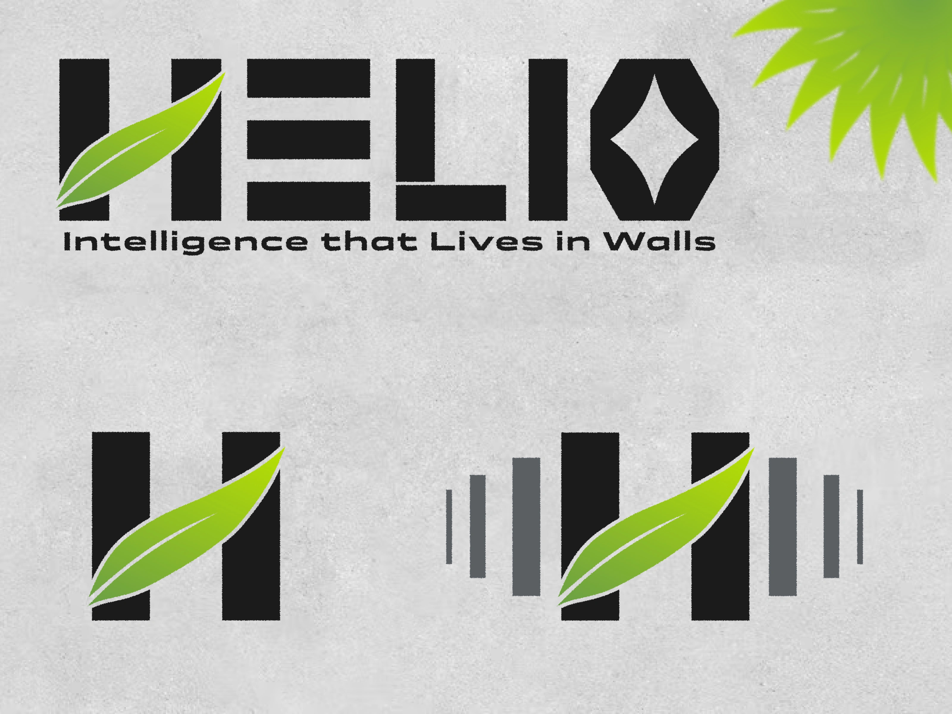
3. Logo System Design – Constructing the word mark using modular “brick” geometry and embedding a leaf motif as the symbol of organic intelligence. And the negative space in the letter 'O' gives the iconic AI symbol.
4. Color & Typography Architecture – Building dual-mode color systems (Normal / Dark) and selecting futuristic yet readable fonts.
5. Iconography – Designing icons derived from logo geometry: Energy Efficiency, AI Mode, Connectivity, Sound Alert, Light Sense, etc.
4. The Outcome
The final system achieved:
A modular identity adaptable across architecture and interface.
A living visual language combining geometric engineering with organic motion.
A cohesive ecosystem of color, typography, and icons for print, digital, and environmental contexts.
This outcome demonstrates how a single design philosophy — intelligence as life within architecture — can manifest across every brand surface.
Like this project
Posted Nov 4, 2025
A complete 0–100 brand design project for a smart-building automation company, covering strategy, logo, color & type system, and icons.