Seth Ramirez
digital artist/Logos, music industry, Branding, Ai strategy
Ready for work
Seth is ready for their next project!
Dallas Mavericks Logo Reimagine
A modern take on the Mavericks identity built around speed, horsepower, and Dallas pride. This concept keeps the core DNA of the brand — the horse, shield, star, blue, silver, and white — while pushing the mark into a sharper, more premium sports identity direction.
The goal was to create a logo system that feels bold, competitive, and arena-ready while still honoring the Mavericks’ original visual language.
Built to Run Dallas.
2
15
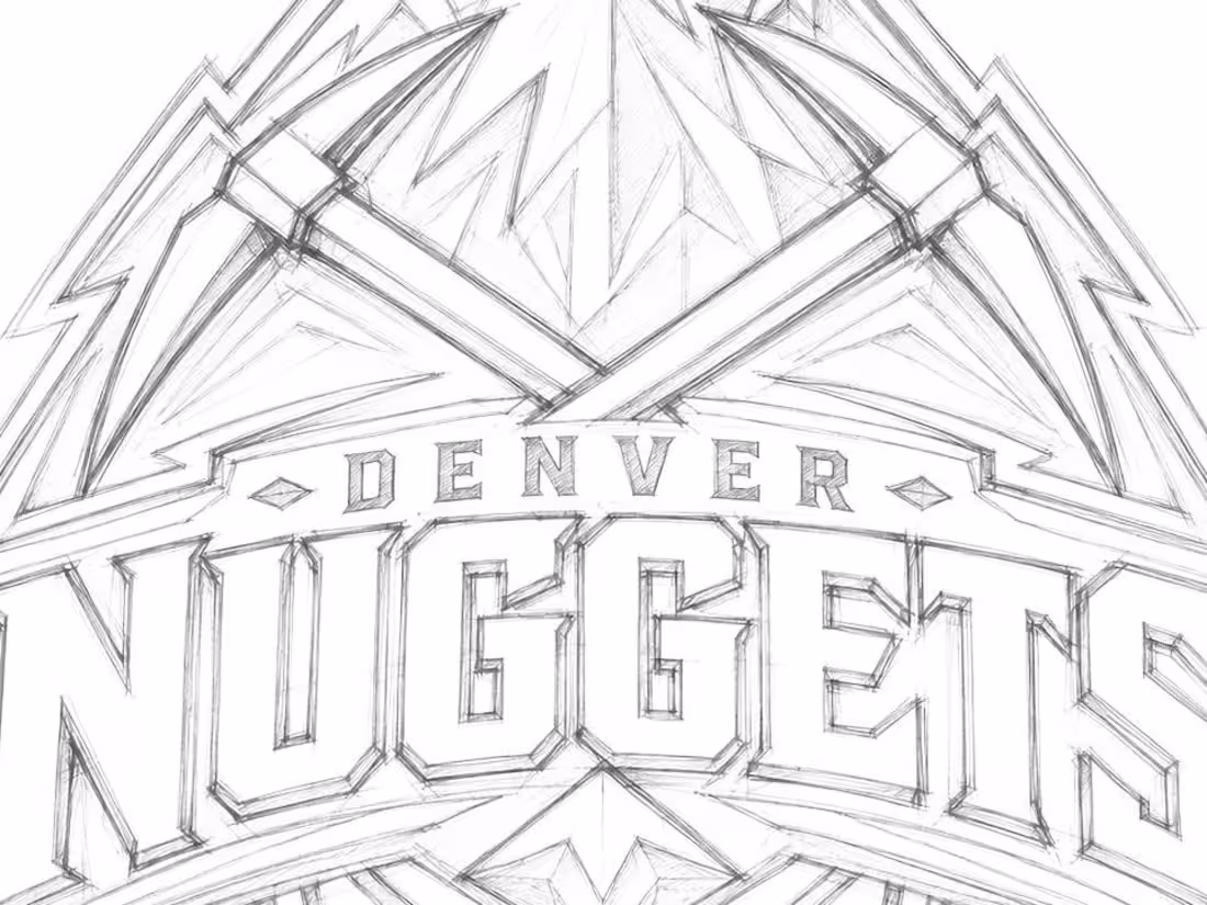
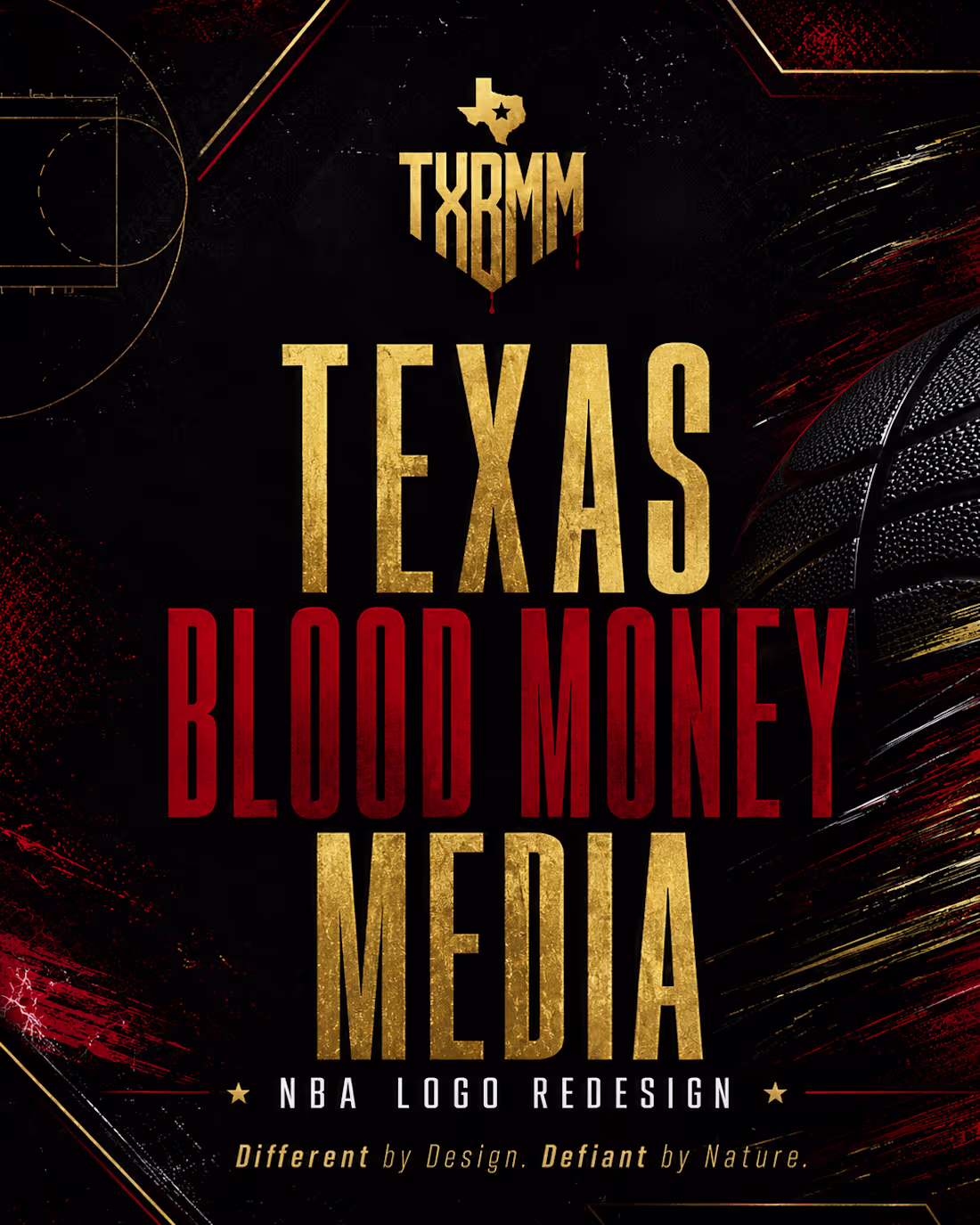
NBA No Look Logo Redesigns.
Cause i'm broke, bored, nobody will hire me and im fixing to be back out on the street.... so why not!?!?
0
37
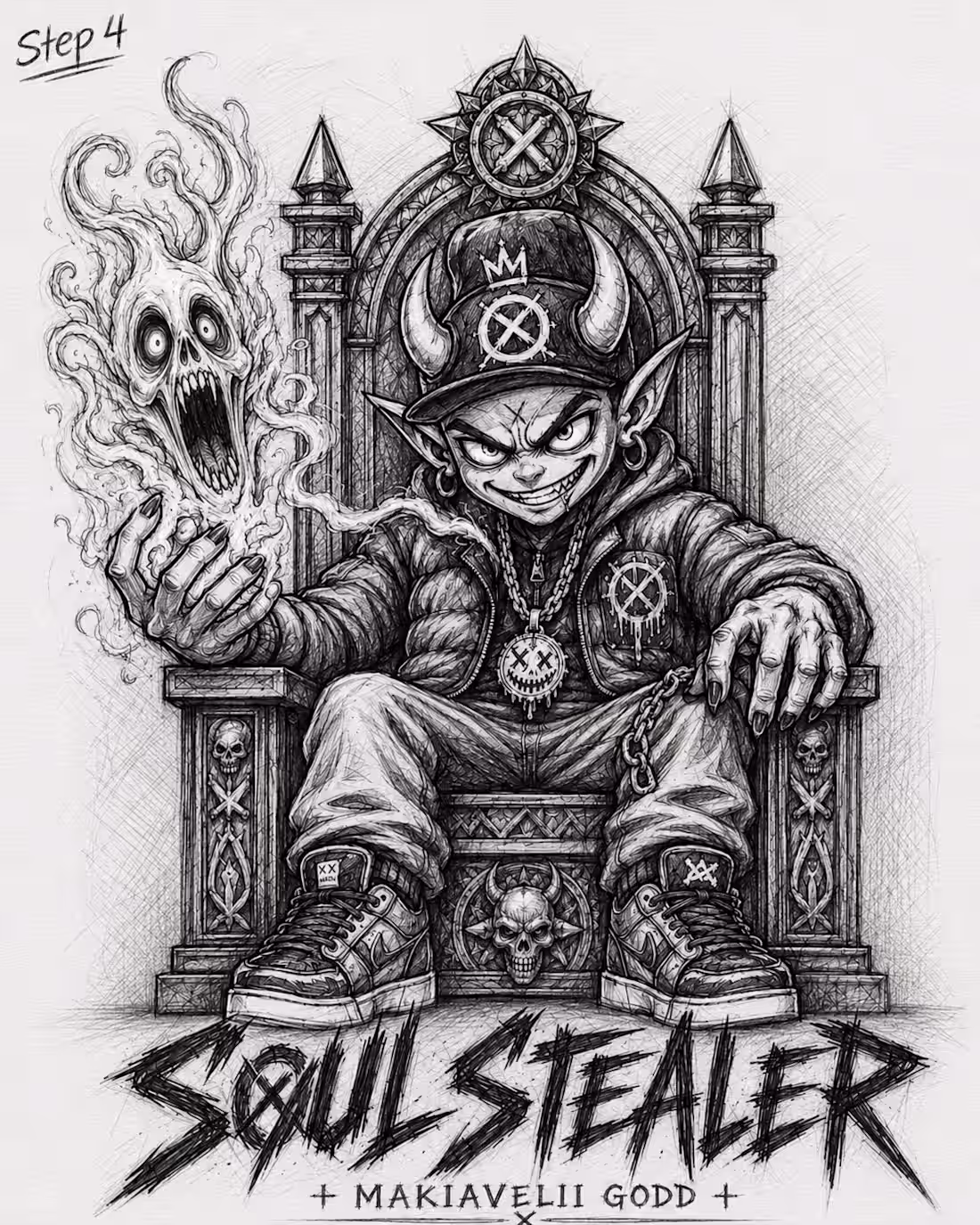
Fan Art/ Concept Poster for Makavelii Godd- Soul Stealer
1
64
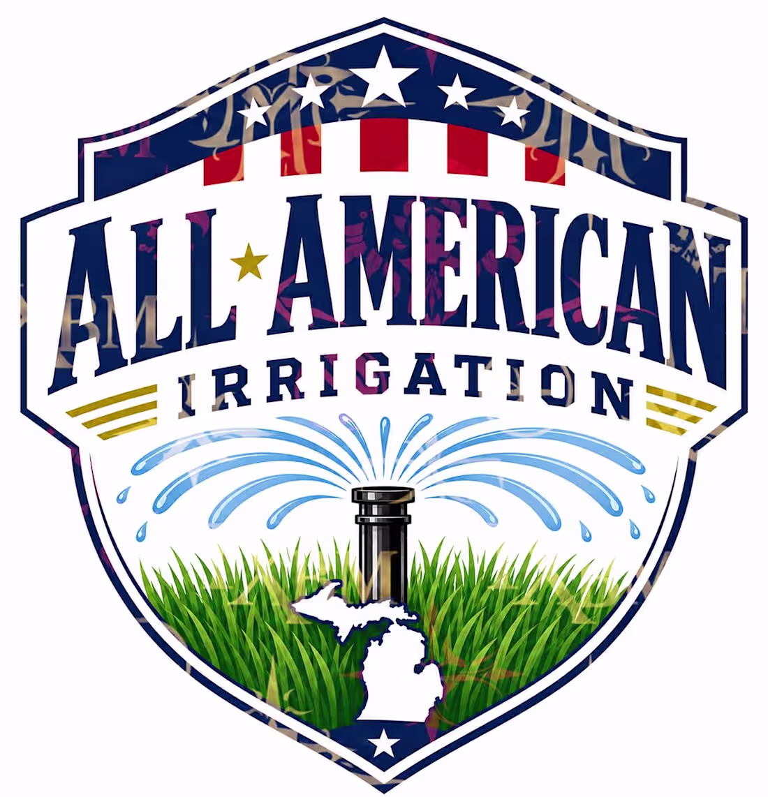
Logo For All-American Irrigation In Michigan
1
60
Texas Blood Money Media Art for bands, brands, and bastards with a pulse.
0
59
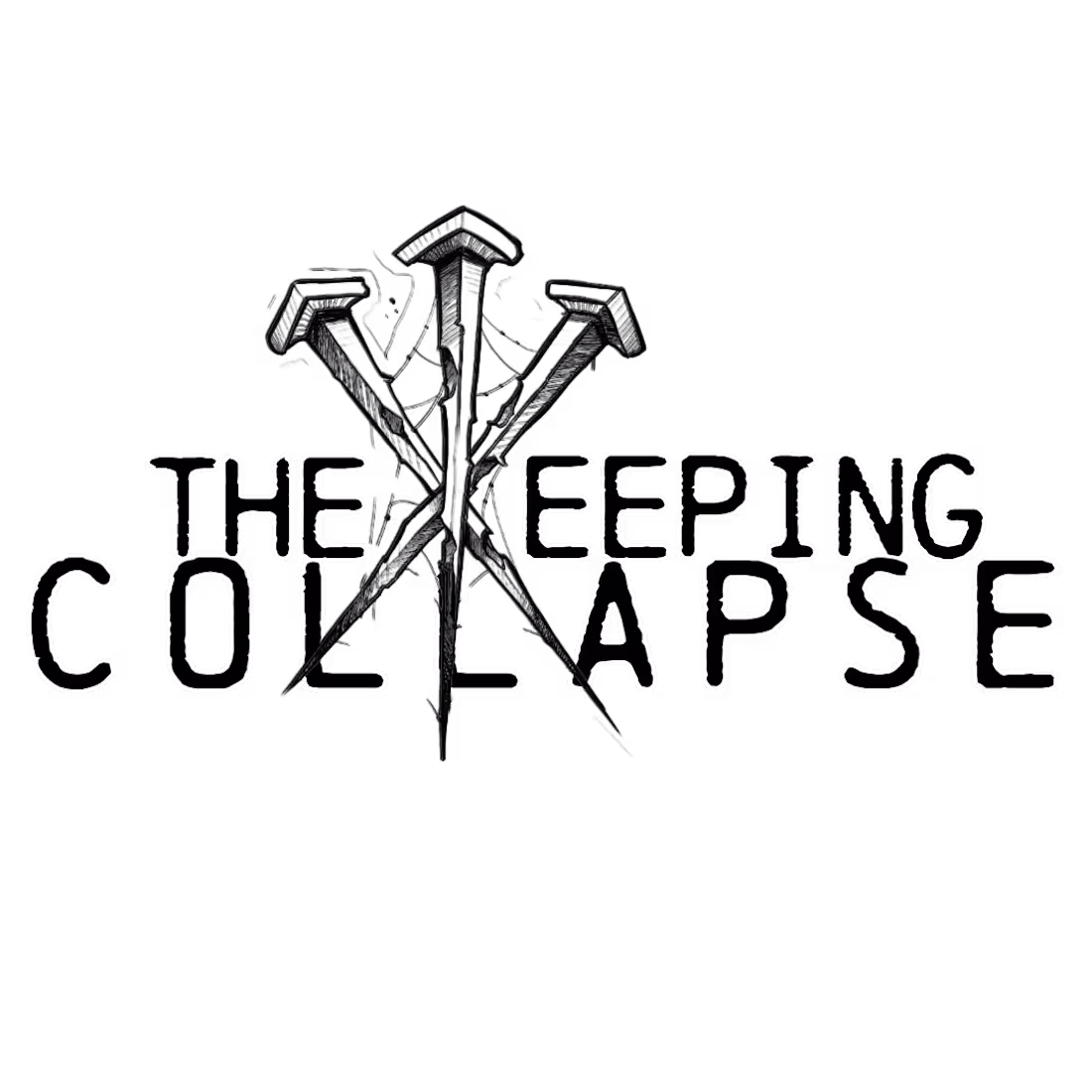
Logo For "THE KEEPING COLLAPSE" Band out of East Texas
1
69
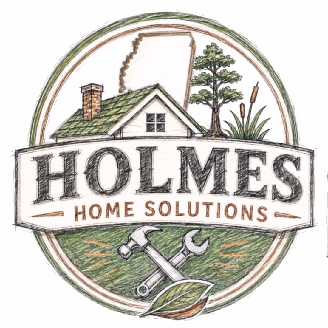
Logo concept for Holmes Home Solutions of of Mississippi.
3
3
149
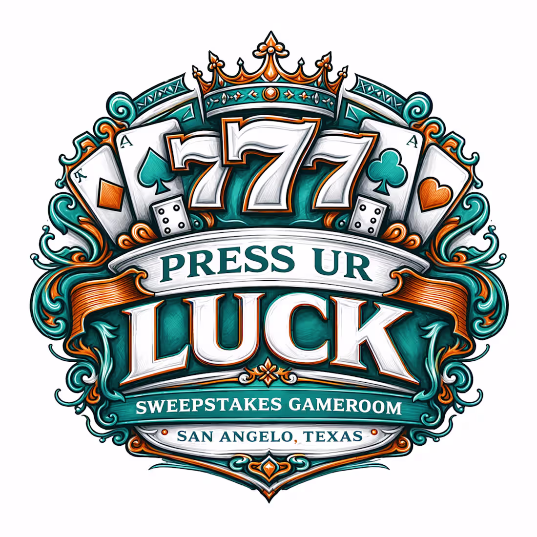
Sweepstakes Game Room Grand opening TBA Logo work I finished recently.
0
69
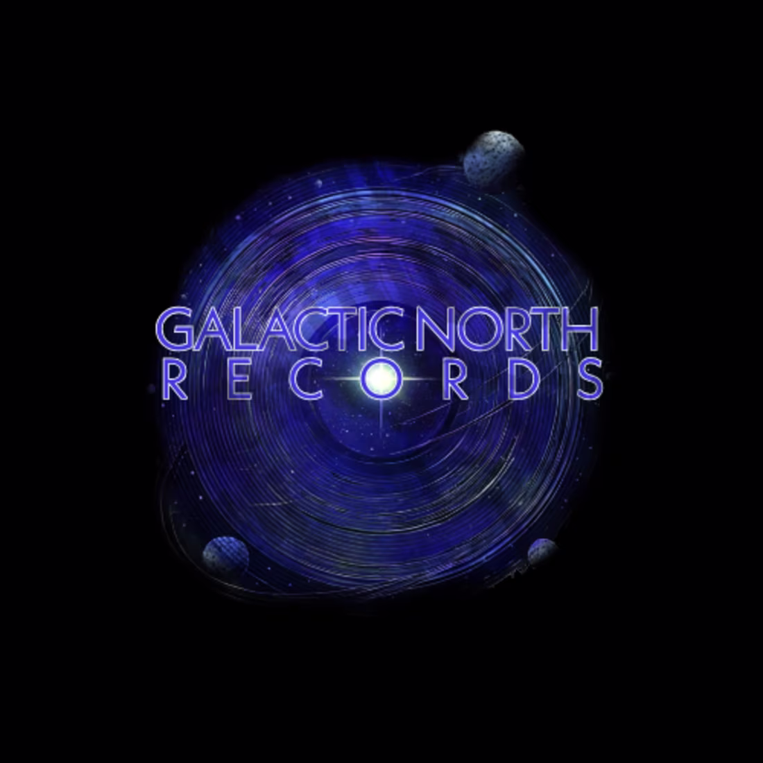
Galactic North Records Logo
1
80
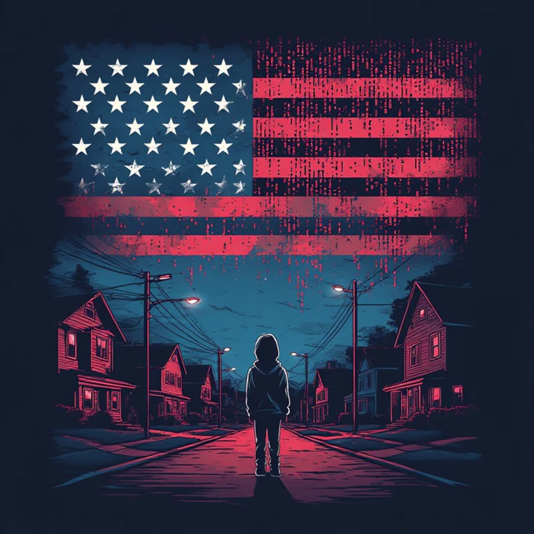
Cover art for Punk Band "Suburban Sermon"
2
85
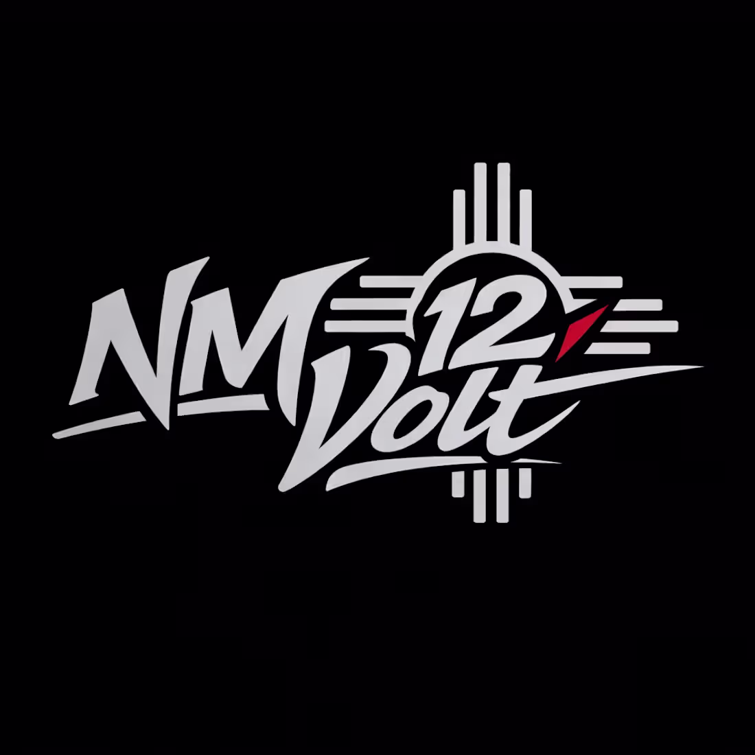
Concept logo work for New Mexico 12Volt
2
3
110
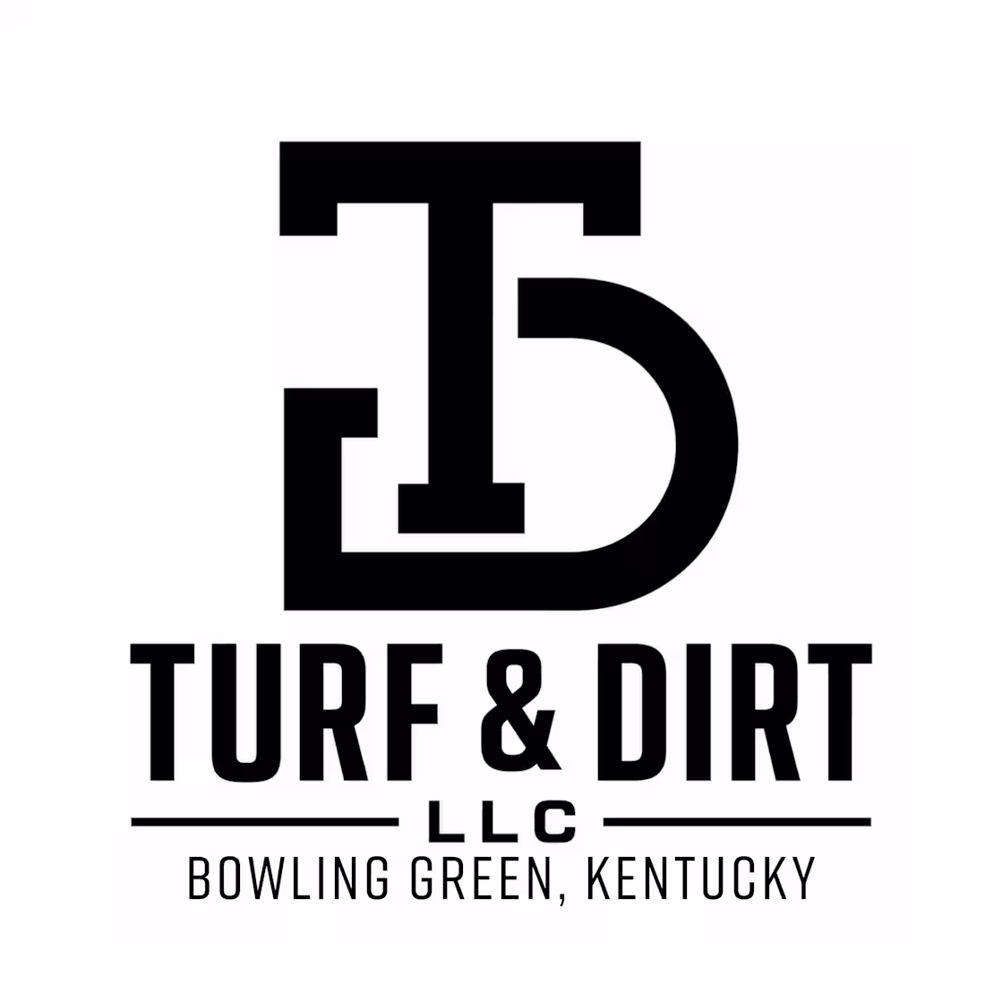
Logo design and branding strategy for Turf And Dirt LLC
Check it out (https://contra.com/p/vo7EqYos-turf-and-dirt-llc-logo-design)
0
46
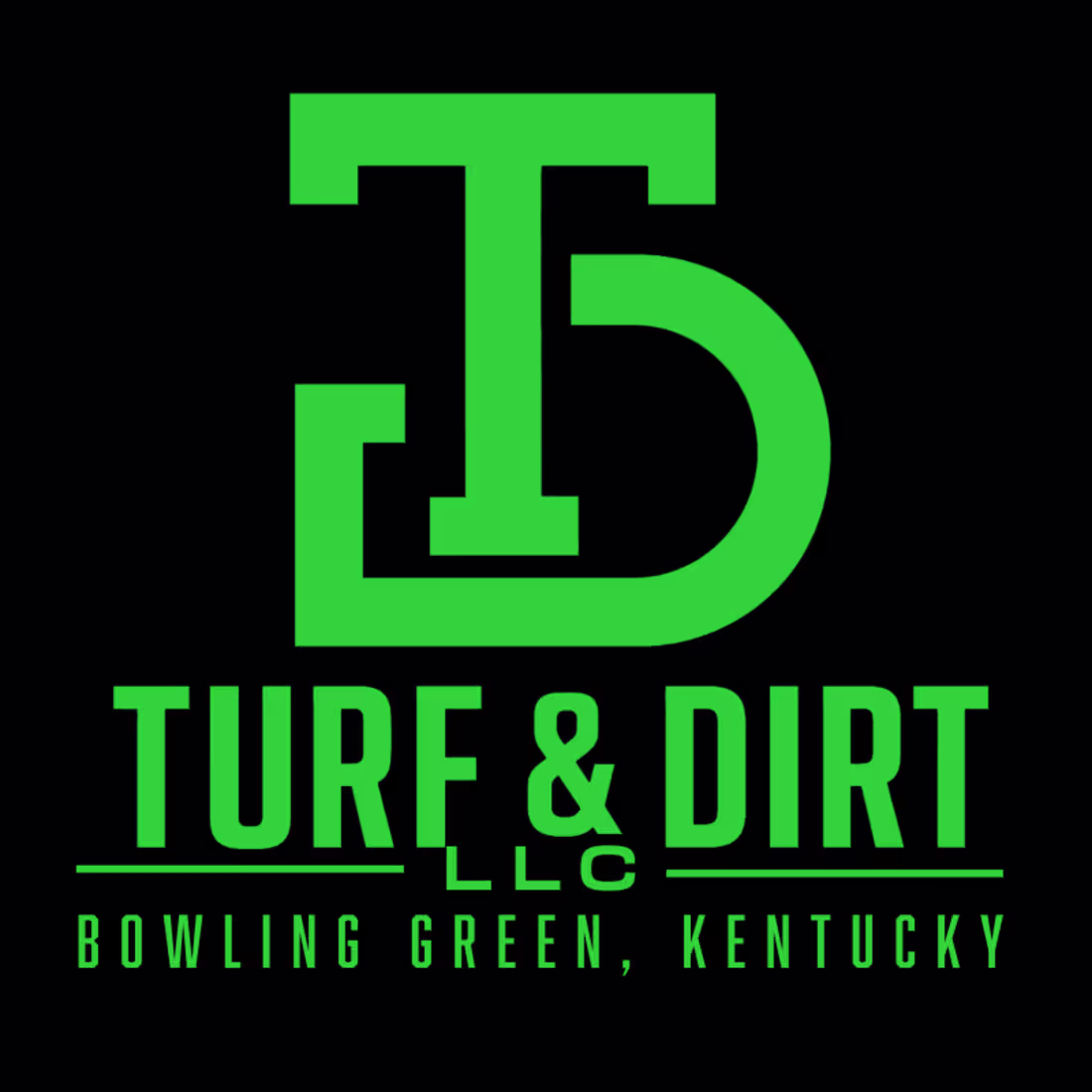
Turf & Dirt LLC Logo Design
0
1
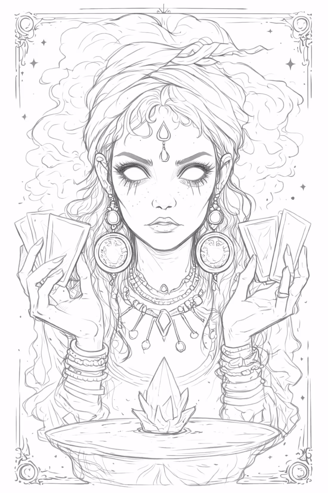
Mystic Gypsy Collectors flyer For SXSW GOGOL BORDELLO
0
42
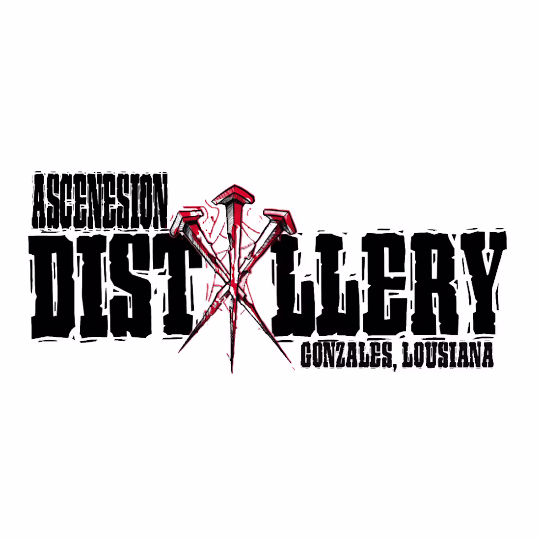
Logo for "Ascension Distillery" In Louisiana.
0
35
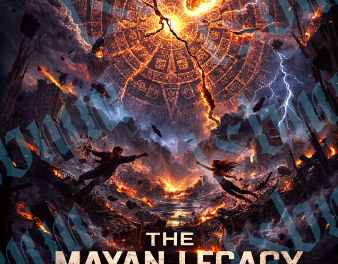
The Mayan Prophecy Novel Art
1
2
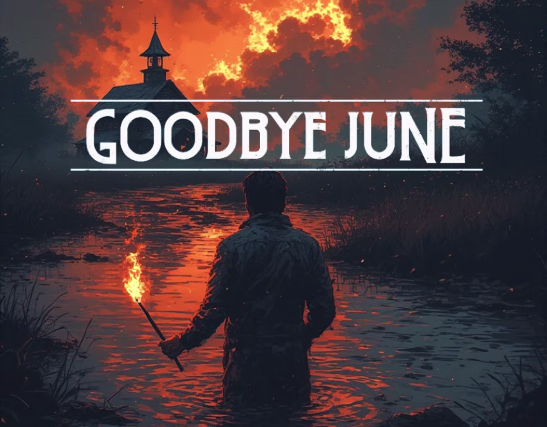
Goodbye June - Dark Cinematic Album Cover Design
0
1