
pro
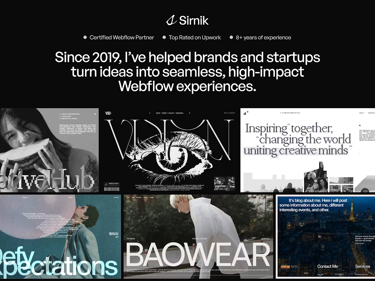
Editorial Webflow Portfolio for Sirnik Studio
2
12
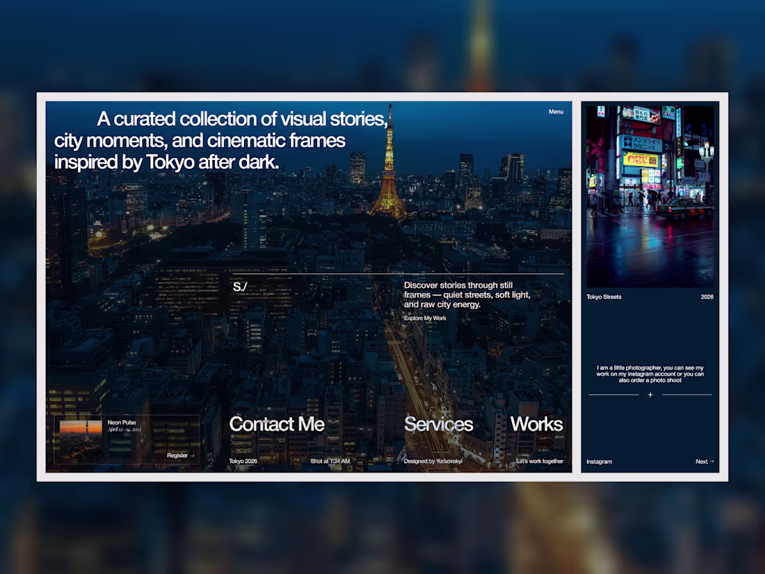
Fragments of Tokyo — Editorial Portfolio Concept
An editorial-inspired portfolio experience built around cinematic city photography, quiet typography, and atmospheric storytelling.
Designed to explore a slower and more immersive digital experience where visuals, pacing, and composition shape the entire feeling of the interface.
Currently crafting premium digital experiences for modern brands, startups, and creative companies.
_
Available for selected Webflow and digital design collaborations!
3
7
275
Editorial-Style Webflow Experience for a Wellness Platform
0
11
CreativeHub — Editorial Webflow Website for a Creative Community
2
41
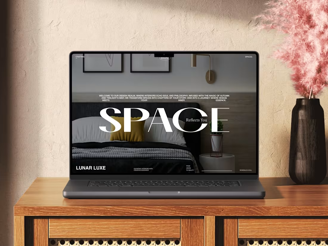
Space that reflects mood, not trends
Minimal interior landing page concept.
Focus on atmosphere, typography, and calm luxury.
Thoughts? 😃
1
477
Most marketing agency websites don’t have a design problem.
It’s usually a clarity problem.
Over the past few projects I worked on for agencies, I kept running into the same 3 things that quietly kill performance:
Positioning that sounds nice - but says nothing
“We help brands grow” looks good on a screen.
But as a client, I still don’t understand if you’re actually for me.
Cases that show visuals, not thinking
A lot of sites look polished - but don’t explain what was done, why it worked, or what changed.
Structure that doesn’t lead anywhere
Sections look fine on their own, but there’s no clear path from “this looks interesting” to “I want to work with them”.
And the thing is - none of this is fixed by “better UI”.
In a few recent projects, just reworking the offer and structure already made the whole site feel clearer and more trustworthy - without adding anything complex.
That’s exactly the approach I used in a recent concept I designed for an agency.
If you’re working on a website right now - or feel like yours looks good but underperforms - take a look at these 3 things first.
Or just reach out, I’m always down to take a quick look and share thoughts!
2
468
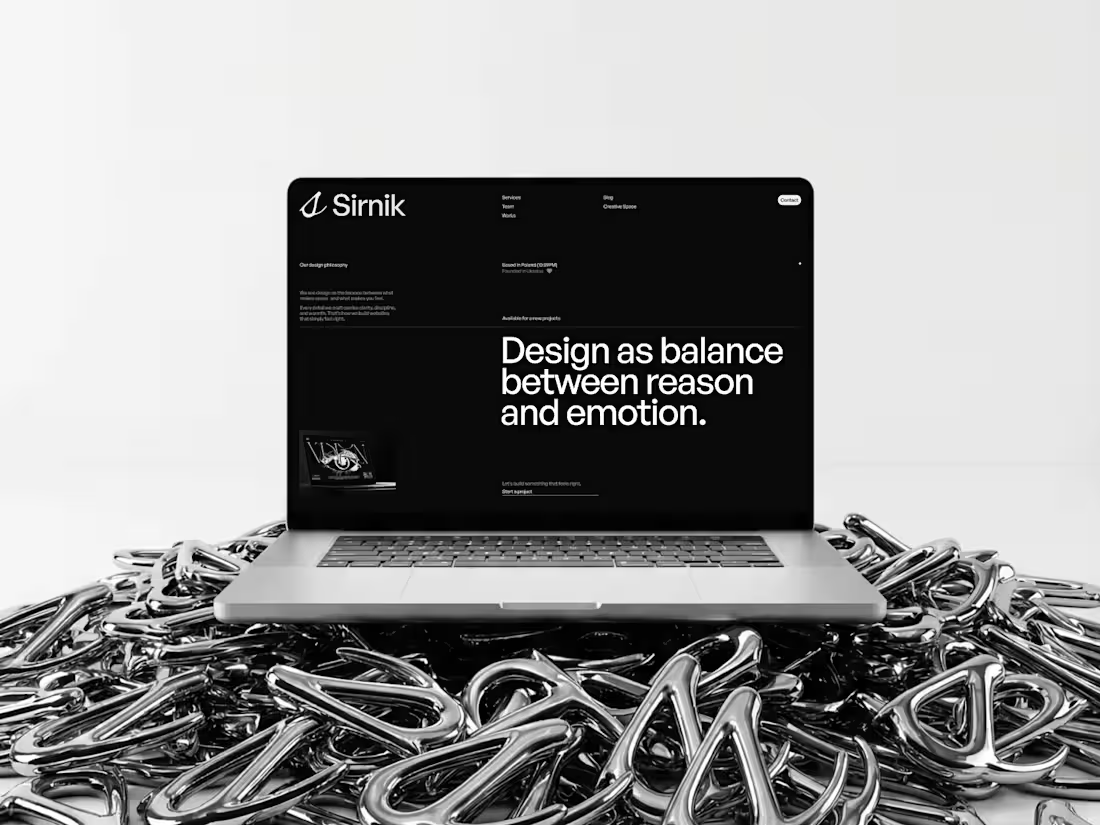
Sirnik is a Webflow design studio website created to showcase a modern approach to digital experiences — balancing clarity, aesthetics and motion.
The goal was to move away from a traditional portfolio and build a space that communicates not only selected work, but also the thinking behind it — structure, interaction and visual direction.
The project focuses on typography, minimal layout and subtle motion to create a clean, high-end feel while keeping the experience intuitive and easy to navigate.
Designed and developed in Webflow.
4
502