
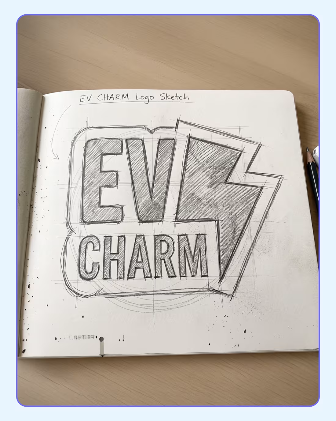
I recently had the pleasure of designing the logo for EV Charm, a specialized EV bike repair workshop and skill-training center based in Delhi. The name itself sparked a fun, unique opportunity: instead of just creating digital artwork, what if the logo physically doubled as a tangible keychain charm?
𝗛𝗲𝗿𝗲 𝗶𝘀 𝗵𝗼𝘄 𝘁𝗵𝗲 𝗱𝗲𝘀𝗶𝗴𝗻 𝘀𝘁𝗼𝗿𝘆 𝘂𝗻𝗳𝗼𝗹𝗱𝗲𝗱:
𝗧𝗵𝗲 𝗖𝗼𝗻𝗰𝗲𝗽𝘁: 𝗪𝗵𝘆 𝗮 𝗸𝗲𝘆𝗰𝗵𝗮𝗶𝗻?
The brand name "EV Charm" demanded a literal interpretation. It naturally lent itself to becoming a physical object. Designing the logo with a keychain in mind allowed us to turn a standard brand mark into a memorable, physical takeaway for the customer.
𝗧𝗵𝗲 𝗘𝘅𝗲𝗰𝘂𝘁𝗶𝗼𝗻: 𝗛𝗼𝘄 𝗜 𝗯𝗿𝗼𝘂𝗴𝗵𝘁 𝗶𝘁 𝘁𝗼 𝗹𝗶𝗳𝗲
To ensure the logo could smoothly transition from a screen to a physical object, I focused heavily on the silhouette. I enclosed the sharp lightning bolt and bold sans-serif typography within a thick, custom die-cut outline. This unified the design and eliminated any fragile, protruding edges to create a solid, durable shape perfect for manufacturing. For the eco-friendly palette, I skipped standard white in favor of a specific sustainable combination: a light mint base (#e1ffec (https://www.linkedin.com/search/results/all/?keywords=%23e1ffec&origin=HASH_TAG_FROM_FEED)) paired with deep teal detailing (#00726f (https://www.linkedin.com/search/results/all/?keywords=%2300726f&origin=HASH_TAG_FROM_FEED)).
𝗧𝗵𝗲 𝗣𝘂𝗿𝗽𝗼𝘀𝗲: 𝗪𝗵𝘆 𝗶𝘁 𝗺𝗮𝘁𝘁𝗲𝗿𝘀
This approach transforms a standard corporate identity into a highly approachable piece of functional merchandise. It perfectly bridges the technical, mechanical nature of an EV workshop with a clever, tangible brand connection that people actually want to keep.
𝗧𝗵𝗲 𝗘𝘅𝗽𝗲𝗿𝗶𝗲𝗻𝗰𝗲: 𝗛𝗼𝘄 𝗶𝘁 𝘄𝗶𝗹𝗹 𝗯𝗲 𝘂𝘀𝗲𝗱
After every successful EV bike repair or completed skill-training session, customers are handed this literal EV Charm to add to their keyring. It turns a simple promotional item into a daily utility, keeping the brands eco-friendly mission riding alongside them on every journey.
0
4
It was 12:30 AM, and I was casually scrolling through some food posts on social media.
Big mistake. It made me starving.
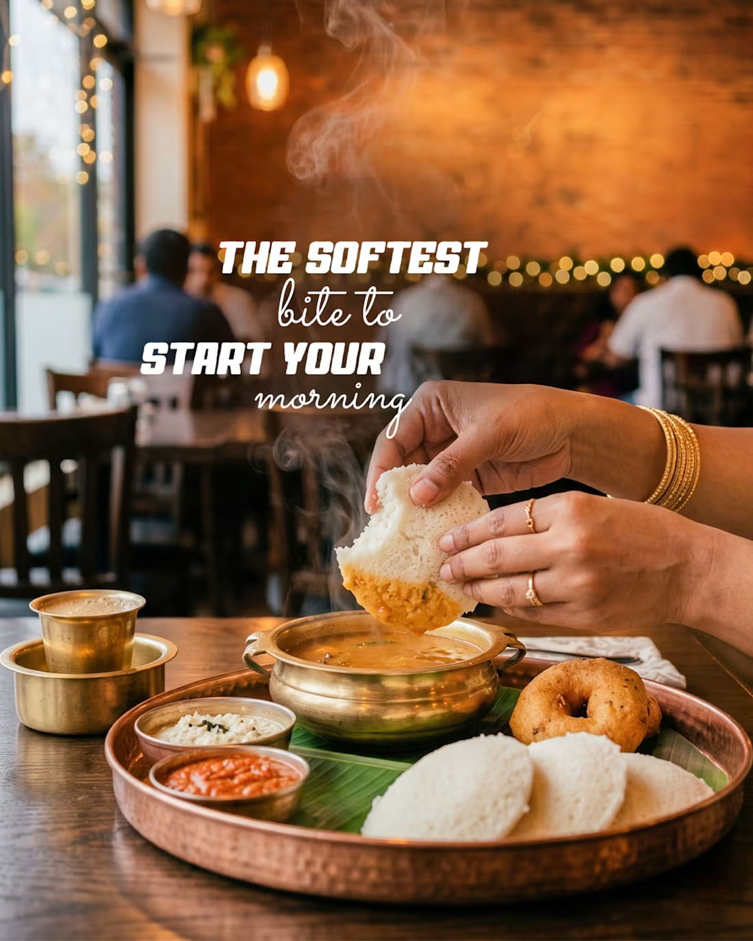
Instead of raiding the fridge, it triggered my creative side and I ended up designing this post.
My entire focus was on the food itself, so I made sure it truly stole the spotlight. Looking at the result, maybe I should just launch an online food business serving this delicious AI food. Who’s volunteering to name the brand?
Jokes aside, what if I designed posts like this for your business?
Visuals that don’t just fill a feed but actually stop the scroll, communicate the message, and genuinely connect with your audience.
If your brand could use creatives that make people stop and stare, let’s talk.
1
12
Project Spotlight: Little Stars Kindergarten Branding (Design Assessment)
The Vision
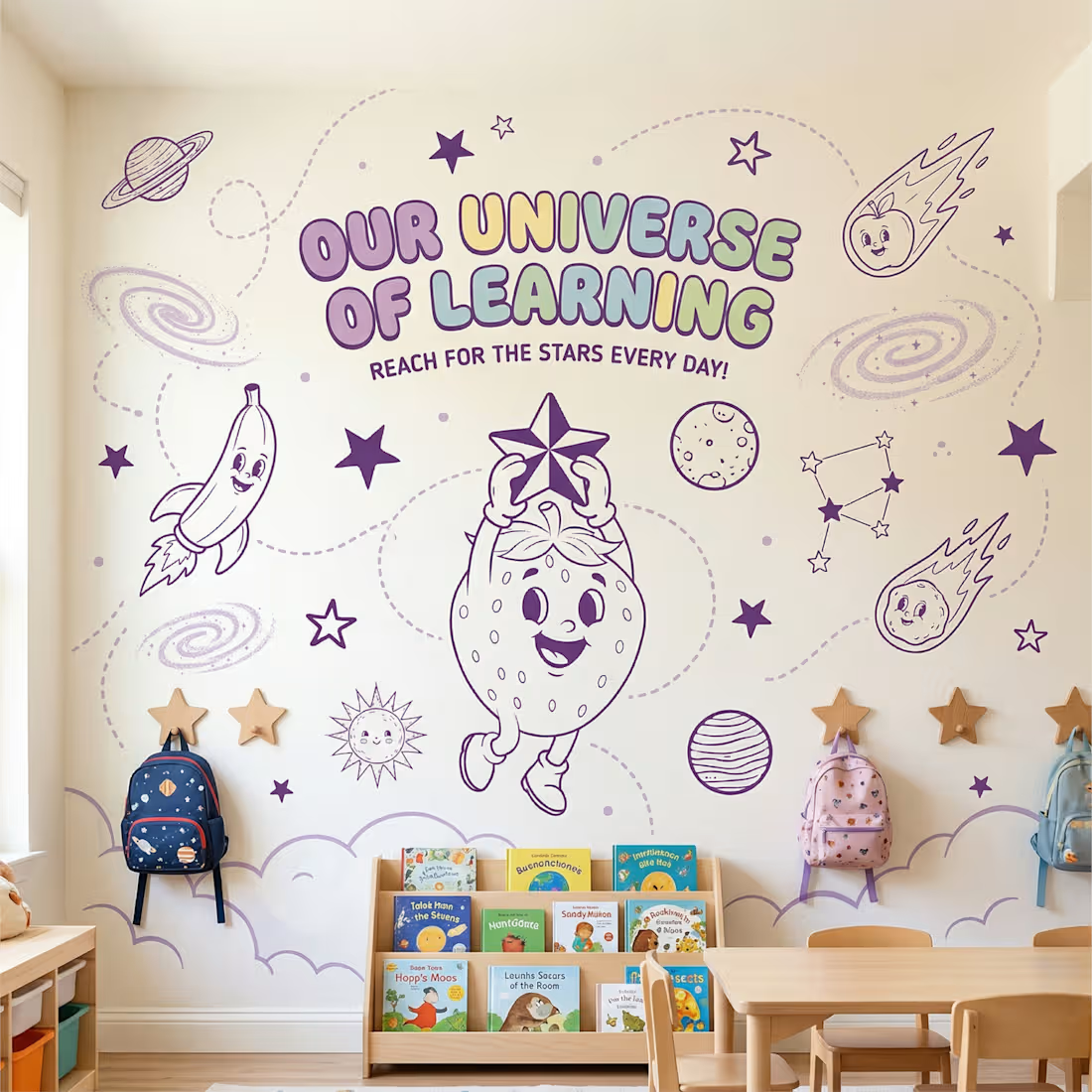
This project was developed as a comprehensive brand identity assessment for Little Stars Kindergarten, a nursery serving children aged 0–5. The goal was to create an identity that blends "cosmic wonder" with "gentle care" to build immediate trust with parents while sparking curiosity in children.
Design Strategy
The Mascot: I designed a whimsical strawberry character using a vintage 1930s "rubber hose" animation style to provide nostalgic, friendly charm.
Symbolism: The mascot is shown hoisting a star, representing a child reaching their full potential in a nurturing environment.
Color Palette: A rich purple theme was selected to reinforce the cosmic "Universe of Learning" while maintaining a calming presence.
Visual Safety: I utilized a soft, cloud-like base and rounded badge frames to establish a "child-first" atmosphere.
Practical Application
To demonstrate the brand's versatility, I applied the assets to a mock launch campaign for a new Cardiff location, featuring a "Reach for the Stars" slogan and promotional "Early Bird" offers.
Assessment Note: Please note that this is a conceptual project completed for a design assessment and is not for an actual business.
I am always looking to grow as a designer your feedback on the mascot style or the layout is most welcome!
#BrandIdentity #GraphicDesign #PortfolioAssessment #LittleStars #DesignFeedback
3
1
67
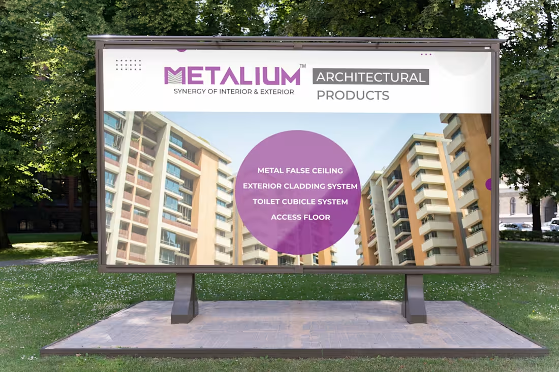
I specialize in high-impact large-format hoarding design, delivering visual clarity across sectors ranging from Healthcare and Fitness to Industrial Architecture. My work for Metallium showcases technical precision in metal ceiling systems, while my designs for clinics and gyms leverage emotive storytelling and bold typography to command attention in public spaces. This demonstrates a versatile mastery of brand-to-scale layout, ensuring a professional and memorable presence for any physical environment.
0
39