The network for creativity
Join 1.25M professional creatives like you
Connect with clients, get discovered, and run your business 100% commission-free
Creatives on Contra have earned over $150M and we are just getting started
Back to feedPost

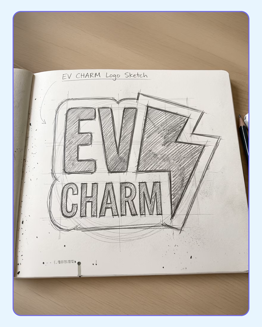
I recently had the pleasure of designing the logo for EV Charm, a specialized EV bike repair workshop and skill-training center based in Delhi. The name itself sparked a fun, unique opportunity: instead of just creating digital artwork, what if the logo physically doubled as a tangible keychain charm?
𝗛𝗲𝗿𝗲 𝗶𝘀 𝗵𝗼𝘄 𝘁𝗵𝗲 𝗱𝗲𝘀𝗶𝗴𝗻 𝘀𝘁𝗼𝗿𝘆 𝘂𝗻𝗳𝗼𝗹𝗱𝗲𝗱:
𝗧𝗵𝗲 𝗖𝗼𝗻𝗰𝗲𝗽𝘁: 𝗪𝗵𝘆 𝗮 𝗸𝗲𝘆𝗰𝗵𝗮𝗶𝗻?
The brand name "EV Charm" demanded a literal interpretation. It naturally lent itself to becoming a physical object. Designing the logo with a keychain in mind allowed us to turn a standard brand mark into a memorable, physical takeaway for the customer.
𝗧𝗵𝗲 𝗘𝘅𝗲𝗰𝘂𝘁𝗶𝗼𝗻: 𝗛𝗼𝘄 𝗜 𝗯𝗿𝗼𝘂𝗴𝗵𝘁 𝗶𝘁 𝘁𝗼 𝗹𝗶𝗳𝗲
To ensure the logo could smoothly transition from a screen to a physical object, I focused heavily on the silhouette. I enclosed the sharp lightning bolt and bold sans-serif typography within a thick, custom die-cut outline. This unified the design and eliminated any fragile, protruding edges to create a solid, durable shape perfect for manufacturing. For the eco-friendly palette, I skipped standard white in favor of a specific sustainable combination: a light mint base (#e1ffec) paired with deep teal detailing (#00726f).
𝗧𝗵𝗲 𝗣𝘂𝗿𝗽𝗼𝘀𝗲: 𝗪𝗵𝘆 𝗶𝘁 𝗺𝗮𝘁𝘁𝗲𝗿𝘀
This approach transforms a standard corporate identity into a highly approachable piece of functional merchandise. It perfectly bridges the technical, mechanical nature of an EV workshop with a clever, tangible brand connection that people actually want to keep.
𝗧𝗵𝗲 𝗘𝘅𝗽𝗲𝗿𝗶𝗲𝗻𝗰𝗲: 𝗛𝗼𝘄 𝗶𝘁 𝘄𝗶𝗹𝗹 𝗯𝗲 𝘂𝘀𝗲𝗱
After every successful EV bike repair or completed skill-training session, customers are handed this literal EV Charm to add to their keyring. It turns a simple promotional item into a daily utility, keeping the brands eco-friendly mission riding alongside them on every journey.

The network for creativity
Join 1.25M professional creatives like you
Connect with clients, get discovered, and run your business 100% commission-free
Creatives on Contra have earned over $150M and we are just getting started
Related posts



What if your biggest streaming platform got a Halloween makeover? 🕸️
As Halloween is closing by, I decided to do a short campaign teaser for one of the biggest streaming platforms.
I redesigned their logo and played with the wording as part of their brand messaging in a spooky theme for the upcoming Halloween event.
I retained the brand consistency across the typography and overall logo shape and changed few details within.
Any twitch streamers, viewers or halloween celebrants here?


Fun concept and perfect timing. The spooky wordmark twist still feels on brand, nice one.

Which option works better? 👀
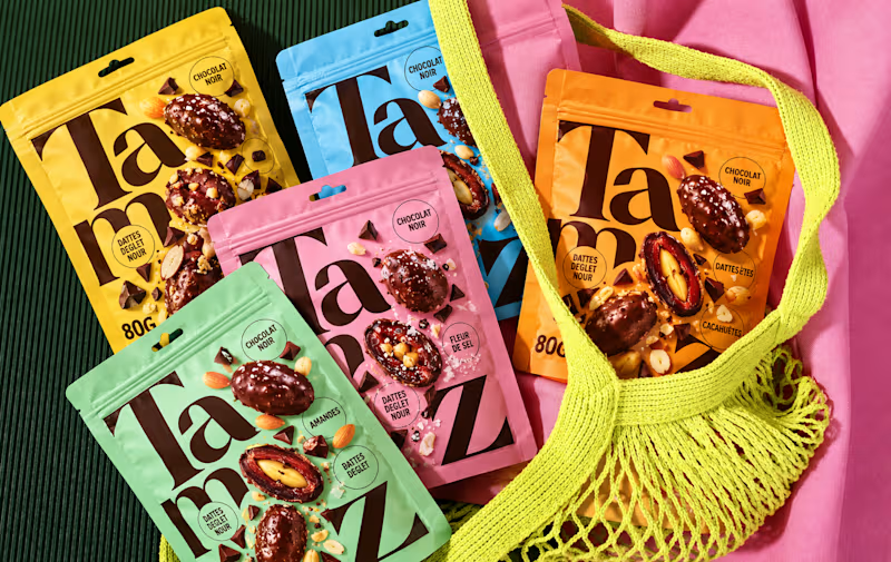
Option 1: the full lineup with the mesh bag
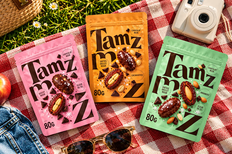
Option 2: the picnic setup
7 voted
20%
28 voted
80%
35 votes
Closed


option 2 for me, the picnic setup feels like something you would actually want to buy