Sanusi Tunde
Squarespace & Shopify Expert | Designer 🎨
Ready for work
Sanusi is ready for their next project!

If the hero is clear, they scroll.
If it isn’t, they bounce.
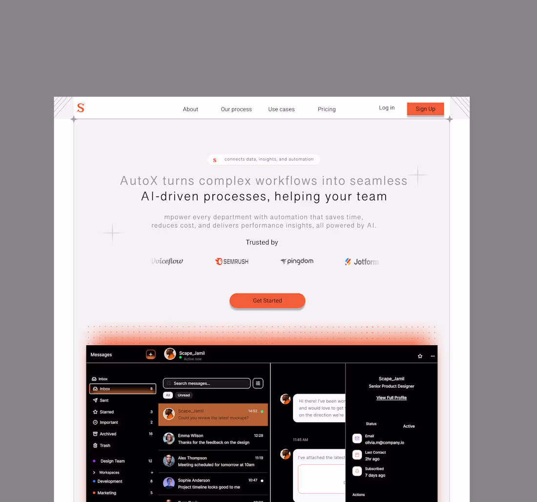
The hero section isn’t just the top of the page.
It’s the first moment a user decides if what you offer is relevant to them.
You have a few seconds to earn attention, trust, and curiosity.
1
21
They didn’t say your price is too high.
They said your value wasn’t clear.
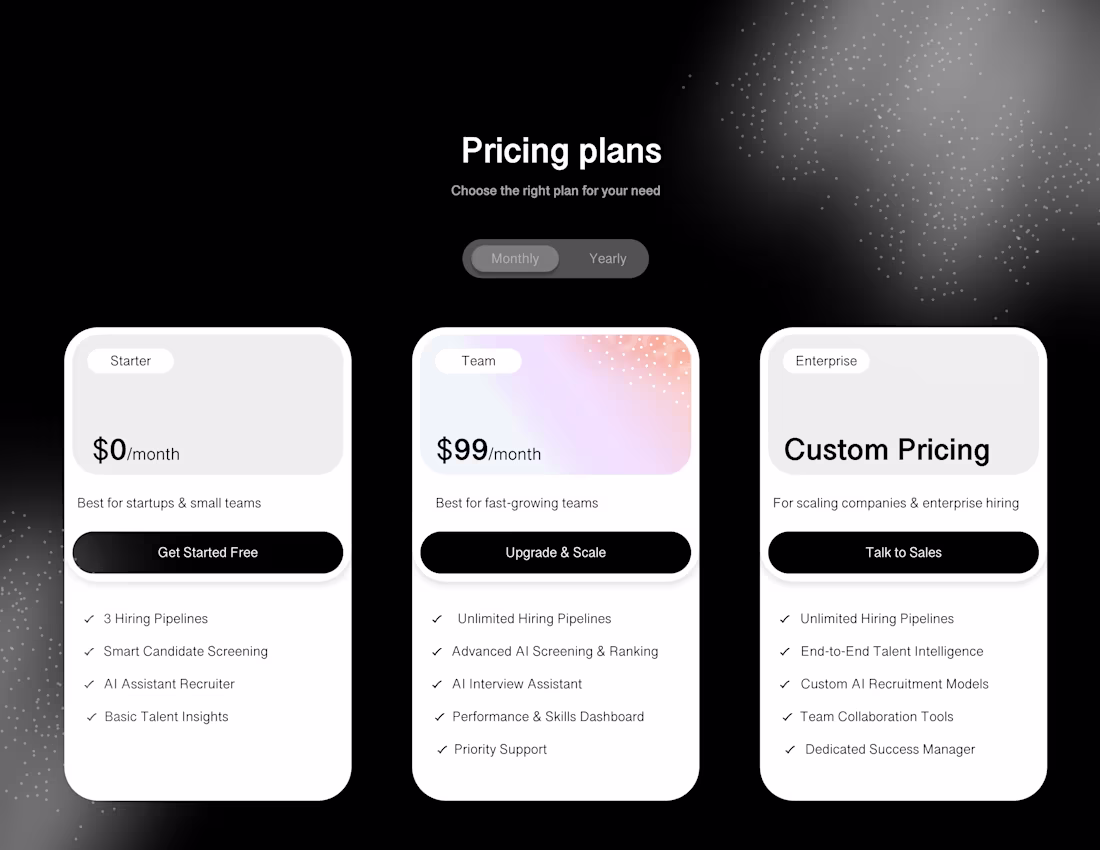
Pricing isn’t where you convince people.
Pricing is where people check whether everything you said so far still feels true.
https://cal.com/scape_Jamil
1
20
If your hero isn’t clear, the rest doesn’t matter.
1
25
Design exploration.
1
22
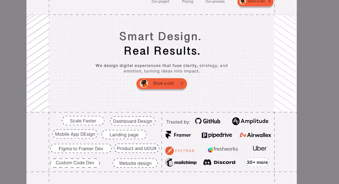
If your landing page can’t sell while you sleep, it’s just decoration.
Because design isn’t the goal, conversion is.
Pretty doesn’t pay. Clarity does.
A landing page should do three things: earn trust, remove doubt, and make saying “yes” effortless. Everything else is noise.
Founders often focus on making it look right, but the real power is in making it feel clear. When users land, they shouldn’t have to think, they should just get it.
That’s what turns browsers into buyers.
That’s what turns design into ROI.
✨ Let’s build landing pages that sell clarity, not confusion.
cal.com/scape_Jamil (https://cal.com/scape_Jamil)
1
12
If your landing page makes people think, you’ve already lost the sale.
The best designs don’t just look good, they make decisions feel obvious.
Your landing page has one job: turn hesitation into conviction. Every word, every scroll, every visual either builds trust or breaks it. And trust is what sells, not buttons, not color palettes, not fancy animations.
When users land on your page, they’re asking one silent question: “Is this for me?” Your design should answer that before they even realize they asked.
Design isn’t about convincing people to buy. It’s about removing every reason not to.
✨ Let’s craft landing pages that don’t just convert, they connect. cal.com/scape_Jamil
2
20
Your startup doesn’t need another rebrand. It needs a redesign of how it works.
3
7
51
The first flow decides if they’ll ever come back. A good product starts with trust, not taps.
1
20
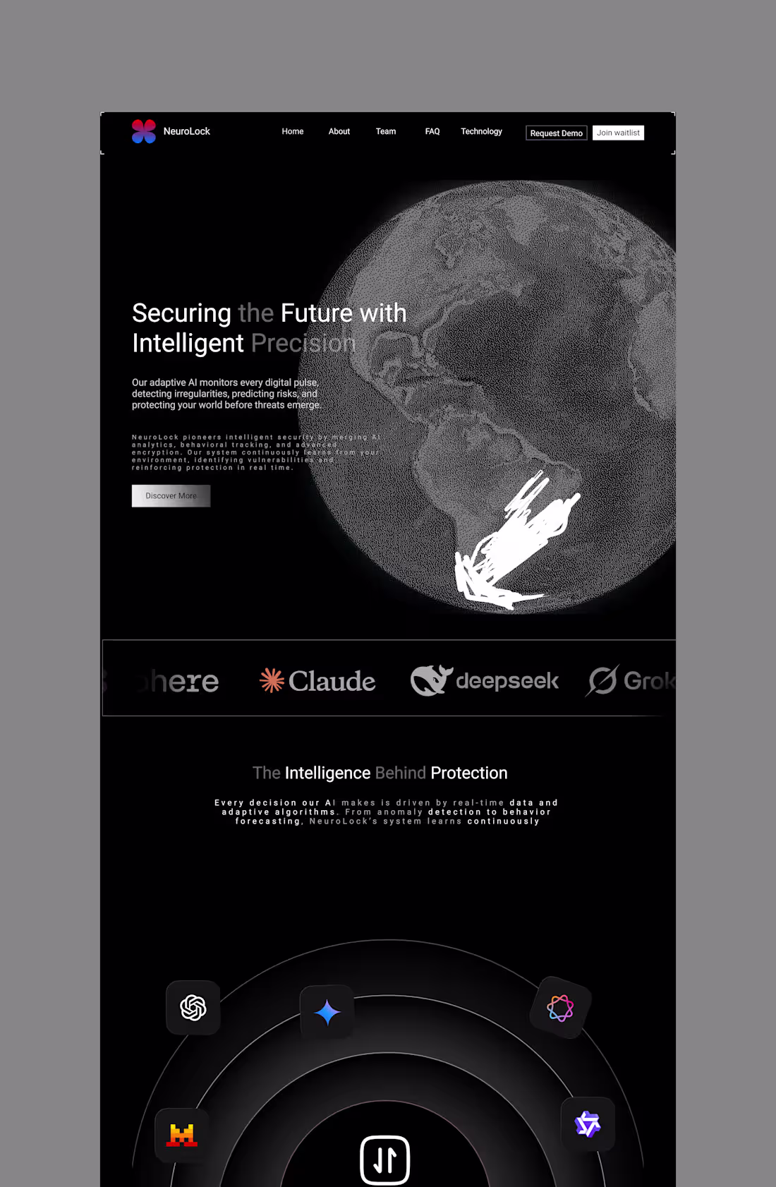
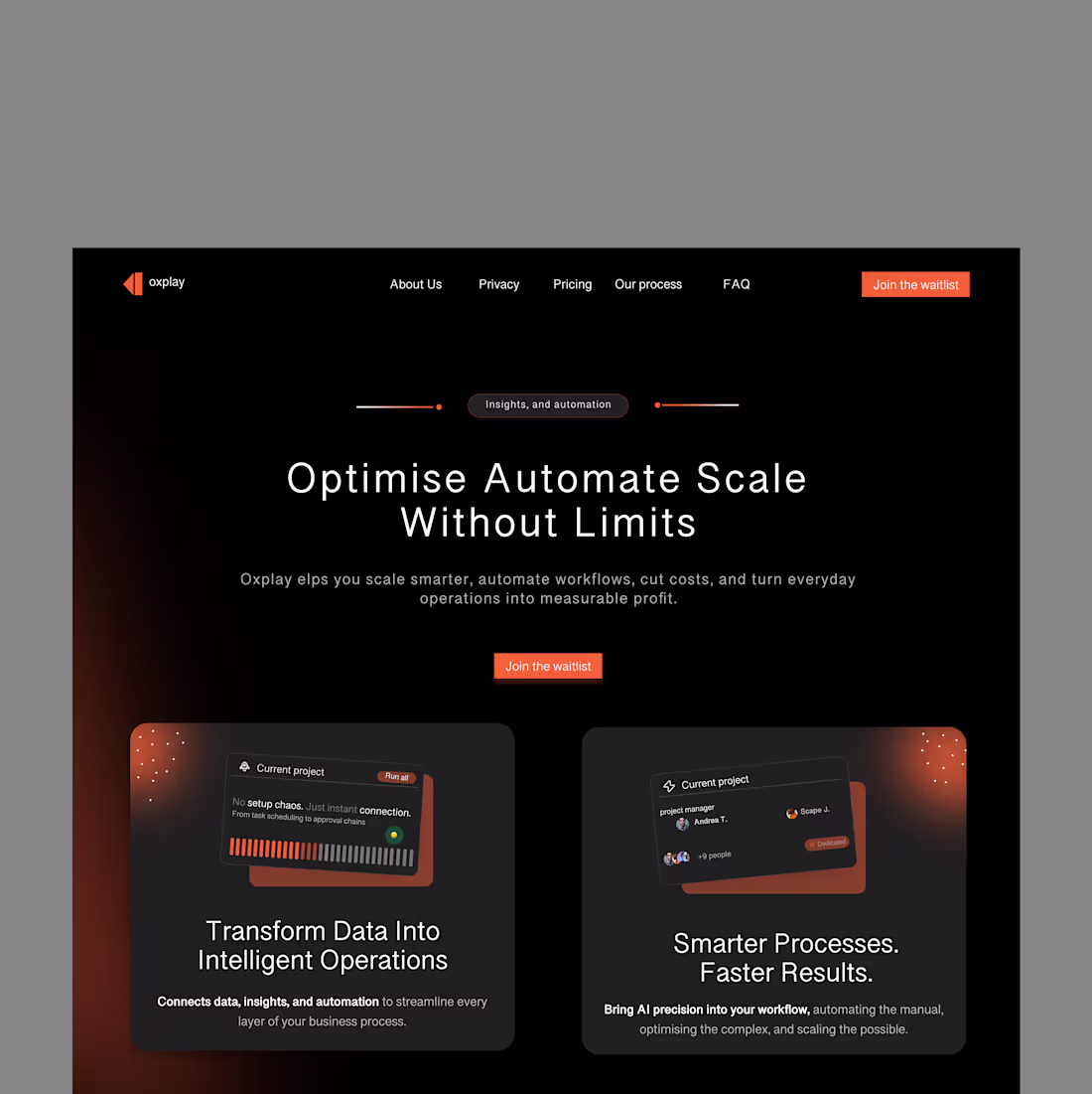
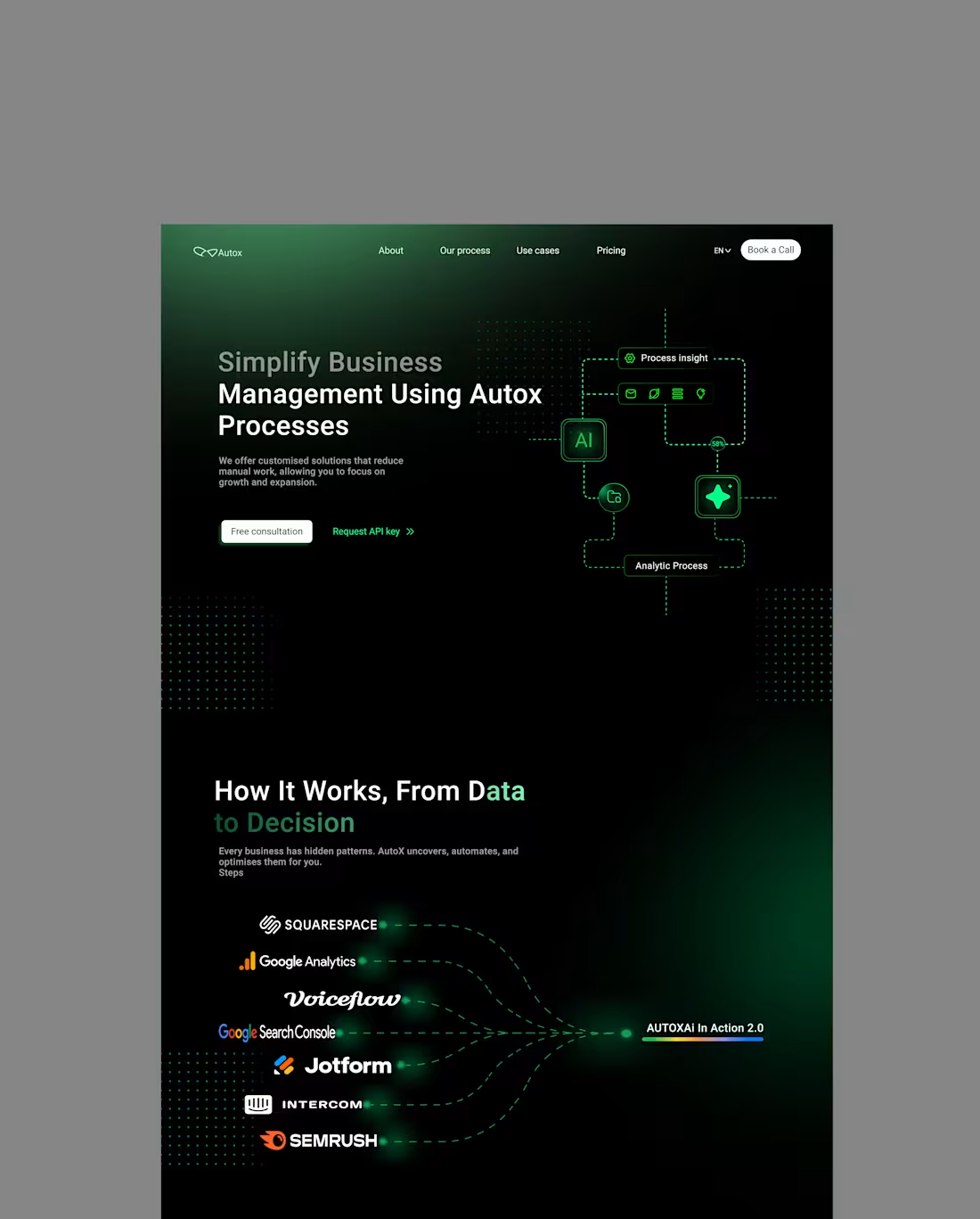
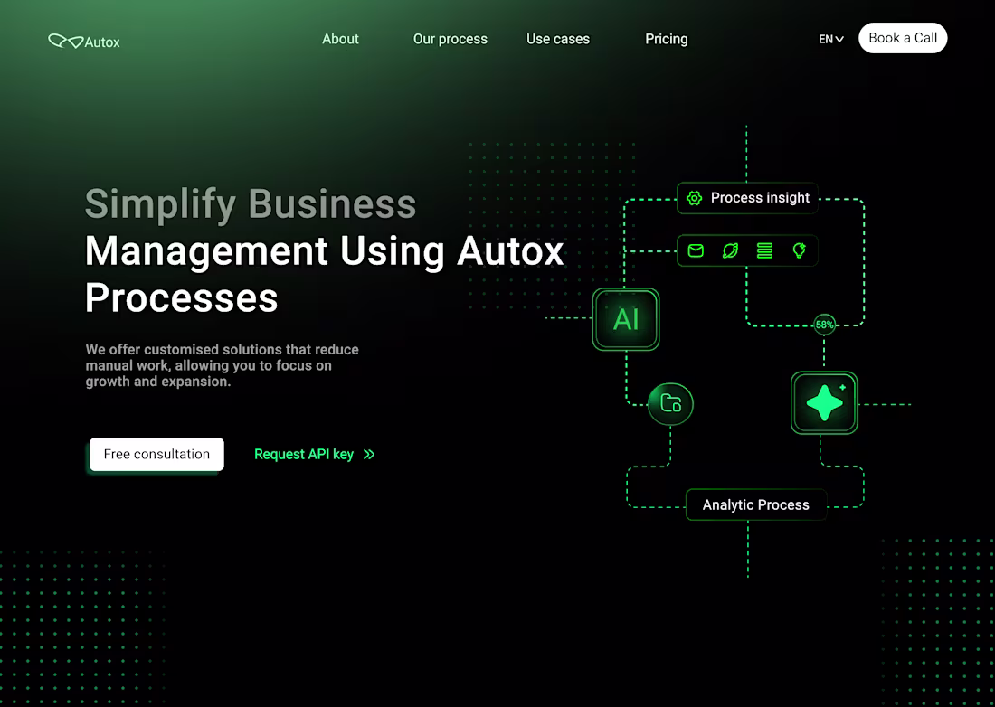
Merging precision and imagination, this landing page explores how design can feel both technical and human. A minimal dark aesthetic meets interactive depth to create an experience that’s sleek, bold, and intelligent by design.
3
5
21
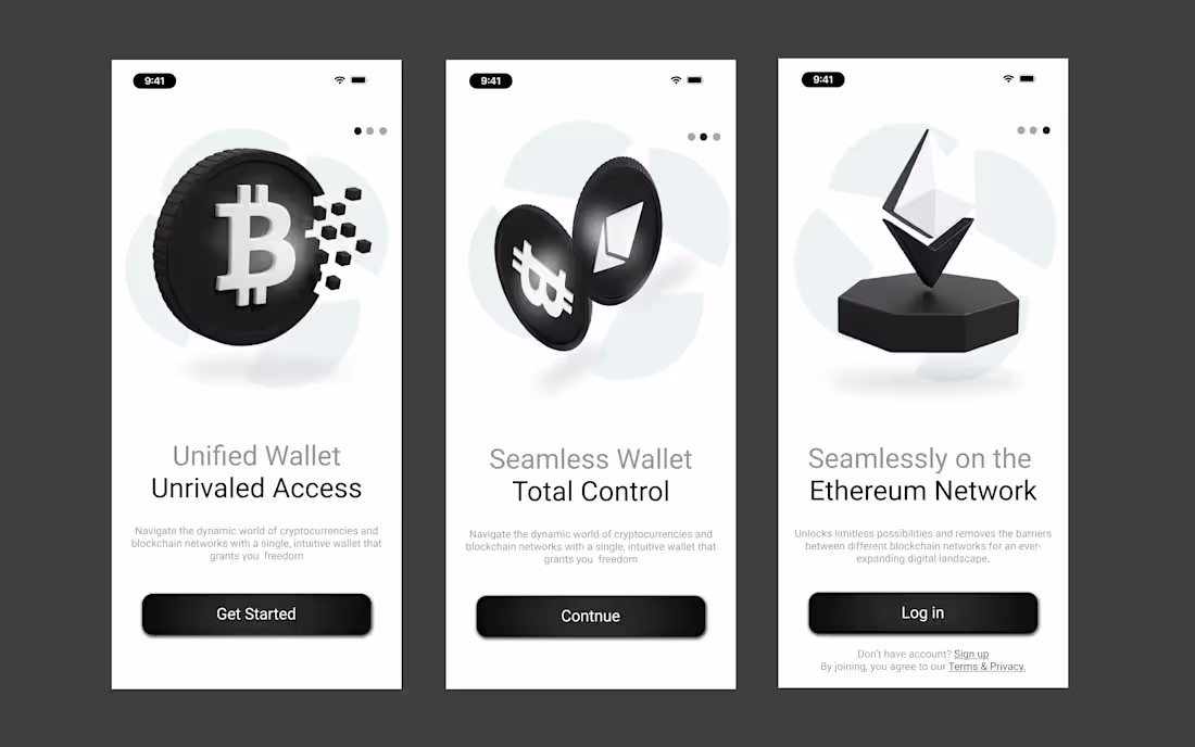
Landing page design and development
0
1
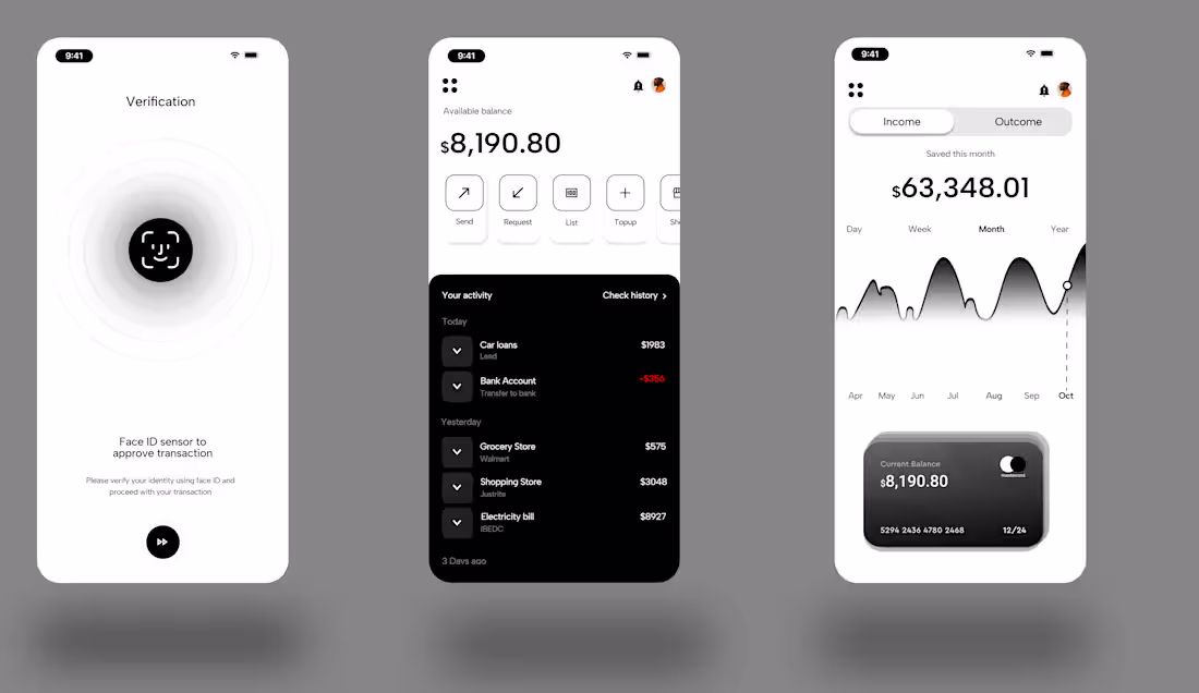
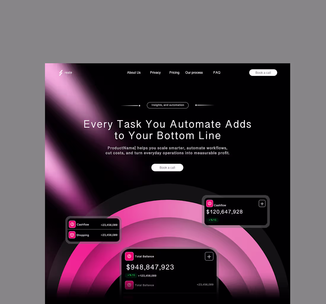
Most finance apps scream complexity.
This one whispers confidence.
Every element, from Face ID to income analytics, was designed to feel smooth, not sterile.
It’s not just design; it’s trust translated into interface.
Fintech doesn’t have to feel cold.
#FintechUI #AppDesign #UXDesign #Kreoslab #ProductDesign
1
10
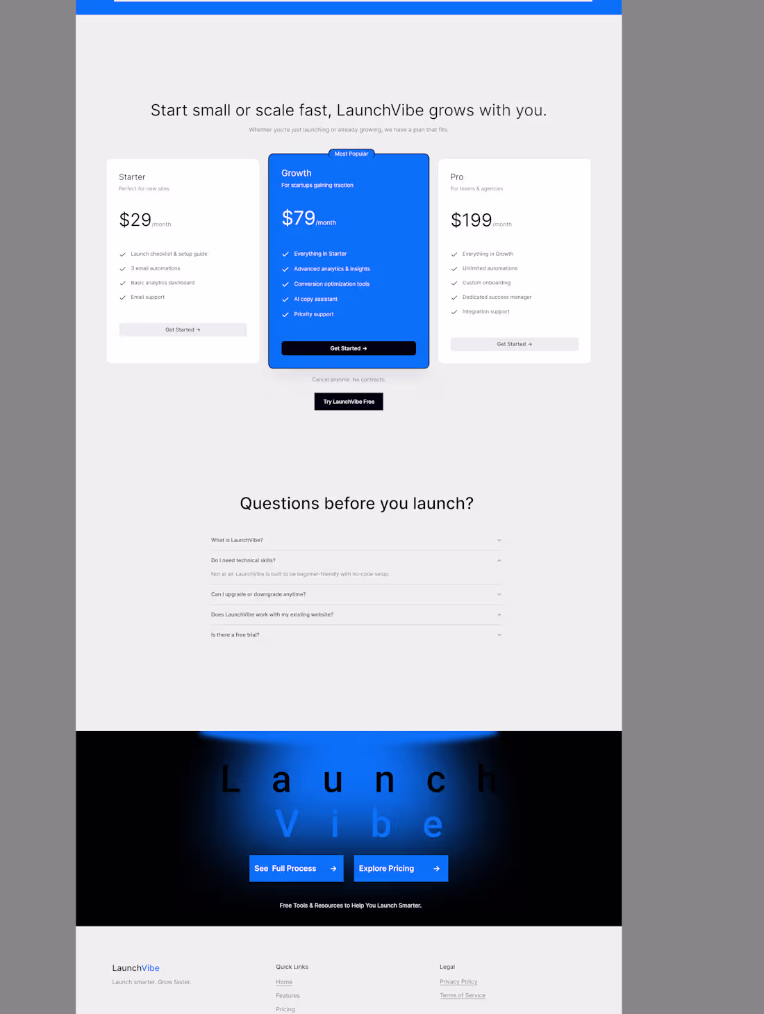
What if launching a website actually felt fun?
That’s the idea behind Launchvibe built for founders who don’t want “another template.”
1
9
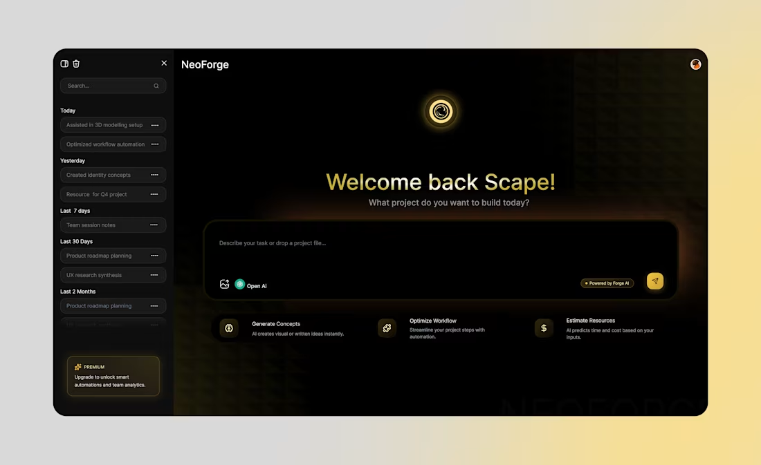
It looks simple until you start using it.
That’s when it hits you, NeoForge, isn’t just UI, it’s rhythm.
Every interaction, every state, every transition was designed to feel engineered, not just arranged.
Because great interfaces don’t just look clean, they move with intention.
1
13

Project management and online virtual assistance
0
5
website designer and marketing strategist.
0
2
Iamscapejamil on Instagram
0
2