
sandhya
Web and app designer with both aesthetic and modern style
Ready for work
sandhya is ready for their next project!
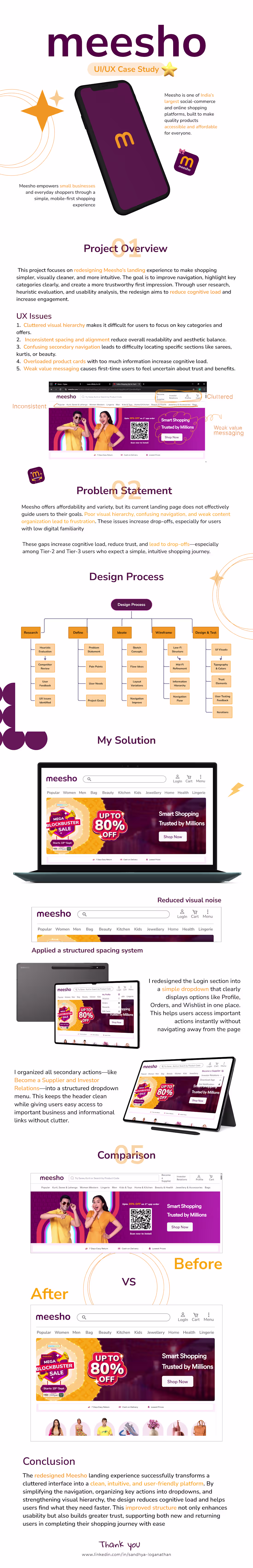
Meesho Redesign Case Study — Simplifying Social Commerce
This case study focuses on redesigning the shopping experience of Meesho with the goal of making it more intuitive, trustworthy, and conversion-friendly — especially for first-time and non-technical users.
Meesho operates in a unique space where buying and reselling intersect, which makes clarity and ease of use even more critical.
🔍 Problem areas identified:
• Cluttered interface and overwhelming product listings
• Confusing navigation for new users
• Lack of trust signals during purchase decisions
• Inconsistent user flow between browsing and checkout
💡 Design approach:
• Simplified UI with clear visual hierarchy
• Improved product discovery and filtering experience
• Strong focus on trust elements (ratings, delivery info, pricing clarity)
• Streamlined checkout flow to reduce drop-offs
• Mobile-first redesign for better accessibility
✨ Key improvements:
• Cleaner, distraction-free product pages
• Faster decision-making with better information structure
• Reduced friction across the user journey
• More engaging and user-friendly interface
🎯 Outcome:
A smoother, more reliable shopping experience that helps users browse, decide, and purchase with confidence — while also supporting Meesho’s social commerce ecosystem.
This redesign reflects my focus on solving real usability problems while balancing business goals and user needs.
Feedback is always welcome 💭
1
28
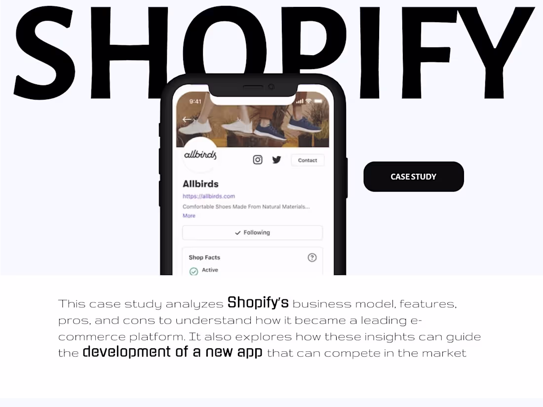
Shopify Case Study — Designing for Seamless E-commerce Experiences
This case study explores how thoughtful UI/UX design can simplify and elevate the online selling experience using Shopify as the foundation.
The focus was on understanding how users interact with e-commerce platforms — from product discovery to checkout — and identifying opportunities to improve clarity, speed, and conversion.
🔍 What I worked on:
• Analyzing user journey from landing to purchase
• Improving product page structure and hierarchy
• Simplifying navigation and reducing friction
• Enhancing mobile shopping experience
• Creating a clean, conversion-focused UI
💡 Key insights:
• Users value speed and clarity over heavy visuals
• A well-structured layout directly impacts conversion rates
• Mobile-first design is critical for modern e-commerce
• Trust elements (reviews, pricing clarity, CTA) play a major role
🎯 Outcome:
A refined, user-centric shopping experience that feels intuitive, fast, and reliable — helping users make decisions with confidence.
This case study reflects my approach to solving real-world design problems through research, structure, and simplicity.
Open to feedback and opportunities 🚀
1
33
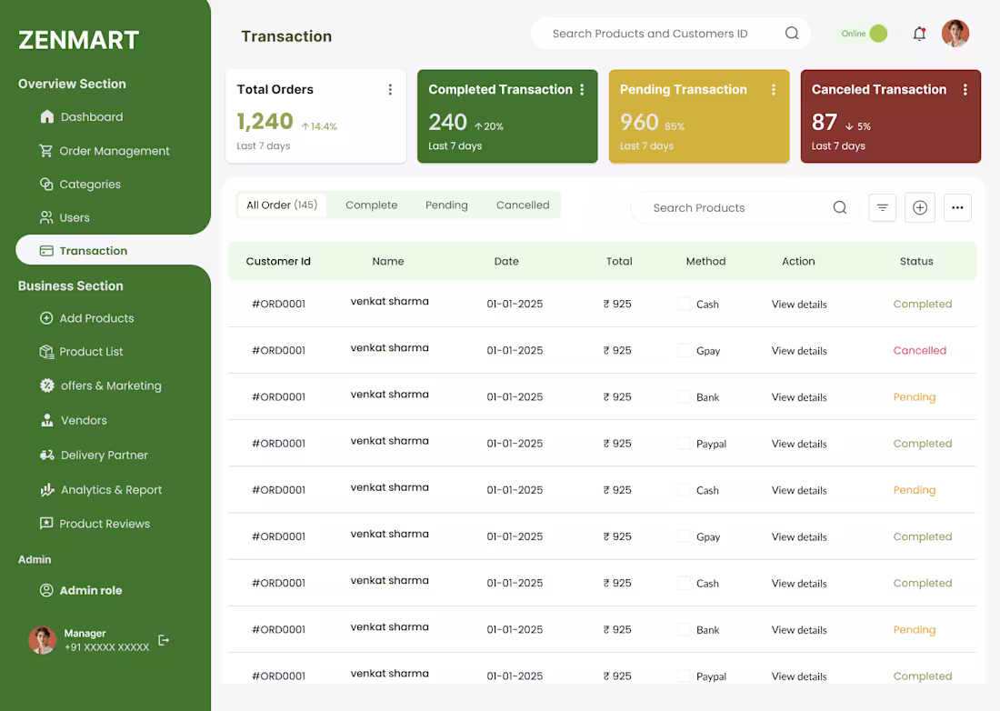
Hyperlocal SaaS Dashboard Design
I design scalable, user-friendly SaaS dashboards tailored for local businesses, delivery platforms, and e-commerce operations. The goal is to simplify complex workflows and help businesses manage everything from one clean, intuitive interface.
💡 What I offer:
• End-to-end SaaS dashboard design (web & responsive)
• Order, inventory, and delivery management interfaces
• User flows & UX strategy for real-world operations
• Data visualization (analytics, sales tracking, performance)
• Clean UI systems built in Figma / Framer
⚙️ Key features included:
• Real-time order tracking & status management
• Inventory and product management dashboards
• Delivery partner coordination interfaces
• Insights & analytics for better decision-making
• Role-based dashboards (admin / seller views)
🎯 What you get:
• A scalable and structured dashboard design
• Faster workflows for business operations
• Reduced complexity for non-technical users
• A modern SaaS experience ready for development
This service is ideal for startups, founders, and businesses building tools similar to hyperlocal delivery platforms.
Let’s build a system that actually works in the real world 🚀
1
38
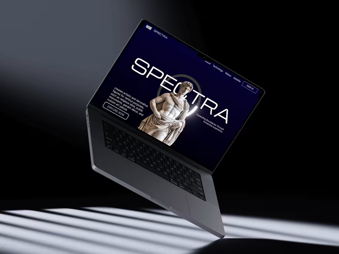
Spectra — Where Art Meets Technology
Spectra is a concept landing page that blends classical art with modern digital innovation. Inspired by timeless sculptures and powered by futuristic design elements, it creates a bold and immersive visual experience.
The idea behind Spectra is to showcase how traditional craftsmanship can evolve through technology — from 3D scanning and digital modeling to precision-driven production.
✨ Key highlights:
• Fusion of classical sculpture aesthetics with modern UI
• Dark, immersive interface with high visual contrast
• Strong hero section with storytelling visuals
• Structured sections for services like 3D printing, scanning, and resin casting
• Artist showcase and artwork gallery integration
🎯 Design goal:
To create a premium, gallery-like digital experience that feels both artistic and technological — appealing to creators, collectors, and modern studios.
Spectra isn’t just a landing page, it’s a visual narrative of how art evolves in the digital era.
Open to feedback and collaborations 🚀
0
49

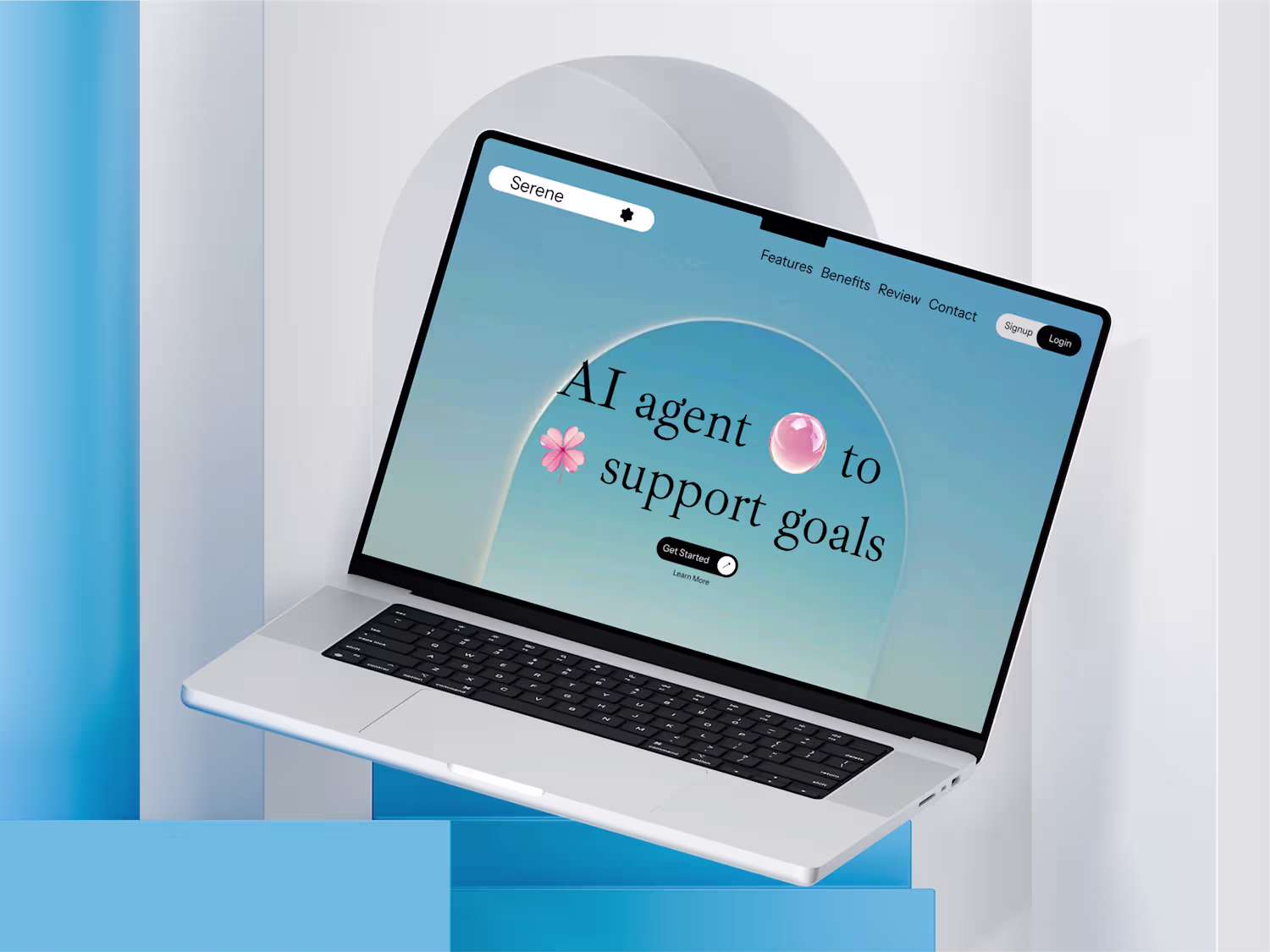
Designed a calming AI-powered landing experience 🌿
This concept focuses on reducing noise and helping users stay in flow with a mindful, minimal interface. From soft gradients and nature-inspired visuals to clean typography and gentle interactions, every element is crafted to feel peaceful and intentional.
✨ Highlights:
• AI agent designed to support personal goals
• Distraction-free, clutter-free workspace
• Personalized yet non-intrusive experience
• Focus on calm, clarity, and flow
Built with a user-first mindset — where productivity meets mental clarity.
Would love to hear your thoughts
0
63