The network for creativity
Join 1.25M professional creatives like you
Connect with clients, get discovered, and run your business 100% commission-free
Creatives on Contra have earned over $150M and we are just getting started
Back to feedPost
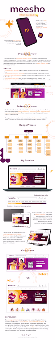
Meesho Redesign Case Study — Simplifying Social Commerce
This case study focuses on redesigning the shopping experience of Meesho with the goal of making it more intuitive, trustworthy, and conversion-friendly — especially for first-time and non-technical users.
Meesho operates in a unique space where buying and reselling intersect, which makes clarity and ease of use even more critical.
🔍 Problem areas identified:
• Cluttered interface and overwhelming product listings
• Confusing navigation for new users
• Lack of trust signals during purchase decisions
• Inconsistent user flow between browsing and checkout
💡 Design approach:
• Simplified UI with clear visual hierarchy
• Improved product discovery and filtering experience
• Strong focus on trust elements (ratings, delivery info, pricing clarity)
• Streamlined checkout flow to reduce drop-offs
• Mobile-first redesign for better accessibility
✨ Key improvements:
• Cleaner, distraction-free product pages
• Faster decision-making with better information structure
• Reduced friction across the user journey
• More engaging and user-friendly interface
🎯 Outcome:
A smoother, more reliable shopping experience that helps users browse, decide, and purchase with confidence — while also supporting Meesho’s social commerce ecosystem.
This redesign reflects my focus on solving real usability problems while balancing business goals and user needs.
Feedback is always welcome 💭
The network for creativity
Join 1.25M professional creatives like you
Connect with clients, get discovered, and run your business 100% commission-free
Creatives on Contra have earned over $150M and we are just getting started
Related posts
Finance apps already deal with user anxiety. The interface shouldn’t add more.
For this mobile app concept, we designed a cleaner home screen experience with focused UX/UI decisions and controlled 3D animation that adds depth without creating clutter.
Built to feel lighter, faster, and easier to trust.
This was created with a design subscription from FANCY — and yes, we’re currently open to new projects.
More than just visuals — creating experiences users remember.
Clean interfaces paired with meaningful interactions. 🚀
📩 Have a project?
👉 Book a call: https://calendly.com/gopi-uiux/30min
👉 Dribble: https://dribbble.com/OptimityLogics
👉 Behance: https://www.behance.net/optimitylogics
👉 Portfolio: https://gopi-prajapati-portfolio.vercel.app
Very well thought out.
Where sliders actually make sense on a website 👀
Sliders aren’t always the right solution. Sometimes they hide important information instead of helping users.
But in the right place, they can improve both structure and user experience.
Here are a few examples where sliders work especially well:
– Portfolio projects
– Team members
– Testimonials
– Events or programs
– Multi-step processes
A good slider isn’t about fitting more content into one section.
It’s about making content easier to explore.
Impressive work
Trending
Claude
Claude has entered the design space. How are you using Claude Design?
Contra University
Learn from expert creatives how to earn more using next-gen AI tools.
creativeaiflow
Creative AI workflows are evolving. What tools do you use, and what are their strengths and weaknesses?
portfolioreview
The best portfolios tell a story, not just show a grid. Share yours for feedback.
freelancerlife
Freelancer life is wins, pivots, and everything in between. What’s yours right now?