samuel ayo
Products that look sharp and ship fast. Design + Framer
- 1x
- Hired
- 5.0
- Rating
- 8
- Followers


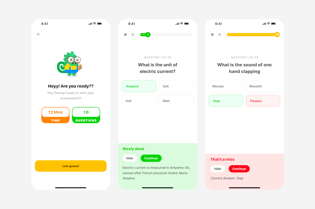
Mobile screens from BrainFriend, an edtech app I worked on. Focused on making daily learning feel simple and rewarding, from onboarding through microlearning content to quick assessments

designed the seek/scrub interaction for Instagram in this one. The idea was simple, if you accidentally close a video or miss a clip, you shouldn't have to sit through the whole thing again just to get back to where you were. With this, you can seek and play instantly instead of...


designed the seek/scrub interaction for Instagram in this one. The idea was simple, if you accidentally close a video or miss a clip, you shouldn't have to sit through the whole thing again just to get back to where you were. With this, you can seek and play instantly instead of...
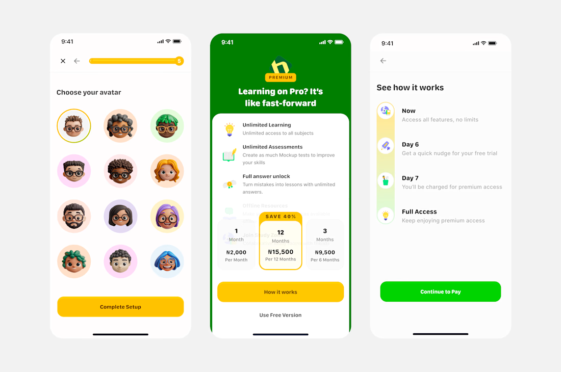
Free trials fail when people forget they signed up and get surprised by a charge.
For this app, I designed a transparent trial to paid flow. Before checkout, users see exactly what happens on day 1, day 6, and day 7, so nobody feels tricked when the charge hits.
I also worked on...

Most people dread assessments. So for this elearning platform, I set out to change that.
Instead of a plain question and answer test, I built a flow with personality: a mascot to ease people in, playful copy even in the wrong answers, and instant feedback that turns a miss into a...