
Sherwin Sampson
Designing the future of finance. Together.


Designing for insight, not information.
Analytics platforms rarely suffer from a lack of data.
They suffer from a lack of clarity.
This concept rethinks the dashboard as a decision-making tool rather than a reporting interface. Information is organized according to the questions users are trying to answer, with visual hierarchy directing attention to meaningful signals instead of competing metrics.
The objective is not to display more data.
It is to make better decisions possible.
0
33
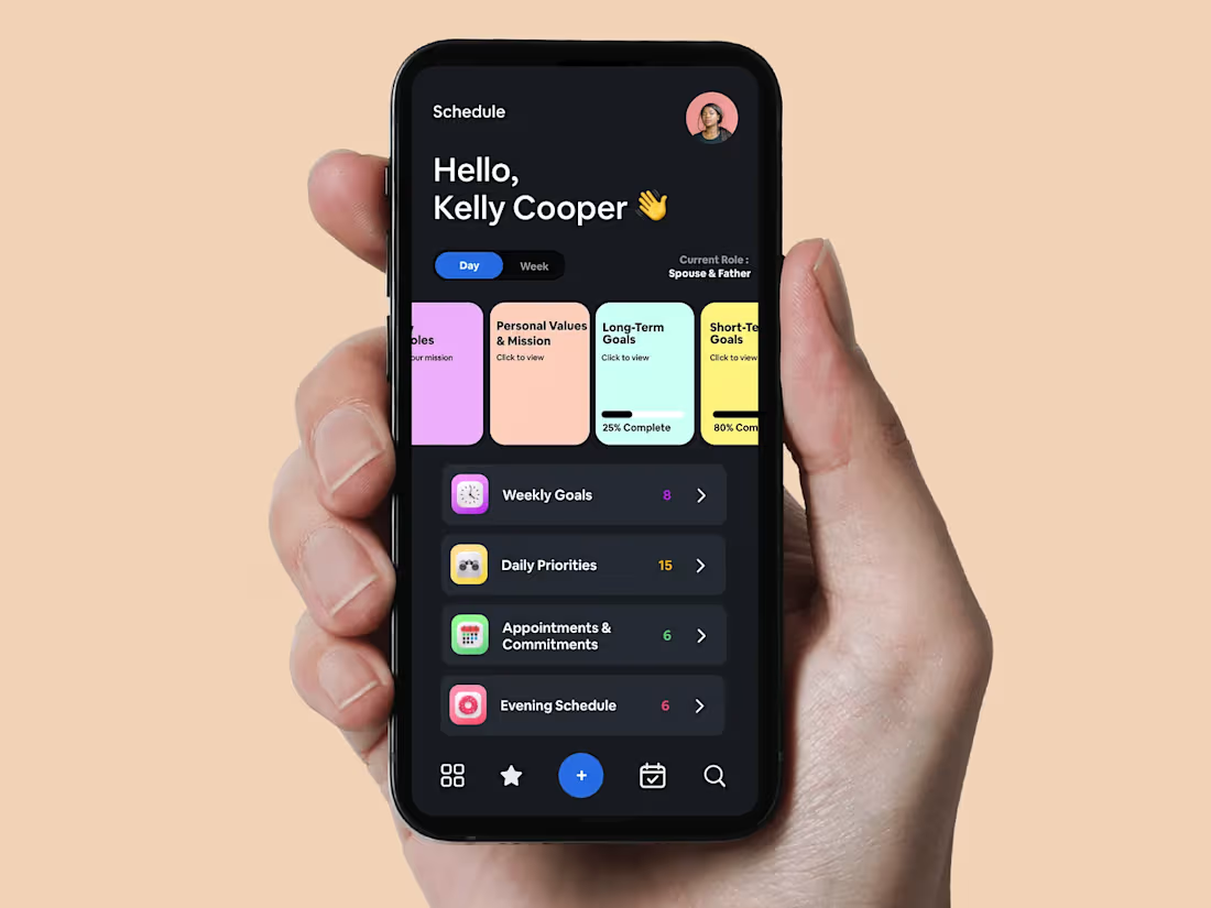
Making priorities visible.
Most planning systems treat every task as equally important.
People don't.
This interface establishes a clear hierarchy between identity, goals, commitments, and actions. By surfacing life roles and long-term objectives alongside daily priorities, each decision is framed within a broader context.
The result is a product that supports alignment rather than activity—helping users invest their time in what matters most, not simply what appears next.
Productivity is often measured by output. Human fulfillment is measured by alignment.
This concept reimagines planning as a hierarchy of decisions. Long-term goals inform weekly objectives. Weekly objectives shape daily priorities. Daily priorities influence every action that follows.
Rather than asking users to remember what matters, the interface makes those priorities visible at the moment decisions are made.
Design, in this context, is not about helping people do more. It is about helping them spend their time in ways that reflect their intentions.
0
86
Reducing cognitive effort without reducing capability.
Every additional visual element competes for a customer's attention.
Every competing element increases cognitive effort.
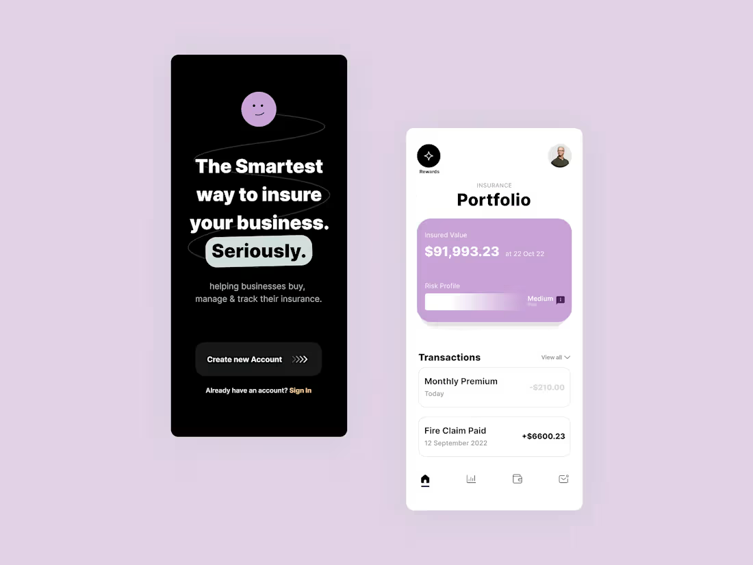
This interface was designed to reduce unnecessary decisions through disciplined use of hierarchy, progressive disclosure, and intentional restraint. Primary actions are unmistakable. Supporting information remains accessible without overwhelming the experience.
Complex products don't have to feel complicated.
They need to communicate with precision.
0
79
Good design isn't decoration. It's risk reduction.
Every interaction introduces the possibility of confusion, hesitation, or abandonment.
Our role is to identify where that risk exists and remove it before your product reaches customers.
In this example, we transformed a complex business onboarding flow into a structured journey that gives customers clarity at every step. Progress is visible. Decisions are broken into manageable tasks. Information is requested only when it's needed.
The objective isn't to make the interface look better.
The objective is to make completion more likely.
2
0
94