Saikat Roy
Brand identity designer • Logo design • Packaging design


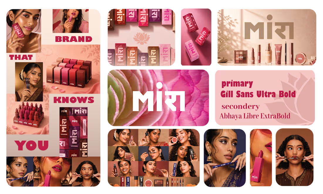
MIRA is an Indian beauty brand developed around a simple question:
Can an Indian beauty brand feel culturally familiar, offer beauty products made with Indian skin tones in mind, and still feel contemporary and memorable?
THINKING
I wanted the brand to feel rooted in Indian culture before it even became visual.
The name MIRA came from the cultural association with Meera, connecting the brand to the story of Meera and her devotion to Krishna. I liked that connection because it gave the brand an Indian emotional foundation without forcing the identity to visually depend on religious imagery.
At the same time, MIRA is short, easy to remember and naturally feels contemporary. That gave me a starting point where cultural meaning and modern beauty could coexist.
From there, I decided that the cultural connection shouldn't become the entire visual direction. Many beauty brands communicate their origin through obvious cultural symbols, which can make the identity recognizable but also predictable.
So I wanted the culture to feel discovered through the brand, rather than announced through it.
DECISION
I chose a more expressive and crafted visual language instead of building MIRA around obvious Indian beauty clichés.
The logo became the first expression of that idea — simple enough to feel contemporary, but distinctive enough to give the brand its own personality.
For the supporting identity, I introduced the lotus as a more subtle cultural and beauty symbol. It allowed me to bring in the Indian connection without making the brand feel overly traditional.
I also explored traditional-inspired patterns as a supporting background element, giving the packaging a stronger Indian character while allowing the main typography and layout to remain modern.
MAKING IT HAPPEN
Once the core identity was established, I carried the same thinking into the packaging.
The logo creates recognition, while the lotus and traditional pattern create the cultural layer. Colour and product information then provide differentiation between the different beauty products.
This meant each element had a job:
Logo → recognition
Lotus → cultural & beauty connection
Pattern → Indian character
Colour → product differentiation
Packaging system → shelf recognition
RESULT
The result is a beauty identity that doesn't try to look Indian through decoration alone.
Instead, MIRA combines cultural meaning, symbolism and contemporary beauty language to create a brand that feels rooted, memorable and relevant to the people it is designed for.
1
16
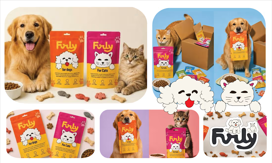
Furly is a pet food and grooming brand created around a simple idea: make pet care feel more playful, expressive and connected to the personality of pets.
The project developed from the name into the character, mascot and packaging system, creating one consistent brand world.
THINKING
I wanted the brand to feel less like a traditional pet-care company and more like something that could naturally connect with a younger, Gen-Z audience.
The first step was finding a name that could carry that personality.
I explored multiple naming directions before landing on Furly. The name came from the connection between fur and pets, while its short, friendly sound made it feel playful and easy to remember.
Once the name was established, it gave me a clear foundation for building the visual identity.
DECISION
I wanted the brand to have personality rather than simply a pet-related symbol.
That led to creating two central characters — a dog and a cat — as the foundation of the brand's mascot system.
Their furry, expressive character became an extension of the Furly name and gave the identity an immediately recognizable personality.
The logo, mascot and supporting graphics were then designed to work together rather than as separate elements.
MAKING IT HAPPEN
The mascot became the starting point for the packaging direction.
I developed a playful, colourful and expressive visual system around the characters, combining them with bold typography, approachable layouts and a more contemporary colour language.
The same system was extended across the pet food packaging, grooming products and supporting brand touchpoints, keeping Furly recognizable while allowing different products to have their own personality.
RESULT
Furly evolved from a simple name into a complete pet-care brand world.
The connection between name → mascot → logo → packaging gives the brand a consistent personality, while the playful visual language makes it feel more contemporary and Gen-Z oriented.
The name started the personality; the characters made it recognizable; the packaging made that personality tangible.
1
22
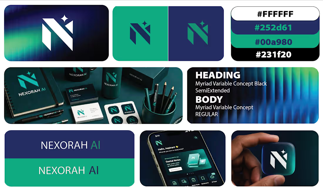
Nexorah AI is a Dubai-based dental education technology company using AI to help dental students learn, practise and prepare more effectively.
The project was primarily focused on creating a distinctive logo and identity mark for the digital product, with supporting applications across the company's ecosystem.
THINKING
Because the product sits between AI, education and dentistry, I wanted to avoid making the identity feel like a typical AI startup or a traditional dental brand.
The logo needed to work especially well inside an app, where it would often appear very small. So the challenge was to create something that could communicate intelligence and progress without depending on complex detail.
I started with the idea of growth.
Learning is a process of moving from one level to another, and I wanted that progression to be present in the structure of the mark rather than simply explained through the brand messaging.
EXPLORATION
My first direction explored a spiral form, using continuous movement to represent learning, progression and development.
The idea had the right conceptual foundation, but when I considered how the identity would behave as an app icon, I felt it became less immediate than it needed to be.
That pushed me toward a simpler and more recognizable interpretation.
DECISION
I developed the final mark around the N of Nexorah.
The structure of the N represents growth and forward movement, while the star represents intelligence, insight and the AI layer.
I chose to integrate these ideas into one mark rather than adding separate symbols for dentistry, education and technology.
This kept the identity simple enough for digital use while still giving the mark a meaning beyond the letter itself.
MAKING IT HAPPEN
Once the direction was approved, I tested the mark first where it mattered most — the app icon.
From there, I extended the same identity across the smartphone interface, website and supporting company materials.
The mark was also applied to practical brand touchpoints such as notebooks, water bottles, pens and gifting items, showing how the identity could move from a digital product into the wider Nexorah ecosystem.
RESULT
The final identity gives Nexorah AI a recognizable visual anchor built around growth and intelligence, while remaining simple enough to work at the small scale required by an app.
The approved direction turns a simple N into a symbol for the company's larger idea:
learning → growth → intelligence.
1
42
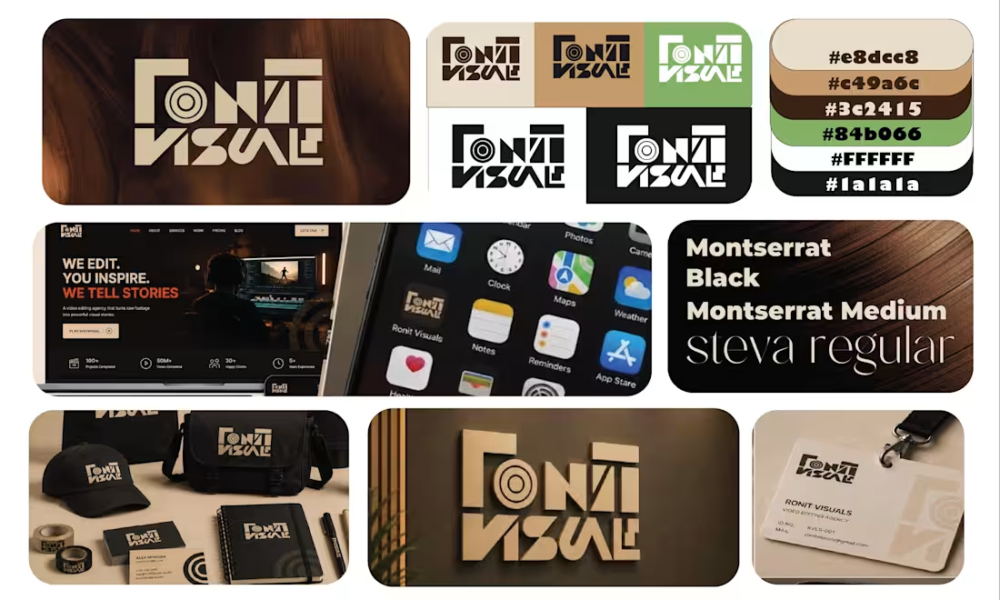
Ronit Visuals is a video editing agency that needed a more refined identity to reflect the quality and modern direction of its work.
The rebrand focused primarily on creating a new logo that could communicate video editing without relying on the obvious, generic visual language commonly used by creative agencies.
THINKING
The previous identity felt more basic and less aligned with the level of work Ronit Visuals wanted to communicate.
I wanted the new logo to feel cleaner, more sophisticated and distinctly modern, while still having a visual connection to the world of video editing.
Instead of using a straightforward play button or camera symbol, I looked at the actual visual components of editing — layers, frames, sequences and the way different elements come together to create a finished visual.
The goal was to make those ideas part of the construction of the logo itself.
EXPLORATION
I explored how layered shapes and editing-style components could form the structure of the mark.
The challenge was to keep the visual reference to editing recognizable without making the logo look like an editing-software icon.
So the forms were simplified and refined until the editing reference became embedded into the geometry rather than illustrated literally.
DECISION
The final logo uses a layered construction inspired by video-editing elements.
The overlapping forms create a sense of frames, layers and movement, while the overall geometry stays minimal and controlled.
This gives Ronit Visuals two things at once:
a clear connection to video editing + a more sophisticated visual identity.
MAKING IT HAPPEN
The final mark was developed to work beyond a single logo lockup.
Its simplified geometry allows it to function as a standalone symbol, digital icon and brand signature, while the layered construction gives the identity a visual characteristic that can be carried into other brand applications.
RESULT
The rebrand moves Ronit Visuals toward a cleaner, more contemporary and professional identity without losing its connection to video editing.
Rather than showing video editing literally, the logo builds the idea of editing into the mark itself through layers, structure and visual composition.
1
41